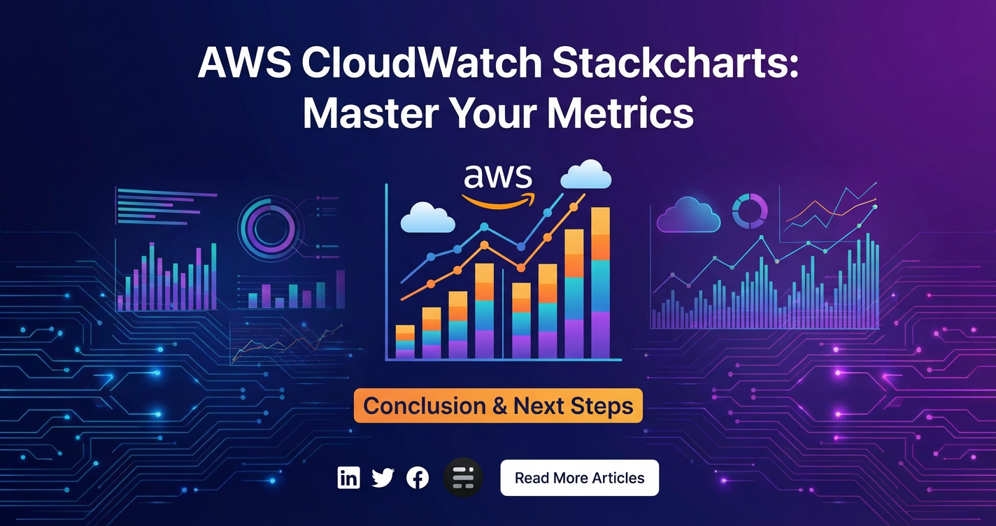
AWS CloudWatch Stackcharts: Master Your Metrics


The intricate dance of modern cloud infrastructure demands not just visibility, but profound insight into the operational heartbeat of every service and resource. In the sprawling landscape of Amazon Web Services (AWS), where applications scale on demand and microservices proliferate, the ability to effectively monitor performance, identify bottlenecks, and proactively respond to anomalies is paramount. This isn't merely a nice-to-have; it's a fundamental pillar of operational excellence, directly impacting reliability, cost-efficiency, and user experience. While AWS offers a plethora of monitoring tools, AWS CloudWatch stands as the foundational service for collecting, visualizing, and acting on metrics, logs, and events across your AWS environment. Within CloudWatch, a particularly powerful yet often underutilized visualization technique emerges: Stackcharts. These aren't just pretty graphs; they are dynamic, layered representations of your data, capable of revealing patterns, distributions, and proportional contributions that simpler line graphs might obscure. Mastering CloudWatch Stackcharts is akin to gaining a superpower in metric analysis, enabling engineers, developers, and operations teams to dissect complex system behaviors with unprecedented clarity.
This comprehensive guide will embark on an extensive journey through the world of AWS CloudWatch Stackcharts. We will peel back the layers of this sophisticated visualization tool, starting from the bedrock of CloudWatch itself and progressing to advanced techniques that empower you to not only see your metrics but truly understand the narratives they tell. We will explore how to craft compelling Stackcharts, leveraging Metric Math expressions to derive new insights, and integrate data from various sources, including critical api and gateway metrics. Furthermore, we will delve into practical applications, showing how Stackcharts can be instrumental in troubleshooting, capacity planning, and even cost optimization. By the end of this exploration, you will possess the knowledge and skills to transform raw data into actionable intelligence, ensuring your AWS environment operates with peak performance and resilience. Get ready to master your metrics and unlock a new dimension of operational awareness with AWS CloudWatch Stackcharts.
Understanding AWS CloudWatch: The Foundational Layer of Observability
Before we can truly appreciate the nuanced power of Stackcharts, it is essential to establish a robust understanding of AWS CloudWatch, the ubiquitous monitoring and observability service that underpins them. CloudWatch serves as the central nervous system for your AWS operations, collecting data from virtually every AWS service you utilize, as well as enabling you to publish your own custom application and infrastructure metrics. Its multifaceted capabilities are designed to provide a holistic view of your resource utilization, application performance, and operational health, forming the bedrock upon which all subsequent analysis, including Stackcharts, is built.
At its core, CloudWatch operates by ingesting three primary types of data: metrics, logs, and events. Each plays a distinct yet interconnected role in painting a complete picture of your environment.
Metrics: These are time-ordered sets of data points that represent a variable being monitored. Virtually every AWS service automatically emits metrics to CloudWatch. For instance, Amazon EC2 instances publish metrics like CPU Utilization, Network In/Out, and Disk Read/Write Operations. Amazon S3 reports metrics on request counts, bucket size, and data transfer. AWS Lambda provides metrics on invocations, errors, and duration. These standard metrics are a treasure trove of information, offering immediate insights into the health and performance of individual resources. Beyond these automated metrics, CloudWatch empowers you to publish custom metrics from your own applications, services, or on-premises infrastructure using the PutMetricData API. This allows you to monitor domain-specific business metrics, application-level error rates, or the performance of internal api endpoints that might not be covered by standard AWS offerings. Each metric is uniquely identified by a name, a namespace (e.g., AWS/EC2, MyCompany/MyApp), and dimensions. Dimensions are key-value pairs that help you categorize and filter metrics, providing granular insights. For example, an EC2 CPU utilization metric might have dimensions like InstanceId and AutoScalingGroupName, allowing you to analyze CPU usage for a specific instance or a group of instances. Understanding dimensions is crucial for crafting targeted Stackcharts, as they often form the basis for grouping and aggregating data effectively.
Logs: While metrics provide quantitative data, logs offer the qualitative narrative. CloudWatch Logs enables you to centralize logs from all your systems, applications, and AWS services into a single, highly durable, and scalable repository. This includes logs from EC2 instances, Lambda functions, Container services (ECS, EKS), CloudTrail (for API activity logging), Route 53 (DNS query logs), and many more. Once ingested into CloudWatch Logs, these logs can be securely stored for extended periods, even indefinitely, based on your retention policies. The true power of CloudWatch Logs lies in its ability to facilitate advanced analysis. CloudWatch Logs Insights is a powerful, interactive query service that allows you to search, filter, and analyze your log data with specialized query language. You can quickly pinpoint error messages, identify unusual access patterns, or extract specific data points from log entries to understand the root cause of issues. Furthermore, you can create custom metrics filters from log data, transforming specific log patterns (e.g., "ERROR" messages, "Login Failed") into numerical metrics that can then be visualized and alarmed upon, bridging the gap between raw log data and structured metric analysis.
Events: CloudWatch Events, now primarily known as Amazon EventBridge, allows you to respond to changes in your AWS environment in real-time. It delivers a near real-time stream of system events that describe changes in AWS resources. These events can originate from AWS services (e.g., EC2 instance state changes, S3 object uploads, Lambda function errors), from your own custom applications, or even from SaaS applications and external partners. EventBridge enables you to define rules that match specific events and then route them to various targets, such as Lambda functions for automated remediation, SNS topics for notifications, SQS queues for decoupled processing, or even another AWS service. This proactive, event-driven architecture is critical for automating operational tasks, implementing security responses, and building resilient, self-healing systems. While not directly visualized in Stackcharts, the outcomes of events (e.g., how many times an auto-scaling event occurred, how many Lambda errors were triggered by an S3 put event) can certainly be captured as metrics and then visualized.
Alarms: CloudWatch Alarms allow you to set thresholds on any CloudWatch metric. When a metric breaches a defined threshold for a specified period, the alarm transitions into an ALARM state and can initiate automated actions. These actions can include sending notifications via Amazon SNS, automatically stopping, terminating, rebooting, or recovering EC2 instances, or even triggering Auto Scaling policies. Alarms are your frontline defense, providing immediate alerts to critical issues, ensuring that human intervention or automated remediation occurs swiftly. The metrics visualized in Stackcharts often become the basis for defining robust and intelligent alarms. By identifying normal operational ranges and detecting deviations through Stackcharts, you can fine-tune alarm thresholds to be highly effective, reducing false positives while ensuring critical issues are never missed.
Dashboards: CloudWatch Dashboards are customizable homepages in the CloudWatch console that you can use to monitor your resources in a single view, even those spread across different regions. You can create different dashboards for different purposes—for example, one dashboard for monitoring your web api performance, another for database health, and yet another for serverless application metrics. Dashboards allow you to combine various types of widgets, including line graphs, stacked area charts (which Stackcharts are a type of), number widgets, log group tables, and text widgets. They provide a consolidated, at-a-glance view of your most critical metrics and operational data, enabling quick decision-making and collaborative monitoring among teams. It is within these dashboards that Stackcharts truly come alive, offering a dynamic and insightful visualization tool to complement other data representations.
The fundamental importance of CloudWatch in the AWS ecosystem cannot be overstated. It is not merely a data collector but an integrated platform that facilitates proactive monitoring, rapid troubleshooting, and continuous optimization. By providing a unified source of truth for operational data, CloudWatch empowers teams to move from reactive firefighting to proactive management, driving efficiency and stability across the entire cloud footprint. With this foundational understanding firmly established, we can now pivot our focus to one of its most compelling visualization features: Stackcharts.
Diving Deep into Stackcharts: The Visualization Powerhouse
With a solid grasp of AWS CloudWatch's foundational components, we can now shift our attention to Stackcharts – a powerful, yet often underutilized, visualization technique that transforms raw metric data into a dynamic, layered narrative. Stackcharts are not just another way to present data; they offer a unique perspective, enabling a deeper understanding of proportional contributions, cumulative totals, and the distribution of various components over time. Unlike traditional line graphs that simply plot individual metrics, Stackcharts stack these metrics on top of each other, allowing you to see both the individual trends and their combined impact in a single, coherent view.
What are Stackcharts? Their Unique Value Proposition:
At its essence, a Stackchart (or stacked area chart) in CloudWatch displays multiple time-series metrics by layering them sequentially. Each layer represents a specific metric or a segment of a larger whole, and the height of each layer at any given point in time corresponds to the value of that metric. The total height of the stacked area then represents the sum of all individual metrics at that time. This layered approach offers several distinct advantages over standard line graphs:
- Proportional Contribution: Stackcharts excel at illustrating the "part-to-whole" relationship. You can instantly see how different components contribute to a total, and how these proportions change over time. For example, when monitoring errors, you can easily visualize the proportion of errors originating from different
apiendpoints or microservices within a total error count. - Cumulative Totals: The top boundary of a Stackchart always represents the sum of all the stacked metrics. This provides an immediate understanding of the overall volume or magnitude of a combined set of metrics. For instance, you could stack
NetworkInandNetworkOutmetrics for an instance to see total network traffic, or stack various request types to see total request volume. - Trend Identification for Components: While showing cumulative totals, Stackcharts still allow you to discern the individual trends of each stacked metric. You can observe if a particular component is growing, shrinking, or remaining stable within the overall context.
- Density and Context: By grouping related metrics, Stackcharts can convey a significant amount of information within a compact space, providing rich context without overwhelming the viewer. This is particularly useful for dashboards where screen real estate is valuable.
How to Create Stackcharts in CloudWatch:
Creating Stackcharts in CloudWatch is an intuitive process, primarily performed through the CloudWatch console or defined programmatically via Infrastructure as Code (IaC) tools like CloudFormation or Terraform.
- Via the CloudWatch Console:
- Navigate to "Dashboards" and either create a new dashboard or open an existing one.
- Click "Add widget" and choose "Number and graph" or "Graph".
- Select "Metrics" as the data source.
- Browse or search for the metrics you wish to visualize. When adding multiple metrics to the same graph, CloudWatch will initially display them as individual lines.
- To convert to a Stackchart, locate the "Graph options" panel, usually positioned above the graph itself. Within these options, you'll find a dropdown or button to change the graph type. Select "Stacked area" (sometimes simply "Stacked").
- Crucially, for a Stackchart to be meaningful, the metrics you stack should ideally represent parts of a common whole. CloudWatch will automatically assign colors to differentiate the layers, but you can customize these for better clarity.
- Leveraging Metric Math Expressions: The true power of Stackcharts often comes to life when combined with CloudWatch Metric Math. Metric Math allows you to query multiple CloudWatch metrics and use mathematical expressions to create new time series. This means you're not just stacking raw metrics, but potentially derived metrics like error rates, percentile latencies, or aggregated values.
- When adding metrics, instead of just selecting raw metrics, you can switch to the "Graph Explorer" or "Graphed metrics" tab and add a "Metric Math" expression.
- For example, if you want to stack
GETrequests,POSTrequests, andPUTrequests for anapi gateway, you would add each as a separate metric (e.g.,m1,m2,m3) and then display them all in a stacked chart. You might even create a Metric Math expression likem1+m2+m3to show the total alongside the stacked individual components. The flexibility of Metric Math allows for highly sophisticated Stackcharts that reflect complex operational logic.
Compelling Use Cases for Stackcharts:
Stackcharts excel in scenarios where understanding the composition and contribution of different elements is key.
- Resource Utilization Across Multiple Instances/Services: Imagine monitoring the CPU utilization of an Auto Scaling Group. Instead of 20 separate lines, a Stackchart can show the combined CPU utilization of all instances, with each layer representing an individual instance. This allows you to see the aggregate load and how individual instances contribute to it. Similarly, for a containerized application, you could stack the memory usage of different containers within a service.
- Error Rates Breakdown by Service/Function: This is a classic application. If your application comprises multiple microservices or Lambda functions, a Stackchart can visualize the total error rate, broken down by the specific service or function experiencing the errors. You can immediately see which component is disproportionately contributing to the overall error count. For example, if you're monitoring an
api gateway's 5xx errors, you can group them by API resource path or by underlying service (apitarget) to quickly identify the problematic upstream. - Latency Distribution: While often better represented by percentile line graphs, Stackcharts can still be useful for latency in certain contexts. For instance, if you have different types of requests (e.g., read, write, search), you could stack their average latencies to see the overall perceived latency and the contribution of each request type.
- Request Volume by Source/Type: If your application processes requests from various sources (e.g., mobile clients, web
apis, internal services) or differentapimethods (GET,POST), a Stackchart can depict the total request volume, with each layer showing the volume from a particular source or method. This helps in understanding traffic patterns and identifying dominant request flows. - Cost Allocation and Trends: While CloudWatch cost metrics are aggregated, if you emit custom metrics related to cost (e.g., cost per tenant, cost per feature), you could stack these to see how different business units or features contribute to your overall infrastructure spend over time, allowing for better cost optimization strategies.
Configuring Stackcharts: Colors, Labels, Legends, and Time Ranges:
Thoughtful configuration enhances the readability and interpretability of your Stackcharts.
- Colors: CloudWatch automatically assigns colors, but you can customize them. Choose distinct colors that are easy to differentiate, especially if you have many layers. Consistent color schemes for recurring metrics across different dashboards can also improve cognitive load for operators.
- Labels: Each stacked layer needs a clear, concise label in the legend. Ensure your metric IDs and labels accurately describe what each layer represents. Use the
labelparameter in Metric Math expressions to create more descriptive labels. - Legends: The legend should be easily accessible and clearly map colors to their respective metrics. CloudWatch dashboards offer options to place legends at the bottom or to the right, and to show/hide statistics like
Min,Max,Avg,Sum,P99, etc., for each metric. - Time Ranges: Selecting the appropriate time range is critical. Stackcharts are most effective for visualizing trends over time. Whether you're looking at the last 15 minutes for real-time troubleshooting or the last 30 days for historical capacity planning, ensure the time range aligns with your analysis goals. CloudWatch allows dynamic time range selection for dashboards.
- Y-Axis Alignment: For Stackcharts, it is common to have a single Y-axis representing the aggregated value. Ensure the units are consistent across all stacked metrics (e.g., all in bytes, all in counts, all in milliseconds). If units differ, consider using separate widgets or normalizing your data with Metric Math.
The Power of GROUP BY and SEARCH Expressions in Stackcharts:
Two features of CloudWatch metrics querying – GROUP BY and SEARCH expressions – are incredibly powerful when combined with Stackcharts, especially for dynamic and scalable monitoring.
GROUP BY: This allows you to aggregate metrics by one or more dimensions. For a Stackchart,GROUP BYis transformative. Instead of explicitly listing every instance's CPU utilization, you can use aSEARCHexpression combined withGROUP BYto dynamically stack CPU utilization for all instances in an Auto Scaling Group, or for allapiendpoints of a specificapi gateway. For example:SEARCH('{AWS/EC2,InstanceId} MetricName="CPUUtilization"', 'Average', 300) GROUP BY InstanceId. This single expression will return a stacked chart where each layer represents the average CPU utilization of an individual instance, and the total height is the sum of all instance CPU utilizations. This is invaluable in highly dynamic environments where resources come and go frequently.SEARCHExpressions: These allow you to find metrics dynamically based on patterns in their metric names, namespaces, or dimensions. When combined withGROUP BYand then visualized as a Stackchart,SEARCHexpressions create incredibly flexible and self-updating monitoring widgets. For instance,SEARCH('{MyApplication,APIName} ErrorCount', 'Sum', 300) GROUP BY APINamecould generate a Stackchart showing the total error count forMyApplication, with individual layers representing the error count for each distinctAPINamedimension. This avoids the need to manually add eachapierror metric, making your dashboards much more resilient to changes in your service landscape.
By combining the visual strength of Stackcharts with the analytical capabilities of Metric Math, GROUP BY, and SEARCH expressions, you elevate your monitoring from mere data display to insightful operational intelligence. This mastery provides a critical edge in maintaining the health and performance of complex AWS architectures.
Advanced Stackcharts Techniques and Best Practices
Having explored the foundational aspects and core utility of Stackcharts, we can now elevate our understanding to more sophisticated applications and best practices. Mastering these advanced techniques will empower you to extract even deeper, more actionable insights from your CloudWatch metrics, transcending basic visualization to become a potent tool for system optimization, anomaly detection, and strategic decision-making.
Unlocking Potential with Metric Math
Metric Math is the analytical engine that drives many of the most powerful Stackcharts. It allows you to transform raw metrics into derived indicators that directly answer critical operational questions. Understanding and effectively applying common Metric Math functions is paramount.
- Common Functions and Their Application with Stackcharts:
SUM,AVG,MIN,MAX: While simple, these functions can be used to aggregate data across multiple resources before stacking. For instance, if you want to stack the average latency of different regions, you might first useAVGon individual region metrics and then display them. Or,SUMis implicitly what Stackcharts show for the total, but you can explicitly define it as a separate line for clarity.RATE(metric): This function calculates the per-second rate of a metric. For metrics that are counters (e.g., request counts, error counts),RATEis indispensable for showing true throughput or error frequency. StackingRATEof differentapicalls can immediately show whichapiendpoint is experiencing the highest rate of invocations or errors.FILL(metric, value)orFILL(metric, repeat)orFILL(metric, repeat): This function fills sparse data points in a time series. If a metric isn't reported for a period,FILLcan ensure the chart remains continuous, which is vital for Stackcharts where gaps could distort the visual sum. You can fill with0(good for counts),repeat(repeats the last known value, useful for stateful metrics), orNULL(leaves a gap).Pnn(metric)(Percentiles): While Stackcharts are generally for sums and proportions, you can stack different percentiles. For example, if you have multiple backend services, you might stack their P90 latency to see which service is contributing most to the overall higher-end latency, assuming you have a way to sum or group these. More often, percentiles are better for line graphs, but in specific scenarios, stacking them (e.g., P50, P90, P99 of differentapicall types) can show the distribution of problematic requests.IF(condition, true_value, false_value): Conditional logic can be powerful. You might useIFto highlight specific conditions or to only include metrics above a certain threshold in your stack. For instance, if you only want to stack error codes greater than 500,IF(m1 > 500, m1, 0)could be used.(m1 / m2) * 100(Custom Expressions): Creating custom ratios is where Stackcharts truly shine. An example for anapi gatewaywould be calculating the error rate:(m_errors / m_requests) * 100. You could then stack error rates for differentapiendpoints to see their individual contributions to overall service instability. Or, for a/healthendpoint,(m_success_requests / m_total_requests) * 100could showapiavailability as a percentage.
Cross-Account and Cross-Region Monitoring with Stackcharts
Modern cloud architectures often span multiple AWS accounts (for security, billing, or organizational separation) and multiple AWS regions (for resilience and global reach). CloudWatch supports cross-account and cross-region observability, and Stackcharts can brilliantly aggregate data from these distributed environments.
- Cross-Account: By setting up monitoring accounts and source accounts, you can view metrics from multiple accounts within a single CloudWatch console. Once configured, you can use
SEARCHexpressions or explicitly select metrics from different accounts. A Stackchart could then visualize the combined CPU utilization across production, staging, and development accounts, or aggregate error rates from services deployed in different accounts. This provides a crucial consolidated view for central operations teams. - Cross-Region: Similarly, CloudWatch allows you to select metrics from different regions on the same dashboard. A Stackchart could show the total number of requests served globally, with each layer representing the volume from a specific AWS region. This is invaluable for global applications to understand traffic distribution and regional performance variations. The ability to stack metrics from various accounts and regions into a single dashboard widget simplifies complex distributed system monitoring significantly.
Anomaly Detection Layered on Stackcharts
CloudWatch Anomaly Detection uses machine learning to continuously analyze historical metric data, identify typical patterns (including hourly, daily, and weekly cycles), and create a baselined band of expected values. You can then overlay this anomaly detection band directly onto your graphs. While Stackcharts are primarily for cumulative and proportional views, layering anomaly detection on the total stacked value or on a significant individual component within the stack can be profoundly insightful.
- Imagine a Stackchart showing the total number of
apirequests, broken down by different client types. If the total request volume suddenly falls outside its expected anomaly detection band, it immediately flags an issue with overall traffic. - Alternatively, if one particular
apiendpoint's error rate (a layer within the Stackchart) suddenly deviates from its expected behavior, even if the overall error count is still "normal," the anomaly detection on that specific layer would highlight it. This feature transforms passive monitoring into proactive intelligence, helping to detect subtle shifts that might otherwise go unnoticed.
Alarming on Stackcharts (Indirectly)
While you cannot directly create a CloudWatch alarm on a Stackchart visualization itself, the insights gained from Stackcharts are instrumental in defining intelligent and effective alarms.
- Identifying Baselines: Stackcharts help visualize normal operational patterns and ranges for aggregate metrics. This understanding directly informs the thresholds you set for alarms. For instance, a Stackchart might reveal that the combined
apilatency (the total height of the stack) rarely exceeds 500ms during peak hours. This could lead to setting an alarm at 600ms. - Pinpointing Critical Components: By showing the proportional contribution, Stackcharts help identify which individual metrics within the stack are most critical. If a specific
apiendpoint's error rate consistently contributes a large proportion of total errors, you might set a more aggressive alarm threshold for that specific metric. - Trend Analysis for Proactive Alarming: Observing trends in Stackcharts (e.g., a gradual increase in one specific type of database query latency forming a layer) can prompt you to create predictive alarms before a full-blown issue arises.
Infrastructure as Code (IaC) for Stackcharts
Manually creating and maintaining dashboards and their widgets, including Stackcharts, in the CloudWatch console can become cumbersome and error-prone, especially in large, dynamic environments. Defining your dashboards and Stackcharts using Infrastructure as Code (IaC) tools like AWS CloudFormation or Terraform offers significant benefits:
- Reproducibility: Dashboards are version-controlled and can be easily deployed across multiple environments (e.g., staging, production) ensuring consistency.
- Version Control: Changes to dashboards are tracked, reviewed, and approved like any other code, reducing human error.
- Automation: Dashboards can be automatically provisioned alongside the resources they monitor.
- Scalability: You can programmatically generate complex dashboards with hundreds of widgets and sophisticated Metric Math expressions without manual clicking.
When defining a Stackchart in CloudFormation, for example, you specify the widget type ("type": "metric"), the metrics array (which includes the metric name, namespace, dimensions, and potentially Metric Math IDs and expressions), and the properties (including view: "stacked", stacked: true, and yAxis configurations). This declarative approach ensures that your monitoring configuration scales with your infrastructure.
Security and Compliance Monitoring with Stackcharts
Stackcharts can play a vital role in security and compliance efforts by visualizing security-related metrics.
- Failed Login Attempts: Stackchart the number of failed login attempts grouped by user or source IP address, derived from CloudWatch Logs. This can quickly highlight brute-force attacks or compromised credentials.
- API Activity Anomalies: Monitor
apicall volumes from unusual geographic locations or for sensitiveapiactions (e.g.,DeleteBucket,StopInstances), stacking them by region or user identity. - Security
gatewayLogs: If yourgatewaysolution logs security events (e.g., WAF blocks, SQL injection attempts), you could turn these into custom metrics and stack them by attack type or source, providing immediate visibility into ongoing threats.
Cost Optimization through Stackcharts
Understanding where your cloud spend goes is critical. While AWS Cost Explorer provides detailed billing data, Stackcharts in CloudWatch can visualize operational metrics that directly impact cost.
- Underutilized Resources: Stack the CPU utilization of instances in a cluster. If one or more instances consistently show very low utilization as a distinct layer, it indicates potential over-provisioning.
- Data Transfer Costs: Monitor
NetworkOutmetrics for different services orapiendpoints. A Stackchart can highlight whichapior service is responsible for the majority of egress traffic, potentially revealing areas for cost optimization through caching or content delivery networks. - Lambda Duration and Invocations: Stack the duration or invocation counts for different Lambda functions. Functions with high durations and frequent invocations might be candidates for optimization or right-sizing, directly impacting billing.
By leveraging these advanced techniques, Stackcharts transform from simple data representations into dynamic, diagnostic instruments. They become an indispensable part of a comprehensive monitoring strategy, enabling teams to not just react to issues but to proactively manage, optimize, and secure their AWS environment with unparalleled clarity and efficiency.
APIPark is a high-performance AI gateway that allows you to securely access the most comprehensive LLM APIs globally on the APIPark platform, including OpenAI, Anthropic, Mistral, Llama2, Google Gemini, and more.Try APIPark now! 👇👇👇
Integrating API and Gateway Metrics with CloudWatch Stackcharts
The modern application landscape is heavily reliant on APIs, forming the connective tissue between microservices, client applications, and external systems. Consequently, the performance, reliability, and security of these APIs are paramount. API Gateways act as a critical front door, managing ingress traffic, enforcing policies, and routing requests to various backend services. Given their pivotal role, metrics from APIs and gateways are among the most crucial to monitor. This section will bridge the conceptual gap, demonstrating how CloudWatch Stackcharts can be leveraged to gain deep insights into the operational health of your api ecosystems, naturally weaving in the previously mentioned keywords.
Monitoring AWS API Gateway Metrics
AWS API Gateway is a fully managed service that makes it easy for developers to create, publish, maintain, monitor, and secure APIs at any scale. As an AWS service, it seamlessly integrates with CloudWatch, emitting a rich set of metrics that are ideal candidates for Stackcharts.
- Key API Gateway Metrics for Stackcharts:
- Latency: The time taken for API Gateway to respond to a request. You can stack the
Latencymetric grouped byResource,Method, orStageto see which specific API endpoints are contributing most to overall response times. For example, a Stackchart could show the P99 latency for/users(GET),/products(POST), and/orders(PUT) methods, revealing whichapioperations introduce the most user-perceived delay. - Count: The total number of
apirequests. Stack this metric byResource,Method, orClientError(4xx) andServerError(5xx) to understand traffic patterns and their distribution. A Stackchart could show the total request volume, with layers for successful calls, client errors (4xx), and server errors (5xx), providing an immediate proportional view of request outcomes. - IntegrationLatency: The time taken for the backend integration to respond to API Gateway. Stacking
IntegrationLatencyfor different backend services helps pinpoint which upstream dependencies are slowing down your APIs. - CacheHitCount/CacheMissCount: If you use API Gateway caching, stacking these metrics can illustrate the effectiveness of your caching strategy and identify
apis that might benefit from better caching or whose cache is being underutilized.
- Latency: The time taken for API Gateway to respond to a request. You can stack the
Using SEARCH expressions with GROUP BY is particularly powerful here. For instance, SEARCH('{AWS/ApiGateway,ApiName,Resource,Method} Latency', 'Average', 300) GROUP BY Resource, Method could dynamically create a Stackchart showing the average latency of all API methods across all resources for a given api name, providing a granular breakdown of performance. This level of detail from an api gateway is critical for quickly identifying performance bottlenecks.
Monitoring Custom API Metrics
Beyond the standard metrics emitted by managed services like AWS API Gateway, your applications often generate highly specific, custom metrics that are crucial for understanding business logic and application-level performance. These could be:
- Transaction Volume per API Endpoint: Counting the number of successful transactions for specific internal
apicalls (e.g.,/checkout,/login). Stacking these metrics can show the proportion of different business operations being performed, highlighting popular features or potential load distribution issues. - Specific Business Logic Errors: If your application
apiencounters errors beyond standard HTTP 5xx codes (e.g., "Insufficient Inventory Error," "Invalid User Data Error"), you can emit custom metrics for these. A Stackchart can then categorize and stack these custom error types, providing immediate insight into application-specific failures. - Feature Usage: Monitoring the usage of specific features exposed via your
apis. Stackcharts can show the relative popularity of different features, which can inform product development decisions.
You can publish these custom metrics to CloudWatch using the PutMetricData API from your application code, Lambda functions, or EC2 instances. Once in CloudWatch, they become first-class citizens, ready to be visualized with Stackcharts.
APIPark - Integrating External Gateway Metrics for Comprehensive Monitoring
While AWS CloudWatch offers robust monitoring for AWS-native services, many enterprises leverage dedicated API management platforms and gateway solutions for enhanced control, security, and developer experience, especially for hybrid or multi-cloud api ecosystems. For instance, an advanced api gateway solution like APIPark, known for its robust API management and AI gateway capabilities, generates critical operational data. APIPark, an open-source AI gateway and API management platform, provides end-to-end API lifecycle management, quick integration of 100+ AI models, and unified api formats. While APIPark provides its own powerful data analysis and detailed API call logging, integrating its core performance indicators into a centralized monitoring dashboard like AWS CloudWatch, could offer a unified view of your entire cloud ecosystem.
Imagine a scenario where APIPark is managing a suite of your enterprise APIs, including those that interact with various AI models. APIPark inherently tracks metrics such as:
- Total API Requests Handled: The sheer volume of traffic flowing through the
gateway. - Latency Distribution: The end-to-end latency experienced by consumers, often broken down by
apiorroute. - Error Rates (4xx, 5xx): Success and failure rates for all proxied requests.
- AI Model Invocation Metrics: Specific metrics related to AI usage, such as token consumption, model response times, or errors specific to AI inference.
These operational metrics from APIPark can be programmatically pushed to CloudWatch as custom metrics using the PutMetricData API. For example, APIPark's detailed API call logging could be processed by a Lambda function, which then extracts key performance indicators (like successful api calls per endpoint, or errors per api consumer) and sends them to CloudWatch.
Once these metrics are in CloudWatch, Stackcharts become an invaluable tool for visualizing them:
- You could create a Stackchart showing the total requests handled by APIPark, broken down by the
apiconsumers (e.g., internal team A, external partner B, mobile app C), revealing the primary drivers ofapitraffic. - Another Stackchart could depict the overall error rate, with layers representing errors from different backend services managed by APIPark, or specific AI model invocation failures, providing a clear "part-to-whole" view of where issues originate within your
gateway-managedapilandscape. - For AI-specific
apis, you might stack metrics on different AI model usage (e.g., GPT-3, Claude, custom models) or the total token consumption across various AI models managed through APIPark's unifiedapiformat, helping to track resource utilization and costs related to AI inference.
This integration strategy allows organizations to maintain APIPark's specialized management capabilities while consolidating critical api and gateway metrics into the overarching CloudWatch monitoring environment, providing a single pane of glass for enterprise observability.
The "MCP" Challenge: Monitoring Context Protocol in Gateways
The keyword mcp (Model Context Protocol, often associated with Claude AI) presents a unique challenge in the context of general CloudWatch metric monitoring. To integrate this naturally, we must interpret it in a broader, more conceptual sense within the realm of api and gateway monitoring, without specifically focusing on Claude AI unless the broader context truly allows.
Let's consider mcp as representing a "Monitoring Context Protocol" or "Management Control Plane" – a set of structured data points or a conceptual protocol that governs how context-specific metrics are generated and reported, particularly within sophisticated gateway solutions.
Advanced api gateways, like those designed to handle complex AI workloads or highly contextual requests, often implement internal protocols or mechanisms to capture rich, context-specific metadata about each request. This Monitoring Context Protocol (mcp) could dictate:
- Contextual Dimensions: What dimensions are relevant for each
apicall? For instance, for an AIapi, dimensions might includemodel_id,request_id,user_id,prompt_length,response_length,temperature_setting, orinvocation_type. These contextual parameters are essential for deep analysis. - Standardized Metric Naming: How are custom metrics named and structured to ensure consistency and ease of analysis? An
mcp-like approach ensures thatlatencyfortext_generationis consistently reported versusimage_recognition. - Data Serialization and Transport: How are these context-rich metrics serialized (e.g., JSON, protobuf) and transported (e.g., via
PutMetricData, Kinesis, Kafka) to a monitoring system like CloudWatch?
If an api gateway or an internal service adheres to such an mcp-like approach for its internal metrics generation, these highly contextual metrics become incredibly valuable for CloudWatch Stackcharts.
Example mcp Integration with Stackcharts:
Imagine your gateway processes various types of AI requests, each adhering to an internal mcp for how their context is tracked.
- You could have custom metrics like
AIInvocationCountwith dimensions likeModelType,InvocationContext, andTenantID. - A Stackchart could then visualize the
Total AIInvocationCountover time, with layers representing differentModelTypes (e.g., text generation, image analysis, natural language understanding). - Another Stackchart might break down
AIInvocationErrorsbyInvocationContext(e.g., 'sentiment_analysis_api', 'translation_service_api'), showing which specificapicontext is generating the most errors, even if they all flow through the same underlying AI model. - Furthermore, if your
mcptracks token usage per request context, you could stackTotalTokensConsumedby differentPromptContexttypes (e.g., long-form content generation vs. short-query responses), revealing cost drivers within your AI workloads.
By interpreting mcp as a conceptual framework or internal protocol for generating rich, contextual metrics within an api or gateway, we can naturally integrate this keyword into our CloudWatch Stackcharts discussion. It highlights how sophisticated gateways and AI services, through their structured data reporting, provide the granular metrics needed for advanced Stackchart analysis, pushing beyond generic api metrics to highly specific operational intelligence.
This comprehensive approach to integrating api and gateway metrics, including custom, context-aware data that might stem from an mcp-like protocol, ensures that CloudWatch Stackcharts become a central analytical tool for understanding and optimizing the most critical components of your modern application architecture.
Real-World Scenarios and Troubleshooting with Stackcharts
The theoretical power of CloudWatch Stackcharts truly manifests in their practical application to real-world operational challenges. In the dynamic and often unpredictable environment of cloud computing, quick and accurate identification of issues is paramount. Stackcharts provide a visual language that dramatically accelerates troubleshooting, facilitates informed capacity planning, and supports proactive problem-solving. Let's explore several common scenarios where Stackcharts prove to be an invaluable diagnostic and analytical tool.
Scenario 1: Diagnosing Degraded Performance
One of the most frequent operational headaches is degraded application performance. Users report slowness, response times increase, but the root cause isn't immediately obvious.
- Problem: An
apiendpoint, say/process-order, is experiencing increased latency. A simple average latency line graph shows a spike, but it doesn't tell you why. - Stackchart Solution:
- Decomposition of Latency: Create a Stackchart that breaks down the total latency of the
/process-orderapiby its internal components. For example, if/process-orderinvokes a Lambda function, interacts with a DynamoDB table, and calls an external paymentgateway, you could emit custom metrics forLambdaExecutionTime,DynamoDBLatency, andPaymentGatewayLatency. - Visualization: Stack these custom latency metrics. The total height represents the end-to-end latency of
/process-order. - Insight: If the
DynamoDBLatencylayer suddenly inflates significantly, while other layers remain stable, you instantly know the database is the bottleneck. If thePaymentGatewayLatencylayer increases, the issue is external. If theLambdaExecutionTimelayer grows, the problem is likely within your Lambda function's code. This visual decomposition is far more intuitive than sifting through multiple line graphs or logs. You can see the proportional contribution of each component to the overall delay, dramatically shortening the mean time to resolution (MTTR).
- Decomposition of Latency: Create a Stackchart that breaks down the total latency of the
Scenario 2: Pinpointing the Source of a Spike in Errors
Error spikes are immediate indicators of a problem, often with a direct impact on user experience. Identifying which service or component is failing is the first step towards resolution.
- Problem: Your
api gatewayis reporting a sudden surge in 5xx errors, indicating server-side issues. However, your application is composed of many microservices, each exposed via a different path on thegateway. - Stackchart Solution:
- Categorizing Errors: Create a Stackchart of the
ServerError(5xx) metric from yourapi gateway. - Grouping by Resource/Service: Crucially, use a
GROUP BYexpression on theResourceorMethoddimension, or even a custom dimension representing the backend microservice responsible for handling thatapipath. For instance,SEARCH('{AWS/ApiGateway,ApiName,Resource} ServerError', 'Sum', 60) GROUP BY Resource. - Insight: The Stackchart will display the total 5xx errors, with each layer representing the errors originating from a specific
apiresource path (e.g.,/users,/products,/orders). If the layer corresponding to/productssuddenly shoots up, you immediately know that the microservice handling product-relatedapis is experiencing issues, allowing you to focus your investigation there without wasting time on other services. This visual apportionment of errors significantly accelerates debugging efforts.
- Categorizing Errors: Create a Stackchart of the
Scenario 3: Detecting Unexpected Cost Overruns
Cloud costs can spiral out of control if not carefully monitored. Stackcharts offer a way to visualize resource consumption patterns that often correlate directly with billing.
- Problem: Your AWS bill for EC2 instances or Lambda functions is higher than expected for the current month, and you need to understand why.
- Stackchart Solution:
- Resource Consumption Breakdown: Create a Stackchart that aggregates key resource consumption metrics by relevant dimensions.
- Example 1 (EC2): Stack
CPUUtilization,NetworkIn, andNetworkOutmetrics for different Auto Scaling Groups or logical service groups usingGROUP BY. If the Stackchart shows a consistent increase inCPUUtilizationfor a specific service layer, it might indicate an inefficient application update or an unexpected load increase requiring scaling or optimization. - Example 2 (Lambda): Stack
InvocationsandDurationmetrics for your most expensive or frequently used Lambda functions. If theDurationlayer for a particular function significantly increases, even without a major spike in invocations, it indicates an inefficient function that is costing more per execution. - Insight: These Stackcharts visually highlight which services or components are consuming a disproportionate or increasing share of resources, enabling targeted cost optimization efforts. You can quickly identify "fat" functions or underutilized instances.
Scenario 4: Capacity Planning and Scaling Decisions
Proactive capacity planning is essential to avoid performance bottlenecks and ensure service availability, especially for high-traffic apis.
- Problem: Your application is growing, and you need to predict future scaling needs for your
apibackend services or database. - Stackchart Solution:
- Historical Usage Patterns: Create a Stackchart that displays historical data for critical metrics like
apirequest rates, database read/write capacity units, or network throughput, grouped by relevant service components. - Visualization: Stack the historical
apiinvocation counts for differentapis (e.g.,/read,/write,/search) over several weeks or months. Observe the trends of each layer and the overall total. - Insight: If the
/searchapi's layer is consistently growing faster than others, and its proportion of the total is increasing, it indicates that your search service will require more capacity in the future. Similarly, stacking database read/write capacity utilization by different tables can reveal which tables are experiencing the most growth and will require sharding or increased provisioned capacity. By analyzing these long-term stacked trends, you can make data-driven decisions about when and how to scale your infrastructure, ensuring that yourgatewayand backend services can handle anticipated load well in advance of actual demand.
- Historical Usage Patterns: Create a Stackchart that displays historical data for critical metrics like
Scenario 5: Validating Deployments and A/B Testing
After deploying a new version of an api or running an A/B test for a new feature, you need to quickly validate its impact.
- Problem: You've rolled out a new version of your
apithat uses a different caching mechanism, and you want to see if it's performing as expected without negatively impacting otherapis. - Stackchart Solution:
- Side-by-Side Comparison: Create a Stackchart that tracks
CacheHitCountandCacheMissCountfor the affectedapiendpoint. Additionally, stack the latency and error rates for the new version (api-v2) against the old version (api-v1), if you're running them in parallel (e.g., using blue/green deployment or API Gateway canary deployments). - Visualization: In the cache example, you'd see
CacheHitCountandCacheMissCountlayers. In the version comparison, you'd seeapi-v1-latencystacked againstapi-v2-latency. - Insight: A successful deployment might show a significant increase in the
CacheHitCountlayer and a corresponding decrease inCacheMissCountafterapi-v2is rolled out. Ifapi-v2-latencyshows a lower or more stable layer compared toapi-v1-latency, it confirms performance improvements. Conversely, an unexpected increase inapi-v2's error rate layer or latency layer would immediately signal a regression, prompting a rollback.
- Side-by-Side Comparison: Create a Stackchart that tracks
By applying Stackcharts in these diverse scenarios, operational teams gain a powerful visual aid that transforms complex metric data into clear, actionable insights. This capability is critical for proactive monitoring, efficient troubleshooting, and continuous improvement across the entire AWS cloud environment.
Conclusion
The journey through AWS CloudWatch Stackcharts reveals them not merely as an aesthetic enhancement to your dashboards, but as an indispensable analytical instrument for navigating the complexities of modern cloud infrastructure. We've traversed from the foundational components of CloudWatch, understanding how metrics, logs, and events form the bedrock of observability, to the intricate art of crafting and interpreting Stackcharts. This comprehensive exploration has illuminated how these dynamic, layered visualizations offer a unique perspective on your operational data, providing unparalleled clarity on proportional contributions, cumulative totals, and the intricate distribution of various components over time.
We've delved into advanced techniques, leveraging the mathematical prowess of Metric Math to derive new insights, integrating data across accounts and regions for a unified operational view, and even augmenting Stackcharts with anomaly detection to catch subtle deviations. The discussion extended into the critical realm of api and gateway monitoring, demonstrating how Stackcharts can dissect performance, error rates, and traffic patterns, whether from AWS API Gateway, custom application APIs, or robust external solutions like APIPark. By conceptually interpreting "MCP" as a "Monitoring Context Protocol" within advanced gateways, we highlighted how even highly contextual, structured metric data can be beautifully visualized to yield profound operational intelligence.
From diagnosing degraded performance and pinpointing the source of error spikes to optimizing costs and strategically planning for future capacity, Stackcharts prove their worth in a myriad of real-world scenarios. They empower engineers, developers, and operations teams to move beyond mere data observation, enabling them to understand the narrative hidden within their metrics. This mastery translates directly into quicker troubleshooting, more informed decision-making, and ultimately, a more resilient, efficient, and cost-effective cloud environment.
In an era where infrastructure is increasingly dynamic and applications are ever more distributed, the ability to visualize and interpret complex operational data with precision is no longer a luxury but a fundamental necessity. By embracing and mastering AWS CloudWatch Stackcharts, you equip yourself with a powerful lens to view your cloud ecosystem, transforming raw data into actionable intelligence and driving your organization towards operational excellence. Continue to explore, experiment, and integrate Stackcharts into your daily monitoring routines, and witness the transformative impact on your cloud operations.
Frequently Asked Questions (FAQs)
1. What is the primary difference between a CloudWatch Stackchart and a regular line graph? A CloudWatch Stackchart (or stacked area chart) displays multiple metrics by layering them sequentially, showing both the individual trend of each metric and their cumulative total. The height of each layer represents the value of that metric, and the total height of the stack represents the sum of all metrics at that point. A regular line graph, in contrast, plots each metric as an independent line, which is excellent for comparing individual trends but doesn't inherently show proportional contribution or a clear cumulative total as effectively as a Stackchart. Stackcharts excel at illustrating part-to-whole relationships and compositions over time.
2. Can I use Metric Math expressions with Stackcharts in CloudWatch? Absolutely, and it's highly recommended! Metric Math expressions dramatically enhance the power and flexibility of Stackcharts. You can use Metric Math to create derived metrics (e.g., error rates, request rates, percentile values), combine metrics from different sources, or apply conditional logic. These derived metrics can then be stacked, allowing you to visualize complex operational indicators that are not available as raw CloudWatch metrics. For example, you could stack the error rates of different api endpoints (calculated using Metric Math) to see their proportional contribution to the overall application instability.
3. How can Stackcharts help me monitor api and gateway performance in AWS? Stackcharts are invaluable for api and gateway monitoring. You can stack metrics like Latency, Count, and Error rates (4xx, 5xx) from AWS API Gateway, or custom metrics from your own application APIs. By grouping these metrics by dimensions like Resource, Method, or Service, you can visualize the total load or error count, broken down by individual api endpoints or backend services. This quickly identifies which specific api operations or backend components are experiencing performance degradation, errors, or unusual traffic patterns, providing granular insights for troubleshooting and optimization.
4. Is it possible to monitor metrics from external API management platforms like APIPark in CloudWatch Stackcharts? Yes, it is definitely possible. While platforms like APIPark provide their own powerful monitoring and analytics, you can integrate their key operational metrics into CloudWatch to achieve a unified view of your entire cloud environment. This is typically done by using the PutMetricData API to publish relevant metrics (e.g., total api requests handled, latency, error rates, AI model invocation counts specific to APIPark's functions) from APIPark's logs or internal monitoring systems into CloudWatch as custom metrics. Once these metrics are in CloudWatch, you can then leverage Stackcharts to visualize them, often grouped by API, service, or other relevant dimensions managed by APIPark.
5. Are Stackcharts useful for detecting anomalies or setting alarms? While you cannot directly set an alarm on a CloudWatch Stackchart visualization itself, Stackcharts are highly effective for detecting anomalies and informing alarm configurations. By visually representing normal operational patterns, including "part-to-whole" contributions and cumulative totals, Stackcharts help you establish baselines and identify deviations that warrant attention. You can also overlay CloudWatch Anomaly Detection bands on top of the total stacked metric or on significant individual layers within the stack to visually spot unexpected behavior. The insights gained from Stackcharts, such as which metrics are most volatile or contribute most to overall issues, are then used to define precise and effective CloudWatch Alarms on the underlying individual or aggregated metrics.
🚀You can securely and efficiently call the OpenAI API on APIPark in just two steps:
Step 1: Deploy the APIPark AI gateway in 5 minutes.
APIPark is developed based on Golang, offering strong product performance and low development and maintenance costs. You can deploy APIPark with a single command line.
curl -sSO https://download.apipark.com/install/quick-start.sh; bash quick-start.sh

In my experience, you can see the successful deployment interface within 5 to 10 minutes. Then, you can log in to APIPark using your account.

Step 2: Call the OpenAI API.