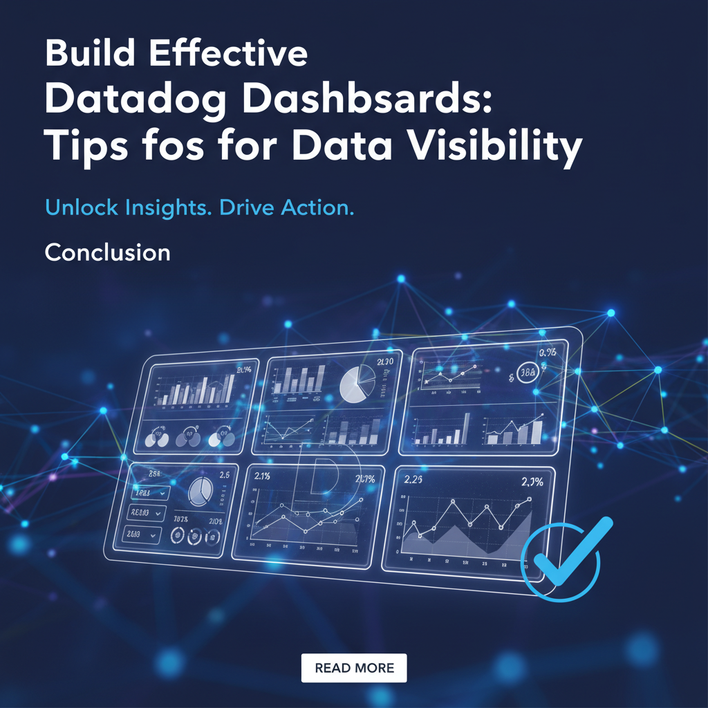
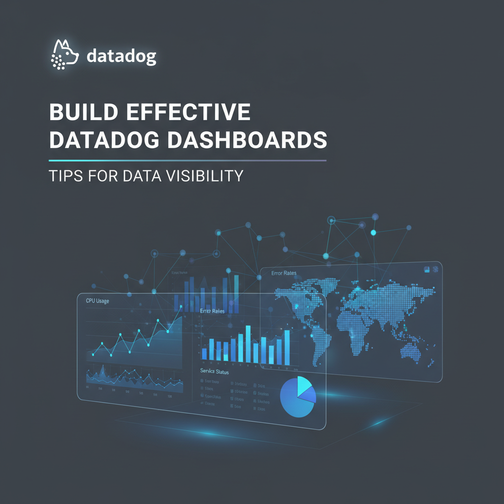
Build Effective Datadog Dashboards: Tips for Data Visibility


Introduction: Navigating the Deluge of Data with Clarity
In today's fast-paced digital landscape, organizations are awash in an ocean of data. From server performance metrics and application logs to user interaction traces and business-critical KPIs, the sheer volume can be overwhelming. Yet, within this deluge lies the crucial intelligence needed to maintain robust systems, deliver exceptional user experiences, and make informed business decisions. The challenge isn't merely collecting data; it's transforming raw data into actionable insights that are easily digestible and readily accessible to the right stakeholders at the right time. This is precisely where effective Datadog dashboards become an indispensable asset.
Datadog, a leading monitoring and analytics platform, offers a powerful suite of tools for end-to-end observability, encompassing infrastructure, applications, logs, network, and user experience. At the heart of its utility are its highly customizable dashboards, which serve as the visual command centers for operations teams, developers, and even business leaders. A well-constructed Datadog dashboard transcends a mere collection of graphs; it tells a coherent story, highlights critical issues, and guides users towards understanding and resolution. Conversely, poorly designed dashboards can contribute to noise, obscure vital signals, and lead to decision paralysis, ultimately hindering an organization's ability to react effectively to incidents or proactively optimize performance.
This comprehensive guide delves deep into the art and science of building truly effective Datadog dashboards. We will explore the foundational principles that underpin great dashboard design, dissect the core components and data types available within Datadog, and provide a wealth of practical tips and advanced techniques to elevate your data visibility. Our aim is to empower you to move beyond generic templates and craft bespoke dashboards that not only showcase your data but actively drive operational excellence and strategic foresight within your organization. By the end of this journey, you'll be equipped with the knowledge to transform your Datadog dashboards from simple data aggregators into dynamic, insightful tools that fuel a proactive and data-driven culture.
The Indispensable "Why": Understanding the Value of Superior Data Visibility
Before we embark on the specifics of how to construct Datadog dashboards, it's paramount to fully grasp the profound impact that superior data visibility has on an organization. The benefits extend far beyond merely "seeing" what's happening; they touch upon every facet of operational efficiency, system reliability, and strategic decision-making. Effective data visibility, primarily facilitated through expertly crafted dashboards, is not a luxury but a fundamental necessity for any modern enterprise.
Firstly, enhanced data visibility dramatically accelerates incident detection and resolution. When critical metrics like CPU utilization, request latency, or error rates are clearly displayed with appropriate thresholds and contextual information, anomalies become immediately apparent. Operations teams can pinpoint the root cause of an issue much faster, reducing Mean Time To Resolution (MTTR). Instead of sifting through fragmented logs or disparate monitoring tools, a unified dashboard provides a holistic view, allowing engineers to correlate events across different layers of the stack – from infrastructure to application code – and understand the cascading effects of a problem. This proactive detection minimizes the blast radius of outages and mitigates their impact on end-users and business revenue.
Secondly, effective dashboards foster proactive performance optimization and capacity planning. By visualizing historical trends and current resource consumption, teams can identify bottlenecks before they impact service quality. For instance, observing a steady upward trend in database connection pools or a consistent spike in memory usage during peak hours can trigger preventative actions, such as scaling up resources, optimizing queries, or refining application code. This foresight prevents potential outages caused by resource exhaustion and ensures that infrastructure investments are made strategically, avoiding both under-provisioning (leading to performance degradation) and over-provisioning (leading to unnecessary costs). The ability to anticipate future needs based on historical data patterns is a cornerstone of efficient IT operations.
Thirdly, superior data visibility cultivates a culture of data-driven decision-making across all levels of an organization. Beyond engineering and operations, business stakeholders can leverage dashboards tailored to their needs to monitor key business metrics, such as conversion rates, user engagement, or transaction volumes. Correlating these business KPIs with underlying system performance metrics provides invaluable context, enabling leadership to understand how technical health directly impacts business outcomes. This symbiotic relationship between technical and business insights empowers better product development decisions, more effective marketing strategies, and ultimately, a more agile and responsive enterprise. When everyone operates from a shared, accurate understanding of the current state, collaboration improves, and strategic alignment is strengthened.
Furthermore, comprehensive data visibility aids significantly in mainlining service level objectives (SLOs) and service level agreements (SLAs). By continuously monitoring critical performance indicators against predefined targets, teams can immediately see if their services are meeting customer expectations and contractual obligations. Dashboards can be configured to display SLO attainment rates, highlight services at risk, and provide the necessary data for post-mortems and capacity adjustments. This transparency builds trust with customers and ensures accountability within internal teams, driving continuous improvement in service delivery.
Finally, in an era where distributed systems and microservices are prevalent, effective dashboards become the linchpin for understanding complex system interactions. No single component operates in isolation. A microservices architecture, while offering agility, introduces significant complexity in terms of inter-service communication and dependency management. Dashboards that visualize the health and performance of individual services, their communication patterns, and their collective impact on the end-user experience are critical. They help in tracing requests across multiple services, identifying choke points in distributed transactions, and ensuring that the entire ecosystem functions harmoniously. This holistic perspective is essential for managing the inherent intricacies of modern cloud-native applications.
In essence, investing time and effort into building effective Datadog dashboards is an investment in an organization's resilience, efficiency, and competitive edge. It transforms raw data into a powerful narrative that informs, warns, and guides, paving the way for operational excellence and strategic advantage.
Foundational Principles of Effective Dashboard Design: Crafting Clarity from Complexity
Building an effective Datadog dashboard isn't merely about dragging and dropping widgets; it's a thoughtful process rooted in fundamental design principles. These principles ensure that your dashboards serve their intended purpose: to provide clear, actionable insights without overwhelming the user. Neglecting these foundational concepts can lead to dashboards that are visually cluttered, contextually ambiguous, or, worse, entirely ignored.
1. Audience-Centricity: Knowing Your Viewer
The most crucial principle is to design for your specific audience. A dashboard intended for a NOC (Network Operations Center) team will look vastly different from one for a software development team, a product manager, or a CEO. - Operations Teams (NOC/SRE): Need real-time, high-level indicators of system health, immediate alerts, and quick drill-down capabilities for incident response. Focus on critical service health, infrastructure availability, and key performance indicators (KPIs) like error rates, latency, and throughput. - Development Teams: Require granular details for debugging, code performance analysis, and feature impact assessment. Dashboards might include application-specific metrics, database query performance, trace data, and detailed logs relevant to their services. - Product Managers/Business Owners: Are primarily interested in business-level metrics, user experience, and feature adoption. These dashboards should translate technical performance into business impact, focusing on conversion rates, user engagement, churn, and revenue. - Executive Leadership: Need highly aggregated, summary views of overall system health, financial performance tied to IT, and high-level strategic KPIs. These dashboards should be simple, intuitive, and focus on trends and deviations from baselines, often with less technical jargon.
Understanding the audience dictates the metrics to display, the level of detail, the visualization types, and even the refresh rate of the data. Always ask: "Who is this dashboard for, and what critical question are they trying to answer?"
2. Goal-Orientation: Defining Purpose and Actionability
Every dashboard should have a clear, singular purpose or a tightly integrated set of related purposes. Avoid the temptation to create a monolithic "everything" dashboard. A dashboard without a clear goal becomes a data dump, making it impossible to quickly glean meaningful information. - Specific Objective: Is it for monitoring a specific service's health? Tracking a new feature rollout? Analyzing database performance? Monitoring a specific geographic region? Clearly define what success looks like for the dashboard. - Actionability: Can the viewer take immediate action based on the information presented? If a metric is red, does it tell them what might be wrong or where to look next? Dashboards should guide users towards investigation or remediation, not just present static numbers. For example, if a dashboard shows high latency, it should ideally link to another dashboard or logs that can help identify the contributing factors.
3. Simplicity and Clarity: Less Is More
In dashboard design, conciseness is key. A cluttered dashboard with too many graphs, conflicting colors, or obscure labels creates cognitive overload. - Minimalism: Prioritize the most critical metrics. If a metric isn't essential for the dashboard's goal, remove it. Use the "rule of thumb" – if a user can't understand the dashboard's main message within 5-10 seconds, it's too complex. - Consistent Visual Language: Use consistent colors, fonts, and labeling conventions across your dashboards. Datadog allows for custom color palettes; leverage them wisely to signify states (e.g., green for healthy, yellow for warning, red for critical). - Clear Labels and Titles: Every graph, legend, and dashboard itself needs a clear, descriptive title. Avoid acronyms or internal jargon that might confuse new team members or cross-functional stakeholders. - White Space: Utilize white space effectively to separate different sections and reduce visual clutter, making the dashboard easier to scan and comprehend.
4. Contextualization: Providing the "So What?"
Raw numbers often lack meaning without context. An effective dashboard provides the necessary background to interpret the data. - Baselines and Averages: Displaying current metrics alongside their historical averages or predefined baselines (e.g., "CPU utilization 80% (vs. avg. 50%)") provides immediate context on whether the current state is normal or anomalous. - Thresholds and Alerts: Visualizing warning and critical thresholds directly on graphs (e.g., a red line indicating an alert threshold) instantly tells the user when something requires attention. Datadog's monitor integration with dashboards is excellent for this. - Related Events: Overlaying deployment markers, configuration changes, or significant incident events on metric graphs helps to correlate system performance with operational activities. This is crucial for understanding cause and effect. - Documentation/Runbooks: Where possible, link directly to relevant documentation, runbooks, or incident management systems from the dashboard. This guides the user on the next steps once an issue is identified.
5. Iteration and Evolution: Dashboards Are Living Documents
Dashboards are not static artifacts; they should evolve with your systems and organizational needs. - Gather Feedback: Regularly solicit feedback from your users. Are they finding the dashboards useful? Is anything missing? Is anything confusing? - Review and Refine: Schedule periodic reviews to remove obsolete metrics, add new ones, and refine visualizations based on usage patterns and evolving priorities. As systems mature or new features are rolled out, the critical metrics to monitor will change. - A/B Testing: For critical dashboards, consider A/B testing different layouts or visualizations to see which ones lead to faster incident resolution or better understanding.
By meticulously applying these foundational principles, you can transform your Datadog dashboards from mere data displays into powerful, intuitive tools that empower your teams, enhance visibility, and ultimately drive operational excellence.
Key Components of Datadog Dashboards: Leveraging the Full Spectrum of Observability Data
Datadog's strength lies in its ability to ingest, correlate, and visualize data from across your entire technology stack. To build truly effective dashboards, it's crucial to understand the different types of data Datadog collects and how each can contribute to a comprehensive view of your system's health and performance. Mastering these components allows you to stitch together a narrative that spans infrastructure, applications, and user experience.
1. Metrics: The Quantitative Pulse of Your Systems
Metrics are the numerical values that represent the performance and health of your infrastructure and applications over time. They are the backbone of most Datadog dashboards, providing quantitative insights into various aspects of your systems.
- Types of Metrics:
- Host Metrics: CPU utilization, memory usage, disk I/O, network traffic from servers, containers, and serverless functions. These are fundamental for infrastructure health.
- Application Metrics: Request rates, error rates, latency, garbage collection activity, thread pool sizes, database connection counts, response times from application code (often via APM integrations or custom metrics). Crucial for application performance.
- Custom Metrics: Any specific business or application-level metric that you define and send to Datadog (e.g., number of successful logins, items added to cart, specific API call counts). These are invaluable for connecting technical performance to business outcomes.
- Synthetic Metrics: Performance data from synthetic tests (e.g., API checks, browser tests) measuring uptime, latency, and success rates from an external perspective.
- Real User Monitoring (RUM) Metrics: Performance data directly from end-user browsers or mobile applications, capturing page load times, front-end errors, and user interaction latency.
- Collection and Aggregation: Datadog Agents, Integrations, and API calls collect these metrics. They are often aggregated (e.g., sum, average, min, max, count) over specific time intervals, allowing you to view trends at various granularities. Understanding the aggregation method is crucial for accurate interpretation. For example, averaging CPU across all hosts might hide a single problematic host.
- Visualization: Metrics are typically visualized using time-series graphs (line, area), heat maps (for host-level resource distribution), pie charts (for proportions), tables, or "Host Maps" for geographical or logical grouping. Choosing the right visualization is paramount for conveying the metric's story effectively. For instance, a line graph is excellent for showing trends over time, while a "gauge" or "scalar" widget is great for a single, current value like a critical health score.
2. Logs: The Detailed Storyteller of Events
While metrics tell you "what" is happening (e.g., high error rate), logs often tell you "why" it's happening. Logs are immutable, time-stamped records of discrete events that occur within your systems, applications, and services.
- Integration and Parsing: Datadog collects logs from various sources (files, syslog, containers, serverless functions) via its Agent and integrations. It then parses these logs, extracting key attributes (e.g.,
status,service,host,trace_id,message) into structured facets. This structuring is essential for effective querying and analysis. - Querying and Filtering: Log explorers within Datadog allow you to query logs using a powerful search language, filter by facets, and analyze log patterns. On dashboards, "Log Stream" widgets display a real-time stream of filtered logs, invaluable during incident response.
- Log-Based Metrics: One of Datadog's powerful features is the ability to generate metrics directly from logs. For example, you can count the number of "ERROR" logs per minute for a specific service and graph this as a metric. This bridges the gap between raw log data and quantitative trends.
- Correlation: A key benefit of Datadog is its ability to automatically correlate logs with metrics and traces. When viewing a metric graph, you can jump directly to logs or traces active during a specific time window, providing deep context.
3. Traces: Following the Journey of a Request
Traces, primarily facilitated by Datadog APM (Application Performance Monitoring), provide end-to-end visibility into the lifecycle of a request as it traverses through multiple services in a distributed system. They are crucial for understanding latency and pinpointing bottlenecks in complex microservice architectures.
- Distributed Tracing: When a request comes into your system, Datadog APM agents automatically instrument your code to generate "spans" for each operation (e.g., database call, external API request, function execution). These spans are linked together to form a "trace" that visualizes the entire journey of the request.
- Performance Analysis: Traces help identify which services or operations are contributing most to the overall latency of a request. You can see service dependencies, error rates for individual spans, and resource consumption at each stage.
- Correlation with Metrics and Logs: Each span in a trace is associated with metrics and logs relevant to that operation. This allows for seamless navigation from a high-level latency metric down to the exact trace and underlying logs responsible for a performance anomaly.
- Dashboard Integration: While full trace analysis is typically done in the APM explorer, dashboards can display key trace metrics (e.g., average latency per service, error rates from specific endpoints), and widgets can link directly to the APM explorer for deeper investigation.
4. Events: Signposts in the Stream of Data
Events are discrete occurrences that provide context to your metrics, logs, and traces. They can be system-generated or custom.
- Types of Events:
- System Events: Deployments, configuration changes, auto-scaling events, host restarts, integration events (e.g., from Kubernetes, AWS, GitHub).
- Custom Events: Manually posted events to mark significant operational activities, business milestones, or specific application state changes.
- Contextualization: Events can be overlaid directly onto metric graphs as vertical markers, immediately showing how an operational activity (like a deployment) might correlate with a change in performance. This is incredibly powerful for understanding cause and effect.
- Notification: Events can also be used for notification and alerting, ensuring relevant teams are aware of critical occurrences.
- Event Stream: A dedicated "Event Stream" widget on dashboards can display recent events, keeping users informed of significant happenings.
5. Synthetic Monitoring: External Validation of Service Health
Synthetic monitoring involves configuring automated, script-based tests that simulate user interactions or API calls from various global locations. These tests run periodically, providing an external, objective view of your application's availability and performance.
- Uptime and Performance: Synthetic tests can monitor the uptime of specific URLs, API endpoints, or critical user flows (e.g., login, checkout). They measure response times, identify broken links, and detect functional issues.
- Proactive Detection: Since synthetic tests run continuously, they can often detect issues before real users report them, allowing for proactive remediation.
- SLO/SLA Verification: The metrics generated by synthetic tests (e.g., success rate, latency) are ideal for validating compliance with Service Level Objectives (SLOs) and Service Level Agreements (SLAs).
- Dashboard Visualization: Synthetic test results can be displayed on dashboards using "Monitor Status" widgets (showing pass/fail for specific tests), time-series graphs (for latency trends), or "World Map" visualizations (showing performance from different geographic regions).
6. Real User Monitoring (RUM): The End-User Experience Perspective
Real User Monitoring captures data directly from your actual users' browsers or mobile applications, providing unparalleled insights into the true end-user experience.
- Front-End Performance: RUM tracks metrics like page load times, Time to First Byte (TTFB), DOM interactive time, resource loading times, and JavaScript error rates.
- User Journeys: It provides visibility into user navigation paths, popular pages, and interaction patterns, helping to identify bottlenecks or friction points in the user journey.
- Geographical and Device Insights: RUM can break down performance by geographical location, device type, browser, and operating system, allowing you to optimize for specific user segments.
- Correlation with Backend: Crucially, Datadog RUM automatically correlates front-end user sessions with their corresponding backend traces and logs, enabling full-stack troubleshooting from user click to database query.
- Dashboard Visualization: RUM metrics can be visualized on dashboards using various widgets to show overall user experience, page performance, front-end error rates, and user counts, often segmented by critical attributes.
By strategically combining these different data types on your Datadog dashboards, you can construct a robust and holistic picture of your systems. Each component offers a unique perspective, and it's the intelligent correlation of these diverse data streams that unlocks truly powerful, actionable insights.
APIPark is a high-performance AI gateway that allows you to securely access the most comprehensive LLM APIs globally on the APIPark platform, including OpenAI, Anthropic, Mistral, Llama2, Google Gemini, and more.Try APIPark now! 👇👇👇
Practical Tips for Building Exemplary Datadog Dashboards: From Concepts to Construction
Translating the foundational principles and diverse data types into practical, effective Datadog dashboards requires a systematic approach and an understanding of the platform's capabilities. Here, we delve into actionable tips that will guide you from initial concept to a polished, insightful dashboard.
1. Start with the Right Questions, Not Just Raw Data
Before you even open the Datadog dashboard editor, sit down with your audience (as identified in the "Audience-Centricity" principle) and ask: - "What problem are we trying to solve with this dashboard?" - "What critical questions do we need to answer immediately?" - "What constitutes 'healthy' vs. 'unhealthy' for this system/service/metric?" - "What actions would we take if a metric went into a warning/critical state?" - "Who needs to see this data, and how often?"
By framing your dashboard creation around specific questions and potential actions, you ensure that every widget you add serves a clear purpose, avoiding the common pitfall of dashboard bloat. For example, for a "Web Service Health" dashboard, key questions might be: "Is the service up?", "Is it responding quickly?", "Are there any errors?", "Is it serving enough traffic?", "Is it consuming too many resources?" Each question then directly informs the selection of specific metrics and visualizations.
2. Choose the Right Visualization for Your Data
Datadog offers a rich array of widget types, each suited for different data stories. Selecting the appropriate visualization is crucial for clarity and impact.
| Widget Type | Best Use Cases | Considerations |
|---|---|---|
| Time-Series Graph | Showing trends over time (e.g., CPU usage, request latency, error rates). Comparing multiple metrics on the same graph. | Essential for observing patterns and anomalies. Ensure consistent timeframes and clear legends for multiple series. |
| Heat Map | Visualizing the distribution of a metric across many entities (e.g., CPU across hosts, latency across services). Identifying outliers or hotspots at a glance. | Excellent for large fleets. Requires a clear understanding of aggregation and color mapping. |
| Table | Displaying raw numbers, top N lists (e.g., top 10 slowest endpoints, services with most errors), or aggregated summary data. | Good for precise values. Can become overwhelming if too many rows/columns. Use conditional formatting for emphasis. |
| Gauge / Scalar | Showing a single, current value for a critical metric (e.g., current active users, overall service health score, total errors today). | Best for KPIs that need immediate attention. Use thresholds and conditional coloring for quick status updates. |
| Log Stream | Displaying real-time filtered logs relevant to the dashboard's context (e.g., logs for a specific service, error logs). | Invaluable during incident response. Ensure effective filtering to avoid noise. |
| Host Map | Visualizing the health and resource utilization of hosts, containers, or pods, often grouped by tags (e.g., environment, service). | Intuitive for infrastructure overview. Effective for quickly identifying problematic machines. |
| Service Map | Showing dependencies and health status between services in an application. | Essential for microservices architectures. Helps trace issues across service boundaries. |
| Top List | Ranking entities based on a metric (e.g., top services by error rate, top databases by query time). | Good for identifying "noisy neighbors" or resource hogs. |
| Event Stream | Displaying a chronological list of recent events (e.g., deployments, alerts, critical logs). | Provides context for changes in metrics. |
| Monitor Status | Showing the current status of specific Datadog monitors directly on the dashboard. | Directly reflects alert state. Good for critical health checks. |
| Notebook | Combining code, queries, and visualizations for detailed analysis and reporting, often used for post-mortems or deep dives. | More analytical than operational. Can be linked from an operational dashboard. |
3. Group Related Data Logically
Organize your dashboard into logical sections. Use Datadog's "Groups" or "Templates" to create visually distinct areas for related metrics. For instance, you might have sections for: - Overall Service Health: Key availability and performance metrics (uptime, latency, error rate). - Resource Utilization: CPU, memory, disk I/O, network for relevant hosts/containers. - Application Specifics: Database connections, queue depths, specific API call metrics. - Business Metrics: Conversion rates, active users, transaction volume.
This segmentation makes the dashboard easier to scan and helps users quickly locate the information they need.
4. Implement Consistent Naming Conventions and Tagging
Your Datadog data is only as useful as its metadata. Employ a consistent and comprehensive tagging strategy across all your infrastructure, applications, and custom metrics. Tags like env:production, service:api-gateway, team:backend, region:us-east-1 allow you to filter, group, and aggregate data effectively across your dashboards.
Similarly, use clear and consistent naming conventions for your dashboards, widgets, and monitors. For example: [Service Name] - [Dashboard Type], e.g., "Customer API - Operational Health" or "Database Cluster - Performance." This improves discoverability and reduces confusion. As organizations rely more heavily on microservices and APIs, understanding the performance of these critical interfaces becomes paramount. Platforms like APIPark, an open-source AI gateway and API management platform, not only streamline the development and deployment of APIs but also provide valuable metrics and logs that can be integrated into Datadog for comprehensive visibility into API health and performance, reinforcing the need for consistent tagging of API-related data.
5. Incorporate Thresholds and Alerts Visually
Don't make users guess what "good" or "bad" looks like. - Set Clear Thresholds: For critical metrics, define warning and critical thresholds within Datadog monitors and display these visually on your time-series graphs (e.g., a yellow line for warning, a red line for critical). - Conditional Formatting: Leverage conditional formatting for scalar widgets or tables to change colors based on metric values (e.g., green for healthy, red for unhealthy). - Monitor Status Widgets: For a quick, high-level overview of critical alerts, use "Monitor Status" widgets, which show the current state of specific Datadog monitors.
6. Leverage Templates and Custom Widgets for Efficiency
Datadog's template variables and custom widgets are powerful tools for creating dynamic and reusable dashboards. - Template Variables: Use template variables (e.g., {{host.name}}, {{service.name}}, {{env}}) to create flexible dashboards that can be filtered and dynamically updated without needing to create a separate dashboard for each host or environment. A single "Service Health" dashboard can be adapted to any service by simply changing a dropdown. - Custom Widgets: For unique visualizations or external data integrations, Datadog's platform allows for custom widget development. While more advanced, this offers unparalleled flexibility. - Shared Dashboards: Create a library of standardized dashboards that teams can duplicate and adapt, ensuring consistency across the organization.
7. Iterate and Refine: Dashboards Are Living Documents
Your dashboards should not be static artifacts. They need to evolve with your systems, your teams, and your understanding of what data is truly important. - Regular Reviews: Schedule periodic reviews (e.g., monthly, quarterly) with your target audience to gather feedback. What's working? What's missing? What's confusing? - Remove Obsolete Data: As systems change or features are deprecated, remove metrics and widgets that are no longer relevant. Clutter reduces clarity. - Add New Metrics: As new features are rolled out or new pain points emerge, identify and add relevant new metrics and visualizations. - Performance Optimization: Ensure your dashboards load quickly. Too many complex queries or widgets can slow down the dashboard, making it less useful. Optimize queries and potentially split very large dashboards into smaller, more focused ones.
8. Incorporate Historical Context
Understanding the current state is important, but understanding how it compares to the past is often more critical. - Time Range Selection: Encourage the use of appropriate time ranges (e.g., last hour, last 24 hours, last week) to see trends. - Comparison to Past Periods: Utilize Datadog's capabilities to overlay historical data (e.g., "compare to 1 week ago") on graphs to immediately spot deviations from normal behavior. This is invaluable for detecting seasonal spikes or gradual performance degradations.
9. Share and Collaborate Effectively
Dashboards are most powerful when they facilitate shared understanding and collaboration. - Public Links: Use Datadog's public link feature to share dashboards with external stakeholders or for internal presentations. - Team Collaboration: Encourage teams to share their best-practice dashboards and contribute to a centralized library. - Linking Dashboards: Create a network of interconnected dashboards. A high-level "Executive Summary" dashboard might link to a more detailed "Application Health" dashboard, which in turn links to a specific "Database Performance" dashboard, allowing for progressive drill-down.
By meticulously applying these practical tips, you can transform your Datadog dashboards from rudimentary data displays into dynamic, insightful tools that empower your teams, enhance visibility, and ultimately drive operational excellence.
Advanced Techniques for Datadog Dashboard Mastery: Beyond the Basics
Once you've mastered the fundamentals, Datadog offers a plethora of advanced features and strategies to further refine your dashboards, providing deeper insights and more sophisticated operational control. These techniques move beyond merely displaying data to actively driving sophisticated monitoring, business alignment, and proactive problem-solving.
1. Building SLO/SLA Dashboards: Focusing on User Experience and Business Commitments
Service Level Objectives (SLOs) and Service Level Agreements (SLAs) are crucial for defining and measuring the reliability of your services. Dedicated Datadog dashboards for SLOs/SLAs shift the focus from internal system metrics to the actual experience of your users and your business commitments.
- Defining SLOs: Start by clearly defining your SLOs based on critical user journeys (e.g., "99.9% of login requests must complete in under 500ms over a 30-day rolling window"). Datadog allows you to formalize these as "Service Level Objectives" objects.
- SLO Widget: Datadog provides a dedicated "SLO Widget" that can be added to your dashboards. This widget displays the current SLO attainment, remaining error budget, and historical trends for your defined SLOs. This provides an immediate, high-level view of how well your services are meeting their reliability targets.
- Error Budget Tracking: SLO dashboards are vital for tracking your "error budget" – the maximum amount of time your service can fail or perform poorly without violating the SLO. Visualizing the consumption of the error budget helps teams make informed decisions about feature releases versus reliability work.
- Linking to Underlying Metrics/Logs/Traces: From an SLO widget, you should be able to drill down to the specific metrics, logs, and traces that are impacting the SLO, enabling rapid root cause analysis when the budget is being consumed too quickly.
2. Crafting Business-Centric Dashboards: Bridging Technical and Business Worlds
While operational dashboards are vital for engineers, business-centric dashboards translate technical performance into tangible business outcomes, making IT performance relevant to product managers, sales teams, and executives.
- Key Business Metrics (KBMs): Identify the KBMs that are directly impacted by your technical systems (e.g., conversion rate, daily active users, transaction volume, revenue per customer, churn rate).
- Custom Metrics for Business: Often, KBMs need to be ingested into Datadog as custom metrics, either directly from your application code, data warehouses, or business intelligence tools.
- Correlation and Context: Display KBMs alongside relevant technical metrics. For example, show conversion rate on the same graph as API latency or database error rates. This correlation helps answer questions like, "Did the recent latency spike impact our sales?"
- Executive Summaries: Create high-level dashboards for executives that distill complex technical data into simple, impactful visuals, focusing on trends, financial impact, and strategic goals. These should avoid technical jargon and focus on the "so what" for the business.
3. Leveraging Anomaly Detection and Forecasting
Datadog's machine learning capabilities can significantly enhance your dashboards by automatically identifying unusual patterns and predicting future trends, reducing manual effort and improving proactive monitoring.
- Anomaly Detection: Instead of static thresholds, use Datadog's anomaly detection functions on your metric graphs. These algorithms learn normal patterns (daily, weekly, yearly seasonality) and highlight deviations, making it easier to spot subtle issues that static thresholds might miss. This is particularly useful for metrics with fluctuating baselines.
- Outlier Detection: For dashboards monitoring many similar entities (e.g., a fleet of microservices or containers), outlier detection can automatically identify the few entities behaving unusually compared to their peers.
- Forecasting: Apply forecasting functions to predict future metric values based on historical data. This can be invaluable for capacity planning, predicting resource exhaustion, or anticipating future performance degradation. For instance, forecasting CPU usage can help predict when you might need to scale up your infrastructure.
4. Integrating with Other Tools and Workflows
Your Datadog dashboards don't exist in a vacuum. Integrating them with your broader operational ecosystem enhances their utility and streamlines workflows.
- Incident Management: Link directly from dashboard widgets to your incident management system (e.g., PagerDuty, Opsgenie) to quickly create or update incidents when a problem is identified.
- Deployment Tracking: Use Datadog's integrations with CI/CD tools (e.g., Jenkins, GitLab CI, GitHub Actions) to automatically overlay deployment markers on your metric graphs. This instantly visualizes the impact of new code releases on system performance.
- Configuration Management: Integrate with configuration management databases (CMDBs) to pull in asset information and enrich your dashboard context.
- Runbooks and Documentation: Embed links to relevant runbooks, troubleshooting guides, or internal documentation directly within your dashboards or on specific widgets, guiding engineers on how to respond to specific alerts or anomalies. This helps standardize incident response and reduce MTTR.
5. Advanced Querying and Functionality: Unleashing Datadog's Power
Mastering Datadog's query language and various functions allows for highly customized and powerful visualizations.
- Advanced Metric Queries: Combine multiple metrics, apply complex filters, and use advanced mathematical functions (e.g.,
rate,derivative,sum by,rollup) to derive more meaningful metrics. For example, calculating error rate as(sum:service.errors.count / sum:service.requests.count) * 100. - JSON Queries for Logs: Use JSON queries in log widgets to extract and visualize specific data points from your structured logs, such as the
durationof a specific API call from a log entry. - Conditional Grouping: For some widgets, you can use conditional grouping to dynamically group data based on certain criteria, providing flexible insights without creating multiple widgets.
- Event Overlay with Filtering: Precisely filter which events are overlaid on your time-series graphs to ensure only relevant context is shown, avoiding noise. For example, only show deployment events for a specific service.
6. The Power of "Dashboard Lists" and "Screenboards" vs. "Timeboards"
Datadog offers different types of dashboards, and understanding their optimal use cases is key.
- Timeboards: Ideal for showing metrics over time, with a unified time selector. Best for operational monitoring, trend analysis, and deep dives into specific service performance.
- Screenboards: More flexible, allowing for free-form arrangement of widgets, different time ranges per widget, and rich text. Perfect for incident war rooms, executive summaries, or combining disparate information like runbook snippets, images, and live status pages.
- Dashboard Lists: Organize your dashboards into logical groups. This is crucial for navigating a large number of dashboards and ensuring discoverability. Create lists by team, service, environment, or role.
By thoughtfully applying these advanced techniques, you can transform your Datadog dashboards from static displays into dynamic, intelligent, and highly actionable control centers that not only reflect the state of your systems but actively guide your teams towards greater efficiency, reliability, and business success. The journey to dashboard mastery is continuous, evolving with your infrastructure and organizational needs, but these advanced strategies provide a robust framework for reaching new heights of data visibility.
Common Pitfalls to Avoid: Steering Clear of Dashboard Dysfunction
Even with the best intentions and access to powerful tools like Datadog, it's easy to fall into common traps that undermine the effectiveness of your dashboards. Recognizing and actively avoiding these pitfalls is just as crucial as implementing best practices. A dysfunctional dashboard can be worse than no dashboard at all, leading to alert fatigue, missed critical signals, and wasted effort.
1. Dashboard Bloat: The "Everything but the Kitchen Sink" Approach
One of the most pervasive pitfalls is trying to cram too much information onto a single dashboard. The temptation to include every possible metric "just in case" is strong. - Symptoms: Too many widgets, tiny graph sizes, overwhelming visual clutter, difficulty in quickly identifying key information. - Consequences: Cognitive overload, decision paralysis, slowed dashboard loading times, users ignoring the dashboard entirely due to its complexity. Critical signals get lost in the noise. - Avoidance: Adhere strictly to the "Goal-Orientation" and "Simplicity" principles. If a widget doesn't directly contribute to the dashboard's primary purpose, remove it. Create multiple, focused dashboards instead of one giant one. Use linking between high-level and detailed dashboards. Prioritize high-impact metrics.
2. Lack of Context: Numbers Without Meaning
Presenting raw numbers or graphs without sufficient context makes them difficult to interpret and act upon. A spike in CPU usage means little if you don't know the normal baseline, the impact of a deployment, or whether it's impacting user experience. - Symptoms: Metrics shown without baselines, thresholds, related events, or correlation to other data sources (logs, traces). - Consequences: Misinterpretation of data, false alarms, delayed incident response, inability to understand cause and effect. - Avoidance: Always include baselines (historical averages), clearly marked warning/critical thresholds, and overlay relevant events (deployments, incidents). Leverage Datadog's anomaly detection to automatically provide context for fluctuating metrics. Ensure legends are clear and units are specified. Link to relevant logs or traces where possible.
3. Ignoring the Audience: One Size Does Not Fit All
Designing a dashboard without considering who will be using it leads to irrelevance and underutilization. An executive dashboard filled with technical jargon is useless to a CEO, just as a detailed application performance dashboard would be overkill for a business analyst. - Symptoms: Dashboards that are either too high-level for engineers to debug or too granular for business stakeholders to understand. Low adoption rates by the intended audience. - Consequences: Inefficiency, frustration, teams building their own fragmented monitoring solutions, missed opportunities for data-driven decisions. - Avoidance: Start every dashboard project by clearly defining the target audience and their specific information needs. Collaborate with them during the design process. Create different dashboards tailored for different roles (e.g., Ops, Dev, Business, Executive).
4. Stagnant Dashboards: Set-It-and-Forget-It Mentality
Technology stacks, applications, and business priorities are constantly evolving. Dashboards that are created once and never updated quickly become obsolete and misleading. - Symptoms: Metrics that are no longer relevant, broken queries due to system changes, dashboards that don't reflect current operational challenges or new feature rollouts. - Consequences: Reliance on outdated information, missed insights from new data, reduced trust in the monitoring system, wasted resources maintaining irrelevant dashboards. - Avoidance: Treat dashboards as living documents. Implement a regular review process (e.g., quarterly audits) to prune obsolete widgets, add new relevant metrics, and update visualizations. Solicit continuous feedback from users.
5. Relying Solely on "Red Means Bad": Over-Reliance on Status Colors
While conditional formatting and color-coded alerts are powerful, over-reliance on them without deeper understanding or context can be problematic. Not every "red" warrants immediate action, and some subtle issues might not trigger a red status at all. - Symptoms: Alert fatigue from too many red indicators, teams reacting to cosmetic changes rather than genuine incidents, critical issues being missed because they didn't turn "red." - Consequences: Diminished trust in alerts, burnout, reduced responsiveness to actual incidents, a false sense of security. - Avoidance: Use color-coding judiciously and in conjunction with other contextual information. Train users to understand why a metric is red (e.g., exceeding a threshold, anomaly detected). Complement color status with trends, baselines, and a clear understanding of the impact. Focus on the actionability of the "red" state.
6. Poor Performance: Slow-Loading Dashboards
A dashboard that takes too long to load becomes a source of frustration, especially during an incident. - Symptoms: Long load times, widgets timing out, browser unresponsiveness. - Consequences: Hindered incident response, users abandoning the dashboard, reduced efficiency. - Avoidance: Optimize your queries. Use efficient aggregation methods. Reduce the number of complex, resource-intensive widgets on a single dashboard. Break down very large dashboards into smaller, focused ones. Leverage template variables for dynamic filtering rather than multiple static copies.
By actively recognizing and mitigating these common pitfalls, you can ensure that your Datadog dashboards remain effective, reliable, and truly instrumental in driving your organization's operational success and strategic decision-making. The goal is to create dashboards that empower, not overwhelm.
Measuring Dashboard Effectiveness: Ensuring Your Efforts Yield Results
Creating Datadog dashboards is an investment of time and resources. To justify this investment and ensure continuous improvement, it's essential to measure their effectiveness. A dashboard that isn't used or doesn't contribute to better outcomes is a wasted effort. Measuring effectiveness helps you iterate, refine, and prove the value of your data visibility efforts.
1. User Adoption and Engagement Rates
The most straightforward measure of effectiveness is whether people are actually using your dashboards. A beautifully designed dashboard is useless if it gathers digital dust. - How to Measure: * Datadog's Usage Analytics: Datadog itself often provides usage statistics for dashboards (views, unique users over time). * Anecdotal Evidence: Regularly ask your target audience if and how they use the dashboards. * Observation: During incident response, observe if teams are naturally gravitating towards and referencing the dashboards. - What to Look For: High and consistent view counts, engagement from a broad set of the target audience, specific dashboards becoming a "go-to" resource during critical events. - Low Adoption Indicators: If adoption is low, it might signal that the dashboard is not solving a real problem, is too complex, or is difficult to discover. This prompts a review of audience needs and design principles.
2. Impact on Mean Time To Resolution (MTTR)
One of the primary goals of operational dashboards is to accelerate incident response. A direct way to measure this impact is by tracking MTTR. - How to Measure: * Pre- and Post-Dashboard Implementation: Compare MTTR metrics for specific services or types of incidents before and after the introduction of effective, relevant dashboards. * Incident Post-Mortems: In post-mortems, explicitly ask if the dashboards were helpful in identifying, diagnosing, or resolving the incident. Capture specific feedback. - What to Look For: A measurable decrease in MTTR for incidents where the dashboards were relevant. Teams reporting that dashboards helped them pinpoint the root cause faster or enabled quicker correlation of events. - Caveat: MTTR is influenced by many factors (team training, incident management processes). It's crucial to isolate the dashboard's specific contribution through focused feedback.
3. User Satisfaction and Feedback
Direct feedback from your users is invaluable for understanding both the strengths and weaknesses of your dashboards. - How to Measure: * Surveys: Conduct short, regular surveys (e.g., quarterly) asking users to rate dashboards on clarity, usefulness, completeness, and ease of navigation. * Dedicated Feedback Channels: Set up a Slack channel, Jira queue, or email alias specifically for dashboard feedback and suggestions. * One-on-One Interviews: For critical dashboards, conduct deeper interviews with key users to understand their workflows and how the dashboards fit into them. - What to Look For: Positive sentiment, constructive suggestions for improvement, reports of dashboards actively improving daily workflows or incident resolution. - Feedback Interpretation: Pay attention to recurring themes. Are multiple users finding a specific metric missing? Is a visualization consistently misunderstood? This qualitative data is rich for guiding iterative improvements.
4. Proactive Problem Identification and Prevention
Effective dashboards should not only help with incident response but also with proactive identification of potential issues before they become critical. - How to Measure: * "Near Miss" Incidents: Track instances where dashboards allowed teams to identify a problem (e.g., resource exhaustion trend, unusual traffic pattern) and take corrective action before it led to an outage. * Reduction in Specific Incident Types: If you have dashboards for specific areas (e.g., database performance), track if the number of database-related incidents decreases over time due to proactive monitoring enabled by those dashboards. - What to Look For: Documented cases of early problem detection, instances where capacity planning was informed by dashboard trends, and a reduction in recurring incident types attributed to better visibility.
5. Alignment with Business Goals
Ultimately, the most effective dashboards contribute to the overarching business objectives. - How to Measure: * Business Impact Post-Mortems: In business-level incident reviews, assess if dashboards helped leadership understand the impact of technical issues on business KPIs. * Strategic Decision Support: Track instances where business-centric dashboards were explicitly referenced in strategic planning meetings or product roadmap discussions. - What to Look For: Evidence that technical and business teams are using the same data to make informed decisions, and that dashboards facilitate a clearer understanding of the relationship between IT performance and business outcomes.
Measuring dashboard effectiveness is an ongoing process that fuels a continuous feedback loop. By regularly assessing adoption, impact on MTTR, user satisfaction, proactive problem identification, and business alignment, you can ensure your Datadog dashboards remain valuable, relevant, and powerful tools in your organization's pursuit of operational excellence and data-driven success.
Conclusion: Orchestrating Clarity in a World of Complexity
The journey to building truly effective Datadog dashboards is both an art and a science. It's an art in crafting intuitive visualizations and compelling data narratives, and a science in rigorously applying principles of data presentation, understanding system dynamics, and leveraging powerful observability tools. In an era where digital services are the lifeblood of most organizations, and the complexity of modern architectures continues to escalate, the ability to distill vast quantities of monitoring data into actionable insights is no longer merely advantageous—it is absolutely essential for survival and competitive advantage.
We've traversed the landscape of Datadog dashboard creation, beginning with the fundamental "why" – understanding the profound value of superior data visibility in accelerating incident resolution, fostering proactive optimization, and driving data-driven decisions. We then laid down the foundational design principles, emphasizing audience-centricity, goal-orientation, simplicity, and contextualization as non-negotiable pillars for any successful dashboard. The exploration of Datadog's key components – from the quantitative pulse of metrics and the detailed stories of logs to the journey maps of traces and the external validation of synthetics – highlighted the rich tapestry of data available to weave comprehensive views.
Our practical tips provided a step-by-step guide to construction, stressing the importance of asking the right questions, choosing appropriate visualizations, consistent tagging, and the vital role of iterative refinement. Finally, the advanced techniques unveiled how to push the boundaries, whether through sophisticated SLO/SLA dashboards, business-centric views, intelligent anomaly detection, or seamless integration with the broader operational ecosystem. Crucially, we also addressed the common pitfalls that can derail even the best intentions, from dashboard bloat to a lack of context, ensuring you're equipped to steer clear of these productivity traps.
Ultimately, an effective Datadog dashboard transcends a mere collection of graphs; it becomes a shared source of truth, a catalyst for communication, and a compass guiding teams through the intricacies of distributed systems. It empowers engineers to troubleshoot with surgical precision, enables operations teams to maintain peak performance, and equips business leaders with the clarity needed to make strategic decisions.
The digital realm continues to evolve, bringing new technologies, new challenges, and even greater volumes of data. Your dashboards, too, must evolve. Embrace the process of continuous learning, experimentation, and refinement. Seek feedback, challenge assumptions, and always strive for greater clarity and actionability. By doing so, your Datadog dashboards will remain powerful allies, transforming complexity into comprehensible narratives and noise into actionable signals, orchestrating clarity in a world of ever-increasing digital complexity.
Frequently Asked Questions (FAQs)
1. What makes a Datadog dashboard "effective"?
An effective Datadog dashboard is one that provides clear, actionable insights to its intended audience, helping them answer critical questions, identify issues quickly, and make informed decisions. Key characteristics include being goal-oriented, simple and uncluttered, providing sufficient context (thresholds, events, baselines), and being regularly updated. It focuses on solving a specific problem or monitoring a specific aspect, rather than being a general data dump.
2. How often should I update or review my Datadog dashboards?
Dashboards should be treated as living documents, not static artifacts. A good practice is to schedule periodic reviews, such as monthly or quarterly, with the dashboard's primary users. During these reviews, gather feedback, remove obsolete metrics, add new relevant data points (especially for new features or system changes), and refine visualizations. Critical dashboards used for incident response might warrant more frequent, informal check-ins.
3. What's the difference between a "Timeboard" and a "Screenboard" in Datadog, and when should I use each?
Timeboards are best for displaying metrics and trends over a unified, shared time window. They are ideal for operational monitoring, performance analysis, and deep dives into specific service health, where comparing data over the same historical period is crucial. Screenboards offer more layout flexibility, allowing widgets to have independent timeframes, include rich text, images, and non-time-series data. They are excellent for incident war rooms, executive summaries, status pages, or for combining diverse information where a single time selector isn't sufficient or desired.
4. How can I ensure my Datadog dashboards are not too cluttered or suffer from "dashboard bloat"?
To avoid dashboard bloat, start by defining a clear, singular goal or a very tightly integrated set of goals for each dashboard. Ruthlessly prioritize metrics that directly contribute to that goal and remove anything else. Use logical grouping (Datadog's "Groups" feature) to organize related data, and leverage template variables to create dynamic, filterable dashboards instead of many static ones. Remember, it's better to have multiple focused dashboards that link to each other than one giant, overwhelming dashboard.
5. What role do tags play in building effective Datadog dashboards?
Tags are absolutely critical for effective Datadog dashboards. They provide the metadata that allows you to filter, group, and aggregate data precisely. By applying consistent tags (e.g., env:production, service:api-gateway, team:backend, region:us-east-1) across all your infrastructure, applications, and custom metrics, you can easily create dynamic dashboard views that focus on specific environments, services, teams, or geographical regions, ensuring that the right data is presented to the right audience. Without a robust tagging strategy, your ability to slice and dice data on dashboards will be severely limited.
🚀You can securely and efficiently call the OpenAI API on APIPark in just two steps:
Step 1: Deploy the APIPark AI gateway in 5 minutes.
APIPark is developed based on Golang, offering strong product performance and low development and maintenance costs. You can deploy APIPark with a single command line.
curl -sSO https://download.apipark.com/install/quick-start.sh; bash quick-start.sh

In my experience, you can see the successful deployment interface within 5 to 10 minutes. Then, you can log in to APIPark using your account.

Step 2: Call the OpenAI API.