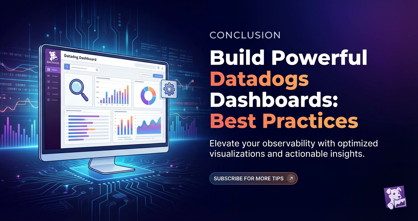
Build Powerful Datadogs Dashboards: Best Practices


In the intricate landscape of modern digital infrastructure, where microservices, cloud computing, and distributed systems are the norm, visibility is no longer a luxury—it is an absolute necessity. Organizations are continuously striving to gain a comprehensive understanding of their systems' health, performance, and operational efficiency. This quest for insight often leads them to powerful monitoring platforms, with Datadog standing out as a leader in providing unified observability across metrics, logs, and traces. Within Datadog's extensive suite of features, its dashboards emerge as the command centers, the visual nerve centers that translate raw data into actionable intelligence. However, merely having access to data is insufficient; the true power lies in how effectively that data is presented and consumed. Building truly powerful Datadog dashboards requires more than just dragging and dropping widgets; it demands a strategic approach, a deep understanding of best practices, and a clear vision of the insights one aims to extract.
This comprehensive guide will delve into the art and science of crafting exceptional Datadog dashboards, moving beyond basic setup to advanced techniques that empower teams to proactively identify issues, optimize performance, and make data-driven decisions. We will explore the foundational principles, dissect various widget types, and outline a robust set of best practices that will transform your monitoring experience. From the initial conceptualization phase to ongoing maintenance and evolution, every facet of dashboard creation will be meticulously examined, ensuring that your Datadog dashboards become indispensable tools for operational excellence and strategic advantage. The goal is not just to display data, but to tell a clear, compelling story about your infrastructure and applications, enabling everyone from engineers to business stakeholders to understand complex system behavior at a glance.
The Indispensable Role of Visibility in Modern Systems
The architectural shift towards cloud-native, microservices-based applications has introduced unprecedented levels of complexity. Systems are no longer monolithic, residing on a handful of servers; they are dynamic ecosystems of ephemeral containers, serverless functions, and interconnected services scaling across global regions. While this paradigm offers immense benefits in agility, resilience, and scalability, it also presents significant challenges in maintaining visibility and understanding system behavior. A single user request might traverse dozens of services, each with its own dependencies, resource consumption, and potential failure points. Without a centralized, coherent view, diagnosing performance bottlenecks, tracking down errors, or even understanding the impact of a new feature deployment becomes an arduous, often reactive, and time-consuming task.
This is precisely where platforms like Datadog demonstrate their critical value. By aggregating metrics, logs, and traces from every layer of the infrastructure—from individual host CPU utilization to application-level error rates and distributed transaction flows—Datadog provides the raw material for comprehensive observability. Yet, raw data, no matter how rich, is only half the battle. The true differentiator is the ability to transform this ocean of information into clear, concise, and immediately understandable insights. This transformation is primarily achieved through well-designed dashboards, which act as the crucial interface between complex system data and human comprehension. They serve as the definitive source of truth for the real-time operational status, enabling teams to move from reactive firefighting to proactive problem resolution and performance optimization. Without powerful dashboards, even the most sophisticated monitoring setup risks becoming an unused archive of uninterpreted data, leaving critical issues unnoticed until they escalate into full-blown outages.
Datadog Dashboards: Your Operational Command Center
At its core, a Datadog dashboard is a highly configurable canvas that allows users to visualize and correlate various types of data collected by the Datadog agent and integrations. Think of it as a customizable control panel where you bring together all the critical indicators of your system's health and performance into a single, cohesive view. These dashboards are dynamic, updating in real-time, and can be tailored to specific roles, services, or even individual incidents. They are much more than static reports; they are living documents that evolve with your systems and operational needs. The real strength of Datadog dashboards lies in their ability to integrate seamlessly across different data types—metrics showing system resource usage, logs providing context on events, and traces detailing application request flows—all within the same visual framework. This unified approach eliminates the need to swivel between different tools, streamlining the diagnostic process and accelerating problem resolution.
Beyond mere visualization, Datadog dashboards empower teams to establish shared understanding and foster collaboration. When an incident occurs, a well-constructed dashboard can immediately highlight the affected components, pinpoint the anomaly, and provide crucial context for engineers to begin their investigation. For development teams, dashboards can track the impact of new code deployments, ensuring performance regressions are caught early. Operations teams rely on them for capacity planning and health checks. Even business stakeholders can benefit from high-level dashboards that translate technical performance into key business metrics like conversion rates or user experience scores. Ultimately, Datadog dashboards are the focal point for any team striving for operational excellence, serving as a critical gateway to understanding the intricate dynamics of their digital services. Their versatility and depth make them an essential component of any modern observability strategy, transforming data points into narratives that guide decision-making and drive continuous improvement.
Understanding the Building Blocks: Datadog's Core Observability Pillars
Before we dive into the specifics of dashboard design, it's crucial to grasp the fundamental data types that Datadog collects and which form the basis of your visualizations. Datadog's strength lies in its ability to unify these three pillars of observability, providing a holistic view of your system's behavior.
Metrics: The Quantitative Pulse of Your System
Metrics are numerical values measured over time, providing quantitative insights into the performance and health of your infrastructure and applications. These are typically time-series data points collected at regular intervals. Datadog collects a vast array of metrics, categorized into:
- Infrastructure Metrics: CPU utilization, memory usage, disk I/O, network traffic from hosts, containers, and serverless functions. These give you a baseline understanding of your underlying resources. For example, a sudden spike in CPU across a fleet of servers might indicate an unexpected workload or a runaway process.
- Application Metrics: Custom metrics from your applications, often related to business logic or service performance. This includes request rates, error rates, latency, queue sizes, and transaction volumes. These metrics are vital for understanding user experience and application health. For instance, monitoring the
checkout.success.countmetric in an e-commerce application can directly show business impact. - Integration Metrics: Data from hundreds of pre-built integrations with popular technologies like AWS, Azure, Google Cloud, Kubernetes, MySQL, Nginx, Redis, and many more. These integrations allow Datadog to automatically collect relevant metrics without extensive manual configuration. For example, you can see
aws.ec2.cpuutilizationalongsidenginx.requests.per_son the same dashboard. - Custom Metrics: You can instrument your own code or scripts to send application-specific metrics to Datadog. This allows for highly tailored monitoring that reflects the unique aspects of your services and business logic. For example, you might send a metric tracking the number of failed login attempts or the duration of a specific background job.
The power of metrics lies in their ability to be aggregated, filtered, and analyzed to reveal trends, anomalies, and correlations. They are the backbone of performance monitoring and capacity planning, providing the hard numbers needed to assess system health and make informed decisions.
Logs: The Narrative of Events and Troubleshooting Goldmines
Logs are discrete, time-stamped text messages generated by applications, operating systems, and infrastructure components. Unlike metrics, which provide a summarized view, logs offer detailed, event-specific information, making them invaluable for debugging, troubleshooting, and security auditing. Every event, every error, every user interaction can potentially generate a log entry, creating a rich narrative of system activity.
Datadog's log management capabilities allow for:
- Unified Collection: Gathering logs from diverse sources—servers, containers, serverless functions, network devices, and custom applications—into a single platform. This eliminates the need to SSH into individual machines to sift through log files.
- Parsing and Faceting: Automatically or manually parsing log lines into structured attributes (facets). For example, extracting
status_code,user_id,service_name, orerror_messagefrom raw log entries. This structuring makes logs searchable and analyzable. - Searching and Filtering: Powerful search queries using keywords, facets, and time ranges to quickly locate relevant log entries. This is critical during incident response to narrow down millions of logs to the few that matter.
- Live Tail: Viewing log streams in real-time, providing immediate feedback on system behavior during deployments or troubleshooting.
- Log-to-Metrics: Transforming specific log patterns into metrics, allowing you to visualize log trends on dashboards. For example, counting the number of "ERROR" logs per second and displaying it as a time-series graph.
- Alerting on Logs: Creating monitors that trigger alerts based on specific log patterns or thresholds, such as an excessive number of HTTP 500 errors.
Logs provide the "why" behind the "what" shown in metrics. A spike in an error metric might prompt you to investigate the corresponding log stream to understand the root cause, revealing stack traces, request payloads, or environmental details that metrics alone cannot convey. They are indispensable for detailed post-mortem analysis and security investigations, offering granular detail that is crucial for understanding specific incidents.
Traces: Unraveling the Journey of a Request
Traces, or distributed traces, provide an end-to-end view of a request's journey as it propagates through various services and components in a distributed system. In a microservices architecture, a single user action might involve calls to multiple backend services, databases, and third-party APIs. Without tracing, it's incredibly difficult to understand the latency contributions of each service or identify the exact point of failure in a complex transaction.
Datadog's APM (Application Performance Monitoring) capabilities leverage distributed tracing to offer:
- End-to-End Visibility: Visualizing the full path of a request from the user's browser or mobile app through all backend services, databases, and caches. Each segment of the request is called a "span."
- Latency Analysis: Identifying which services or operations are contributing most to overall request latency. This helps pinpoint performance bottlenecks and optimize critical paths.
- Error Detection: Pinpointing exactly where errors occur within a distributed transaction, even if the error occurs deep within a nested service call.
- Service Maps: Automatically generating a map of service dependencies, showing how different services interact and their health status. This provides a high-level architectural overview.
- Profiling: Diving deeper into application code execution to identify specific functions or lines of code that are consuming excessive CPU or memory.
- Integrating Metrics and Logs: Each span in a trace can be correlated with relevant metrics and logs, offering a truly unified view. For instance, clicking on a slow span can immediately pull up associated logs or show relevant infrastructure metrics for the host running that service.
Traces are particularly powerful for complex, distributed applications, bridging the gap between high-level service health and granular code-level performance. They enable developers and SREs to understand the true user experience and diagnose performance issues that span multiple services, providing the ultimate context for microservices troubleshooting.
By mastering the collection and interpretation of metrics, logs, and traces, you establish a solid foundation for building powerful and insightful Datadog dashboards. These three pillars, when effectively correlated and visualized, paint a complete picture of your system's behavior, allowing for proactive monitoring, rapid incident response, and continuous performance optimization.
Planning Your Dashboard Strategy: More Than Just Pretty Graphs
Before you even think about dragging your first widget onto a canvas, a well-defined strategy is paramount. A powerful Datadog dashboard isn't just a collection of attractive graphs; it's a meticulously designed tool tailored to provide specific insights to a target audience for a clear purpose. Without this foresight, dashboards quickly become cluttered, overwhelming, and ultimately useless.
1. Define the Purpose and Audience
The very first step is to clarify why you are building this dashboard and who will be using it. Different roles require different information:
- Executive Dashboards: High-level overview of critical business KPIs (Key Performance Indicators) and overall system health. Focus on uptime, latency, error rates, and key business transactions. Less technical detail, more aggregated trends.
- SRE/Operations Dashboards: Real-time operational status, incident response, and troubleshooting. Focus on infrastructure health (CPU, memory, disk I/O, network), service-level metrics (request rates, error rates, latency, saturation), and system alerts. These are often highly granular and dynamic.
- Developer Dashboards: Application-specific performance, deployment validation, and debugging. Focus on application errors, traces, custom metrics, and specific service dependencies.
- Product Manager Dashboards: Feature adoption, user experience, and A/B test results. Focus on business metrics, user journey funnels, and performance related to specific features.
- Capacity Planning Dashboards: Long-term trends for resource utilization, predicting future needs. Focus on historical data, forecasts, and resource limits.
Defining the audience dictates the level of detail, the metrics to include, and the overall layout. A dashboard designed for an executive will be very different from one designed for an on-call engineer.
2. Identify Key Metrics and KPIs
Once the purpose and audience are clear, identify the most critical metrics and KPIs that directly address the dashboard's objective. Avoid the temptation to dump every available metric onto the dashboard. Focus on the "golden signals" of monitoring: latency, traffic, errors, and saturation.
- Latency: How long does it take for requests to be processed? (e.g.,
p99 request duration,database query time) - Traffic: How much demand is being placed on the system? (e.g.,
requests per second,active users,network throughput) - Errors: How often are things going wrong? (e.g.,
HTTP 5xx rate,application error count,failed jobs) - Saturation: How busy is the system? (e.g.,
CPU utilization,memory usage,queue depth,disk I/O)
For business-focused dashboards, tie these technical metrics back to business outcomes. For example, high latency on a checkout api might directly translate to lost sales. Consider the context of your services. For a caching service, cache hit ratio is critical. For a message queue, message backlog is key. Each service has its own unique set of critical metrics.
3. Structure and Layout: The Storyboard Approach
A dashboard should tell a coherent story, guiding the viewer's eye from high-level summaries to more granular details. Plan the layout logically:
- Top Left: The most critical, high-level overview metrics that demand immediate attention (e.g., overall service health, system-wide error rates). People tend to read left-to-right, top-to-bottom.
- Grouping Related Information: Cluster widgets that are related to the same service, component, or workflow. For instance, all metrics related to a specific database instance should be together.
- Visual Hierarchy: Use larger, more prominent widgets for the most important data points. Use consistent color schemes and labeling.
- Context and Explanation: Don't assume everyone knows what every metric means. Use Markdown widgets to provide brief descriptions, links to runbooks, or definitions of terms. This is particularly useful for complex or custom metrics.
- Flow: Consider how a user might navigate the dashboard during an incident. Start with aggregated health, then drill down into specific services, then into individual components or logs. This helps establish a diagnostic flow.
A good practice is to sketch out your dashboard on paper or a whiteboard first. What questions should this dashboard answer? What information is needed to answer them? How would you present that information visually? This storyboard approach helps ensure a logical and intuitive user experience.
4. Timeframes and Scope
Consider the appropriate timeframes for your dashboard. Real-time operational dashboards typically focus on the last 5 minutes to 1 hour, while capacity planning dashboards might look at the last 7 days or even 30 days. Be mindful of the granularity of your data and the default time ranges you set for widgets.
Also, consider the scope: is this a dashboard for a single service, an entire application, or the entire infrastructure? Use template variables to make dashboards reusable across different environments (dev, staging, prod) or instances of a service. For example, having a variable for service_name allows you to switch the dashboard's focus without duplicating the entire setup.
By investing time in this planning phase, you lay the groundwork for dashboards that are not only visually appealing but also highly functional, relevant, and instrumental in driving informed decision-making across your organization.
APIPark is a high-performance AI gateway that allows you to securely access the most comprehensive LLM APIs globally on the APIPark platform, including OpenAI, Anthropic, Mistral, Llama2, Google Gemini, and more.Try APIPark now! 👇👇👇
Mastering Datadog Widget Types for Impactful Visualizations
Datadog offers a rich palette of widget types, each designed to effectively visualize different facets of your data. The key to building powerful dashboards lies in selecting the right widget for the right data and the right message. Using a diverse range of widgets can enhance clarity, reduce cognitive load, and make your dashboards more engaging and informative.
1. Time-series Widget: The Cornerstone of Trend Analysis
The time-series widget is arguably the most fundamental and frequently used visualization in Datadog. It displays metrics over a specified time period, allowing you to observe trends, spikes, dips, and correlations.
- Use Cases: Tracking CPU utilization over time, showing requests per second, plotting error rates, visualizing network throughput, monitoring database query latency, or observing custom business metrics like active user count.
- Best Practices:
- Clarity: Limit the number of lines on a single graph to prevent clutter. Group related metrics.
- Aggregation: Choose appropriate aggregation methods (e.g.,
avg,sum,max,min,p99,count). For latency,p99orp95is often more indicative of user experience thanavg. - Comparison: Use "compare to" features to show changes week-over-week or day-over-day, providing immediate context for current performance.
- Markers: Add horizontal markers for thresholds (e.g., SLOs, critical limits) to quickly identify when metrics are out of bounds.
- Overlays: Overlay related events (e.g., deployments, alerts) to correlate performance changes with specific incidents or actions.
- Y-Axis Alignment: Ensure axes are scaled appropriately. Consider multiple Y-axes for different units if necessary, but use sparingly to avoid confusion.
2. Top List Widget: Highlighting the Biggest Contributors
The top list widget displays a ranked list of entities (e.g., hosts, containers, services, users) based on a specific metric. It's excellent for quickly identifying top consumers, top error sources, or top performers.
- Use Cases: Finding the top 10 hosts by CPU usage, identifying services with the highest error rates, listing containers consuming the most memory, or showing the most active users on a platform.
- Best Practices:
- Focus: Limit the number of items displayed (e.g., top 5 or top 10) to maintain readability.
- Meaningful Metrics: Pair with metrics that are truly indicative of "topness" in the context you care about.
- Links: Configure clickable links to related dashboards or detailed views for specific entities.
3. Host Map Widget: Geographical or Grouped Overview
The host map provides a visual representation of your infrastructure, typically displaying hosts, containers, or services as squares, colored by a selected metric. This offers an immediate, high-level health overview.
- Use Cases: Seeing a cluster of unhealthy hosts in a specific availability zone, identifying regions with high latency, visualizing service health across different environments.
- Best Practices:
- Clear Color Palettes: Use intuitive colors (e.g., green for healthy, red for unhealthy, yellow for warning).
- Relevant Metrics: Color the map by a key health metric (e.g.,
system.cpu.idleorservice.error.rate). - Grouping: Use grouping (e.g., by
availability_zone,service,role) to create logical clusters and simplify the view.
4. Table Widget: Detailed, Raw Data Display
The table widget displays raw metric values, log attributes, or trace properties in a tabular format. It's ideal when you need to see precise numbers and multiple dimensions for a set of entities.
- Use Cases: Listing specific database connections and their current state, showing detailed API response times for various endpoints, summarizing log counts by service, or displaying resource usage per container.
- Best Practices:
- Conciseness: Only include columns that are essential. Too many columns make the table unreadable.
- Sorting: Allow for sorting by different columns to quickly find critical information.
- Conditional Formatting: Use colors or icons to highlight values that meet certain criteria (e.g., error rates above a threshold).
- Pagination/Limiting: For large datasets, ensure you're not trying to display thousands of rows at once; use limits or pagination.
5. Log Stream Widget: Real-time Event Context
The log stream widget displays a filtered, real-time stream of logs. It's invaluable for providing immediate context during troubleshooting or observing specific events as they occur.
- Use Cases: Monitoring application errors during a deployment, observing authentication attempts, tracking specific user interactions, or viewing system events related to an incident.
- Best Practices:
- Aggressive Filtering: Apply strong filters (e.g.,
service:web-app AND status:error) to focus on relevant logs and prevent overwhelming the viewer. - Correlation: Place log streams near related metric widgets to quickly correlate unusual metric behavior with specific log events.
- Highlighting: Use conditional formatting to highlight critical log levels (e.g., ERROR, CRITICAL) for quick identification.
- Aggressive Filtering: Apply strong filters (e.g.,
6. Anomaly Detection Widget: Spotting the Unusual
This advanced widget uses machine learning to identify when a metric's behavior deviates significantly from its learned normal pattern. It's powerful for catching subtle issues that might not trigger fixed-threshold alerts.
- Use Cases: Detecting unusual spikes in network traffic, identifying abnormal drops in user activity, or noticing subtle but persistent increases in request latency that signify a slow degradation.
- Best Practices:
- Appropriate Metrics: Use on metrics with predictable patterns (e.g., daily or weekly cycles). Avoid highly volatile or irregular metrics.
- Context: Combine with time-series graphs of the raw metric to provide context for the anomaly.
7. Event Stream Widget: Timeline of Actions
The event stream widget displays a chronological list of events within your system, such as deployments, configuration changes, alerts, or custom events.
- Use Cases: Correlating performance changes with recent deployments, reviewing alerts that fired during an incident, tracking scheduled maintenance windows.
- Best Practices:
- Filtering: Filter to only show events relevant to the dashboard's scope.
- Contextualization: Use alongside time-series graphs to see event markers directly on the graph, providing immediate correlation.
8. Service Map Widget: Microservices Topology
For APM users, the service map visualizes the dependencies and relationships between your services, along with their health status.
- Use Cases: Understanding the architecture of a distributed application, identifying services with high error rates in a request path, tracing the flow of transactions through microservices.
- Best Practices:
- High-Level Overview: Use as a starting point to identify problematic services before drilling down into individual traces.
- Health Indicators: Leverage the color-coding to quickly spot unhealthy services.
9. Markdown Widget: Providing Crucial Context and Documentation
Often overlooked, the Markdown widget allows you to embed rich text, images, and links directly onto your dashboard. This is critical for adding context and making your dashboards self-documenting.
- Use Cases: Explaining what a dashboard is for, defining custom metrics, providing links to runbooks or relevant documentation, offering troubleshooting steps, or displaying a team's on-call rotation schedule.
- Best Practices:
- Clarity: Keep explanations concise and easy to understand.
- Links: Include links to external resources (e.g., Confluence, Jira, GitHub) for deeper dives.
- Definitions: Define any ambiguous terms or complex metrics.
10. Query Value Widget: Single, High-Impact Numbers
This widget displays a single, aggregated numerical value from a metric query, often with conditional formatting. It's perfect for showing critical KPIs that require immediate attention.
- Use Cases: Displaying the current error rate, total active users, last known latency for a critical endpoint, or the number of open incidents.
- Best Practices:
- Thresholds: Use conditional formatting to change color based on thresholds (e.g., green for good, yellow for warning, red for critical).
- Clear Labels: Ensure the label clearly explains what the number represents.
- Aggregated Data: Best for single, high-level indicators.
By strategically combining these various widget types, you can construct Datadog dashboards that are not only comprehensive but also intuitive, actionable, and visually compelling, turning raw data into a powerful narrative of your system's performance.
Advanced Techniques and Best Practices for Superior Dashboards
Building effective Datadog dashboards goes beyond simply dragging and dropping widgets; it involves a thoughtful application of best practices and an understanding of advanced features to maximize clarity, performance, and utility.
1. Naming Conventions and Tagging: The Foundation of Discoverability
Consistent and logical naming conventions for your dashboards, metrics, logs, and tags are absolutely critical. Without them, even the most beautifully designed dashboard becomes difficult to find, understand, and use effectively across a growing organization.
- Dashboard Naming: Use a consistent prefix followed by the service/component and purpose.
- Good:
[Service A] - Overview,[Service B] - Database Performance,[Platform] - K8s Cluster Health - Bad:
My Dashboard,New Monitor Stuff,Server Metrics
- Good:
- Metric Naming: Adopt a hierarchical structure (e.g.,
service.component.metric_name.unit).- Good:
web_app.auth.login.rate,api.gateway.request.latency.p99 - Bad:
login_count,latency
- Good:
- Tagging Strategy: Tags are incredibly powerful for filtering and grouping data across Datadog. Define a clear tagging strategy early on. Every resource should ideally have tags for
env(environment: prod, staging, dev),service,team,region,owner,version, and any other relevant operational or business dimensions. This enables you to slice and dice data precisely, ensuring that the same dashboard can often be reused for different services or environments using template variables.
2. Template Variables: Dynamic and Reusable Dashboards
Template variables transform static dashboards into dynamic, reusable tools. Instead of creating separate dashboards for each service, host, or environment, you can use variables to filter the data displayed across all widgets simultaneously.
- How it Works: You define a variable (e.g.,
{{service}},{{host}},{{env}}) and then use that variable in your metric queries, log queries, or tag filters within your widgets. Users can then select values for these variables from a dropdown menu at the top of the dashboard. - Use Cases:
- Service-Specific Views: Create one "Service Health" dashboard and use a
servicetemplate variable to view the health of any specific service. - Environment Switching: Toggle between
production,staging, anddevelopmentenvironments with anenvvariable. - Instance-Level Drilldown: For multi-instance services, use a
hostorinstance_idvariable to inspect individual components.
- Service-Specific Views: Create one "Service Health" dashboard and use a
- Best Practices:
- Sensible Defaults: Set meaningful default values for variables (e.g.,
env:production). - Clear Labels: Give your variables descriptive labels (e.g., "Select Service:", "Environment:").
- Limit Options: For variables with a large number of possible values, consider using search filters or grouping to make them manageable.
- Sensible Defaults: Set meaningful default values for variables (e.g.,
3. Clear and Consistent Visual Language: Color, Scale, and Grouping
A dashboard's visual design significantly impacts its effectiveness. Consistency is key.
- Color Coding: Use a consistent color palette across all dashboards for similar metrics (e.g., always use green for success, red for errors, blue for latency). For example, if CPU utilization is often red when high, ensure this applies universally.
- Scaling and Units: Ensure all metrics are displayed with appropriate units (e.g.,
msfor milliseconds,%for percentage,req/sfor requests per second). Use consistent Y-axis ranges for comparable metrics to avoid misinterpretation. - Grouping: Logically group related widgets together. Use Markdown widgets as section headers to create visual breaks and structure. For example, a "Database Performance" section might contain multiple time-series graphs, a top list, and a table widget all related to database metrics.
4. SLOs (Service Level Objectives) and Burn Rate Widgets: Proactive Health Monitoring
Integrating Service Level Objectives (SLOs) directly into your dashboards provides a powerful, proactive approach to monitoring service health. An SLO is a target value or range for a service level indicator (SLI), like 99.9% uptime or median latency under 100ms.
- SLO Widget: Displays the current status of your SLOs, showing whether you are meeting your objectives and how much error budget remains. This provides a business-centric view of performance.
- Burn Rate Widget: This specialized widget shows how quickly you are consuming your error budget. A high burn rate indicates that an incident, even if minor, is quickly pushing you towards missing your SLO. This is a critical early warning signal.
- Best Practices:
- Define Clear SLOs: Ensure your SLOs are well-defined, measurable, and reflect actual user impact.
- Visibility: Place SLO and Burn Rate widgets prominently on critical service dashboards, especially those focused on service ownership or business impact. They act as a single, clear indicator of health.
5. Correlating Metrics, Logs, and Traces: The Unified Observability Story
The true power of Datadog lies in its ability to connect all three pillars of observability. Your dashboards should facilitate this correlation.
- Links to Logs/Traces: Configure widgets to link directly to filtered log views or specific traces when a user clicks on a data point or entity. For example, clicking an error spike on a time-series graph could open a filtered log stream showing only error logs from that time period.
- Embedded Log/Trace Widgets: Include small, filtered log stream or trace list widgets alongside metric graphs to provide immediate context without leaving the dashboard.
- Unified Context: When an anomaly is detected in a metric, the dashboard should ideally guide the user to relevant logs and traces to understand the root cause. This could be achieved by carefully arranging widgets or by using Markdown widgets to explain the investigative flow.
6. Performance Considerations: Efficient Queries
Complex queries or dashboards with a very large number of widgets can impact dashboard load times.
- Efficient Queries: Optimize your metric queries. Avoid overly broad or computationally expensive aggregations if possible. Use
sum byoravg byonly for necessary tags. - Time Ranges: Be mindful of the default time range. While 1 hour is good for real-time, a 30-day view on a dashboard with hundreds of widgets can be slow.
- Number of Widgets: While Datadog can handle many widgets, a dashboard with too many can be overwhelming and slow. Prioritize.
7. Iteration and Maintenance: Dashboards are Living Documents
Dashboards are not "set it and forget it" entities. Your infrastructure, applications, and operational needs evolve, and so should your dashboards.
- Regular Review: Periodically review your dashboards with your team. Are they still providing value? Are there obsolete metrics? Are new services or features missing?
- Feedback Loop: Encourage feedback from users. What information is missing? What is confusing?
- Deprecation: Don't be afraid to remove or archive dashboards that are no longer useful. Clutter detracts from clarity.
- Version Control (Optional): For highly critical dashboards, consider exporting their JSON definitions and storing them in version control (Git). This allows for tracking changes, reverting to previous versions, and managing dashboards as code. Datadog's API makes this possible, allowing programmatic creation, updating, and deletion of dashboards, which can be integrated into a CI/CD pipeline. This aligns with the principles of an Open Platform approach, where infrastructure and monitoring configurations are managed as code, ensuring consistency and auditability.
By adhering to these advanced techniques and best practices, you can transform your Datadog dashboards from simple data displays into powerful, indispensable tools that drive operational excellence and enable your teams to respond swiftly and intelligently to the ever-changing demands of modern IT environments.
Integrating with the Broader Ecosystem: Datadog as a Hub
While Datadog excels as a standalone observability platform, its true power is often unlocked through its ability to integrate seamlessly with a vast ecosystem of tools and services. A powerful Datadog dashboard isn't just about what's inside Datadog; it's also about how it connects to and reflects the broader operational landscape. This integration transforms Datadog from a monitoring tool into a central hub for operational insights, correlating data across the entire software development lifecycle and infrastructure stack.
1. Automation and Orchestration with Datadog's API
Datadog provides a robust and well-documented API that allows for programmatic interaction with its platform. This is a critical feature for organizations embracing Infrastructure as Code and automation.
- Dashboard Management as Code: You can create, update, and delete dashboards entirely through the API. This means dashboard definitions can be stored in version control systems (like Git), reviewed through pull requests, and deployed automatically via CI/CD pipelines. This ensures consistency, auditability, and reduces manual configuration errors. For example, a new service deployment could automatically provision its associated Datadog dashboards.
- Metric Submission: Custom applications can send metrics directly to Datadog via the API, allowing for highly specific business and application performance monitoring. This is particularly useful for niche applications or older systems where agents might not be feasible.
- Event Generation: The API can be used to send custom events to Datadog, marking significant occurrences like deployments, configuration changes, or specific business events. These events can then be overlaid on dashboards, providing invaluable context for performance changes.
- Integration with Alerting Workflows: Automate the creation and management of monitors, service level objectives (SLOs), and notification channels. For instance, a new service created via an orchestration tool could automatically have its essential monitors and SLOs configured in Datadog.
By leveraging the API, Datadog becomes more than just a visualization tool; it becomes an active participant in your automated operational workflows, reflecting a true Open Platform ethos where data and configurations are accessible and manageable programmatically. This capability significantly reduces operational overhead and enhances the speed and reliability of system management.
2. Monitoring API Gateways and External Services
Many modern architectures rely on API gateway solutions to manage, secure, and route API traffic. These gateways are critical components, acting as the entry point for all incoming requests, and their performance directly impacts user experience. Datadog offers comprehensive integrations to monitor popular API gateways, such as AWS API Gateway, NGINX, Kong, and Apigee.
- Gateway Metrics: Datadog collects key metrics from these gateways, including request counts, latency, error rates, and traffic volume. These metrics are then prominently displayed on Datadog dashboards, providing a real-time view of the gateway's health and performance.
- Correlation with Backend Services: By correlating API gateway metrics with the performance metrics of the backend services they route to (monitored via APM and infrastructure agents), you can pinpoint whether performance issues originate at the gateway level or deeper within your application stack. For example, a sudden increase in 5xx errors from the gateway could indicate a problem with one of the upstream services it's forwarding requests to.
- Security and Rate Limiting: Dashboards can visualize metrics related to security features and rate limiting enforced by the gateway, helping to identify potential DDoS attacks or misconfigured policies.
Beyond traditional API gateways, the rise of AI and large language models (LLMs) introduces a new layer of complexity. Managing access, traffic, and cost for these powerful models often necessitates specialized AI gateways. Platforms like APIPark, an open-source AI gateway and API management platform, provide crucial functionalities such as unified API invocation formats, prompt encapsulation, and end-to-end API lifecycle management for AI and REST services. Datadog can be instrumental in monitoring the performance and health of such dedicated AI gateways, tracking metrics like AI model invocation rates, response latencies from different models, and any errors encountered when interacting with external AI services. By visualizing these critical metrics within Datadog dashboards, organizations gain transparency into the operational status and efficiency of their AI infrastructure, ensuring that these advanced capabilities are not only deployed but also reliably performed. Monitoring such a specialized gateway ensures that the underlying AI infrastructure is as robust and observable as any other critical service.
3. Incident Management and Collaboration Tools
Datadog integrates with leading incident management and collaboration platforms, streamlining communication and accelerating incident resolution.
- Alert Notifications: Datadog alerts can be configured to send notifications to Slack, PagerDuty, Opsgenie, VictorOps, Microsoft Teams, and other tools. This ensures that the right people are notified instantly when an issue arises.
- Automated Incident Creation: Alerts can automatically create incidents in systems like Jira Service Management, providing a structured workflow for tracking and resolving issues.
- Contextual Links: Alert notifications often include direct links back to the relevant Datadog dashboard, metric explorer, log search, or trace view, allowing responders to immediately jump to the source of the problem with full context.
- Runbooks and Documentation: As mentioned earlier, Markdown widgets within dashboards can link directly to runbooks or documentation in Confluence, Notion, or internal wikis, guiding responders through troubleshooting steps.
4. Continuous Integration/Continuous Deployment (CI/CD) Pipelines
Integrating Datadog into your CI/CD pipeline enhances operational confidence and reduces the risk associated with new deployments.
- Deployment Markers: Automate the creation of Datadog events to mark deployments on your dashboards. This allows you to immediately correlate performance changes with recent code pushes, making it easier to identify and rollback problematic deployments.
- Canary Deployments: Use Datadog to monitor the performance of canary releases, comparing the new version's metrics (latency, errors) against the stable version. This can be visualized directly on dashboards, allowing for automated or manual rollbacks if performance degrades.
- Performance Testing: Integrate performance test results into Datadog as custom metrics, providing historical context for application behavior under load.
By viewing Datadog not just as a monitoring platform but as an integral part of a larger operational and development ecosystem, organizations can create a truly unified and proactive approach to managing their complex digital services. Dashboards become not just displays of data, but dynamic interfaces that connect to, respond to, and inform every aspect of your system's lifecycle.
The Future of Dashboards: AI-Driven Insights and Proactive Observability
As technology continues to advance, the evolution of monitoring and observability tools, particularly dashboards, is poised for significant transformation. While today's best practices focus on human-centric design and actionable insights, the future promises even greater automation, intelligence, and predictive capabilities. The ultimate goal remains the same: to reduce the time from anomaly detection to resolution, often referred to as Mean Time To Resolution (MTTR), and ideally, to prevent issues before they impact users.
1. AI and Machine Learning for Anomaly Detection and Root Cause Analysis
Datadog already incorporates machine learning for anomaly detection, allowing dashboards to highlight metrics that deviate from historical patterns. However, future iterations will likely expand this significantly:
- Automated Root Cause Analysis: Imagine dashboards that don't just show an anomaly but also suggest potential root causes by correlating data across metrics, logs, and traces using AI. This could involve identifying a specific code change (from deployment events), a saturated resource (from infrastructure metrics), or a high-latency API call (from traces) as the primary culprit. This shift would move dashboards from purely descriptive to highly prescriptive tools.
- Predictive Analytics: AI could analyze historical data to predict future performance degradations or capacity shortfalls, displaying these forecasts directly on dashboards. This would enable teams to proactively scale resources or optimize code well before an incident occurs, turning reactive monitoring into predictive maintenance.
- Contextual Intelligence: AI could learn the relationships between different metrics and services, providing a more intelligent grouping and correlation of data on dashboards, making complex distributed systems easier to understand at a glance.
2. Automated Dashboard Generation and Optimization
The manual effort involved in creating and maintaining dashboards can be substantial. Future trends will likely see AI playing a larger role in this process:
- Smart Dashboard Recommendations: Based on a service's dependencies, deployed technologies, and typical incident patterns, AI could suggest or even automatically generate initial dashboard layouts optimized for that specific service.
- Self-Optimizing Dashboards: Dashboards could adapt over time, dynamically highlighting the most relevant metrics during an incident, or de-emphasizing less critical data when systems are healthy. This would reduce visual clutter and ensure that the most important information is always front and center.
- Natural Language Interaction: Imagine querying your dashboard using natural language: "Show me the error rate for the authentication service in the last hour" or "Why is the checkout conversion rate dropping?" This would democratize access to insights, allowing non-technical users to extract information easily.
3. Enhanced Interactive and Immersive Experiences
Beyond static displays, dashboards will become more interactive and immersive:
- Drill-Down and Contextual Linking: While already present, these features will become more seamless, potentially offering dynamic overlays that provide detailed log or trace data directly within a metric graph without navigating away.
- Augmented Reality (AR) and Virtual Reality (VR): For highly complex environments or control centers, AR/VR could offer immersive 3D visualizations of infrastructure, allowing engineers to "walk through" their system and interact with data in novel ways. While speculative for mass adoption, such niche applications could revolutionize operational awareness.
- Integration with Business Intelligence (BI) Tools: Deeper, bidirectional integration with BI tools will allow operational data to be more seamlessly merged with business data, creating a truly holistic view that ties technical performance directly to financial and user experience outcomes. This makes Datadog not just a technical monitoring platform, but an integral part of the business intelligence fabric, forming a truly Open Platform for all data consumers.
4. Edge Observability and IoT
As computing extends further to the edge and the Internet of Things (IoT) grows, dashboards will need to adapt to monitor vast fleets of diverse, often intermittent, devices.
- Geo-Spatial Dashboards: Visualizing the health and performance of devices distributed geographically, allowing for rapid identification of regional issues.
- Resource-Constrained Monitoring: Adapting to collect and visualize data from devices with limited processing power and network connectivity.
The future of Datadog dashboards is one where human expertise is augmented by powerful AI and automation, leading to a more proactive, intelligent, and intuitive observability experience. The goal is to move from simply showing "what is happening" to proactively identifying "what will happen" and even automatically suggesting "how to fix it," thereby transforming operational teams into strategic enablers rather than just responders.
Conclusion: Orchestrating Observability for Digital Excellence
In the ever-accelerating rhythm of the digital age, where the resilience and performance of our applications directly correlate with business success, robust observability is not merely a technical requirement—it is a strategic imperative. Datadog dashboards, when meticulously designed and thoughtfully implemented, transcend their role as mere data displays to become the indispensable operational command centers for modern enterprises. This comprehensive guide has traversed the landscape of Datadog dashboard creation, from the foundational understanding of metrics, logs, and traces, through the strategic planning process, to the nuanced mastery of widget types and the application of advanced best practices. We have also explored how Datadog, with its powerful API and open integration capabilities, acts as a pivotal gateway within a broader operational ecosystem, connecting diverse tools and enabling a truly Open Platform approach to managing complex digital infrastructure. The ability to monitor an external API management solution like APIPark further underscores Datadog's versatility in providing unified visibility across an organization's entire digital footprint, from core infrastructure to advanced AI services.
The journey to building powerful Datadog dashboards is an ongoing one, demanding continuous iteration, adaptation, and a keen focus on the evolving needs of your teams and systems. By adhering to the principles of clarity, consistency, and contextual relevance, and by strategically leveraging features like template variables, SLOs, and the seamless correlation of all three pillars of observability, you empower your organization with the insights necessary to not only react swiftly to incidents but also to proactively optimize performance, ensure reliability, and drive innovation. As we look towards a future where AI and machine learning promise to infuse even greater intelligence and automation into our monitoring tools, the foundational best practices for designing human-understandable, actionable dashboards will remain paramount. Ultimately, powerful Datadog dashboards are not just about visualizing data; they are about telling a compelling, accurate, and actionable story about your digital world, enabling every stakeholder to navigate complexity with confidence and achieve digital excellence.
Frequently Asked Questions (FAQ)
1. What are the "golden signals" of monitoring, and why are they important for Datadog dashboards?
The "golden signals" of monitoring are four key metrics critical for understanding the health of any service: Latency (how long requests take), Traffic (how much demand is being placed on the system), Errors (how often failures occur), and Saturation (how busy the system is). They are crucial for Datadog dashboards because they provide a high-level, comprehensive overview of service health and performance. By focusing on these signals, you can quickly identify potential issues and ensure your dashboards are actionable and relevant, avoiding information overload with less critical metrics.
2. How can I make my Datadog dashboards reusable for different services or environments?
The most effective way to make your Datadog dashboards reusable is by utilizing Template Variables. These allow you to define dynamic filters (e.g., service_name, environment, region) that users can select from a dropdown menu. When a variable's value changes, all widgets on the dashboard that use that variable automatically update to display data for the selected entity. This eliminates the need to create separate, duplicate dashboards for each service, host, or environment, saving time and ensuring consistency.
3. What is the role of an API Gateway in the context of Datadog monitoring?
An API Gateway acts as the single entry point for all API calls, managing traffic, security, routing, and other cross-cutting concerns for backend services. In the context of Datadog monitoring, the API Gateway is a critical component whose performance directly impacts the user experience. Datadog can integrate with various API Gateways (like AWS API Gateway, NGINX, or APIPark) to collect metrics on request rates, latency, and errors. Visualizing these metrics in Datadog dashboards allows you to monitor the gateway's health, identify bottlenecks, and correlate its performance with the downstream services it routes to, providing end-to-end visibility of your API ecosystem.
4. How can I use logs and traces effectively within my Datadog dashboards for troubleshooting?
To effectively use logs and traces in dashboards for troubleshooting, you should aim for correlation and context. 1. Embed Log Streams: Include filtered Log Stream widgets on your dashboards, positioned near relevant metric graphs. Filter these streams to show only critical or error logs for the specific service or component being monitored. 2. Enable Links: Configure metric or list widgets to link directly to filtered log views or specific traces when a data point or entity is clicked. For instance, clicking an error spike on a time-series graph could automatically open a Datadog log search with the relevant time frame and filters applied. 3. Use Service Maps/Trace Lists: For microservices, include Service Map or Trace List widgets to visualize dependencies and quickly identify problematic services in a transaction path, then drill down into individual traces for detailed performance breakdowns.
5. What are Service Level Objectives (SLOs) and how do they enhance Datadog dashboards?
Service Level Objectives (SLOs) are quantifiable targets for a service's performance, such as 99.9% uptime or median request latency below 100ms. They are based on Service Level Indicators (SLIs), which are the actual metrics measured (e.g., uptime percentage, latency). Integrating SLOs into Datadog dashboards enhances them by: * Business Relevance: Translating technical performance into clear, business-centric goals that stakeholders can understand. * Proactive Monitoring: Displaying "error budget" burn rates which indicate how quickly you're approaching an SLO violation, allowing teams to act proactively before user impact becomes severe. * Prioritization: Helping teams prioritize incidents based on their impact on critical service levels, ensuring focus on what truly matters for user experience and business continuity. SLO widgets provide a direct, high-level indicator of overall service health against defined goals.
🚀You can securely and efficiently call the OpenAI API on APIPark in just two steps:
Step 1: Deploy the APIPark AI gateway in 5 minutes.
APIPark is developed based on Golang, offering strong product performance and low development and maintenance costs. You can deploy APIPark with a single command line.
curl -sSO https://download.apipark.com/install/quick-start.sh; bash quick-start.sh

In my experience, you can see the successful deployment interface within 5 to 10 minutes. Then, you can log in to APIPark using your account.

Step 2: Call the OpenAI API.