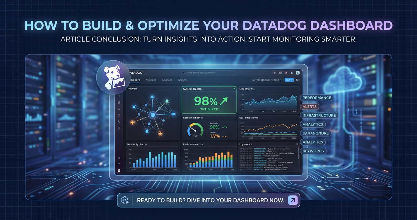
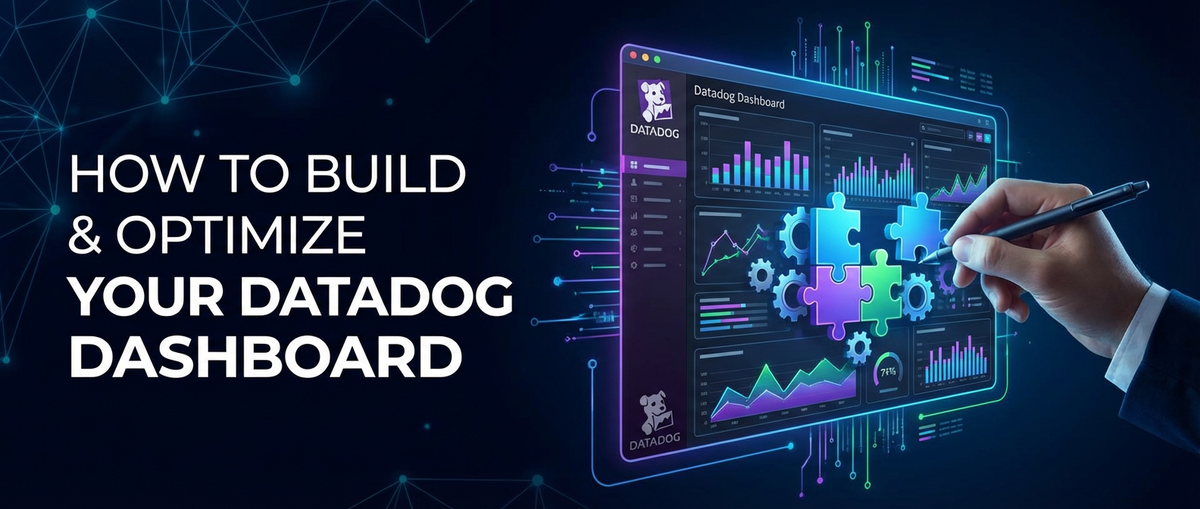
How to Build & Optimize Your Datadogs Dashboard


In the rapidly evolving landscape of modern software development and operations, the ability to observe, understand, and react to the intricate behaviors of complex systems is paramount. Datadog has emerged as a titan in the observability space, offering a unified platform for metrics, logs, traces, and more. At the heart of leveraging Datadog’s power lies the art and science of building and optimizing dashboards. These visual interfaces are not just pretty pictures; they are the command centers that provide real-time insights into the health, performance, and user experience of your applications and infrastructure. Without well-crafted dashboards, even the most sophisticated monitoring tools can leave you drowning in data, unable to discern signal from noise.
This comprehensive guide delves deep into the methodologies and best practices for constructing highly effective Datadog dashboards, moving beyond basic setup to advanced optimization techniques. We'll explore everything from strategic planning and metric selection to layout design, advanced features, and the critical role of dashboards in managing API-driven architectures and gateway performance. By the end of this journey, you'll be equipped with the knowledge to transform raw data into actionable intelligence, empowering your teams to make informed decisions, preemptively address issues, and ultimately drive superior operational excellence.
The Foundation of Observability: Understanding Datadog Dashboards
Before we dive into the construction process, it's crucial to solidify our understanding of what Datadog dashboards are and why they are indispensable. In essence, a Datadog dashboard is a customizable visual canvas where you can display various types of data collected from your infrastructure, applications, and services. These data points, or "widgets," can range from time-series graphs and scatter plots to tables, logs, and alert statuses, all dynamically updating to reflect the current state of your systems. The primary goal of any dashboard is to provide a quick, intuitive, and comprehensive overview, enabling stakeholders—be it engineers, SREs, product managers, or business leaders—to grasp the operational reality at a glance.
The value proposition of well-designed dashboards extends beyond mere data visualization. They serve as critical tools for:
- Proactive Monitoring: Spotting anomalies and potential issues before they escalate into full-blown outages.
- Troubleshooting & Root Cause Analysis: Quickly narrowing down the scope of a problem by correlating various metrics and logs.
- Performance Optimization: Identifying bottlenecks and areas for improvement within your applications and infrastructure.
- Capacity Planning: Understanding resource utilization trends to inform future scaling decisions.
- Business Intelligence: Tracking key performance indicators (KPIs) that directly impact business outcomes.
- Communication & Collaboration: Providing a shared source of truth for teams to discuss system health and performance.
Datadog offers two primary types of dashboards, each suited for different use cases:
- Timeboards: These are designed for real-time monitoring and historical analysis of time-series data. They automatically adjust the time window for all widgets simultaneously, making them ideal for observing trends, comparing performance over different periods, and conducting incident investigations. Timeboards are excellent for operational teams who need to track system health and performance metrics over time.
- Screenboards: These offer a more flexible, free-form canvas, allowing widgets to have independent time windows and custom layouts. Screenboards are often used for creating status pages, executive overviews, or incident response dashboards where specific, fixed views or different time contexts are needed for various widgets. They are less about time-series comparison and more about presenting a snapshot of multiple disparate data points or views.
Choosing between a Timeboard and a Screenboard depends entirely on your specific monitoring objective. For most day-to-day operational monitoring and deep dives, Timeboards are the go-to choice due to their synchronized time context, which simplifies correlation across different metrics.
Strategic Planning: The Blueprint for an Effective Dashboard
Before you even log into Datadog, the most crucial step in building an effective dashboard is strategic planning. A dashboard, like any other engineering artifact, benefits immensely from a clear purpose, defined scope, and a well-thought-out design. Rushing into widget creation without a plan often leads to cluttered, overwhelming, and ultimately useless dashboards.
1. Define Your Audience and Purpose
Who will be using this dashboard? What questions are they trying to answer? A dashboard for an SRE team focused on microservice health will look vastly different from one designed for a product manager tracking user engagement or an executive overseeing business KPIs.
- Operational Teams (SREs, DevOps): Focus on system health, error rates, latency, resource utilization, and immediate incident detection. Their dashboards need granular data, alert statuses, and links to logs/traces.
- Development Teams: Emphasize application-specific metrics, deployment health, feature flag performance, and user-facing error rates.
- Product Managers: Prioritize user experience metrics, feature adoption, conversion rates, and business-level KPIs.
- Executives: Require high-level summaries, key business metrics, service level objectives (SLOs) compliance, and overall system health status.
Clearly defining the audience helps you determine the appropriate level of detail, the types of metrics to include, and the overall visual language of the dashboard.
2. Identify Key Metrics and Goals
What are the most critical pieces of information needed to achieve the dashboard's purpose? This is where the concept of "signal to noise" ratio becomes paramount. Resist the urge to display every available metric. Instead, focus on the ones that are truly indicative of system health, performance, or business outcomes.
A useful framework for selecting metrics, especially for application and service monitoring, is the RED Method or the Four Golden Signals:
- RED Method (for services):
- Rate: The number of requests per second.
- Errors: The number of failed requests per second.
- Duration: The time taken to process requests (latency).
- Four Golden Signals (for systems):
- Latency: The time it takes to service a request.
- Traffic: How much demand is being placed on your system.
- Errors: The rate of requests that fail.
- Saturation: How "full" your service is.
Beyond these technical metrics, consider business-specific KPIs that directly reflect the success of your application or service. For example, for an e-commerce platform, "orders placed per minute" or "conversion rate" could be critical.
When considering the health of your api endpoints or the performance of your gateway, specific metrics become critical. For instance, an api gateway is often the first point of contact for external traffic, making its latency, error rate, and request volume direct indicators of user experience and system stability. A robust observability strategy for APIs involves tracking:
- API Request Volume: Total requests, requests per endpoint, requests per client.
- API Latency: Average, p95, p99 latency for each endpoint.
- API Error Rates: HTTP 4xx and 5xx errors, per endpoint and overall.
- API Cache Hit Ratios: If caching is employed.
- API Authentication Failures: Indicating potential security issues or misconfigurations.
- Upstream Service Latency/Errors: The performance of the backend services called by the api gateway.
The goal is to create a narrative with your metrics, telling a story about the system's current state.
3. Sketch Your Layout and Information Hierarchy
Before you touch Datadog, grab a pen and paper (or a digital whiteboard) and sketch out your dashboard. Consider:
- Visual Hierarchy: What are the most important metrics that should be immediately visible? These typically go at the top or in prominent central positions.
- Logical Grouping: Group related metrics together. For example, all CPU-related metrics in one section, all database metrics in another.
- Flow: How should the user's eye naturally move across the dashboard? Often, a left-to-right, top-to-bottom flow works well, mimicking reading patterns.
- Density: Avoid overcrowding. White space is your friend. A cluttered dashboard is an overwhelming dashboard.
- Color Usage: Use color sparingly and purposefully, e.g., red for critical alerts, amber for warnings, green for healthy.
This pre-visualization step saves significant time and rework, ensuring that your digital dashboard aligns with your conceptual goals.
Building Blocks: Constructing Your Datadog Dashboard
With a solid plan in hand, it's time to translate your blueprint into a living, breathing Datadog dashboard. Understanding the various widget types and their effective use is fundamental to this process.
1. Choosing the Right Dashboard Type
As discussed, decide whether a Timeboard (synchronized time window, ideal for trends and investigations) or a Screenboard (flexible layout, independent widget time windows, good for status pages) best suits your immediate need. For the purpose of this guide, we will primarily focus on Timeboards, as they are most commonly used for operational monitoring and optimization.
2. Mastering Datadog Widgets
Widgets are the individual components that populate your dashboard. Datadog offers a rich variety, each designed to display specific types of data effectively.
- Time-Series Graph: The most common widget. Displays how one or more metrics change over time. Essential for tracking trends, spotting anomalies, and comparing different services or instances. You can graph raw metrics, functions (e.g.,
sum,avg,p95), and even apply filters using tags. - Query Value: Displays the current value of a metric or a function of a metric. Excellent for showing real-time KPIs like "current active users" or "current error rate." Can be configured with conditional formatting for quick status checks.
- Table: Presents data in a tabular format. Useful for displaying lists of hosts, top N consumers of a resource, or aggregated metrics across various dimensions.
- Heatmap: Visualizes the distribution of a metric's values over time, often used for latency percentiles to show performance variations.
- Log Stream: Displays a filtered stream of logs directly on your dashboard. Invaluable for correlating events with metric changes during incident response.
- Event Stream: Shows a stream of events (e.g., deployments, config changes, alerts) that occurred in your environment. Helps contextualize metric changes.
- Alert Graph/Status: Visualizes the state of specific monitors or groups of monitors. Provides a quick overview of alerting status.
- Topology Map: For services monitored with APM, shows a visual representation of service dependencies and health.
- Geomap: Displays metrics overlaid on a world map, useful for geographically distributed applications.
- Text/Markdown: Allows you to add context, instructions, or links directly to the dashboard. Use it for titles, descriptions, or links to runbooks.
- Image: Embeds an image, often used for company logos or architectural diagrams.
- Host Map: Provides a visual overview of your infrastructure, showing the health of individual hosts or clusters.
- Live Container View: Shows real-time container activity and resource usage.
- Web Traffic: Visualizes real user monitoring (RUM) data for web applications.
Example Table: Common Widget Types and Their Use Cases
| Widget Type | Primary Use Case | Example Query/Data Source |
|---|---|---|
| Time-Series Graph | Tracking trends, identifying anomalies | system.cpu.usage{env:production} by {host} |
| Query Value | Displaying real-time KPIs, quick status checks | avg:nginx.requests.total{service:web-app} |
| Table | Listing top consumers, aggregated data | top(avg:aws.ec2.cpuutilization, 10, 'instance-id') |
| Heatmap | Visualizing latency distributions, performance variability | trace.http.request.duration.by.service{env:prod} |
| Log Stream | Correlating events, troubleshooting | service:my-app status:error |
| Alert Status | Overview of monitor health, incident detection | Status of monitor:cpu_high_alert |
| Text/Markdown | Adding context, instructions, links | ## Application Health Overview\n[Runbook](link_to_runbook) |
3. Querying Your Data Effectively
The power of Datadog lies in its flexible querying language. Each widget requires a query to specify which data to display.
- Metrics: Most queries start with a metric name (e.g.,
system.cpu.usage). You can apply aggregation functions (e.g.,avg,sum,max,min,p95) and use filters based on tags (e.g.,{env:prod,service:my-app}).- Example:
avg:aws.elb.request_count{region:us-east-1} by {elb_name}
- Example:
- Logs: Log queries are similar to those in the Logs Explorer. You can search by keywords, facets, and attributes.
- Example:
status:error service:payment-** @http.status_code:[500 TO 599]
- Example:
- Traces (APM): Queries can target spans, services, or resources.
- Example:
avg:trace.http.request.duration{service:web-app,resource:/users} by {http.method}
- Example:
Leveraging tags is crucial for effective querying. Tags allow you to slice and dice your data along various dimensions (e.g., env, service, host, datacenter). Consistent tagging across your infrastructure and applications makes your dashboards infinitely more powerful and flexible.
Key Metrics to Monitor: A Deep Dive into Observability Signals
While the choice of metrics is highly application-specific, certain categories and patterns of metrics are universally valuable for robust observability. Going beyond the RED Method and Golden Signals, let's explore more detailed monitoring categories.
1. System-Level Metrics
These provide insights into the underlying health of your infrastructure.
- CPU:
system.cpu.usage(overall, user, system, idle, iowait): Highiowaitcan indicate disk or network bottlenecks.system.load.1,system.load.5,system.load.15: Average number of processes waiting for CPU time.
- Memory:
system.mem.used,system.mem.free,system.mem.total: Tracking overall memory consumption.system.mem.pct_usable: Percentage of usable memory. High swap usage (system.swap.used) often indicates memory pressure.
- Disk I/O:
system.disk.in_use: Percentage of disk space used.system.disk.bytes_read,system.disk.bytes_written: Throughput.system.disk.util: Disk utilization percentage. High values indicate potential bottlenecks.system.disk.await: Average time (in ms) for I/O requests.
- Network:
system.net.bytes_rcvd,system.net.bytes_sent: Network traffic in and out.system.net.packets_in.count,system.net.packets_out.count: Packet count.system.net.tcp.active_opens,system.net.tcp.passive_opens: Indicating connection activity.system.net.udp.errors: UDP communication issues.
2. Application-Level Metrics
These metrics are crucial for understanding how your applications are performing and interacting.
- Request Rates:
nginx.requests.total,http.server.requests.count: Total requests, broken down by service, endpoint, and HTTP method.
- Error Rates:
nginx.errors.count,http.server.requests.errors: Number of 4xx and 5xx responses. Crucial for user impact.- Application-specific error metrics (e.g.,
my_app.exceptions.count).
- Latency/Duration:
http.server.requests.duration.p95,http.server.requests.duration.p99: High percentiles are critical for user experience.- Database query latency, external api call latency.
- Concurrency/Queue Depth:
jvm.threads.count,redis.info.connected_clients: Number of active threads, connections, or items in a queue. High values can indicate resource contention.
- Garbage Collection (for JVM apps):
jvm.gc.old_gen_time,jvm.gc.young_gen_time: Excessive GC time can lead to application pauses.
- Custom Metrics:
- Application-specific business metrics (e.g., "successful payments," "items added to cart," "failed login attempts"). These bridge the gap between technical performance and business outcomes.
3. API and Gateway Specific Metrics
Given the increasing prevalence of microservices and api-driven architectures, dedicated monitoring for your APIs and the gateway controlling them is non-negotiable. This is where products like APIPark become invaluable, providing granular data that feeds directly into your Datadog dashboards.
- API Gateway Metrics:
- Request Latency:
apigateway.latency.p95,apigateway.latency.p99- measures the time taken by the gateway to process a request before forwarding it and after receiving the response. - Request Count:
apigateway.requests.total- total number of requests handled by the gateway. - Error Rates:
apigateway.errors.4xx,apigateway.errors.5xx- HTTP error codes indicating client-side and server-side issues originating from or passing through the gateway. - Backend Latency:
apigateway.backend.latency- latency introduced by the upstream services the gateway calls. This helps distinguish issues in the gateway itself from issues in the backend. - Cache Hit/Miss Rate:
apigateway.cache.hits,apigateway.cache.misses- if the gateway uses caching, these metrics indicate its efficiency. - Rate Limiting Events:
apigateway.rate_limit.exceeded- number of requests blocked due to exceeding rate limits. - Authentication/Authorization Errors:
apigateway.auth.failures- crucial for security and access management.
- Request Latency:
- Individual API Metrics:
- Endpoint-Specific Latency/Errors/Requests: Drill down into specific
apiendpoints to understand individual performance bottlenecks or high error rates. - Payload Size:
api.request.payload_size,api.response.payload_size- can impact network usage and processing time. - Client Usage:
api.client.requests.total- identify which clients (e.g., external applications, internal microservices) are making the mostapicalls. This helps understand dependencies and potential overload scenarios.
- Endpoint-Specific Latency/Errors/Requests: Drill down into specific
Many Open Platform solutions, especially those designed for API management like APIPark, offer extensive logging and analytics capabilities that directly contribute to these metrics. For instance, APIPark provides "Detailed API Call Logging" and "Powerful Data Analysis" features, which capture every detail of an API call, from request/response headers and bodies to latency and status codes. This granular data is then aggregated and made available, forming the perfect foundation for building comprehensive api-centric dashboards in Datadog. By integrating metrics from an api gateway solution like APIPark, your Datadog dashboards can offer an unparalleled view into the health and performance of your entire API ecosystem, from the edge to the backend services.
4. Database Metrics
- Connections:
postgres.connections,mysql.connections- active, idle, max connections. - Query Performance:
postgres.queries.count,mysql.commands.insert,mysql.commands.select- query execution counts and durations. - Replication Lag:
postgres.replication.lag- critical for read replicas. - Buffer Cache Hit Ratio:
mysql.innodb.buffer_pool_hit_rate- indicates how effectively the database is using memory. - Locks:
mysql.innodb.row_lock_waits- contention issues.
5. Cloud Infrastructure Metrics (AWS, Azure, GCP, etc.)
- EC2/VMs: CPU utilization, network I/O, disk I/O, status checks.
- Load Balancers (ALB/NLB): Request count, target connection errors, HTTP 5xx errors, latency.
- RDS/Managed Databases: CPU, memory, connections, disk I/O, database-specific metrics (e.g.,
aurora.cpu.utilization). - Lambda/Functions: Invocations, errors, duration, throttles.
- Kubernetes: Pod CPU/memory usage, node resource utilization, deployment status, networking, API server health.
The key is to select metrics that are actionable and relevant to your defined purpose. Avoid "vanity metrics" that look good but provide no real insights or pathways to resolution.
APIPark is a high-performance AI gateway that allows you to securely access the most comprehensive LLM APIs globally on the APIPark platform, including OpenAI, Anthropic, Mistral, Llama2, Google Gemini, and more.Try APIPark now! 👇👇👇
Optimizing Your Dashboard for Clarity and Performance
Building a dashboard is only half the battle; optimizing it for usability, clarity, and performance ensures it remains a valuable tool rather than becoming digital clutter.
1. Layout and Organization: The Art of Visual Storytelling
A well-organized dashboard guides the user's eye and facilitates rapid understanding.
- Logical Grouping: Place related widgets close together. Use headers (via Markdown widgets) to clearly delineate sections (e.g., "Application Performance," "Database Health," "API Gateway Metrics").
- Top-Left Priority: The human eye naturally gravitates to the top-left corner. Place your most critical, high-level metrics (e.g., overall service health, critical error rates, top-line business KPIs) here.
- Flow and Progression: Arrange widgets to tell a story. Start with high-level summaries and progressively move to more granular details or related components. For instance, start with overall API health, then drill down into specific
apiendpoints, and then perhaps the backend services they call. - Consistency: Maintain a consistent style for graphs (e.g., same color for the same metric across different widgets), text sizes, and naming conventions.
- Avoid Overcrowding: Too many widgets on one screen can be overwhelming. If a dashboard becomes too dense, consider splitting it into multiple, more focused dashboards, potentially linking between them with Markdown widgets.
- Use Spacers and Separators: Datadog offers options for empty spaces or horizontal rules to improve visual separation.
2. Naming Conventions: The Language of Clarity
Consistent and descriptive naming is paramount for dashboard, widget, and metric clarity.
- Dashboard Names: Should clearly reflect its purpose and audience (e.g., "SRE - Microservice X Health," "Product - User Funnel," "Executive - API Performance Overview").
- Widget Titles: Concise and descriptive, explaining what the widget displays (e.g., "Web App Request Rate," "Database Latency P99," "API Gateway 5xx Errors").
- Metric Aliases: Use meaningful aliases for metrics in graphs to make them readable without needing to inspect the raw query.
- Tags: Enforce a consistent tagging strategy across your entire infrastructure (e.g.,
env:production,service:users-api,team:backend). This enables powerful filtering and segmentation.
3. Templating Variables: Dynamic Dashboards
Templating variables are one of Datadog's most powerful features for creating flexible, reusable dashboards. They allow you to define dropdown menus at the top of your dashboard that can dynamically filter the data displayed by all (or selected) widgets.
- Use Cases:
- Environment Selection: Switch between
prod,staging,devenvironments. - Service/Microservice Selection: View metrics for a specific
apiservice. - Host/Instance Selection: Focus on a particular server.
- Region/Availability Zone: Filter by geographical location.
- Environment Selection: Switch between
- Benefits: Reduces dashboard sprawl by allowing one dashboard to serve multiple similar purposes. Greatly enhances the efficiency of troubleshooting by enabling quick pivoting between different contexts. For an Open Platform with many services and environments, templating variables are a must-have for streamlined observability.
- Implementation: Define a variable (e.g.,
service_name) based on a tag (e.g.,service) or a list of values. Then, in your widget queries, replace the hardcoded tag value with{{service_name}}.
4. Conditional Formatting: Highlighting What Matters
Don't make users hunt for problems. Use color and formatting to draw immediate attention to critical states.
- Query Value Widgets: Configure thresholds to change the widget's background color or text color based on the metric's value (e.g., green for healthy, yellow for warning, red for critical).
- Time-Series Graphs: Use event overlays or change line colors based on specific conditions if supported.
- Usage: Apply conditional formatting judiciously. Too many flashing colors can be distracting. Focus on the truly actionable thresholds.
5. Alert Integration: The Call to Action
Dashboards are great for observation, but monitors (alerts) are what drive action. Integrate your alerts directly into your dashboards.
- Alert Status Widgets: Display the current status of key monitors.
- Event Stream: Overlay alerts as events on time-series graphs to correlate them with metric changes.
- Links to Runbooks: Use Markdown widgets to link directly to runbooks or incident management procedures associated with specific alerts or dashboard sections.
6. Performance Considerations: Smooth Sailing
Large, complex dashboards with many widgets and expensive queries can sometimes load slowly, hindering their usefulness.
- Query Optimization:
- Minimize Metric Count: Only query what's essential.
- Aggregate Early: Use aggregation functions (e.g.,
avg,sum) as early as possible in your queries to reduce the data points processed. - Leverage Tags: Efficiently filter data using well-indexed tags.
- Avoid Wildcard Aggregations: While powerful, queries like
sum:system.cpu.usage{*} by {host}can be very expensive if you have thousands of hosts. Be specific with your filters.
- Widget Count: While there's no hard limit, an excessive number of widgets (e.g., hundreds) on a single Timeboard can impact loading times. Consider splitting very large dashboards.
- Time Window: Shorter time windows (e.g., 1 hour vs. 1 month) generally result in faster queries. While Timeboards dynamically adjust, be mindful of the default or maximum time range you expect users to apply.
- Browser Performance: Ensure users have modern browsers and sufficient system resources, as dashboards are rendered client-side.
Advanced Datadog Features for Enhanced Dashboarding
Beyond the basics, Datadog offers a suite of advanced features that can elevate your dashboards from functional to exceptionally insightful.
1. Tagging Strategy: The Unsung Hero
We've mentioned tags repeatedly, but their importance cannot be overstated. A well-thought-out, consistent tagging strategy is the bedrock of powerful Datadog dashboards and indeed, the entire observability platform.
- Service-Oriented Tags:
service:<service_name>,team:<team_name> - Infrastructure Tags:
host:<hostname>,availability-zone:<az>,region:<region>,cloud:<provider> - Deployment Tags:
version:<app_version>,git_commit:<commit_hash> - Environment Tags:
env:<production|staging|development> - Business Tags:
customer:<customer_id>,tier:<premium|standard>
Tags enable you to: * Filter dashboards dynamically. * Group metrics for aggregation and comparison. * Scope monitors to specific parts of your infrastructure. * Attribute costs to different teams or services. * Perform targeted log searches and trace analysis.
Automate tag application wherever possible (e.g., via Datadog Agent integrations, Kubernetes annotations, cloud provider metadata).
2. Monitor Grouping and Composite Alerts
For complex systems, individual monitors can quickly become overwhelming. Datadog allows you to group related monitors, providing a consolidated view of their statuses. Composite alerts allow you to create an alert that fires only when multiple conditions (from different monitors or queries) are met. This is invaluable for reducing alert fatigue and focusing on true system-level issues. Your dashboard can then display the status of these composite alerts, indicating more severe, correlated problems rather than isolated incidents.
3. Service Level Objectives (SLOs)
Datadog allows you to define and track Service Level Objectives (SLOs) based on your metrics and monitors. Integrating SLO widgets into your dashboards provides a high-level, business-centric view of your services' health and adherence to defined performance targets. This is particularly useful for product managers and executives who need to understand the impact of technical performance on user experience and business commitments. For an Open Platform that serves many internal or external users via APIs, SLOs are a direct way to communicate service reliability.
4. Datadog Notebooks
While not strictly a dashboard feature, Notebooks are powerful for conducting ad-hoc investigations, performing root cause analysis, and sharing findings. You can create "live" documents that combine queries, graphs, logs, markdown, and code snippets. When an anomaly is spotted on a dashboard, a Notebook can be the next step for a deeper dive, and its findings can then inform future dashboard iterations or new monitor creations.
5. Multi-Scope Dashboards with group by and as_count()
Sometimes you need to visualize the same metric across many dimensions on a single graph. The group by clause in Datadog queries, combined with functions like as_count(), allows you to create highly informative graphs. For instance, visualizing http.server.requests.count grouped by service and status_code can show you traffic patterns and error distributions across all your microservices on one graph. Similarly, as_count() can convert a gauge metric into a count over a time window, useful for event tracking.
Integrating with API Management and Gateways: A Unified Observability View
Modern application architectures are increasingly built upon microservices and API-first principles. Monitoring the performance and health of your APIs and the api gateway that orchestrates them is crucial for maintaining service reliability and user experience. Datadog dashboards provide the perfect canvas for achieving this unified observability.
An api gateway acts as the single entry point for all API requests, handling routing, authentication, rate limiting, and often caching. Its performance directly impacts the entire application ecosystem. When building dashboards for an api gateway, focus on metrics that reveal its own operational health and its impact on upstream services. This includes request throughput, latency (at the gateway itself and to backends), error rates, and resource utilization of the gateway instances.
Consider a scenario where you're managing a complex microservices environment, perhaps using an Open Platform to expose various api services to internal teams and external partners. In such a setup, the flow of data and requests can be incredibly intricate. This is precisely where a robust API management platform, such as APIPark, plays a pivotal role, not only in managing and securing your APIs but also in generating the critical telemetry that Datadog dashboards thrive on.
APIPark, as an Open Source AI Gateway & API Management Platform, is designed to simplify the management, integration, and deployment of AI and REST services. One of its standout features, "Detailed API Call Logging," records every nuance of each api call, from initial request to final response, including headers, bodies, latency, and status codes. This level of granularity is gold for observability. Imagine having a Datadog dashboard that, in real-time, displays:
- Overall API Gateway Latency: A Time-Series graph showing
apipark.gateway.request.duration.p95. - Error Rate by API Endpoint: A table showing
apipark.api.errors.5xxgrouped byapi_endpointand sorted by count. - Request Volume by Client: A graph visualizing
apipark.client.requests.totalgrouped byclient_idto identify heavy users. - Authentication Failures: A Query Value widget highlighting
apipark.auth.failures.countwith conditional formatting to turn red above a certain threshold. - Upstream Service Health: Using
apipark.upstream.latency.p99to see if issues originate from the backend microservices.
APIPark's "Powerful Data Analysis" capabilities further enhance this by analyzing historical call data to identify trends and performance changes, which can then be brought into Datadog for longer-term capacity planning and proactive maintenance. The ability of APIPark to integrate 100+ AI models and standardize their invocation format means that even AI-driven APIs can be consistently monitored on the same Datadog dashboards, providing a unified view across all your service types. This synergy between a powerful api gateway and an observability platform like Datadog creates an end-to-end view of your digital services, from the user's browser to the deepest backend microservice or AI model.
When your api gateway is configured to emit these detailed metrics to Datadog, your dashboards become invaluable for:
- Rapid Incident Response: Quickly identify if an issue is at the gateway layer, a specific
apiendpoint, or a downstream service. - Performance Tuning: Pinpoint slow
apicalls or backend services that need optimization. - Security Monitoring: Track suspicious
apirequest patterns or high numbers of authentication failures. - Capacity Planning: Understand
apitraffic growth and make informed scaling decisions for both the gateway and your backend services. - SLA/SLO Tracking: Visually represent compliance with defined service level agreements for your APIs.
By combining the robust API management features of an Open Platform like APIPark with the comprehensive observability of Datadog, organizations can achieve a level of transparency and control over their API ecosystem that is otherwise difficult to attain. This integration ensures that every facet of your api lifecycle, from design and deployment to invocation and decommissioning, is fully observable and optimizable.
Best Practices for Dashboard Maintenance and Evolution
Building a great dashboard is a continuous process, not a one-time event. Systems evolve, priorities change, and new metrics emerge. Therefore, effective dashboard maintenance and evolution are critical to ensuring their long-term value.
1. Regular Review and Refinement
- Scheduled Reviews: Designate a recurring schedule (e.g., monthly, quarterly) to review your dashboards with their primary users. Gather feedback on their usefulness, identify missing metrics, and remove obsolete widgets.
- Post-Incident Analysis: After every major incident, review the relevant dashboards. Did they provide the necessary information for quick diagnosis? What data was missing? Use these lessons to refine existing dashboards or create new, specialized ones.
- Metric Lifecycle Management: As services evolve, some metrics may become irrelevant while new, more pertinent ones emerge. Be proactive in updating your dashboards to reflect these changes.
2. Documentation and Runbooks
A dashboard is only as good as the action it inspires. For critical dashboards, link directly to documentation and runbooks using Markdown widgets.
- What to Monitor: Briefly explain what each section or key widget represents.
- Why it Matters: Explain the significance of critical thresholds or anomalies.
- What to Do: Provide clear steps to take when specific metrics cross thresholds or alerts fire. Link to internal wikis, troubleshooting guides, or incident response playbooks.
Good documentation empowers both seasoned engineers and newcomers to effectively utilize your dashboards for monitoring and incident response.
3. Collaboration and Ownership
Observability is a team sport.
- Assign Ownership: For critical dashboards, assign a clear owner (a team or an individual) responsible for its maintenance, accuracy, and relevance.
- Encourage Contribution: Empower teams to build and suggest improvements for dashboards relevant to their services. Datadog’s collaboration features (e.g., comments on graphs) can facilitate this.
- Share Knowledge: Conduct internal workshops or training sessions on how to effectively use Datadog dashboards and interpret the metrics.
4. Version Control and Programmatic Management
For organizations with a large number of dashboards or a desire for Infrastructure as Code (IaC) practices, managing dashboards programmatically is a powerful approach.
- Datadog API: Datadog provides a robust API that allows you to create, update, and delete dashboards programmatically.
- Terraform/Pulumi: Use tools like Terraform or Pulumi with the Datadog provider to define your dashboards as code. This enables:
- Version Control: Track changes to dashboards in Git.
- Automated Deployment: Deploy dashboard updates through CI/CD pipelines.
- Consistency: Ensure consistency across multiple environments (e.g., development, staging, production).
- Review Process: Implement code reviews for dashboard changes, just like any other code.
Managing dashboards as code brings discipline and scalability to your observability efforts, especially crucial for large-scale, dynamic environments where an Open Platform approach is taken for development and operations.
5. Continuously Iterate and Innovate
The observability landscape is constantly evolving. Stay informed about new Datadog features, new monitoring best practices, and new challenges introduced by emerging technologies. Be willing to experiment with new widget types, different visualizations, and novel ways to correlate data. The "perfect" dashboard is a myth; instead, aim for "continuously improving" dashboards that adapt to your organization's changing needs.
Conclusion: The Path to Observability Maturity
Building and optimizing Datadog dashboards is a journey, not a destination. It requires a blend of technical expertise, strategic thinking, and a deep understanding of your systems and business objectives. By meticulously planning your dashboards, selecting the right metrics—from system-level health to granular api performance and gateway insights—and leveraging Datadog's powerful features, you transform raw data into a narrative of operational truth.
The seamless integration of comprehensive API management solutions, such as APIPark, into your observability stack further elevates this capability, providing the granular data needed to truly understand your API ecosystem. As an Open Platform for managing APIs and AI services, APIPark generates the critical telemetry that, when visualized on thoughtfully designed Datadog dashboards, empowers teams to not only react swiftly to incidents but also to proactively identify bottlenecks, optimize performance, and drive innovation.
Embrace the continuous process of review, refinement, and documentation. Empower your teams with dynamic, actionable dashboards that not only reflect the current state of your systems but also illuminate the path forward. In doing so, you won't just be building dashboards; you'll be building a culture of observability excellence that underpins the reliability, performance, and success of your digital endeavors.
Frequently Asked Questions (FAQs)
1. What's the fundamental difference between a Datadog Timeboard and a Screenboard?
A Datadog Timeboard is designed for monitoring time-series data, where all widgets on the board share the same time window, making it ideal for observing trends and correlating metrics over time. It automatically adjusts the time range for all graphs. A Screenboard, on the other hand, offers a free-form layout where each widget can have its own independent time window, allowing for more flexible, static-like displays often used for status pages or executive summaries. For most operational monitoring and troubleshooting, Timeboards are preferred due to their synchronized time context.
2. How can I ensure my Datadog dashboards remain performant and don't load slowly?
To optimize dashboard performance, focus on query efficiency: minimize the number of metrics queried, use aggregation functions early in your queries, and leverage well-indexed tags for filtering. Avoid excessively broad wildcard queries. Also, consider the total number of widgets on a single dashboard; very large dashboards with hundreds of widgets can sometimes impact load times. If necessary, split complex dashboards into several smaller, more focused ones. Regularly review and refine queries to remove unnecessary complexity.
3. What role does tagging play in effective Datadog dashboarding?
Tagging is absolutely critical. A consistent and comprehensive tagging strategy allows you to slice and dice your data along various dimensions (e.g., environment, service, host, team, region). This enables powerful filtering, dynamic templating, and precise segmentation of metrics, logs, and traces. Effective tagging ensures your dashboards are flexible, reusable, and can quickly pinpoint issues within specific parts of your infrastructure or application, drastically improving troubleshooting efficiency.
4. How can Datadog dashboards help in monitoring API performance, especially with an API Gateway?
Datadog dashboards are excellent for API performance monitoring. You can visualize key API metrics such as request rates, latency (p95, p99), and error rates (4xx, 5xx) for both your overall API gateway and individual API endpoints. By integrating with an API management platform like APIPark, which provides detailed API call logging and data analysis, you can get granular metrics on gateway processing time, backend service latency, cache hit ratios, and even authentication failures. This allows you to quickly identify if issues originate at the gateway, within specific APIs, or in downstream services.
5. What are templating variables, and why are they important for dashboards?
Templating variables allow you to create dynamic dropdown menus on your Datadog dashboards that can filter all (or selected) widgets based on the chosen value. For example, you can have a dropdown to select a specific environment (prod, staging), a microservice, or a host. They are important because they enable the creation of highly flexible and reusable dashboards, reducing the need for multiple static dashboards. This not only saves time in dashboard management but also significantly speeds up troubleshooting by allowing users to quickly pivot and focus on specific contexts without leaving the dashboard.
🚀You can securely and efficiently call the OpenAI API on APIPark in just two steps:
Step 1: Deploy the APIPark AI gateway in 5 minutes.
APIPark is developed based on Golang, offering strong product performance and low development and maintenance costs. You can deploy APIPark with a single command line.
curl -sSO https://download.apipark.com/install/quick-start.sh; bash quick-start.sh

In my experience, you can see the successful deployment interface within 5 to 10 minutes. Then, you can log in to APIPark using your account.

Step 2: Call the OpenAI API.