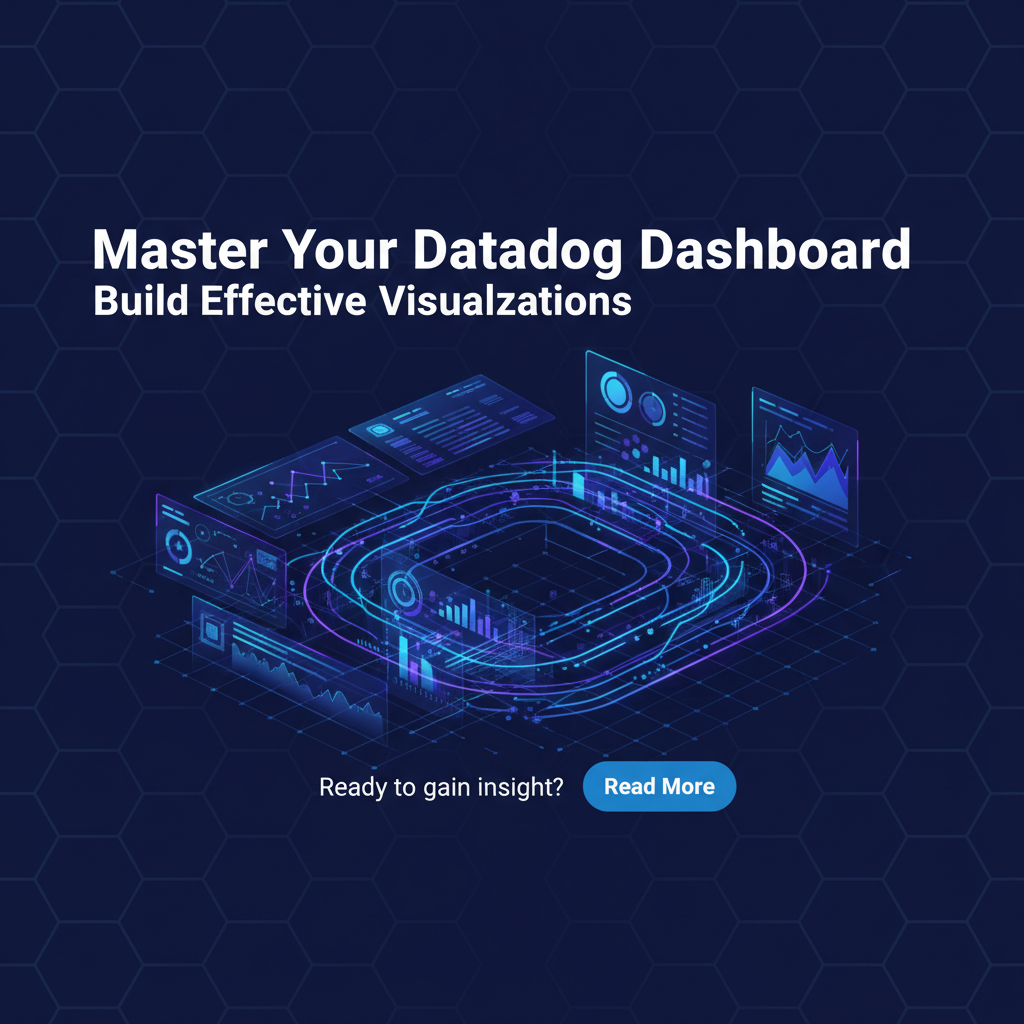
Master Your Datadog Dashboard: Build Effective Visualizations


Master Your Datadog Dashboard: Build Effective Visualizations for Unparalleled Observability
In the intricate landscape of modern digital infrastructure, where microservices communicate across vast networks and cloud-native applications scale dynamically, visibility is not just a luxury—it is an absolute necessity. Organizations are constantly seeking robust solutions to monitor the health, performance, and user experience of their systems, and among the pantheon of powerful observability platforms, Datadog stands as a titan. At its core, Datadog offers an unparalleled ability to aggregate metrics, logs, and traces from diverse sources, transforming raw data into actionable insights. However, the true mastery of Datadog lies not merely in collecting this data, but in crafting sophisticated, intuitive dashboards that tell a coherent story, enabling teams to rapidly identify issues, understand trends, and make informed decisions. This comprehensive guide will delve deep into the art and science of building effective visualizations within Datadog, empowering you to move beyond basic charts and unlock the full potential of your monitoring strategy, ensuring your teams possess the clarity needed to navigate even the most complex operational challenges.
The journey to a truly effective Datadog dashboard is multifaceted, demanding a thoughtful approach that marries technical understanding with a keen sense of design and user experience. It's about translating complex system behaviors into easily digestible visual narratives, transforming overwhelming data streams into clear signals. We will explore everything from defining your dashboard's purpose and selecting the right data sources to leveraging advanced visualization types, implementing best practices for design, and understanding how Datadog fits into a broader enterprise ecosystem that includes cutting-edge technologies like API and AI gateways. By the end of this exploration, you will possess a framework for constructing dashboards that are not just visually appealing, but are powerful tools for proactive problem-solving and strategic planning.
Unlocking Datadog's Observability Power: Beyond Basic Monitoring
Datadog is far more than a simple metric aggregator; it is a holistic observability platform designed to provide a unified view of your entire technology stack, from infrastructure to application code and user experience. Its strength lies in its ability to seamlessly integrate with hundreds of technologies, automatically collecting a staggering array of metrics, logs, and traces. This deep and broad data collection is the foundation upon which effective dashboards are built. Understanding Datadog’s core capabilities is the first step toward building visualizations that truly matter.
At its heart, Datadog consolidates three pillars of observability: 1. Metrics: Numerical values representing system health and performance over time (e.g., CPU utilization, request latency, error rates). Datadog’s agent and integrations collect these continuously. 2. Logs: Timestamped records of events occurring within your applications and infrastructure. Datadog provides powerful log management, enabling searching, filtering, and analysis of vast volumes of log data. 3. Traces: End-to-end representations of requests as they flow through distributed systems, showing the journey across different services and revealing bottlenecks or errors. Datadog APM (Application Performance Monitoring) captures these traces.
The power emerges when these pillars are not viewed in isolation but are correlated and presented together. An effective Datadog dashboard doesn't just show a CPU spike; it correlates that spike with a concurrent increase in API errors shown in logs, and perhaps a slow transaction trace, giving a complete picture of an issue. This correlation is precisely what makes Datadog indispensable and what you must strive to achieve in your dashboard designs. Without this integrated perspective, teams are often left sifting through disparate tools, losing critical time during incident response. The goal, therefore, is to craft dashboards that facilitate this correlation effortlessly, making the invisible visible and the complex understandable.
Phase 1: Defining Your Dashboard's Purpose and Audience
Before even thinking about specific widgets or colors, the most critical step in building an effective Datadog dashboard is to clearly define its purpose and identify its primary audience. A dashboard without a clear objective is merely a collection of data points; an effective dashboard tells a story tailored to a specific set of questions or users. This foundational planning prevents the creation of "dashboard sprawl"—a common pitfall where teams create numerous, unorganized dashboards that fail to provide coherent insights.
What Questions Do You Need Answers To?
Every successful dashboard begins by addressing a core set of questions. Instead of thinking "What data can I put on this dashboard?", ask "What problems am I trying to solve?", "What information do stakeholders need to monitor?", or "What metrics indicate the health of this particular service or business function?". For instance: * For a service reliability engineer: "Is our application healthy and performing within SLOs?" "Are there any current incidents or impending failures?" "What is the error rate for critical API endpoints?" * For a product manager: "Are users experiencing issues with the new feature?" "What is the overall latency for user interactions?" "How is user engagement trending?" * For a business executive: "What is the revenue impact of current system performance?" "Are we meeting our customer satisfaction targets?" "What is the operational cost trending?"
By starting with questions, you inherently focus on outcomes and relevant data, rather than just data availability. List these questions explicitly. Each question should ideally map to one or more metrics or visualizations on your dashboard. This disciplined approach ensures that every widget serves a purpose, contributing to a cohesive narrative.
Identifying Your Target Audience
The audience for your dashboard dictates its content, level of detail, and visual presentation. A dashboard designed for a developer debugging a specific microservice will look vastly different from one intended for an executive reviewing high-level business KPIs.
- Engineering/Operations Teams: These dashboards are often highly technical, focusing on granular metrics like CPU utilization, memory consumption, disk I/O, network throughput, error rates, latency, and specific application logs. They need real-time data for incident response and detailed historical data for root cause analysis. Correlation between metrics, logs, and traces is paramount.
- Product Teams: Product-centric dashboards focus on user experience, feature adoption, conversion rates, and overall application performance from a user's perspective. They might include metrics like page load times, unique active users, funnel drop-off rates, and A/B test results.
- Business Stakeholders/Executives: These dashboards are high-level, summarizing key performance indicators (KPIs) that directly impact business objectives, such as revenue, customer churn, service uptime, and operational costs. They require simplicity, clarity, and often trend analysis over longer periods.
Consider the technical proficiency of your audience. An executive dashboard should avoid jargon and technical minutiae, presenting information in a clear, unambiguous way. Conversely, an engineer's dashboard can assume a higher level of technical understanding, allowing for more complex metrics and direct links to underlying log and trace data. Tailoring the dashboard to its intended consumers ensures that the information is consumable and actionable for everyone who interacts with it.
Pinpointing Key Metrics (KPIs)
Once the questions and audience are clear, you can identify the specific Key Performance Indicators (KPIs) that will answer those questions. These are the vital signs of your system and business. For a web service, common KPIs might include:
- Availability: Is the service up and running? (e.g., Uptime percentage, HTTP 2xx rates)
- Latency: How fast is the service responding? (e.g., P99, P95, P50 response times)
- Throughput: How many requests is the service handling? (e.g., Requests per second)
- Error Rate: How often is the service failing? (e.g., HTTP 5xx rates, exception counts)
- Resource Utilization: Is the service under strain? (e.g., CPU, Memory, Disk, Network I/O)
For each KPI, determine the appropriate aggregation (average, sum, count, percentile) and the relevant dimensions (tags like service, host, environment, region). This detailed definition will directly inform the Datadog query you build for each widget, ensuring precision and relevance in your visualizations. The meticulous selection of KPIs prevents information overload, focusing the dashboard on the truly critical indicators of performance and health.
Phase 2: Sourcing and Collecting Your Data within Datadog
A dashboard is only as good as the data feeding it. Datadog excels at aggregating vast amounts of information, but understanding how that data is collected and what data points are available is crucial for building meaningful visualizations. Datadog collects three primary types of telemetry: metrics, logs, and traces, each serving a distinct purpose in painting a complete picture of your system's behavior. Effectively harnessing these diverse data streams requires a strategic approach to agent deployment, integration configuration, and custom metric collection.
Harnessing Metrics, Logs, and Traces
Metrics: These are numerical measurements collected at regular intervals, representing the state or performance of a system component. Datadog collects a plethora of out-of-the-box metrics from its vast array of integrations. For example, CPU utilization, memory usage, network I/O, disk space, and request counts are all standard metrics. When designing your dashboard, think about which metrics directly address your KPIs. For instance, system.cpu.idle might be less informative than system.cpu.usage for understanding load, and aws.ec2.cpuutilization gives cloud-specific insights. Beyond standard system metrics, application-level metrics, such as database query latency or queue lengths, often provide more granular insight into user-facing performance. Ensure that these application-specific metrics are being emitted by your code or collected via custom checks, as they are often the earliest indicators of problems within your services.
Logs: Logs are timestamped textual records of events occurring within your applications, infrastructure, and services. They provide rich contextual information that metrics often lack. A dashboard might show a spike in error rates (metric), but logs provide the actual error messages, stack traces, and associated request IDs, which are invaluable for debugging. Datadog's log management capabilities allow you to ingest, parse, filter, and analyze logs at scale. Within your dashboards, log widgets can be configured to display specific log patterns (e.g., "ERROR" or "WARN" messages from a particular service) or to show counts of unique log events, providing immediate context to metric anomalies. The ability to pivot directly from a metric anomaly to correlated logs within the same timeframe is a cornerstone of efficient troubleshooting in Datadog.
Traces: Traces (or distributed traces) provide an end-to-end view of a request's journey through a distributed system. Datadog APM (Application Performance Monitoring) captures these traces, allowing you to visualize how a request interacts with various microservices, databases, and external APIs. Each segment of a trace (called a "span") records details like service name, operation, duration, and associated errors. When a dashboard shows high latency for a user-facing endpoint, a trace widget can immediately pinpoint which service in the request path is introducing the delay. This granular visibility into service dependencies and performance bottlenecks is critical for microservice architectures. Integrating trace data directly into dashboards, perhaps by showing the average latency of key operations or the error rate of specific spans, transforms reactive monitoring into proactive performance optimization.
Datadog Integrations: Bridging the Gap
Datadog's strength lies in its extensive ecosystem of integrations. It offers hundreds of out-of-the-box integrations for virtually every cloud provider, operating system, database, web server, and application framework imaginable.
- Cloud Providers (AWS, GCP, Azure): Connect your cloud accounts to Datadog to automatically collect metrics, logs, and traces from services like EC2, S3, Lambda, Kubernetes, CloudWatch, Stackdriver, and Azure Monitor. These integrations are often just a few clicks away and provide a wealth of data about your cloud infrastructure's health and performance.
- Container Orchestration (Kubernetes, Docker): Datadog agents can be deployed as DaemonSets in Kubernetes clusters to collect metrics from nodes, pods, and containers, as well as Kubernetes events and logs. This provides deep visibility into the ephemeral and dynamic nature of containerized environments.
- Databases (PostgreSQL, MySQL, MongoDB): Collect performance metrics like query latency, connection counts, buffer hit ratios, and replication status directly from your database instances.
- Web Servers (Nginx, Apache): Monitor request rates, error codes, connection counts, and latency metrics from your web servers.
- Custom Applications: For bespoke applications or services not covered by standard integrations, Datadog provides client libraries for various programming languages (e.g., Python, Java, Go, Node.js) to emit custom metrics and traces. This allows you to instrument your code to capture business-specific KPIs or application-specific performance data.
When planning your dashboard, audit your stack and ensure that all critical components have appropriate Datadog integrations enabled. Each integration typically exposes a set of default dashboards, which can serve as excellent starting points for your custom visualizations, providing a baseline of relevant metrics and optimal widget configurations.
Monitoring Your API and AI Ecosystem: A Crucial Data Source
Modern applications increasingly rely on a mesh of internal and external APIs, and the rapid adoption of artificial intelligence and Large Language Models (LLMs) means that AI services are becoming critical components of many software stacks. These components, while often abstracted, are vital data sources that must be integrated into your observability strategy, especially when building comprehensive Datadog dashboards. The performance and reliability of your API and AI infrastructure directly impact user experience and business outcomes.
Consider the role of an API Gateway. An API Gateway acts as a single entry point for all API requests, managing traffic routing, load balancing, authentication, authorization, and rate limiting. It's a critical choke point, and its performance directly impacts every service behind it. Datadog can be configured to monitor the API Gateway itself, collecting metrics such as: * Request Volume: Total requests per second, broken down by endpoint, client, or authentication status. * Latency: Response times for requests passing through the gateway, often measured at various percentiles (P50, P90, P99). * Error Rates: Percentage of requests resulting in HTTP 4xx or 5xx errors, indicating issues with clients or upstream services. * Resource Utilization: CPU, memory, and network usage of the gateway instances.
Visualizing these metrics on a Datadog dashboard provides immediate insights into the health of your entire API ecosystem. A sudden spike in 5xx errors at the gateway level signals a widespread issue affecting multiple downstream services, allowing for a quicker, more targeted response than monitoring individual services in isolation.
Extending this concept to AI Gateway and LLM Gateway technologies, the need for robust monitoring becomes even more pronounced. AI models, especially large language models (LLMs), often involve complex inference processes, consume significant computational resources, and have unique performance characteristics. An AI Gateway or LLM Gateway standardizes access to these models, often handling prompt engineering, model versioning, request queuing, and cost management. Monitoring these gateways with Datadog allows you to: * Track LLM Inference Latency: Measure the time taken for an AI model to generate a response, which can vary significantly based on model complexity and input size. * Monitor Token Usage: For LLMs, tracking input and output token counts can be crucial for cost management and capacity planning. * Observe AI Model Error Rates: Identify when specific models are failing to generate valid responses or are encountering internal errors. * Analyze AI Endpoint Usage: Understand which AI models and endpoints are being utilized most frequently. * Assess Resource Consumption: Monitor the GPU or specialized hardware utilization of the underlying AI inference infrastructure.
For organizations managing a complex landscape of APIs and AI models, tools like APIPark become indispensable. As an open-source AI gateway and API management platform, APIPark simplifies the integration and management of both traditional REST services and a hundred-plus AI models, offering unified API formats for AI invocation and end-to-end API lifecycle management. Monitoring the performance metrics exposed by platforms like APIPark through Datadog dashboards can provide invaluable insights into the health and efficiency of your entire service layer, including your AI infrastructure. For instance, Datadog can ingest custom metrics from APIPark regarding the performance of its unified API invocation endpoints for AI models, or the latency of prompt encapsulation into REST APIs. By correlating these specific metrics with broader system health, teams can gain a complete understanding of how their cutting-edge AI services are performing in real-world scenarios, identifying bottlenecks not just in the AI model itself, but also in the management and delivery layers facilitated by platforms like APIPark. This holistic view is vital for maintaining high performance and reliability across a modern, API-driven, and AI-powered application environment.
Phase 3: Choosing the Right Visualizations and Widget Types
Once you have a clear purpose, identified your audience, and understood your data sources, the next step is to translate that data into compelling visual stories using Datadog's extensive library of widgets. The choice of visualization is paramount; the right widget makes complex data immediately understandable, while the wrong one can obscure insights or even mislead. Datadog offers a rich palette of visualization options, each suited for different types of data and analytical needs.
Understanding Core Widget Categories
Datadog widgets can be broadly categorized based on the type of data they best represent and the insights they aim to convey:
- Time-Series Widgets (Metric Graphs):
- Line Graphs: The most common and versatile. Excellent for showing trends of a single metric or comparing multiple metrics over time. Ideal for visualizing CPU usage, request latency, error rates, or any metric that changes continuously. Use different colors and line styles for clarity when comparing multiple series.
- Area Graphs: Similar to line graphs but fill the area beneath the line. Useful for showing cumulative totals or when the magnitude of the value is important. Stacked area graphs can show contributions of different components to a total.
- Bar Graphs: Best for comparing discrete values or showing distributions. Stacked bar graphs can show proportions over time. Useful for displaying counts of events (e.g., number of errors per service per hour).
- Distribution Widgets:
- Histograms: Show the distribution of values for a single metric. Excellent for understanding the spread of latencies, queue depths, or request sizes. Helps identify outliers or multi-modal distributions.
- Heat Maps: Visualize the distribution of a metric across two dimensions over time. For example, latency across different hosts, showing which hosts are consistently slower or have intermittent spikes. Ideal for identifying performance hotspots.
- Summary and Status Widgets:
- Gauges and Monitors: Display a single, current value of a metric, often with thresholds to indicate health (e.g., "CPU Usage: 75%"). Critical for high-level status dashboards.
- Scorecard: Shows a single numeric value with optional comparisons to past periods. Great for KPIs like "Uptime: 99.99% (vs. 99.98% last week)".
- Change: Highlights the percentage change of a metric over two time periods. Useful for tracking trends and identifying significant shifts.
- Top List: Displays the top N entities (e.g., hosts, services, containers) by a specific metric. Excellent for identifying top resource consumers or error sources.
- Event Stream: Shows a live stream of events (e.g., deployments, alerts, scaling events). Provides crucial context for understanding changes on other graphs.
- Host Map/Service Map: Visualizes the health and interconnections of your infrastructure hosts or services in a topological view. Quickly identifies failing nodes or unhealthy services.
- Log and Trace Widgets:
- Log Stream: Displays raw log entries matching specific filters. Essential for immediate debugging and context.
- Log Count/Volume: Shows the aggregated count of log entries over time, often filtered by severity (ERROR, WARN). Can be displayed as a time series or bar graph.
- Trace List/APM Graph: Displays individual traces or aggregated APM metrics (e.g., average latency per endpoint). Provides deep dive capabilities into application performance.
- Informational and Contextual Widgets:
- Markdown: Allows you to add static text, links, images, or formatted content to your dashboard. Crucial for providing context, explanations, links to runbooks, or team contacts. Often overlooked but vital for making dashboards truly user-friendly.
- Alert Value: Displays the current status and message of a Datadog monitor. Integrates alerting directly into your dashboard for immediate visibility.
Choosing Wisely: Matching Data to Visualization
The key to effective visualization is matching the data type and the question you're asking to the most appropriate widget.
- For showing trends over time: Line graphs are almost always the go-to. If you need to see the cumulative impact, area graphs work well.
- For comparing discrete items: Bar graphs are effective. Use them to compare error rates across different regions or top N consuming services.
- For understanding distributions: Histograms and heat maps are indispensable. If you want to know if most requests are fast but some are very slow, a histogram will reveal that, whereas an average might hide it.
- For overall health at a glance: Gauges, scorecards, and alert value widgets provide immediate status updates.
- For deep dives and debugging: Log streams and trace lists provide the granular detail needed for root cause analysis.
- For context and guidance: Markdown widgets are your friend. Never underestimate the power of clear instructions or definitions.
Avoid the temptation to use a complex widget when a simpler one will suffice. Overloading a dashboard with too many different widget types can make it confusing and hard to interpret. Aim for clarity and conciseness above all else. Remember that the goal is not to display all available data, but to display the most relevant data in the most understandable way.
Here’s a practical table outlining common Datadog widget types and their ideal use cases:
| Widget Type | Primary Use Case | Best For Answering | Example Metrics/Data |
|---|---|---|---|
| Timeseries | Showing trends of one or more metrics over time. | How has X changed over the last hour/day/week? | system.cpu.usage, nginx.requests.total, http.request.latency (p99) |
| Host Map | Visualizing the health and performance of your infrastructure hosts. | Which hosts are under stress or unhealthy? | system.cpu.idle, system.disk.in_use, network.in.bytes |
| Service Map | Visualizing service dependencies and their health. | Where is the bottleneck in my distributed application? | trace.django.request.hits, trace.service.request.errors |
| Top List | Identifying the top N entities by a specific metric. | Which services/containers are consuming the most resources? | container.cpu.usage, aws.s3.bucket_size, kafka.consumer.lag |
| Log Stream | Displaying real-time or historical log entries based on filters. | What errors or warnings are currently occurring in service X? | service:my-app status:error, env:prod message:"database connection" |
| Table | Presenting aggregated metric data in a tabular format. | What are the average latencies for each API endpoint? | avg(http.request.latency) by endpoint |
| Gauge | Displaying a single, real-time value of a metric. | What is the current CPU utilization? Is the queue full? | system.cpu.usage, rabbitmq.queue.messages |
| Scorecard | Tracking a single KPI with historical comparison. | Is our uptime better or worse than yesterday? | sum(uptime.percentage), avg(api.error.rate) |
| Markdown | Adding contextual information, links, or instructions. | What is this dashboard for? Who owns this service? | Links to runbooks, team contacts, dashboard purpose description |
| Heat Map | Visualizing distribution of a metric across two dimensions over time. | Are there specific hosts or regions with consistent high latency? | http.request.latency by host, region |
| Event Stream | Displaying a chronological list of system events. | What deployments or scaling events happened recently? | tags:deployment, tags:kubernetes-cluster |
By thoughtfully selecting and configuring these widgets, you can transform raw data into a dynamic, insightful narrative that guides your teams towards efficient monitoring and rapid problem resolution.
APIPark is a high-performance AI gateway that allows you to securely access the most comprehensive LLM APIs globally on the APIPark platform, including OpenAI, Anthropic, Mistral, Llama2, Google Gemini, and more.Try APIPark now! 👇👇👇
Phase 4: Best Practices for Dashboard Design and Layout
Building effective visualizations goes beyond simply picking the right widgets; it encompasses a holistic approach to design, ensuring clarity, conciseness, and intuitive navigation. A poorly designed dashboard, even with accurate data, can be overwhelming and counterproductive. Adhering to best practices in layout, labeling, and interactivity will elevate your Datadog dashboards from mere data displays to powerful decision-making tools.
Clarity and Conciseness: Less is More
One of the most common pitfalls in dashboard design is trying to cram too much information onto a single screen. This leads to visual clutter, making it difficult to discern critical information from background noise. * Focus on the essential: Each dashboard should have a primary purpose, and every widget should contribute to that purpose. If a widget doesn't help answer the dashboard's core questions, remove it. * Avoid redundancy: Don't display the same metric in multiple ways on the same dashboard unless there's a specific analytical reason (e.g., showing both average and P99 latency for an endpoint to highlight outliers). * Prioritize information: Place the most important or frequently referenced metrics and visualizations in prominent positions, typically at the top-left of the dashboard, where they are immediately visible without scrolling.
Information Hierarchy and Grouping
Organize your dashboard logically to create a clear information hierarchy. * Group related widgets: Place widgets that relate to the same component, service, or aspect of performance together. For example, all CPU, memory, and disk metrics for a specific host could be in one section, while all API latency metrics could be in another. Use Datadog's section headers to clearly delineate these groups. * Top-down flow: Structure your dashboard to move from high-level summaries down to more granular details. An executive dashboard might start with overall service health (scorecards), then move to key application KPIs (timeseries), and finally to infrastructure health. * Dashboard Tiers: Consider creating a tiered approach to your dashboards: * "Golden Signal" / High-Level Health Dashboards: A few dashboards showing critical KPIs (e.g., RED metrics: Rate, Errors, Duration) for your entire system or critical services. These are for quick status checks. * Deep Dive / Troubleshooting Dashboards: More detailed dashboards focusing on specific services, components, or problem areas, designed for engineers to diagnose issues. These often link from the high-level dashboards. * Business Dashboards: Focus on business-centric metrics and their impact on revenue or user experience.
Consistent Labeling and Naming Conventions
Consistency is crucial for readability and ease of understanding. * Clear titles: Give each dashboard and widget a descriptive title that clearly indicates its content. "Service X Health" is better than "Dashboard 1". "P99 API Latency (ms)" is better than "Metric 1". * Units and legends: Always include units (e.g., ms, %, RPS) on your graphs. Ensure legends are clear and concise, differentiating between multiple series on a single graph. * Standardized tags: Leverage Datadog's tagging system extensively. Consistently tagging your hosts, services, and metrics (e.g., env:prod, service:frontend, team:billing) allows for powerful filtering and segmentation across all dashboards and queries.
Color Coding and Visual Cues
Thoughtful use of color can significantly enhance a dashboard's effectiveness. * Semantic colors: Use colors consistently to convey meaning. Red for errors/critical, yellow for warnings, green for healthy. For example, consistently color error rates red across all your dashboards. * Limit palette: Don't use too many different colors on a single graph, as it can become visually confusing. If you have many series, consider grouping them or using different shades of a primary color. * Accessibility: Be mindful of colorblindness. Don't rely solely on color to differentiate critical information; use shape, line style, or text labels as well. * Thresholds: Utilize Datadog's ability to add thresholds and alert zones to graphs. Visually marking acceptable performance ranges helps users quickly identify anomalies without needing to memorize baseline values.
Templating and Variables for Dynamic Dashboards
Datadog's templating feature is a game-changer for creating flexible and reusable dashboards. Instead of creating a separate dashboard for each environment, service, or host, you can create a single, templated dashboard. * Template variables: Define variables (e.g., env, service, host, region) that users can select from dropdown menus. All widgets on the dashboard then dynamically update to display data for the selected variable. * Tag-based variables: Base your template variables on Datadog tags. This automatically populates the dropdown with all available tag values, ensuring that your dashboard adapts as your infrastructure changes. * Wildcards and exclusion: Use wildcards (e.g., service:*) to show all services, or exclusion filters (e.g., service:!test) to exclude specific ones. * Benefits: Reduces dashboard sprawl, ensures consistency across environments, and makes it easier to compare performance between different instances or services. A single "Service Health" dashboard can be reused for every microservice by simply changing a service variable.
Timeframes and Comparisons
The chosen timeframe profoundly impacts the story a dashboard tells. * Appropriate time ranges: Select default time ranges that are relevant to the dashboard's purpose. For operational dashboards, "Last 1 hour" or "Last 4 hours" might be suitable for real-time monitoring. For trend analysis, "Last 7 days" or "Last 30 days" is better. * Custom timeframes: Educate users on how to use Datadog's custom timeframes to zoom in on specific incidents or periods. * Time comparison: Leverage Datadog's time comparison feature (e.g., "Compare to: 1 day ago") to show current performance relative to a past period. This is invaluable for identifying performance regressions or understanding the impact of changes. For example, comparing today's latency to yesterday's or last week's can highlight if a deployment introduced a new issue.
Proactive vs. Reactive Dashboards
Consider the primary mode of interaction with your dashboard: * Reactive dashboards: Designed for incident response. They focus on identifying and diagnosing issues after they occur. These dashboards often include granular metrics, logs, and traces, with clear paths to drill down into root causes. They might prominently feature alert statuses and critical error rates. * Proactive dashboards: Designed to anticipate problems before they impact users. These dashboards often include predictive analytics, capacity planning metrics, trend analysis over longer periods, and early warning indicators (e.g., queue length increasing, resource utilization trending upwards towards limits). They help teams identify potential issues and take preventative action.
A balanced approach often involves having both types, with high-level proactive dashboards linking to more granular reactive ones when anomalies are detected. Effective dashboard design isn't a one-time activity but an ongoing process of refinement, based on user feedback and evolving monitoring needs.
Phase 5: Advanced Datadog Features for Enhanced Dashboards
Beyond the fundamental widgets and design principles, Datadog offers a suite of advanced features that can significantly amplify the power and utility of your dashboards. Leveraging these capabilities allows for deeper insights, more robust monitoring, and a more streamlined incident response workflow. From integrating alerts to tracking service level objectives, these features transform passive data displays into active operational intelligence hubs.
Monitors and Alerts Integration
Datadog's monitoring and alerting capabilities are tightly integrated with its dashboarding system, creating a powerful feedback loop. * Direct monitor status on dashboards: Use the "Alert Value" widget to display the current status (OK, WARN, ALERT) of your Datadog monitors directly on your dashboards. This provides an immediate, high-level overview of critical alerts without needing to navigate to the Alerts page. Clicking on the widget can often link directly to the monitor's detail page for further investigation. * Contextual alerts: When an alert fires, seeing the affected metric or log trend directly on a dashboard, surrounded by related metrics, provides crucial context. You can configure monitors to automatically link to specific dashboards in their notification messages, guiding responders directly to the relevant visualization. * Threshold visualization: Configure time-series widgets to display the thresholds of associated monitors. This visually highlights when a metric is approaching or has crossed a critical threshold, enabling proactive intervention before an alert even fires. For instance, if your API latency monitor has a warning threshold at 200ms and a critical threshold at 500ms, displaying these lines on the latency graph provides immediate visual cues of performance degradation.
Synthetic Monitoring: Beyond Internal Metrics
Synthetic monitoring allows you to simulate user interactions and API calls from various global locations, providing an external, user-centric view of your application's availability and performance. * Global availability: Dashboard synthetic test results (e.g., success rate, latency from different regions) to understand the global reachability and performance of your services. If your website is slow in Europe but fast in North America, synthetic tests will reveal this. * Proactive issue detection: Synthetic tests can alert you to issues even before real users report them or before internal metrics fully reflect an outage. Displaying these metrics prominently on dashboards for critical user journeys helps identify issues that might not be visible from infrastructure metrics alone. * API endpoint validation: Monitor the availability and latency of critical API endpoints (e.g., login, checkout) from an external perspective. This is particularly valuable for public-facing APIs or services consumed by partners, providing a 'black box' view of their external performance, regardless of the internal health of the underlying service.
Service Level Objectives (SLOs): Measuring What Matters
Datadog SLOs allow you to define and track the reliability targets for your services, tying them directly to your business goals. * SLO widgets: Display SLO status, remaining error budget, and historical compliance directly on your dashboards. This provides a clear, high-level view of whether your services are meeting their reliability commitments. * Error Budget burn rate: Visualize your error budget burn rate over time. A rapidly burning budget signals that a service is experiencing significant reliability issues and requires immediate attention to avoid breaching the SLO. * Alignment with business: SLO dashboards shift the focus from simply "monitoring metrics" to "monitoring service reliability against business expectations," fostering better alignment between engineering and business teams. They make the impact of operational issues tangible and measurable in terms of customer experience and business continuity.
Custom Metrics: Tailoring Observability to Your Business
While Datadog provides a wealth of out-of-the-box metrics, real-world applications often have unique, business-specific KPIs that require custom metric collection. * Application-specific metrics: Instrument your application code to emit custom metrics directly to Datadog. Examples include unique user sign-ups, items added to a cart, payment processing failures, or specific feature usage counts. * Business-level KPIs: Beyond technical performance, track metrics that directly relate to business outcomes. For example, "revenue generated per minute," "conversion rate for a specific funnel," or "number of successful customer onboarding flows." * Enhanced insights: Integrating these custom metrics into your dashboards provides an unparalleled view of how technical performance directly impacts business performance, enabling more informed decision-making. You can correlate a spike in database latency with a drop in "items added to cart" to directly quantify the business impact of a technical issue.
Dashboard Versioning and Sharing
Effective collaboration is key to successful monitoring, and Datadog provides features to facilitate this. * Versioning: Datadog automatically tracks changes to your dashboards, allowing you to view revision history, revert to previous versions, and understand who made which changes. This is invaluable for managing changes and preventing accidental modifications. * Sharing and access control: Easily share dashboards with specific teams or make them public within your organization. Define granular access controls to ensure that only authorized personnel can view or edit sensitive dashboards. This promotes a culture of shared responsibility and transparency. * Dashboards as code: For larger organizations, manage dashboards as code using Datadog's API and tools like Terraform. This allows for version control, automated deployment, and consistent dashboard management across multiple environments and teams, treating your observability configurations like any other critical infrastructure component.
By integrating these advanced features, your Datadog dashboards evolve from static displays into dynamic, interactive operational command centers. They empower teams to not only react to issues but to proactively identify potential problems, track progress against reliability targets, and ultimately drive better business outcomes through superior observability.
Refining and Iterating: Dashboards are Living Documents
The creation of a Datadog dashboard is not a one-time event; it is an ongoing, iterative process. Your systems evolve, business requirements change, and new monitoring challenges emerge. Therefore, your dashboards must also evolve to remain relevant and effective. Viewing dashboards as living documents encourages continuous improvement and ensures that they always provide the most valuable insights.
Gather Feedback Continuously
The most effective dashboards are those that are actively used and appreciated by their target audience. * Solicit user input: Regularly ask the engineers, product managers, and business stakeholders who use your dashboards for their feedback. What's working well? What's missing? Is anything confusing? Are there new questions they need answered? * Observe usage patterns: Pay attention to how people interact with dashboards. Are certain widgets consistently ignored? Are users always navigating to another dashboard for more detail, indicating a gap in the current one? * Conduct reviews: Periodically schedule formal dashboard review sessions with your teams. This is an opportunity to discuss current operational challenges and brainstorm how dashboards can be improved to address them.
Adapt to Changing Systems and Requirements
Your infrastructure is dynamic, and so are your monitoring needs. * New services and features: When new microservices are deployed, or new features are rolled out, ensure that relevant metrics, logs, and traces are collected and integrated into existing dashboards, or create new specialized dashboards if necessary. * Architectural shifts: If your architecture undergoes significant changes (e.g., moving from monolith to microservices, adopting serverless, implementing a new API Gateway), review and update your dashboards to reflect these changes and capture new performance characteristics. * Incident retrospectives: After every major incident, review the dashboards that were used during the investigation. Were they sufficient? Did they help identify the root cause quickly? What additional information would have been helpful? Incorporate these learnings to improve future dashboards. This "post-mortem" approach to dashboard design is critical for continuous improvement.
Perform Regular Maintenance and Pruning
Dashboards can suffer from "bit rot" if not actively maintained. * Remove obsolete widgets: If a service is decommissioned or a metric is no longer relevant, remove the corresponding widgets to reduce clutter. * Update queries: Ensure that metric queries and filters are still accurate and efficient. * Consolidate similar dashboards: If you find multiple dashboards serving very similar purposes, consider consolidating them into a single, more comprehensive, and potentially templated dashboard. This reduces confusion and maintenance overhead. * Check for broken links or outdated information: Ensure all Markdown links are valid and any static text reflects current realities.
By embracing this iterative approach, your Datadog dashboards will remain highly relevant, incredibly powerful, and a continuous asset in your journey towards unparalleled observability. They will evolve from static reports into dynamic command centers that empower your teams to navigate the complexities of modern digital infrastructure with confidence and precision.
Conclusion: Orchestrating Observability with Masterful Visualizations
The journey to mastering your Datadog dashboards is a continuous one, rooted in a deep understanding of your systems, your data, and your teams' operational needs. We have traversed the landscape from defining the foundational purpose of a dashboard and identifying its audience, through the critical process of sourcing comprehensive data—including crucial insights from API and AI gateways—and selecting the most impactful visualizations. We then explored the art of dashboard design, emphasizing clarity, hierarchy, and the strategic use of templating, culminating in the integration of advanced Datadog features like monitors, synthetic tests, and SLOs. Each phase underscores a singular truth: an effective Datadog dashboard is not merely a collection of graphs, but a meticulously crafted narrative, designed to transform raw telemetry into actionable intelligence.
By adhering to the principles outlined in this guide, you can move beyond fragmented monitoring and embrace a holistic observability strategy. Your dashboards will become living, breathing command centers, empowering your teams to proactively identify anomalies, swiftly diagnose root causes, and make data-driven decisions that enhance system reliability, improve user experience, and drive business success. Whether you are an SRE striving for optimal uptime, a developer debugging a microservice, or a business leader tracking key performance indicators, thoughtfully constructed Datadog dashboards provide the unified vision required to navigate the complexities of today's digital landscape with confidence. Embrace the iterative process of refinement, gather feedback, and continually adapt your visualizations to reflect the evolving nature of your infrastructure and business objectives. In doing so, you will not only master your Datadog dashboards but also unlock an unparalleled level of insight into the very heart of your digital operations.
Frequently Asked Questions (FAQs)
1. What are the "Golden Signals" of monitoring, and how do I visualize them in Datadog? The "Golden Signals" of monitoring typically refer to Latency, Traffic (or Rate), Errors, and Saturation (LTES). In Datadog, you visualize them using: * Latency: Time-series graphs showing P99, P95, and average response times (e.g., http.request.latency.p99). * Traffic/Rate: Time-series graphs displaying requests per second (RPS) or messages processed per minute (e.g., nginx.requests.total, kafka.consumer.lag). * Errors: Time-series graphs or scorecards showing error rates (e.g., http.response.5xx.count, api.error.rate) or count of specific error logs. * Saturation: Time-series graphs indicating resource utilization nearing limits (e.g., system.cpu.usage, system.mem.used, aws.elb.active_connections). These signals provide a high-level overview of service health and are often placed prominently on top-level dashboards.
2. How can I ensure my Datadog dashboards are useful for both technical and non-technical stakeholders? To cater to both audiences, adopt a tiered dashboard approach. Create high-level, business-focused dashboards that summarize key KPIs (e.g., uptime, conversion rates, user experience scores) using scorecards, gauges, and clear markdown explanations for non-technical users. These dashboards should avoid jargon and focus on impact. Then, create separate, more granular, technical dashboards for engineering and operations teams, containing detailed metrics, logs, and traces. Provide clear links or "drill-down" capabilities from the high-level dashboards to the detailed ones, allowing technical users to investigate anomalies while keeping the executive view clean. Leveraging Datadog's templating features can help maintain consistency across these tiers.
3. What's the best way to organize my Datadog dashboards to avoid "dashboard sprawl"? Effective organization is crucial. Here are some strategies: * Categorization: Group dashboards by team, service, environment (e.g., env:prod, service:auth-service), or monitoring pillar (e.g., "APM Performance," "Infrastructure Health"). * Templating: Use Datadog's template variables to create a single, dynamic dashboard that can display data for multiple services or environments, significantly reducing the number of unique dashboards. * Naming Conventions: Implement clear, consistent naming conventions (e.g., [Team] - [Service Name] - [Purpose]). * Favorites and Tags: Encourage users to "favorite" relevant dashboards and utilize Datadog's built-in tagging for dashboards to improve searchability and filtering. * Regular Audits: Periodically review and prune outdated or redundant dashboards.
4. How can I integrate monitoring for my API Gateway and AI/LLM Gateway into Datadog dashboards? You can integrate monitoring for API and AI/LLM Gateways by: * Standard Integrations: If your gateway (e.g., AWS API Gateway, Nginx) has a direct Datadog integration, enable it to automatically collect metrics (e.g., latency, error rates, request counts) and logs. * Custom Metrics: For custom gateways or specific AI/LLM metrics not covered by standard integrations, use Datadog's agent or client libraries to send custom metrics directly from your gateway instances (e.g., ai.model.inference.latency, llm.token.usage). * Log Forwarding: Forward gateway access logs and error logs to Datadog for detailed analysis and correlation with performance metrics. * Synthetic Monitoring: Set up synthetic API tests to monitor the external availability and performance of your gateway endpoints. * APIPark Integration: If using a platform like APIPark, collect custom metrics exposed by APIPark related to its API lifecycle management, AI model invocation, and traffic routing performance, and forward its comprehensive call logs to Datadog. These metrics and logs can then be visualized in dedicated or integrated dashboards to show the health and efficiency of your API and AI ecosystem.
5. What are common mistakes to avoid when building Datadog dashboards? * Information Overload: Trying to put too many widgets on a single screen, making it cluttered and hard to read. Focus on key information. * Lack of Purpose: Building a dashboard without a clear objective or target audience, resulting in a random collection of metrics. * Inconsistent Design: Using inconsistent naming, color schemes, or layouts, which confuses users. * Ignoring Context: Dashboards without accompanying markdown widgets to explain what the data means, links to runbooks, or team contacts. * Stale Dashboards: Failing to update dashboards as systems evolve, leading to obsolete or irrelevant information. * Over-reliance on Averages: Using only average metrics, which can hide critical performance issues (e.g., P99 latency often reveals more about user experience than average latency). * Lack of Actionability: Dashboards that show problems but don't provide a clear path or context for remediation.
🚀You can securely and efficiently call the OpenAI API on APIPark in just two steps:
Step 1: Deploy the APIPark AI gateway in 5 minutes.
APIPark is developed based on Golang, offering strong product performance and low development and maintenance costs. You can deploy APIPark with a single command line.
curl -sSO https://download.apipark.com/install/quick-start.sh; bash quick-start.sh

In my experience, you can see the successful deployment interface within 5 to 10 minutes. Then, you can log in to APIPark using your account.

Step 2: Call the OpenAI API.