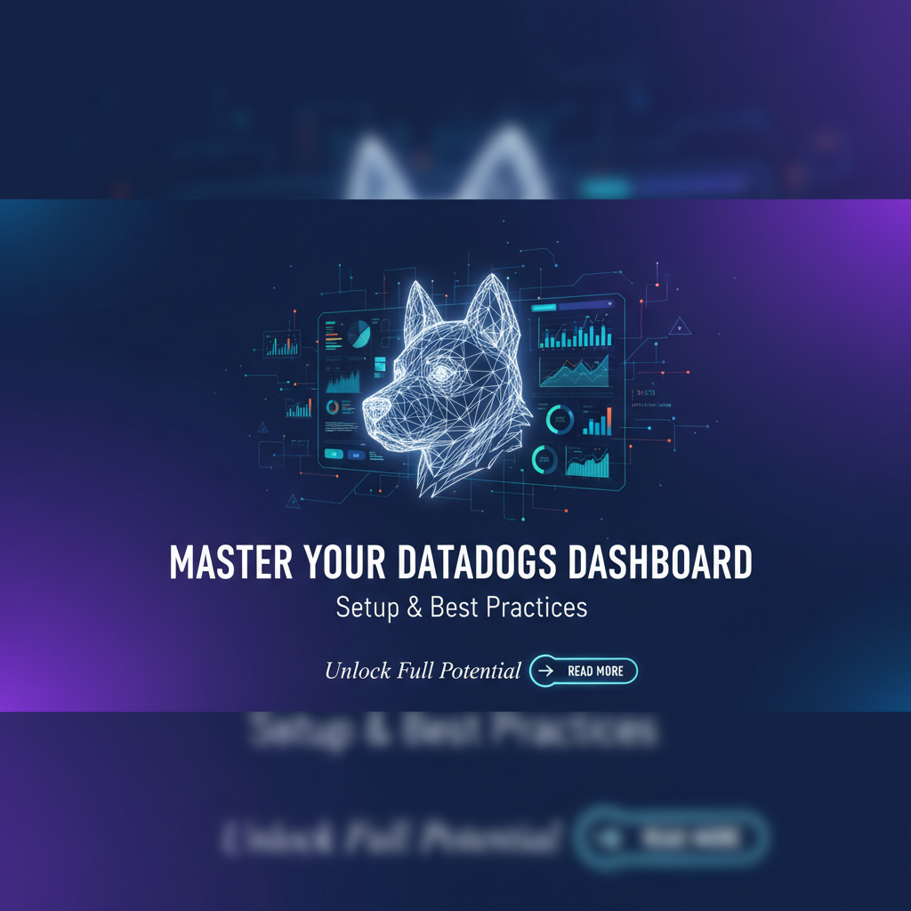
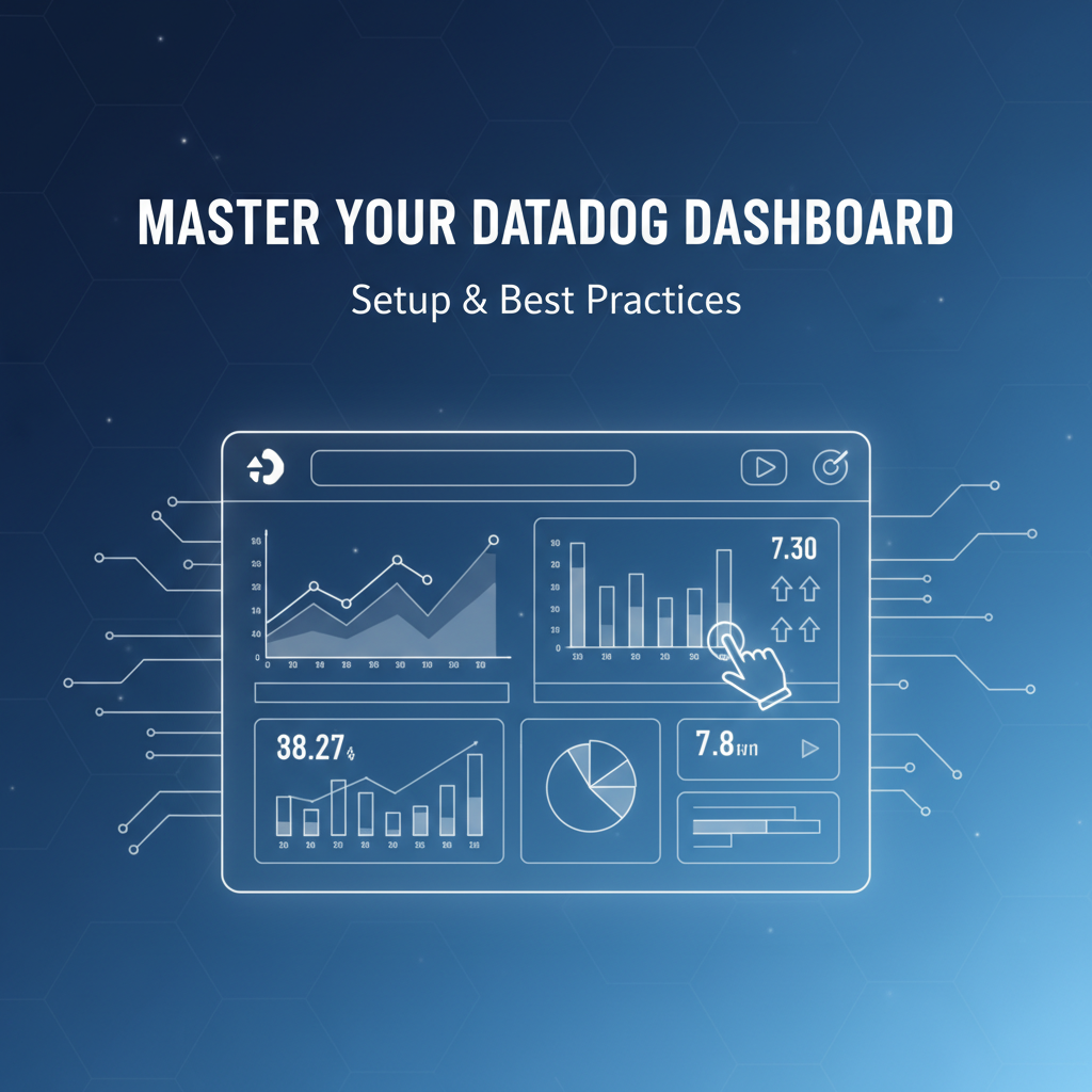
Master Your Datadogs Dashboard: Setup & Best Practices


In the fast-paced world of modern software development and operations, understanding the health, performance, and behavior of your applications and infrastructure is paramount. As systems grow in complexity, distributed architectures become the norm, and the sheer volume of data generated by logs, metrics, and traces can be overwhelming. This is where a robust observability platform like Datadog shines, and at its heart lies the powerful, customizable dashboard.
A Datadog dashboard isn't merely a collection of graphs; it's a dynamic, interactive canvas that transforms raw data into actionable insights. It serves as your single pane of glass, allowing teams—from developers and SREs to business stakeholders—to visualize trends, identify anomalies, troubleshoot issues, and make informed decisions in real-time. Mastering your Datadog dashboards means moving beyond basic visualizations to craft comprehensive, intelligent views that drive operational excellence and business success.
This comprehensive guide will take you on a journey through the intricate world of Datadog dashboards. We will delve into every aspect, from the foundational steps of setting up your first dashboard to adopting advanced techniques and adhering to industry best practices. Our aim is to empower you to design dashboards that are not only aesthetically pleasing but also profoundly insightful, ensuring you extract maximum value from your monitoring investments. Prepare to transform your approach to system visibility and unlock the full potential of Datadog.
Chapter 1: The Foundation – Getting Started with Datadog and Its Observability Paradigm
Before we dive into the specifics of dashboard construction, it’s essential to grasp the fundamental role Datadog plays in modern observability. Understanding its core philosophy will inform every decision you make when designing your monitoring views.
1.1 What is Datadog and Why Does it Matter?
Datadog is a comprehensive monitoring and analytics platform for cloud-scale applications. It provides a unified view across an entire technology stack, encompassing infrastructure, applications, logs, and user experience. Unlike siloed monitoring tools, Datadog aggregates data from diverse sources into a single platform, enabling correlations across different telemetry types. This holistic approach is critical for distributed systems where a problem in one component can cascade across many others, making root cause analysis challenging without integrated insights.
The platform collects metrics, events, logs, and traces from servers, containers, databases, cloud providers, and custom applications. It then processes, aggregates, and visualizes this data, offering features such as:
- Infrastructure Monitoring: Real-time visibility into hosts, VMs, and containers.
- Application Performance Monitoring (APM): End-to-end tracing of requests across services.
- Log Management: Centralized log collection, processing, and analysis.
- Synthetic Monitoring: Proactive testing of application availability and performance.
- Real User Monitoring (RUM): Insight into actual user experience on web and mobile applications.
- Network Performance Monitoring: Visibility into network traffic and connectivity.
- Security Monitoring: Threat detection and compliance monitoring.
This rich tapestry of data is what feeds your Datadog dashboards, making them indispensable tools for operational awareness.
1.2 Why Datadog Dashboards are Crucial for Modern Operations
In an environment where microservices communicate asynchronously, serverless functions execute ephemerally, and infrastructure scales dynamically, static monitoring views are insufficient. Datadog dashboards offer:
- Centralized Visibility: A single place to view the health of your entire stack, eliminating the need to jump between multiple tools. This is especially vital for incident response, where every second counts. Teams can quickly determine if an issue is application-related, infrastructure-related, or even external, saving precious time during an outage.
- Real-time Insights: Dashboards update in real-time, providing an immediate snapshot of current system performance. This enables proactive identification of emerging issues before they escalate into major incidents. For instance, a sudden spike in error rates or a gradual increase in latency can be spotted and addressed before users are significantly impacted.
- Customization for Specific Needs: Different teams have different monitoring priorities. Developers might focus on application-level metrics, while operations teams might prioritize infrastructure health. Dashboards can be tailored to these specific needs, ensuring each team has access to the most relevant information for their role. This reduces cognitive load and improves efficiency.
- Historical Analysis and Trend Identification: Beyond real-time, dashboards allow you to review historical data, identify long-term trends, and track the impact of deployments or configuration changes. This is crucial for capacity planning, performance optimization, and understanding the longevity of system behavior. Patterns of degradation or improvement over weeks or months become readily apparent.
- Collaboration and Communication: Dashboards serve as a common language for technical and non-technical stakeholders. They facilitate discussions during incident reviews, stand-ups, and capacity planning meetings. A well-designed dashboard can communicate complex system states clearly, fostering better collaboration across teams.
- Proactive Problem Detection: By visualizing key metrics against predefined thresholds or historical baselines, dashboards can help detect anomalies that might indicate an impending problem. While alerts notify you, dashboards provide the context and breadth to understand the scope and potential impact.
1.3 Setting Up Your Datadog Account and Agent Installation (A Brief Overview)
Before you can build your magnificent dashboards, you need data. This involves two primary steps:
- Account Creation: Navigate to the Datadog website and sign up for an account. Datadog offers a free trial, allowing you to explore its capabilities without commitment.
- Datadog Agent Installation: The Datadog Agent is a lightweight, open-source software that runs on your hosts (servers, containers, serverless environments, etc.) and collects metrics, logs, and traces. It sends this data back to Datadog HQ. Installation methods vary depending on your environment (Linux, Windows, Kubernetes, Docker, AWS EC2, Azure VMs, GCP instances, etc.), but typically involve a single command-line script or container deployment. The Agent is highly configurable, allowing you to specify which metrics to collect, which logs to tail, and how traces should be gathered from your applications.
Once the Agent is running and reporting, you'll start seeing data populate in your Datadog account, ready for visualization on your dashboards. Datadog also offers numerous integrations with cloud providers (AWS, Azure, GCP), databases (PostgreSQL, MySQL, MongoDB), web servers (Nginx, Apache), and messaging queues (Kafka, RabbitMQ), which often involve simple configuration steps within the Datadog UI to start collecting high-level service metrics. These integrations dramatically expand the scope of data available for your dashboards without requiring manual Agent configuration for every service.
Chapter 2: Dashboard Fundamentals – Building Your First Dashboard
With data flowing into Datadog, you're ready to embark on the exciting journey of building your first dashboard. This chapter will walk you through the essential steps, from navigating the UI to selecting appropriate widget types and configuring your data sources.
2.1 Navigating the Datadog Dashboard UI
The Datadog UI is designed for intuitive exploration, yet its depth can be intimidating initially. To access dashboards:
- Main Navigation: On the left sidebar, click on "Dashboards". This will lead you to a list of all your existing dashboards.
- Dashboard List: Here you can search, filter, and star your favorite dashboards for quick access. You'll also see options to create a "New Dashboard".
- Dashboard Types: Datadog offers two primary dashboard types:
- Timeboard: Ideal for viewing time-series data, comparing trends, and performing historical analysis. Most of your dashboards will likely be timeboards.
- Screenboard: A free-form canvas allowing for more flexible placement of widgets, including text, images, and non-time-series data. Useful for operational runbooks, status pages, or high-level overviews. For the purpose of this guide, we will primarily focus on Timeboards due to their prevalence in monitoring.
When you create a new dashboard, you'll be presented with a blank canvas. The top bar provides options for naming your dashboard, setting its global timeframe, and sharing/exporting. The right sidebar is where you add and configure widgets.
2.2 Choosing the Right Widget Types for Your Data
Widgets are the building blocks of your dashboards. Each widget type is designed to visualize specific kinds of data effectively. Selecting the correct widget is crucial for conveying information clearly and succinctly.
Here's a breakdown of common and highly useful widget types:
- Timeseries: The most common widget. Displays how a metric changes over time. Essential for tracking CPU utilization, request latency, error rates, and any other data point that fluctuates over time. You can plot multiple metrics on the same graph, use different aggregations (average, sum, max, min, count), and apply mathematical functions.
- Top List: Shows a ranked list of items (e.g., top 10 hosts by CPU, top 5 services by error rate). Excellent for identifying resource hogs or problematic entities at a glance. You can configure the number of items to display and the metric by which they are ranked.
- Host Map: Provides a visual representation of your hosts, colored and sized according to a chosen metric. Great for quickly spotting outliers or clusters of unhealthy hosts in large infrastructures.
- Table: Displays raw or aggregated data in a tabular format. Useful for detailed views, specific log attributes, or summarizing key metrics from multiple sources.
- Heatmap: Visualizes the distribution of a metric over time or across different dimensions. Excellent for latency percentiles, queue depths, or any metric where you want to see the spread of values rather than just the average.
- Distribution: Shows the distribution of values for a single metric at a specific point in time. Useful for understanding latency distributions (e.g., are most requests fast, or are there significant outliers?).
- Gauge: Displays a single, current value of a metric. Ideal for showing critical, real-time metrics like current active users, remaining disk space, or a single SLO status.
- Query Value: Similar to Gauge but more flexible, allowing you to display the result of a specific query (e.g., the total number of errors in the last 5 minutes).
- Log Stream: Displays a live stream or historical view of logs, filtered by specific queries. Crucial for debugging and understanding what happened around an event.
- Trace List/Flame Graph: Integrates APM traces directly into your dashboard, allowing you to see recent traces for a service or jump directly to a flame graph for performance analysis.
- Event Stream: Shows a stream of events from your Datadog account (deployments, alerts, custom events). Helps correlate system changes with performance shifts.
- Text: Simple markdown editor for adding context, explanations, or runbook links to your dashboard. Invaluable for making dashboards self-explanatory.
- Image: Embeds an image, useful for diagrams or company logos.
Choosing the right widget involves asking: "What story am I trying to tell with this data?" and "Who is the audience for this information?"
2.3 Adding Data Sources: Metrics, Logs, and Traces
Once you select a widget, you need to tell it what data to display. Datadog's power lies in its ability to combine different telemetry types on a single dashboard.
- Metrics: The most common data source. When you add a Timeseries widget, for example, you'll be prompted to write a metric query. Datadog's query language is highly flexible.
- Basic Query:
system.cpu.idle(shows the idle CPU percentage across all hosts). - Filtering:
system.cpu.idle{host:web-01}(idle CPU for a specific host). - Grouping:
system.cpu.idle by {host}(separate lines for each host). - Aggregations:
avg:system.cpu.idle(average idle CPU). - Functions:
anomalies(avg:system.cpu.idle, 'basic', 2)(detects anomalies in CPU usage). - Arithmetic:
100 - avg:system.cpu.idle(CPU utilization). - Wildcards:
system.cpu.idle{host:web-*}(all hosts starting with 'web-'). - Tags: Tags are critical for effective querying. Datadog automatically assigns tags (like
host,aws_account,service,env), and you can add custom tags. These tags allow you to scope your queries precisely. For example,avg:aws.ec2.cpuutilization{environment:production,region:us-east-1}retrieves data only from production EC2 instances in a specific region.
- Basic Query:
- Logs: For Log Stream widgets, you'll use Datadog's log search syntax.
- Basic Search:
status:error(all logs with "error" status). - Facets:
service:webapp @http.status_code:[500 TO *](logs from 'webapp' service with 5xx status codes). - Keywords:
message: "connection refused"(logs containing specific text). - Combined:
service:payment-processor status:error message:"timeout"(very specific log filtering).
- Basic Search:
- Traces (APM): For Trace List or Flame Graph widgets, you'll query based on APM service, resource, status, or other span attributes.
- Example:
service:my-api-service resource:"/techblog/en/users/{id}" @http.status_code:500(traces for a specific API endpoint returning 500 errors).
- Example:
The ability to interweave these data sources on a single dashboard provides a truly contextual understanding of your system's state. You might have a timeseries graph showing application latency, a log stream showing errors from that application, and a trace list showing specific slow requests, all on one screen.
2.4 Basic Configuration: Timeframes and Scopes
Every dashboard has a global timeframe selector (e.g., "Past 1 hour," "Past 4 hours," "Past 1 day"). This allows you to quickly adjust the scope of all time-series widgets on the dashboard. You can also define custom timeframes.
Additionally, many widgets allow for their own specific timeframes, overriding the global setting. This is useful if you want a particular graph to always show a broader historical context (e.g., "Past 7 days") while the rest of the dashboard focuses on real-time activity.
Scopes are defined through your queries using tags. By consistently applying tags to your hosts, services, and cloud resources, you can easily filter entire dashboards or individual widgets to focus on specific environments (e.g., env:production), regions (region:us-west-2), or teams (team:frontend). This makes dashboards highly reusable and adaptable to different needs.
A powerful feature is the ability to share a dashboard with a specific global scope already applied in the URL, allowing you to provide deep links to pre-filtered views.
| Widget Type | Best Use Case | Data Source Focus | Example Query Context |
|---|---|---|---|
| Timeseries | Tracking metric trends over time | Metrics | avg:system.cpu.idle by {host} |
| Top List | Identifying top performers or resource consumers | Metrics | top(avg:aws.ec2.cpuutilization, 10, 'sum', 'desc') |
| Host Map | Visualizing host health across an infrastructure | Metrics (e.g., CPU, Memory) | avg:system.cpu.usage |
| Table | Displaying raw data, aggregates, or log attributes | Metrics, Logs | sum:nginx.requests.count by {status_code} (for metrics)service, http.status_code, message (for logs) |
| Heatmap | Analyzing metric distribution (e.g., latency percentiles) | Metrics | avg:trace.servlet.request.duration.p99 |
| Log Stream | Real-time log monitoring and troubleshooting | Logs | status:error service:payment |
| Trace List | Viewing recent APM traces for a service | Traces (APM) | service:user-api @http.method:POST @http.status_code:[500 TO *] |
| Text | Adding context, runbook links, or instructions | N/A | Markdown for descriptions, links |
This table provides a concise overview of how different widgets serve distinct purposes, guiding you in selecting the most effective visualization for your data storytelling.
Chapter 3: Advanced Dashboard Techniques – Elevating Your Monitoring Strategy
Once you've mastered the basics, it's time to unlock the true power of Datadog dashboards through advanced techniques. These methods enable you to create dynamic, interconnected, and highly contextual monitoring views.
3.1 Templated Variables: Dynamic Dashboards for Diverse Scenarios
One of Datadog's most powerful features for creating flexible and reusable dashboards is templated variables. Instead of building separate dashboards for each environment, region, or service, you can create a single "templated" dashboard that can be dynamically filtered using dropdown menus.
How it works: You define variables (e.g., environment, service, host) and then use these variables in your widget queries. For instance, instead of {env:production}, you would use {$environment}. At the top of your dashboard, Datadog renders dropdowns for each variable, allowing users to select values and instantly update all widgets on the dashboard to reflect that selection.
Benefits:
- Reusability: Create one dashboard template and apply it across all your environments (development, staging, production), regions, or specific services.
- Reduced Dashboard Sprawl: Fewer dashboards to maintain and navigate, improving discoverability.
- Contextual Filtering: Users can quickly narrow down the data to specific areas of interest during an investigation.
- Consistency: Ensures that all teams are looking at the same set of metrics and visualizations, just for different contexts.
Example Use Cases:
- Environment Selector: A dropdown for
env(production,staging,dev). - Service Selector: A dropdown for
service(e.g.,user-auth,payment-processor,notification-service). - Region Selector: For multi-region deployments.
- Custom Tags: Any tag you define in Datadog can be used as a templated variable, offering immense flexibility.
To implement templated variables, simply click the "Add variable" button on your dashboard, define the variable name and query (e.g., tags.env, tags.service), and then replace static tag values in your widget queries with $ followed by your variable name (e.g., avg:system.cpu.idle{$host}).
3.2 Composite Dashboards: Linking Related Data for Deeper Dives
While templated variables allow you to filter a single dashboard dynamically, composite dashboards enable you to link multiple related dashboards together for a more structured drill-down experience. This is invaluable when you have a high-level overview dashboard and want to provide quick access to more detailed views without cluttering the main screen.
How it works: You can place links (using text widgets or other interactive elements) on your primary dashboard that navigate to secondary dashboards. Crucially, these links can carry over the context from the primary dashboard, such as the selected timeframe or templated variable values.
Benefits:
- Hierarchical Monitoring: Create a logical flow from high-level summaries to granular details. For instance, an "Infrastructure Overview" dashboard could link to a "Detailed Host Metrics" dashboard or a "Kubernetes Pod Health" dashboard, carrying over the selected host or namespace.
- Focused Views: Each dashboard remains focused on a specific aspect, making them easier to digest.
- Efficient Troubleshooting: During an incident, teams can quickly navigate from a broad issue identification to a deep-dive analysis by following logical links.
Example: Imagine an "Overall Application Health" dashboard. If you see a latency spike in your payment-processor service, a text widget on that dashboard could link to a "Payment Processor Deep Dive" dashboard, automatically passing the service:payment-processor context and the incident's timeframe. This ensures the linked dashboard immediately displays relevant data without manual re-filtering.
To implement this, you'll construct a URL for the target dashboard, including parameters for templated variables or timeframes (e.g., https://app.datadoghq.com/dashboard/my-dashboard-id?tpl_var_service=payment-processor&from_ts=1678886400&to_ts=1678890000). Datadog's UI often provides tools to easily generate these contextual URLs.
3.3 Log Management Integration: Contextual Troubleshooting
Logs are the narrative of your systems, detailing every event, error, and interaction. Integrating logs directly into your Datadog dashboards provides critical context for understanding metric anomalies or performance degradations.
Techniques:
- Log Stream Widgets: Add a "Log Stream" widget filtered by relevant tags (e.g.,
service:my-api-service,env:production). This allows you to see a live tail of logs or historical logs corresponding to the dashboard's timeframe. When a metric spikes, you can immediately check the correlated logs for error messages, warnings, or specific events. - Log Analytics Integration: Beyond just streaming logs, you can use log queries to power metric-like visualizations. For example, you can count the number of log events with
status:errorover time and display it as a timeseries graph, effectively turning log data into a custom metric. This is powerful for tracking error trends or specific event occurrences. - Log Facets/Attributes in Tables: Use a table widget to display aggregated log data, showing the top 10 error messages or the count of specific log attributes like
http.status_codefor your api endpoints.
By having metrics and logs side-by-side, your dashboard becomes a powerful troubleshooting workstation. A peak in aws.elb.httpcode_elb_5xx on your load balancer metric can be instantly correlated with service:webserver status:error logs in the same timeframe, leading to faster root cause identification.
3.4 Trace Integration: Performance Bottleneck Identification
Application Performance Monitoring (APM) provides detailed insights into individual requests, showing how they traverse through your services and highlighting latency bottlenecks. Integrating traces into your dashboards completes the observability picture.
Techniques:
- Trace List Widgets: Display a list of recent traces for a particular service or endpoint. You can filter these by duration, status (e.g., error traces), or specific tags.
- Service Overview Widgets: For a high-level view, use the "Service Summary" or "Service Map" widgets to show the health and dependencies of your services based on APM data.
- Latency Distribution with Heatmaps: Use a heatmap widget powered by APM metrics (e.g.,
trace.servlet.request.duration.p99ortrace.database.query.duration.p95) to visualize latency percentiles over time, making it easy to spot periods of degraded performance. - Direct Trace Links: From log entries or error messages on your dashboard, you can often click to jump directly to the correlated APM trace in Datadog, providing a full flame graph breakdown of the request's execution path. This drill-down capability is invaluable for debugging performance issues.
A comprehensive dashboard might show CPU usage (infrastructure), API latency (metrics), error logs (logs), and slow traces (APM) for a critical service. When a problem arises, you have all the necessary context at your fingertips, reducing the Mean Time To Resolution (MTTR).
3.5 Synthetic Monitoring Widgets
Synthetic Monitoring proactively tests your application's availability and performance from various global locations. Integrating these results into your dashboards provides an external, user-centric view of your service health.
Techniques:
- Synthetic Test Status Widgets: Display the current status of your key synthetic tests (e.g., an uptime check for your main website, an API endpoint check for your microservice). This immediately tells you if your application is accessible and functioning correctly from an external perspective.
- Latency Graphs: Plot the response time of your synthetic tests over time. This helps you track performance degradation over time as experienced by your users, independent of internal server metrics.
- Error Rate Visualizations: Show the percentage of synthetic tests that are failing. This can be a leading indicator of an outage before internal monitoring fully registers the impact.
By combining internal system metrics with external synthetic checks, your dashboards offer a balanced view, ensuring both operational teams and business stakeholders are aware of end-user impact.
3.6 SLO/SLA Dashboards
Service Level Objectives (SLOs) and Service Level Agreements (SLAs) are crucial for defining and measuring reliability. Datadog allows you to define SLOs based on metrics, logs, or synthetics. Integrating these into your dashboards provides a clear, real-time view of your adherence to these critical targets.
Techniques:
- SLO Status Widgets: Datadog offers dedicated widgets to display the current status of your SLOs, including their error budget burn rate and remaining budget. This allows teams to quickly see if they are on track to meet their reliability targets.
- Error Budget Burn Rate Graphs: Visualize how quickly your error budget is being consumed. A steep increase in the burn rate is a strong indicator of an ongoing or emerging incident that requires immediate attention.
- Historical SLO Performance: Display trends of your SLO attainment over longer periods, helping teams understand overall reliability patterns and the impact of changes.
These dashboards shift the focus from simply "is it working?" to "is it working reliably enough for our users/business?" They are invaluable for communication between engineering teams and business stakeholders, providing a common language for reliability.
APIPark is a high-performance AI gateway that allows you to securely access the most comprehensive LLM APIs globally on the APIPark platform, including OpenAI, Anthropic, Mistral, Llama2, Google Gemini, and more.Try APIPark now! 👇👇👇
Chapter 4: Best Practices for Effective Datadog Dashboards
Building a dashboard is easy; building an effective dashboard requires thought and adherence to best practices. A poorly designed dashboard can be as unhelpful as no dashboard at all, leading to information overload, confusion, and delayed incident response.
4.1 Clarity and Simplicity: Less is More
The primary goal of any dashboard is to convey information quickly and unambiguously. Overloading a dashboard with too many widgets, metrics, or overly complex graphs defeats this purpose.
- Focus on Key Metrics: Identify the most critical metrics that represent the health and performance of the system you're monitoring. For example, for a web service, these might be latency, error rate, throughput, and saturation (LETS method).
- Eliminate Clutter: Each widget should serve a purpose. If a graph consistently shows flat lines or provides redundant information, remove it. Use whitespace effectively to separate logical groups of widgets.
- Use Clear Titles and Labels: Every widget needs a descriptive title. Graph axes should be clearly labeled. Use understandable metric names instead of raw, cryptic identifiers.
- Consistent Color Schemes: If possible, use consistent colors for similar metrics across different graphs (e.g., always use red for errors, green for success). Datadog allows custom colors for individual series.
- Appropriate Visualization: Choose the widget type that best represents the data. A timeseries for trends, a top list for rankings, a gauge for single critical values. Avoid using a timeseries for a single static number, for instance.
4.2 Actionability: What Do I Do Next?
An effective dashboard doesn't just show a problem; it guides you towards understanding and resolving it. Every graph should prompt a question or suggest a next step.
- Thresholds and Baselines: Configure warning and critical thresholds on your graphs. These visual cues immediately highlight when a metric is out of its normal operating range. Even better, use Datadog's anomaly detection functions to highlight deviations from learned normal behavior.
- Contextual Links: As discussed with composite dashboards, embed links to runbooks, documentation, related dashboards, or even external tools (like incident management platforms) directly on the dashboard. This transforms the dashboard from a static display into an interactive operational tool.
- Error Budgets: If using SLOs, display error budget burn rates. This tells teams not just that an error is occurring, but how significantly it's impacting their reliability targets.
- Correlate, Don't Just Display: Arrange widgets so that related information is grouped together. For example, CPU utilization, memory usage, disk I/O, and network traffic for a single host should be physically close on the dashboard. This allows for quick correlation during troubleshooting.
4.3 Audience-Specific Dashboards
Not everyone needs the same level of detail or the same metrics. Tailor your dashboards to the specific audience that will be using them.
- Executive Dashboards: High-level, aggregated views focused on business impact, key performance indicators (KPIs), and service-level objectives (SLOs). Minimal technical jargon.
- Operations/SRE Dashboards: Comprehensive views of system health, critical infrastructure metrics, and proactive alerting. Focus on identifying and triaging incidents.
- Developer Dashboards: Detailed application-level metrics, error rates, trace data, and logs for specific services or features. Designed for deep-dive debugging and understanding code performance.
- Team-Specific Dashboards: Each team should have dashboards focused on the services and infrastructure they own. These might include application-specific metrics, relevant third-party API performance, and deployment-related data.
This approach prevents information overload and ensures that each user group receives the most relevant information efficiently.
4.4 Consistent Naming Conventions and Tagging Strategy
Scalable monitoring relies heavily on consistent metadata.
- Metric Naming: Adopt a standardized naming convention for custom metrics (e.g.,
service.component.metric_name.unit). Datadog's built-in metrics already follow a convention (e.g.,system.cpu.idle). - Dashboard Naming: Use clear, descriptive names that indicate the dashboard's purpose and scope (e.g.,
[Service] Frontend API Overview - Prod,[Infra] Kubernetes Cluster Health - Dev). - Robust Tagging: Tags are the backbone of Datadog's filtering and aggregation capabilities.
- Mandatory Tags: Enforce tags like
env(production, staging, dev),service,team,region,host_type. - Automation: Automate tag assignment through your CI/CD pipelines, configuration management tools, or cloud provider integrations.
- Consistency: Ensure tags are consistently applied across all your infrastructure and applications. Inconsistent tagging will lead to fragmented data and difficulty in querying. A well-thought-out tagging strategy is perhaps the most critical component for maintaining sanity in a large Datadog deployment, enabling you to slice and dice data precisely as needed.
- Mandatory Tags: Enforce tags like
4.5 Regular Review and Refinement
Dashboards are not "set it and forget it" tools. Systems evolve, priorities change, and new insights emerge.
- Scheduled Reviews: Periodically review your dashboards (e.g., monthly, quarterly). Ask: Is this dashboard still relevant? Are all widgets useful? Is anything missing? Are there any metrics that have become noisy or irrelevant?
- Post-Incident Analysis: After an incident, revisit the dashboards used for troubleshooting. Identify gaps in visibility or areas where information was unclear. Use these insights to improve existing dashboards or create new ones.
- User Feedback: Gather feedback from the teams using the dashboards. What do they find useful? What causes confusion? What data would help them more? A dashboard that isn't used effectively by its target audience is a wasted effort.
4.6 Alerting and Thresholds (Complementary to Dashboards)
While dashboards visualize data, alerts act upon it. They are two sides of the same coin.
- Dashboard-Driven Alerts: Often, you'll identify patterns on a dashboard that warrant an alert. For example, if you see a metric consistently spiking above a certain value, you should configure an alert for it.
- Contextual Alerts: Ensure your alerts link back to relevant dashboards. When an alert fires, the recipient should be able to click a link and immediately land on a dashboard providing full context for the issue.
- Noise Reduction: Fine-tune alert thresholds to minimize false positives. Too many alerts lead to alert fatigue, making teams ignore actual critical issues. Use Datadog's anomaly detection and forecast monitors to create more intelligent, adaptive alerts.
4.7 Documentation
Even the most intuitive dashboard benefits from documentation.
- In-Dashboard Text Widgets: Use text widgets to explain complex metrics, define what "normal" looks like, or provide links to relevant documentation or runbooks.
- External Documentation: Maintain a wiki or knowledge base that lists all dashboards, their purpose, the metrics they display, and who maintains them. This is especially useful for onboarding new team members.
Chapter 5: Optimizing Performance and Cost in Datadog Dashboards
As your Datadog usage grows, managing performance and cost becomes increasingly important. Dashboards, especially those with many complex widgets, can contribute to these factors. Thoughtful design can mitigate potential issues.
5.1 Metric Granularity and Data Retention
Datadog stores metrics at different levels of granularity depending on their age. Newer data has higher resolution (e.g., 10-second intervals), while older data is downsampled (e.g., 1-minute, then 1-hour averages).
- Querying Older Data: Be aware that queries over long timeframes (months, years) will use downsampled data. This is usually fine for trend analysis but may lack the precision needed for granular incident investigation far in the past.
- Custom Metrics Cost: Datadog charges based on the number of custom metrics ingested. Each unique combination of a metric name and its tags counts as a separate "custom metric." Be judicious about creating custom metrics, ensuring each one provides actionable value. Avoid metrics that are overly high-cardinality (e.g., a unique ID for every user action) unless absolutely necessary, as these can quickly escalate costs.
- Data Retention Policies: While Datadog manages standard metric retention, understanding how different data types (metrics, logs, traces) are retained and how this impacts your queries and costs is crucial. Adjust your log retention policies, for instance, based on compliance needs and troubleshooting windows.
5.2 Dashboard Load Times
A dashboard with dozens of complex queries, especially over long timeframes, can take a long time to load. This frustrates users and hinders quick decision-making.
- Simplify Complex Queries: Break down overly complex queries into simpler ones if possible, or refactor them for efficiency.
- Reduce Widget Count: Consider if every widget is truly essential. Can some be moved to a drill-down dashboard?
- Optimize Timeframes: Default your dashboards to shorter, real-time friendly timeframes (e.g., "Past 1 hour"). Users can always expand the timeframe if needed. Avoid making "Past 7 days" the default for an operational dashboard.
- Consolidate Data: If multiple widgets use very similar queries, see if they can be combined or simplified.
- Browser Performance: While largely out of your control, be mindful that very large dashboards can strain browser resources.
5.3 Effective Tagging Strategy for Cost Control and Query Efficiency
As mentioned, tagging is vital for organization. It's also a key factor in cost and performance.
- Avoid High-Cardinality Tags: Tags with a very large number of unique values (e.g., user ID, request ID, session ID) should be used with extreme caution on metrics. Each unique tag value creates a new metric series, significantly increasing metric count and cost. If you need to search on high-cardinality data, logs and traces are generally more suitable.
- Standardize Tag Keys: Use a consistent set of tag keys across your organization. This makes querying much easier and reduces the chance of creating duplicate metrics due to different casing or spelling of tag keys.
- Regular Tag Audits: Periodically review your tags to ensure they are still relevant and being applied correctly. Remove obsolete tags to keep your metric count lean.
- Use Metrics, Logs, Traces Appropriately: Understand the strengths of each telemetry type. Metrics are for aggregation and trending. Logs are for detailed events and debugging specific occurrences. Traces are for end-to-end request flows and performance bottlenecks. Don't try to cram detailed event data into metrics using high-cardinality tags; use logs instead.
5.4 Data Retention Policies
While Datadog provides default retention periods, understanding these is important for cost management and ensuring you have the data you need for historical analysis.
- Metrics: Datadog typically retains granular metrics for 15 months, with longer retention for aggregated data. Most operational dashboards focus on recent data, but for yearly trends, you'll be using aggregated points.
- Logs: Log retention can be configured, often impacting cost significantly. Retain logs for as long as necessary for compliance, troubleshooting, and auditing, but avoid indefinite retention of all logs to control costs. Use Datadog's log indexes and archives effectively.
- Traces: Trace retention also varies and can be configured. Keep traces for a period relevant to your debugging and performance analysis cycles.
By consciously managing these aspects, you can ensure your Datadog dashboards remain performant, cost-effective, and provide accurate insights without unnecessary overhead.
Chapter 6: Integrating Datadog with Your Broader Ecosystem
Datadog's strength lies not only in its comprehensive data collection but also in its ability to integrate with and provide insights into your entire technology stack. This includes your custom applications, third-party services, and the crucial components that manage inter-service communication.
6.1 Datadog's Extensibility: Beyond Standard Integrations
While Datadog offers hundreds of out-of-the-box integrations, the real world often requires monitoring unique components or custom applications.
- Custom Metrics: You can send custom metrics to Datadog using various methods:
- Datadog Agent: The Agent can be configured to collect metrics from custom scripts, applications using StatsD or DogStatsD clients, or by tailing application logs for specific patterns.
- Datadog API: Your applications can directly send metrics to the Datadog API using client libraries. This is useful for capturing application-specific KPIs or internal business metrics.
- Lambda/Cloud Functions: For serverless environments, custom metrics can be sent from Lambda functions using Datadog's serverless libraries.
- Custom Checks: The Datadog Agent can run custom Python scripts to perform specific health checks or collect metrics not covered by standard integrations. This allows you to monitor very niche components of your infrastructure or application.
- Event Generation: Send custom events to Datadog to mark deployments, configuration changes, or significant application events. These events appear on dashboards, correlating system performance with specific actions. This is invaluable for understanding the impact of deployments on performance.
By leveraging these extensibility options, you ensure that even your most unique systems contribute data to your comprehensive Datadog dashboards, providing a truly unified view.
6.2 Monitoring API-Driven Architectures and API Gateways
In modern distributed systems, communication between services predominantly happens through APIs. Monitoring these APIs is critical for understanding application performance, user experience, and overall system health. Datadog provides robust capabilities for this, but the underlying infrastructure for managing these APIs also warrants attention.
Many organizations employ an API gateway to manage inbound and outbound API traffic. An API gateway acts as a central gateway for all requests to your microservices or external services, offering crucial functionalities such as:
- Authentication and Authorization: Securing access to your APIs.
- Rate Limiting and Throttling: Protecting your backend services from overload.
- Routing and Load Balancing: Directing requests to the appropriate services.
- Request/Response Transformation: Modifying data formats.
- Caching: Improving performance.
- Observability: Providing its own metrics and logs about API traffic.
Monitoring your API gateway with Datadog is therefore paramount. You'll want to track metrics like:
- Request Latency: How long the gateway takes to process requests.
- Error Rates: Percentage of 4xx and 5xx errors generated or forwarded by the gateway.
- Throughput: Number of requests per second handled by the gateway.
- CPU and Memory Usage: Resource consumption of the gateway itself.
- Specific API Endpoint Performance: Often, API gateway logs can be parsed to extract metrics per API endpoint, allowing you to create dashboards showing the performance of individual APIs.
By visualizing these metrics on your Datadog dashboards, you gain invaluable insights into the health of your entire API ecosystem. If the API gateway becomes a bottleneck or starts generating errors, it can impact every service behind it, making its monitoring a top priority.
6.3 Specialized API Management and AI Gateways
For organizations dealing with highly complex API ecosystems, especially those integrating numerous AI models or managing a broad portfolio of REST services, specialized tools offer dedicated solutions that complement Datadog's monitoring capabilities.
For example, APIPark is an open-source AI gateway and API management platform. It's designed to help developers and enterprises manage, integrate, and deploy AI and REST services with ease. APIPark functions as a unified AI gateway, providing features like:
- Quick Integration of 100+ AI Models: Centralized management for various AI providers.
- Unified API Format for AI Invocation: Standardizes requests, abstracting away underlying AI model changes.
- Prompt Encapsulation into REST API: Turns AI models with custom prompts into new, manageable APIs.
- End-to-End API Lifecycle Management: From design and publication to invocation and decommission.
- Performance Rivaling Nginx: Designed for high throughput and cluster deployment.
- Detailed API Call Logging and Data Analysis: Provides comprehensive logs and analytics for all API interactions.
When data flowing through your systems originates from or interacts with such sophisticated API infrastructures managed by platforms like APIPark, your Datadog dashboards become even more critical. You might monitor:
- Metrics exported by APIPark itself (e.g., API call rates, latency for AI model invocations, error counts from the gateway).
- Logs from APIPark for specific API errors, authentication failures, or rate limit breaches.
- The performance of the services interacting with APIPark's managed APIs.
This highlights a collaborative ecosystem: APIPark manages and streamlines the complex world of AI and REST APIs, providing a robust and performant gateway, while Datadog consumes the telemetry from APIPark and the services it connects to, offering the overarching observability and visualization needed for operational and business insights. Your Datadog dashboards then serve as the ultimate lens through which the health and performance of this entire integrated system are viewed, enabling proactive issue resolution and continuous optimization.
Conclusion: Empowering Your Teams with Mastered Datadog Dashboards
Mastering your Datadog dashboards is more than just learning how to drag and drop widgets; it's about cultivating a mindset of informed decision-making, proactive problem-solving, and continuous improvement. By embracing the foundational principles, leveraging advanced techniques, and adhering to best practices, you transform your monitoring from a reactive chore into a powerful, strategic asset.
Well-crafted dashboards empower every team member, from the front-line engineer to the CTO, with the clarity and context needed to understand complex systems. They facilitate rapid incident response by pinpointing anomalies and providing the necessary drill-down capabilities. They foster collaboration by offering a shared, consistent view of reality. And crucially, they drive innovation by providing insights into performance bottlenecks, user experience challenges, and the effectiveness of new deployments.
The journey to dashboard mastery is ongoing. As your systems evolve, your monitoring needs will too. Regular review, refinement, and a commitment to integrating new data sources—whether from custom applications, the performance of your API gateway, or specialized platforms like APIPark managing your AI APIs—will ensure your Datadog dashboards remain at the forefront of your observability strategy.
Invest the time to design, optimize, and iterate on your dashboards. The dividends, in terms of reduced MTTR, improved system reliability, enhanced team efficiency, and ultimately, greater business success, will be immeasurable. Your Datadog dashboards are your eyes and ears into the digital heart of your organization; make sure they are clear, concise, and constantly telling you the most important stories.
5 Frequently Asked Questions (FAQs) about Datadog Dashboards
1. What is the difference between a Datadog Timeboard and a Screenboard?
A Timeboard is designed for time-series data visualization, focusing on trends and historical analysis over a defined period. It automatically aligns widgets in a grid, making it ideal for operational monitoring, performance tracking, and incident response. A Screenboard, on the other hand, is a free-form canvas allowing for more flexible placement of widgets, including text, images, and non-time-series data. Screenboards are often used for status pages, runbooks, or high-level overviews where visual layout takes precedence over strict time-series comparisons.
2. How can I make my Datadog dashboards dynamic and reusable for different environments or services?
You can achieve this using templated variables. By defining variables (e.g., environment, service, host) on your dashboard and using these variables in your widget queries (e.g., {$environment} instead of env:production), Datadog automatically creates dropdown menus. Users can then select values from these dropdowns to dynamically filter all relevant widgets on the dashboard, making a single dashboard template adaptable to multiple contexts.
3. What are the most important metrics to include on a basic operational dashboard?
For a fundamental operational dashboard, focus on what's often referred to as the "four golden signals" (or LETS method): * Latency: The time it takes to serve a request (e.g., API response time, database query duration). * Errors: The rate of failed requests or operations (e.g., 5xx HTTP status codes, application exceptions). * Throughput/Traffic: The demand on your system (e.g., requests per second, bytes in/out). * Saturation/Utilization: How busy your system's resources are (e.g., CPU utilization, memory usage, disk I/O, queue length). Additionally, incorporating logs for error messages and traces for performance bottlenecks provides crucial context.
4. How can I improve the performance and reduce the load time of my complex Datadog dashboards?
To optimize dashboard performance: * Simplify Complex Queries: Refactor overly complex metric queries. * Reduce Widget Count: Evaluate if all widgets are truly essential; consider moving less critical ones to drill-down dashboards. * Optimize Default Timeframes: Set the default timeframe to a shorter, real-time friendly period (e.g., "Past 1 hour"), allowing users to expand it if needed. * Leverage Tags: Ensure a robust and consistent tagging strategy to make queries more efficient and targeted. * Avoid High-Cardinality Metrics: Be cautious with custom metrics that have a very high number of unique tag values, as these can drastically increase query time and cost.
5. How do Datadog dashboards help in troubleshooting incidents more effectively?
Datadog dashboards enhance troubleshooting by providing: * Centralized Context: A single pane of glass to view correlated metrics, logs, and traces from various parts of your system, eliminating tool switching. * Real-time Anomaly Detection: Visual cues (like thresholds or anomaly highlighting) that quickly surface deviations from normal behavior. * Drill-down Capabilities: Links to more granular dashboards, relevant logs, or specific APM traces directly from anomaly points, allowing rapid root cause analysis. * Historical Comparison: Ability to quickly compare current performance against past behavior or deployment markers to understand the impact of changes. * Collaboration: A shared visual reference for teams to discuss and triage issues, streamlining communication during an incident.
🚀You can securely and efficiently call the OpenAI API on APIPark in just two steps:
Step 1: Deploy the APIPark AI gateway in 5 minutes.
APIPark is developed based on Golang, offering strong product performance and low development and maintenance costs. You can deploy APIPark with a single command line.
curl -sSO https://download.apipark.com/install/quick-start.sh; bash quick-start.sh

In my experience, you can see the successful deployment interface within 5 to 10 minutes. Then, you can log in to APIPark using your account.

Step 2: Call the OpenAI API.