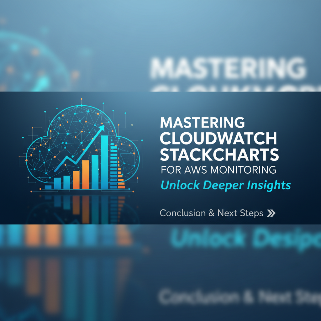
Mastering CloudWatch Stackcharts for AWS Monitoring


In the vast and dynamic landscape of cloud computing, particularly within the Amazon Web Services (AWS) ecosystem, robust monitoring is not merely a best practice; it is an absolute imperative for maintaining operational excellence, ensuring application performance, and safeguarding against unforeseen disruptions. As infrastructures scale and applications grow in complexity, the ability to gain clear, actionable insights from oceans of data becomes paramount. Enter AWS CloudWatch, the cornerstone of monitoring for AWS resources and applications, offering a comprehensive suite of tools designed to provide visibility into every facet of your cloud environment. While CloudWatch offers an array of visualization options, from line graphs to bar charts, one particular tool stands out for its unique ability to illuminate proportional contributions and aggregated trends over time: CloudWatch Stackcharts.
Stackcharts, with their distinctive layered appearance, provide an intuitive and powerful method for understanding how different components contribute to a total, revealing both individual performance and collective impact simultaneously. Imagine needing to track the aggregated CPU utilization across an entire fleet of EC2 instances, or to visualize the breakdown of incoming network traffic across various load balancer targets, or perhaps to assess the total number of invocations for a serverless application composed of numerous Lambda functions, segmenting by individual function. In such scenarios, a traditional line graph might show only the sum, or require multiple overlaid lines that become cluttered and difficult to interpret. Stackcharts, however, elegantly solve this challenge, presenting a clear, visual decomposition of the whole into its constituent parts, all while illustrating their evolution over a chosen time period. This article embarks on an exhaustive journey to master CloudWatch Stackcharts, unraveling their mechanics, exploring their diverse applications, and equipping you with the knowledge to transform raw monitoring data into profound operational intelligence, thereby elevating your AWS monitoring strategy to an unprecedented level of sophistication and clarity. Through detailed explanations, practical examples, and advanced techniques, we aim to provide a definitive guide that empowers you to harness the full potential of these indispensable visualization tools for proactive problem-solving, efficient resource management, and informed decision-making within your AWS deployments.
Understanding AWS CloudWatch: The Foundational Layer of Observability
Before we plunge into the intricacies of Stackcharts, it's essential to firmly grasp the foundational capabilities of AWS CloudWatch itself. CloudWatch serves as the central nervous system for monitoring your AWS resources and the applications you run on AWS. It acts as a unified hub, collecting operational data and insights in the form of metrics, logs, and events, enabling you to detect anomalous behavior, set alarms, visualize logs, and take automated actions to keep your applications running smoothly. Without a solid understanding of CloudWatch's core components, the true power of its visualization tools, including Stackcharts, cannot be fully appreciated or leveraged.
At its heart, CloudWatch operates around three primary data types: metrics, logs, and events. Metrics are numerical time-series data points that represent the performance of a resource or application. AWS services automatically publish a vast array of metrics to CloudWatch – from EC2 CPU Utilization and network I/O, to S3 Request Counts and DynamoDB Read/Write Capacity Units, and even Lambda function invocations and error rates. You also have the flexibility to publish your own custom metrics from your applications or services, providing a granular view of application-specific performance indicators that AWS doesn't cover by default. Each metric is uniquely identified by its name, namespace (a container for metrics from a specific service or application), and dimensions (key-value pairs that help filter and refine the metric data, such as InstanceId for EC2 CPU utilization). These dimensions are particularly crucial when it comes to creating meaningful Stackcharts, as they allow us to segment and categorize our data effectively.
CloudWatch Logs provides a robust solution for collecting, monitoring, storing, and accessing log files from various sources, including EC2 instances, AWS Lambda functions, CloudTrail, Route 53, and custom applications. Logs are invaluable for debugging, auditing, and understanding the fine-grained behavior of your systems. Rather than just numerical data, logs contain textual information about events that occur within your environment. CloudWatch Logs enables you to search, filter, and analyze this log data, extract metrics from log events, and even trigger alarms based on specific log patterns. Integrating log data with visual dashboards, though often done through metric filters or Logs Insights queries, can complement the insights gained from direct metric visualizations like Stackcharts.
CloudWatch Events (now largely superseded and enhanced by Amazon EventBridge for many use cases, though CloudWatch Events still exists) provides a near real-time stream of system events that describe changes in AWS resources. These events can trigger automated actions, such as invoking a Lambda function, sending a notification, or initiating an EC2 instance stop/start. While not directly a visualization tool, the ability to react to events provides a powerful layer of automation that complements monitoring. For instance, an alarm triggered by a CloudWatch metric could be configured to send an event that then scales out an Auto Scaling Group, demonstrating the closed-loop nature of CloudWatch's capabilities.
The collected metrics, logs, and events are then brought to life through CloudWatch Dashboards. Dashboards are customizable home pages in the CloudWatch console that you can use to monitor your resources in a single view, even those spread across different regions. You can create different types of widgets on these dashboards, each visualizing data in various formats – line graphs, number widgets, gauge widgets, and critically for our discussion, stacked area and stacked bar charts. Dashboards allow you to consolidate metrics from multiple services, applications, and even accounts, offering a holistic operational view. They are instrumental in quickly identifying issues, understanding system health at a glance, and providing the visual context necessary for deep-dive analysis.
Finally, CloudWatch Alarms allow you to set thresholds on any CloudWatch metric. When a metric breaches a predefined threshold, the alarm enters an ALARM state and can trigger automated actions, such as sending notifications via Amazon SNS, initiating Auto Scaling actions, or creating OpsItems in AWS Systems Manager. While Stackcharts are primarily for historical analysis and trend identification, alarms provide the immediate notification system that leverages the same underlying metric data, turning passive monitoring into proactive incident response.
In summary, CloudWatch is an exhaustive monitoring and observability service that collects raw data from your AWS environment and applications, transforms it into actionable insights, and enables automated responses. Its interconnected components – metrics, logs, events, alarms, and especially dashboards – form a robust framework for maintaining the health, performance, and availability of your AWS workloads. Understanding this framework is the indispensable first step toward effectively leveraging advanced visualization techniques like Stackcharts to extract profound meaning from your operational data.
Deconstructing Stackcharts: Core Concepts and Unparalleled Benefits
At first glance, a Stackchart might simply appear as a colorful graph, but beneath its visually engaging surface lies a sophisticated method of data representation that is uniquely powerful for specific monitoring challenges in the cloud. Unlike a traditional line chart which typically plots individual metrics against a time axis, or a bar chart comparing discrete values at a single point, a Stackchart presents multiple data series as vertically stacked areas or bars, where each series contributes to a total height. This allows for an immediate understanding of both the magnitude of the total value and the proportional contribution of each component to that total, over a given period.
Fundamentally, a Stacked Area chart in CloudWatch illustrates how the composition of a total changes over time. Each colored "stack" represents a different metric or a different dimension of a single metric, piled one on top of the other. The top boundary of the highest stack at any given point in time reflects the cumulative total of all the underlying components. For instance, if you're tracking network bytes received across five different EC2 instances, a stacked area chart would show you the total network ingress for your application (the top line) and simultaneously how much each of those five instances contributed to that total at any moment. This dynamic visualization is invaluable for identifying trends in both the aggregate and its individual constituents.
Stacked Bar charts operate on a similar principle but typically compare discrete time intervals, such as hourly or daily totals, making them suitable for showing aggregated sums over predefined periods. While less common for real-time, continuously streaming metric data in CloudWatch, they can be effective for visualizing daily summaries or aggregated totals where each bar represents a day and segments within the bar represent contributions from different sources. For the most part, when discussing "Stackcharts" in CloudWatch monitoring, we often refer to the "Stacked Area" variety due to its continuous time-series nature and ability to convey evolving trends.
Why are Stackcharts uniquely suited for certain monitoring scenarios in AWS?
- Visualization of Proportions and Trends Over Time: The most compelling advantage of Stackcharts is their ability to show the "parts-to-whole" relationship. They make it immediately apparent how much each element contributes to the overall sum and how this proportion shifts over time. For example, if you're managing a microservices architecture, a Stackchart can reveal how much CPU or memory each service instance consumes relative to the total cluster usage, helping identify resource hogs or shifts in workload distribution.
- Ease of Comparing Contributions: When dealing with multiple similar resources (e.g., instances in an Auto Scaling Group, Lambda functions in an application, different API endpoints), Stackcharts allow for a quick visual comparison of their individual contributions. It’s easier to spot which instance is taking the lion's share of network traffic or which Lambda function is being invoked most frequently within a larger set. This is significantly harder to discern from multiple overlapping line graphs.
- Identifying Outliers or Dominant Contributors: By visually separating contributions, Stackcharts can highlight an individual component that is disproportionately impacting the total. If one EC2 instance suddenly starts consuming significantly more network bandwidth than its peers, a Stackchart would make this spike visually evident within the context of the overall network traffic. This can be a critical early warning sign of an issue, such as a misconfigured application or a compromised instance.
- Understanding Capacity Planning and Resource Allocation: For managers and architects, Stackcharts provide high-level insights into resource utilization. Are your services evenly distributing load? Is there significant unused capacity in one area while another is nearing its limits? Stackcharts can inform decisions about scaling strategies, optimizing resource allocation, and identifying potential bottlenecks before they impact performance. For example, visualizing the total provisioned throughput for a DynamoDB table against the actual consumed capacity, broken down by various application operations, can guide decisions on scaling and cost optimization.
- Aggregating Dissimilar but Related Metrics: While typically used for similar metrics (e.g., CPU across instances), Stackcharts can also be thoughtfully applied to aggregate related but dimensionally different metrics. For example, you might stack
BytesReceivedandBytesSentfor a single instance to see total network throughput, or stackReadCapacityUnitsandWriteCapacityUnitsfor a DynamoDB table to see total throughput usage.
When not to use a Stackchart:
Despite their power, Stackcharts are not a universal solution for all monitoring needs. * When individual absolute values are paramount: If the precise, independent value of each component is more critical than its contribution to a total, separate line graphs might be clearer. For instance, comparing the latency of multiple distinct services where their combined latency isn't a meaningful aggregate. * For too many series: Stackcharts can become cluttered and unreadable if you try to stack too many distinct metrics or dimensions (e.g., more than 7-10). The individual layers become too thin to differentiate, and the chart loses its interpretability. * When components are negatively correlated: If the values of different series frequently move in opposite directions, the stacking can create a misleading visual representation of trends. * For comparing trends where stacking obscures patterns: Sometimes, seeing individual peaks and valleys clearly is more important than the aggregate sum. Stacking can smooth out or obscure individual fluctuations.
In essence, CloudWatch Stackcharts are an indispensable tool for visualizing aggregated metrics and understanding the proportional impact of individual resources or dimensions over time. They offer a unique perspective that complements other chart types, providing a holistic and intuitive view of complex cloud environments. Mastering their application means gaining a clearer lens through which to observe and manage the intricate dance of your AWS infrastructure and applications.
Building Your First Stackcharts: A Step-by-Step Guide
Creating effective Stackcharts in AWS CloudWatch involves a structured approach, moving from selecting the right metrics to configuring the visualization for maximum clarity. This section will walk you through the process, providing practical examples that highlight the utility of Stackcharts for common AWS monitoring scenarios.
To begin, navigate to the AWS CloudWatch console. Once there, locate "Dashboards" in the left-hand navigation pane and either create a new dashboard or select an existing one to add your new widget.
Step 1: Add a New Widget to Your Dashboard
- Click "Add widget": On your chosen dashboard, click the prominent "Add widget" button.
- Choose "Line" (or "Number"): CloudWatch typically presents "Line" as the default for metric graphs. Select this, then click "Next". While the initial selection is "Line," we will configure it to be a Stackchart in the subsequent steps.
- Select "Metrics": Ensure "Metrics" is selected as the data source. Click "Next".
Step 2: Selecting Metrics for Your Stackchart
This is where the power of CloudWatch's metric repository comes into play. You'll browse or search for the metrics you wish to visualize. The key to a good Stackchart is to select metrics that are logically related and whose aggregated sum provides meaningful insight, with individual components contributing to that sum.
Let's explore a few common examples:
Example 1: CPU Utilization Across an Auto Scaling Group (ASG)
Monitoring the collective CPU utilization of an ASG is a prime candidate for a Stackchart. It allows you to see the total CPU load handled by the group and how evenly that load is distributed among individual instances.
- Browse for Metrics: In the "Add to dashboard" screen, under the "Metrics" tab, click on "All metrics".
- Navigate to EC2 Metrics: Go to
EC2->Per-Instance Metrics. - Select CPU Utilization: Find and check the box next to
CPUUtilization. - Filter by Instance: Now, you'll see a list of all your EC2 instances with their
CPUUtilizationmetric. Instead of selecting individual instances manually, you can use the search bar or filter by specific dimensions. If your instances are part of an Auto Scaling Group, you might have specific tags, or you can select multipleInstanceIds that belong to that group. For a practical Stackchart, select 3-5 instances to avoid clutter. - Initial View: By default, CloudWatch will display these as separate line graphs. This is where we transform them.
Example 2: Network Bytes In/Out for Multiple EC2 Instances
Understanding network throughput across a set of instances is another excellent use case. A Stackchart can show total incoming or outgoing traffic and the contribution of each instance.
- Browse for Metrics: Similar to Example 1, go to
EC2->Per-Instance Metrics. - Select Network Metrics: Choose
NetworkIn(bytes received by the instance) andNetworkOut(bytes sent from the instance). - Filter and Select Instances: Select the relevant
InstanceIds. You might want to create separate Stackcharts forNetworkInandNetworkOutfor clarity, or combine them for a total traffic view for each instance.
Example 3: Concurrent Executions for Lambda Functions
For serverless applications, understanding which Lambda functions are consuming concurrent execution capacity is vital for cost management and performance.
- Browse for Metrics: Go to
Lambda->By Function Name. - Select ConcurrentExecutions: Choose
ConcurrentExecutions. - Select Functions: Select the Lambda functions whose concurrent executions you want to track as a group.
Step 3: Configuring the Widget to be a Stackchart
Once you have selected your metrics, the next crucial step is to configure the visualization type.
- Switch to Graph Options: On the "Add to dashboard" screen, after selecting your metrics, look for the "Graphed metrics" tab and then click on the "Graph options" tab.
- Select Stacked Area: Under "Graph type," you'll see options like "Line," "Stacked area," "Stacked bar," etc. Select "Stacked area." Immediately, your line graphs will transform into a visually compelling Stackchart. If your data is better suited for discrete time intervals, you could choose "Stacked bar."
- Configure Y-Axis (Optional but Recommended):
- Left Y-axis label: Provide a clear label (e.g., "CPU Utilization (%)", "Network Bytes (B)", "Concurrent Executions").
- Left Y-axis bounds: Setting explicit minimum and maximum bounds (e.g., 0 to 100 for CPU Utilization) can make the chart more consistent and easier to interpret, preventing auto-scaling from distorting visual comparisons over time.
- Legend Options: Customize the legend to display relevant information like "Label," "Statistic," "Period," "Unit," etc. A clear legend helps identify each stack component.
- Widget Title: Give your widget a descriptive title (e.g., "ASG CPU Utilization Breakdown," "Application Network Ingress").
Step 4: Using Search Expressions and Metric Math for Advanced Aggregation
CloudWatch's capabilities extend beyond simply plotting raw metrics. You can use search expressions to dynamically include metrics that match certain patterns or tags, which is incredibly useful for Auto Scaling Groups where instances are constantly changing.
For instance, to get all CPUUtilization metrics for EC2 instances with a specific tag Environment=Production: SEARCH('{AWS/EC2,InstanceId} MetricName="CPUUtilization" "Environment"="Production"', 'Average', 300)
Metric Math allows you to perform calculations on metrics, deriving new insights. While Stackcharts are primarily for showing raw contributions, you can use Metric Math to prepare data before stacking or to calculate derived metrics that are then stacked. For example, if you wanted to stack the percentage of free memory for multiple instances, and you only have UsedMemory and TotalMemory metrics, you could use Metric Math to calculate (TotalMemory - UsedMemory) / TotalMemory * 100. Then, these calculated values could be stacked, although stacking percentages might be less intuitive than raw values in some cases. The sum of percentages could exceed 100%, which would misrepresent a part-to-whole relationship. However, if each instance's free memory percentage is what you're tracking independently within the stack, it could work.
Integrating "api," "gateway," and "open platform"
While the primary focus of Stackcharts is often on EC2, Lambda, or other compute resources, they are equally valuable for monitoring API-related services. AWS API Gateway, for example, is a fully managed service that makes it easy for developers to create, publish, maintain, monitor, and secure APIs at any scale. CloudWatch provides a rich set of metrics for API Gateway, and these can be effectively visualized using Stackcharts.
Example: Monitoring API Gateway Request Counts by Resource Path
Imagine you have an API Gateway managing several endpoints for an application. You want to see the total number of API requests and how each specific endpoint contributes to that total.
- Browse for Metrics: Go to
AWS/ApiGateway->By API Name. - Select Metrics: Choose
Count(representing the total number of requests). - Filter by API Name and Resource: You will see dimensions for
ApiName,Resource, andMethod. To create a Stackchart showing requests per resource, select yourApiNameand then individually select theCountmetric for eachResourcepath you want to monitor (e.g.,/users,/products,/orders). - Configure as Stacked Area: In "Graph options," select "Stacked area."
- Title: "API Gateway Request Count by Resource."
This specific Stackchart immediately reveals which of your API endpoints is receiving the most traffic, how their usage changes over time, and the overall load on your gateway. It’s an incredibly efficient way to monitor the distribution of API calls and identify disproportionately popular or underutilized resources. This exemplifies how CloudWatch, as an integral part of the AWS open platform, provides comprehensive observability for all its services, including critical components like API Gateway, enabling you to manage your application's external interfaces with precision.
Step 5: Saving and Sharing Your Dashboard
Once you've configured your Stackchart (and any other widgets), click "Create widget" or "Save dashboard." Your new Stackchart will appear on the dashboard. Dashboards can be shared within your AWS account or even with other AWS accounts, facilitating collaborative monitoring and operational transparency.
By following these steps, you can start building powerful CloudWatch Stackcharts that provide deep, actionable insights into your AWS environment, transforming raw data into clear, proportional, and trend-aware visualizations.
APIPark is a high-performance AI gateway that allows you to securely access the most comprehensive LLM APIs globally on the APIPark platform, including OpenAI, Anthropic, Mistral, Llama2, Google Gemini, and more.Try APIPark now! 👇👇👇
Advanced Stackchart Techniques for Deeper Insights
While basic Stackcharts are powerful, CloudWatch offers advanced capabilities that can elevate your monitoring from reactive observation to proactive intelligence. Leveraging Metric Math, cross-account monitoring, and integration with other CloudWatch features can unlock even deeper insights from your stacked visualizations.
1. Metric Math for Complex Calculations and Derived Metrics
Metric Math is perhaps one of the most underutilized yet potent features in CloudWatch. It allows you to query multiple CloudWatch metrics and use mathematical expressions to create new time series. This is incredibly useful for Stackcharts when you need to visualize derived metrics or combine related but distinct data points into a single, meaningful stack.
Use Case: Visualizing the Percentage of Free Memory Across EC2 Instances
AWS doesn't natively provide a "Free Memory" metric for EC2 instances. You typically get MemoryUtilization if you use the CloudWatch agent. However, if you have custom metrics for UsedMemory and TotalMemory (or can derive them), you can stack the free memory percentage for each instance. This might not be a pure "part-to-whole" Stackchart in the traditional sense, but it effectively stacks calculated values for comparison.
Let's assume you have UsedMemory and TotalMemory custom metrics for instances:
- Add Metrics: Select
UsedMemoryandTotalMemoryfor multiple instances. - Apply Metric Math: For each instance, create a Metric Math expression.
- Let
m1beUsedMemoryfor Instance A. - Let
m2beTotalMemoryfor Instance A. - New Metric Math expression:
((m2 - m1) / m2) * 100(e.g.,(m2_instanceA - m1_instanceA) / m2_instanceA * 100). Label thisFreeMemoryPct_InstanceA.
- Let
- Repeat for all Instances: Create a similar expression for each instance.
- Stack the Calculated Metrics: In the "Graph options," select "Stacked area" for all these
FreeMemoryPctmetrics.
This Stackchart would then show the free memory percentage for each instance, stacked. While the sum of percentages isn't necessarily meaningful in itself (it could easily exceed 100%), the individual stacked layers effectively show how much free memory each instance has relative to others, and how its free memory changes over time, all within a single visual context. It's a way of using the stacking visual for comparison rather than strictly a sum.
Use Case: Error Rate Breakdown for a Load Balancer Target Group
If you have an Application Load Balancer (ALB) distributing traffic to multiple target groups, and you want to visualize the error rates (HTTPCode_Target_4XX_Count, HTTPCode_Target_5XX_Count) for each target group relative to their total requests, Metric Math can help.
- Add Metrics: Select
HTTPCode_Target_4XX_Count,HTTPCode_Target_5XX_Count, andRequestCountfor each target group. - Calculate Error Rates: For each target group, create expressions like:
m1 = HTTPCode_Target_4XX_Count_TargetGroupAm2 = HTTPCode_Target_5XX_Count_TargetGroupAm3 = RequestCount_TargetGroupAerror_rate_tgA = ((m1 + m2) / m3) * 100
- Stack Error Rates: Stack the
error_rate_tgA,error_rate_tgB, etc., to see which target group contributes most to the overall error landscape (if you assume all target groups are part of a larger application component).
2. Cross-Account and Cross-Region Monitoring
For large organizations operating multiple AWS accounts or deploying applications across various geographical regions, gaining a unified view is critical. CloudWatch Dashboards support cross-account and cross-region monitoring, allowing you to bring metrics from disparate environments into a single Stackchart.
To achieve this, you need to configure sharing of CloudWatch data between accounts. Once set up, when adding a widget, you can select the desired source account and region from a dropdown menu. This enables a powerful Stackchart that might, for instance, display the aggregated CPUUtilization for all production instances spread across different AWS accounts and regions, offering a true enterprise-wide operational snapshot. This truly underlines the concept of AWS being an open platform for complex, distributed applications, with CloudWatch providing the overarching observability.
3. Leveraging CloudWatch Logs Insights with Stackcharts
While Stackcharts primarily visualize metrics, CloudWatch Logs Insights, a powerful interactive log analytics service, can be indirectly integrated to enhance Stackcharts. You can use Logs Insights to query log data and then create metric filters from the results. These metric filters then publish custom metrics to CloudWatch, which can then be incorporated into Stackcharts.
Example: Stacking Error Counts from Application Logs
Suppose your application logs contain specific error messages, and you want to visualize the rate of these errors, broken down by distinct application components or microservices.
- Query Logs Insights: Write a Logs Insights query to extract error messages and group them by a relevant field (e.g.,
service_name).sql fields @timestamp, @message | filter @message like /ERROR/ | stats count(*) as error_count by service_name | sort @timestamp desc - Create Metric Filter: From your Logs Insights query, you can "Create metric" from the actions menu. Define a metric filter that matches your error pattern and extracts the
service_nameas a dimension. - Publish Custom Metrics: Each
service_namewill now publish aerror_countcustom metric. - Stack Custom Metrics: Add these newly created custom
error_countmetrics, filtered by theirservice_namedimension, to a Stackchart. This visualizes which service is generating the most errors over time, contributing to the overall error landscape.
4. Custom Metrics and How They Enhance Stackcharts
The flexibility to publish custom metrics to CloudWatch is a game-changer. Any application-specific performance indicator – such as active user sessions, queue depth for an internal message broker, or the number of processed items by a worker – can be captured. When these custom metrics are published with appropriate dimensions (e.g., queue_name, worker_id), they become ideal candidates for Stackcharts.
Example: Worker Processed Item Count by Worker ID
If you have a fleet of worker instances or Lambda functions processing tasks, and each publishes a ProcessedItems metric with a WorkerId dimension:
- Publish Custom Metrics: Your application code pushes
ProcessedItemswithWorkerId=worker-1,WorkerId=worker-2, etc. - Stack Custom Metrics: Create a Stackchart from the
ProcessedItemsmetric, grouping byWorkerId. This will show the total work processed and how each worker contributes, highlighting imbalances or throughput issues.
5. Anomaly Detection Integration: Overlaying Anomaly Bands
CloudWatch Anomaly Detection automatically learns the typical behavior of a metric and creates a model that predicts expected values. You can overlay these anomaly detection bands on your Stackcharts. While the bands apply to the total value, they can help identify periods when the overall system behavior deviates significantly from the norm, prompting you to investigate the individual stacked components for the root cause. This adds another layer of intelligence, transforming historical trend visualization into a predictive monitoring tool.
6. Dashboard Organization and Best Practices for Large Environments
As you build more Stackcharts and other widgets, organizing your dashboards becomes crucial. * Group Related Widgets: Place Stackcharts related to a specific application or service together. * Logical Layout: Arrange widgets in a logical flow, perhaps from high-level overviews to more detailed breakdowns. * Consistent Naming: Use clear, consistent titles for your widgets and dashboards. * Templating: For consistent monitoring across similar services or environments, consider using Infrastructure as Code (e.g., CloudFormation, Terraform) to define your CloudWatch Dashboards programmatically. This ensures standardization and reproducibility.
By mastering these advanced techniques, you can transform your CloudWatch dashboards into sophisticated operational control centers, using Stackcharts to illuminate the intricate dynamics of your AWS cloud environment and empower proactive, informed decision-making.
Real-World Use Cases and Best Practices
The theoretical understanding of Stackcharts truly comes to life when applied to real-world AWS operational challenges. Here, we delve into several practical use cases, demonstrating how Stackcharts can provide invaluable insights across various AWS services and application architectures, concluding with essential best practices for maximizing their effectiveness.
Case Study 1: EC2 Fleet Health and Resource Utilization
Scenario: You manage a critical web application running on an Auto Scaling Group of EC2 instances behind an Application Load Balancer. You need to ensure optimal performance and resource distribution.
Stackchart Application: Create a Stackchart for AWS/EC2 CPUUtilization metric, dimensioned by InstanceId for all instances within your ASG. * Insight: This chart will instantly show the total CPU load on your fleet and how evenly it's distributed. If one instance's stack is disproportionately large, it might indicate uneven load distribution, a misconfigured application, or an instance nearing saturation. If the aggregate sum (top of the stack) consistently nears 100%, it signals a need to scale out the ASG or optimize applications. * Enhancement: Similarly, create Stackcharts for NetworkIn and NetworkOut to understand network traffic distribution and identify instances that are unexpectedly sending or receiving large volumes of data. This can help pinpoint data exfiltration attempts or heavy data processing workloads.
Case Study 2: Serverless Application Performance and Cost Management
Scenario: You have a serverless application composed of multiple AWS Lambda functions, processing various business logic steps. You need to monitor their invocation patterns, error rates, and resource consumption.
Stackchart Application: 1. Lambda Invocations: Create a Stackchart for AWS/Lambda Invocations metric, dimensioned by FunctionName. * Insight: This immediately reveals which Lambda functions are being called most frequently and how their invocation rates change over time. It provides a clear visual of your application's workload distribution across its serverless components, helping identify bottlenecks or unexpected spikes. 2. Lambda Errors: Create a Stackchart for AWS/Lambda Errors metric, dimensioned by FunctionName. * Insight: This helps quickly identify which functions are contributing most to overall application errors. A sudden increase in a specific function's stack layer indicates a potential issue requiring immediate attention. * Enhancement: By combining Invocations and Errors (perhaps using Metric Math to calculate ErrorRate = (Errors / Invocations) * 100), and then stacking the error rates per function, you get a clearer picture of problematic functions relative to their usage.
Case Study 3: Database Performance and Resource Utilization (RDS)
Scenario: You operate a critical Amazon RDS database, possibly with read replicas. You need to monitor connection counts, throughput, and ensure optimal database health.
Stackchart Application: 1. Database Connections: Create a Stackchart for AWS/RDS DatabaseConnections metric, dimensioned by DBInstanceIdentifier for your primary and replica instances. * Insight: This shows the total number of open connections to your database cluster and how these are distributed between the primary and its replicas. Uneven distribution might indicate client misconfiguration, while a high aggregate number nearing connection limits signals potential contention or a need to scale. 2. IOPS (Input/Output Operations Per Second): Create a Stackchart for AWS/RDS ReadIOPS and WriteIOPS for your primary instance. * Insight: While not typically stacked across instances for Read/Write, you can stack ReadIOPS and WriteIOPS for a single instance to see its total I/O activity. If you have multiple distinct database instances for different applications, you could stack their total IOPS (sum of Read and Write for each) to see which database consumes the most I/O resources, contributing to the overall storage load.
Case Study 4: API Gateway Monitoring and API Management
Scenario: Your applications expose functionalities through AWS API Gateway, acting as the gateway for various microservices and backend systems. You need to monitor the performance and usage of these APIs. This is a crucial area where the keywords "api" and "gateway" become naturally relevant.
Stackchart Application: 1. API Request Count by Resource: As discussed earlier, create a Stackchart for AWS/ApiGateway Count metric, dimensioned by Resource and Method for a specific API. * Insight: This powerfully illustrates which API endpoints are receiving the most traffic, their individual contributions to the overall load on your gateway, and how patterns of usage change over time. It helps identify popular features, potential areas for optimization, or endpoints experiencing unusually high activity. 2. API Latency Breakdown: While more challenging to stack directly, you could use Metric Math to create custom metrics representing P50_Latency, P90_Latency, etc., for different endpoints and stack these if you need to compare relative latencies across endpoints in a visual manner (though individual line graphs are often preferred for latency). However, a combined Stackchart for Count or IntegrationLatency (time taken for the backend to respond) across resources is highly effective. 3. Error Code Distribution: Create a Stackchart for AWS/ApiGateway 4XXError and 5XXError metrics, perhaps broken down by Resource or Method. * Insight: This quickly highlights which API resources or methods are generating the most client (4XX) or server (5XX) errors, providing a clear visual of where issues are originating within your gateway.
Integrating APIPark: When discussing the importance of comprehensive API management and the need for robust monitoring of API gateways, it's natural to mention platforms designed to facilitate this. APIPark is an excellent example of an open source AI gateway & API management platform that helps developers and enterprises manage, integrate, and deploy AI and REST services with ease. While CloudWatch provides deep insights into the underlying AWS infrastructure that APIPark might run on (e.g., EC2 instances, Lambda functions, or even the API Gateway service itself if APIPark is proxying through it), APIPark itself offers powerful features like detailed API call logging and data analysis directly within its platform. This means that while CloudWatch Stackcharts can monitor the infrastructure supporting an API gateway solution like APIPark, APIPark provides its own specialized tools for monitoring the specific traffic and performance of the APIs it manages, giving a more granular view of the actual API interactions, request counts, and error rates at the application layer, complementing the infrastructure-level insights from CloudWatch. This duality allows for a holistic view: CloudWatch for the cloud resources, and APIPark for the managed APIs themselves.
Best Practices for Mastering CloudWatch Stackcharts:
- Keep Dashboards Focused: Avoid creating overcrowded dashboards. Each dashboard should ideally serve a specific purpose (e.g., "Application A Performance," "Database Health"). Too many widgets or too many stacked series can lead to information overload.
- Use Consistent Naming Conventions: Standardize the naming of your metrics, dimensions, and dashboard widgets. This improves readability and makes it easier for team members to understand the data.
- Combine Different Widget Types: Stackcharts are powerful, but they work best when combined with other widget types. Use number widgets for key KPIs, line graphs for individual metric trends, and alarms for immediate notifications.
- Set Appropriate Periods and Time Ranges: The time period (e.g., 1 minute, 5 minutes) and time range (e.g., 1 hour, 3 days) significantly impact how data appears on a Stackchart. Choose them wisely based on the granularity and historical context you need. Shorter periods show more detail but can be noisy; longer periods offer smoother trends.
- Leverage Search Expressions and Tags: For dynamic environments, use CloudWatch search expressions with resource tags to automatically include or exclude metrics. This reduces manual effort, especially with Auto Scaling Groups or frequent resource changes.
- Use Clear Labels and Units: Ensure your Y-axis labels and legend clearly indicate what is being measured and in what units. This prevents misinterpretation.
- Regularly Review and Refine Dashboards: Monitoring needs evolve. Periodically review your dashboards with your team. Are they still providing actionable insights? Are there new metrics that should be added? Remove obsolete widgets to maintain clarity.
- Educate Your Team: Ensure everyone who uses the dashboards understands how to interpret Stackcharts and what common patterns or anomalies indicate. Foster a culture of proactive monitoring.
- Consider Thresholds and Alarms: While Stackcharts are for visualization, always complement them with CloudWatch Alarms for critical metrics. Don't just observe problems; get notified about them immediately. You can set alarms on the total aggregate value displayed by your Stackchart.
By diligently applying these real-world use cases and best practices, you can transform your raw AWS monitoring data into a rich tapestry of operational intelligence, enabling faster troubleshooting, better resource allocation, and a deeper understanding of your cloud environment's performance and health.
Challenges and Considerations
While CloudWatch Stackcharts offer an unparalleled perspective on aggregated metrics and proportional contributions, their effective implementation is not without its challenges and considerations. Awareness of these aspects is crucial for setting realistic expectations and designing a robust, sustainable monitoring strategy.
1. Data Granularity and Retention
CloudWatch metrics come with varying levels of granularity. Standard resolution metrics (e.g., EC2 CPUUtilization) are typically available at 1-minute intervals for up to 15 days, then aggregated to 5-minute averages for longer periods, and finally to 1-hour averages for data older than 63 days. Custom metrics can be published with standard (1-minute) or high resolution (1-second).
- Challenge: If you require fine-grained analysis of historical data beyond the short-term retention of 1-minute metrics, the aggregated data might smooth out critical short-lived spikes or fluctuations that a Stackchart would otherwise reveal. This can make it difficult to perform deep forensic analysis on older incidents.
- Consideration: Be mindful of the data resolution when troubleshooting historical events. For long-term, high-granularity retention, consider exporting CloudWatch metrics to services like S3 or specialized observability platforms for archival and more advanced analytics.
2. Cost Implications of Extensive Monitoring
CloudWatch services, while offering a generous free tier, accrue costs based on usage. This includes the number of custom metrics published, the amount of log data ingested and stored, the number of alarms configured, and the dashboards created (though dashboards themselves don't typically incur direct costs, the underlying metrics do).
- Challenge: Creating a vast number of highly-dimensional custom metrics, or monitoring every single dimension for every resource with Stackcharts, can quickly escalate CloudWatch costs. For example, if you have hundreds of Lambda functions and publish unique custom metrics for each with multiple dimensions, the cost can become substantial.
- Consideration: Implement a cost-aware monitoring strategy. Focus on key performance indicators (KPIs) and critical resources. Leverage search expressions to dynamically include metrics rather than individually selecting hundreds. Regularly review your CloudWatch billing to identify and optimize expensive metrics or log groups that may not be providing sufficient value. Utilize sampling for less critical custom metrics if high resolution isn't always needed.
3. Information Overload on Complex Dashboards
The very power of Stackcharts – displaying multiple data series in a consolidated view – can become a drawback if overused or poorly designed.
- Challenge: A Stackchart with too many stacked layers (e.g., more than 7-10 distinct components) can become visually cluttered, making it difficult to differentiate individual contributions, identify specific trends, or even read the legend. The "stack" itself can obscure the individual lines, especially if some components are very small relative to others.
- Consideration: Prioritize clarity over comprehensiveness. Create multiple, focused Stackcharts rather than one monolithic one. Group related components intelligently. Use different dashboards for different levels of abstraction (e.g., a high-level overview dashboard, and a drill-down dashboard for specific application components). For highly dynamic environments with hundreds of instances, consider using techniques like "top N" analysis in Logs Insights to identify dominant contributors before adding them to a dashboard, rather than stacking all possible dimensions.
4. The Learning Curve for New Users
CloudWatch, with its extensive features, namespaces, dimensions, metric math, and various visualization options, can present a steep learning curve for those new to AWS monitoring.
- Challenge: Understanding how to select the right metrics, combine them effectively, apply metric math, and then interpret the nuances of a Stackchart requires a certain level of familiarity with CloudWatch and the underlying AWS services. Without this understanding, users might misinterpret data or fail to extract meaningful insights.
- Consideration: Invest in training and documentation for your team. Provide clear examples and walk-throughs for common monitoring scenarios. Start with simple Stackcharts and gradually introduce more complex configurations. Leverage shared dashboards and templates to provide a consistent and easy-to-understand monitoring experience across the organization. Encourage experimentation and foster a culture of learning and continuous improvement in monitoring practices.
By thoughtfully addressing these challenges and considerations, organizations can effectively harness the advanced visualization capabilities of CloudWatch Stackcharts without falling prey to common pitfalls, ensuring that their monitoring efforts remain both powerful and pragmatic.
Conclusion
In the demanding realm of modern cloud operations, where the fluidity of AWS environments dictates a continuous need for deep visibility, mastering CloudWatch Stackcharts emerges as an indispensable skill. This comprehensive exploration has journeyed from the foundational concepts of AWS CloudWatch to the intricate mechanics of Stackcharts, providing a detailed blueprint for their creation, advanced application, and strategic deployment across a myriad of real-world scenarios. We've seen how these uniquely powerful visualizations transcend the limitations of traditional graphs, offering an immediate and intuitive understanding of how individual components contribute to a collective whole, illuminating proportional impacts and evolving trends over time.
From dissecting the aggregated CPU utilization of an EC2 fleet to unraveling the invocation patterns of serverless Lambda functions and monitoring the complex traffic flows through an API Gateway, Stackcharts consistently prove their worth. They empower engineers, operations teams, and business stakeholders alike to move beyond mere data observation, enabling them to swiftly identify performance bottlenecks, pinpoint resource distribution anomalies, optimize costs, and proactively address potential issues before they escalate into critical incidents. The judicious application of Metric Math further amplifies their utility, allowing for the visualization of derived metrics and the extraction of even more profound insights from raw data streams.
Moreover, the natural integration of keywords like "api" and "gateway" within the context of monitoring AWS API Gateway underscores how CloudWatch serves as an overarching observability layer for virtually every service within the expansive AWS "open platform." We've also briefly touched upon how specialized platforms like APIPark complement CloudWatch by offering dedicated API management and monitoring capabilities at the application layer, highlighting the layered approach to modern observability.
However, true mastery extends beyond mere technical proficiency; it encompasses a strategic understanding of potential challenges, including data granularity, cost management, and the risk of information overload. By adhering to best practices—such as maintaining focused dashboards, utilizing consistent naming conventions, and combining Stackcharts with other visualization types and alarms—organizations can transform their CloudWatch dashboards into highly effective, actionable command centers.
In essence, CloudWatch Stackcharts are not just another graph type; they are a critical lens through which the complex dynamics of your AWS cloud environment can be perceived with unprecedented clarity. By embracing and mastering these visualizations, you equip your teams with the ability to not only react to issues but to anticipate them, fostering a culture of proactive optimization and ensuring the enduring stability, performance, and efficiency of your cloud-native applications. Their power lies in their simplicity to convey complexity, making them an indispensable tool in the arsenal of any cloud professional dedicated to operational excellence in AWS.
Frequently Asked Questions (FAQs)
1. What is a CloudWatch Stackchart and how does it differ from a regular line graph? A CloudWatch Stackchart (typically a Stacked Area chart) displays multiple data series as vertically stacked areas over a time axis. Each colored "stack" represents a different metric or dimension, with the total height at any point reflecting the sum of all components. This differs from a regular line graph, where multiple lines might overlap, making it difficult to discern individual contributions to a total or to see proportional changes over time. Stackcharts are ideal for visualizing part-to-whole relationships and trends in aggregated data.
2. When should I use a Stackchart versus other CloudWatch widget types? Use a Stackchart when you need to: * Understand how different components contribute to a total over time (e.g., CPU utilization across multiple instances in an ASG). * Visualize the proportion of each part to the whole. * Identify dominant contributors or shifts in distribution within a set of related metrics. * Track aggregated resource usage across a group of similar entities. Avoid Stackcharts if the individual absolute values are more important than their contribution to a sum, if you have too many distinct series (making it cluttered), or if the values are negatively correlated.
3. Can I use Metric Math with Stackcharts? Yes, absolutely. Metric Math is a powerful feature that allows you to perform calculations on metrics, deriving new time series. You can use Metric Math to prepare data before stacking it (e.g., calculating percentage of free memory for each instance) or to combine related metrics (e.g., total network bytes by summing NetworkIn and NetworkOut for an instance). You then select these calculated metrics and choose "Stacked area" as the graph type.
4. How can I monitor my API Gateway using CloudWatch Stackcharts, and how does APIPark relate? You can effectively monitor AWS API Gateway using CloudWatch Stackcharts by visualizing metrics like Count (total requests), 4XXError, and 5XXError dimensioned by Resource or Method. This shows the total API traffic/errors and the contribution from each endpoint or method. APIPark is an open source AI gateway and API management platform. While CloudWatch Stackcharts monitor the underlying AWS infrastructure that APIPark might run on, APIPark itself provides its own robust logging and data analysis features specifically for the APIs it manages, offering a more granular view of API performance and usage at the application layer, complementing CloudWatch's infrastructure-level insights.
5. What are some common pitfalls to avoid when creating CloudWatch Stackcharts? Common pitfalls include: * Too Many Series: Stacking too many metrics (more than 7-10) can make the chart cluttered and unreadable. * Misleading Aggregations: Stacking metrics where the sum isn't logically meaningful (e.g., stacking percentages if the total can exceed 100% and isn't intended to represent a whole). * Lack of Context: Not providing clear titles, Y-axis labels, or legends, leading to misinterpretation. * Information Overload: Over-populating a dashboard with too many complex Stackcharts. * Ignoring Granularity: Not considering the data retention and aggregation periods, which can obscure critical short-term events in historical views.
🚀You can securely and efficiently call the OpenAI API on APIPark in just two steps:
Step 1: Deploy the APIPark AI gateway in 5 minutes.
APIPark is developed based on Golang, offering strong product performance and low development and maintenance costs. You can deploy APIPark with a single command line.
curl -sSO https://download.apipark.com/install/quick-start.sh; bash quick-start.sh

In my experience, you can see the successful deployment interface within 5 to 10 minutes. Then, you can log in to APIPark using your account.

Step 2: Call the OpenAI API.