Mastering Home Deck Icons: Enhance UI & User Experience


In the increasingly complex digital landscape, where the sheer volume of data, services, and advanced functionalities can overwhelm even the most seasoned professionals, the clarity and efficiency of user interfaces (UI) have never been more critical. This holds especially true for sophisticated technical platforms designed to manage the backbone of modern applications: APIs and Artificial Intelligence models. Within these intricate systems, the concept of "Home Deck Icons" emerges not merely as an aesthetic embellishment but as a foundational element for fostering intuitive navigation, reducing cognitive load, and fundamentally enhancing the overall user experience (UX). This extensive exploration delves into the strategic significance of mastering these visual cues, transforming daunting technical portals into accessible, powerful command centers for developers, administrators, and business strategists alike.
The Unseen Architects of Usability: Icons in Technical Interfaces
At its core, an icon is a graphical representation that aims to convey meaning instantaneously, transcending language barriers and often replacing lengthy textual descriptions. In the context of a "Home Deck"—which we interpret as the primary dashboard or central hub of a complex system like an API management platform or an AI gateway—icons serve as the unseen architects of usability. They are the silent guides that direct users through an otherwise labyrinthine array of features, functionalities, and data points. Without thoughtfully designed icons, the most powerful backend system can become an impenetrable fortress, leading to frustration, errors, and underutilization.
For technical users, the challenge is distinct. Unlike consumer applications where simplicity often equates to abstraction, technical interfaces frequently demand granular control and deep insight. Here, icons must strike a delicate balance: simplifying complex concepts without oversimplifying their underlying meaning. They must be instantly recognizable, culturally sensitive, and semantically precise. A poorly chosen icon for "API Versioning" could lead to deploying outdated endpoints, while an ambiguous icon for "LLM Model Selection" could result in using a suboptimal AI for a critical task. Therefore, mastering the design and deployment of these icons is not merely a task for a graphic designer; it's a strategic imperative that impacts operational efficiency, system reliability, and ultimately, the success of the entire platform. The meticulous attention to detail in icon design ensures that users can quickly ascertain the function of various elements, improving their ability to navigate, interact, and ultimately, master the sophisticated tools at their disposal. This level of precision minimizes training overhead, reduces potential for user error, and cultivates a sense of confidence and control among the user base, leading to higher engagement and productivity.
The Home Deck as the Command Center: Navigating Complex Ecosystems
Imagine the "Home Deck" of a modern technical platform as the bridge of a starship: it's where all critical information converges, and all essential controls are within reach. Whether it's an API Developer Portal, an Open Platform for collaborative development, or an LLM Gateway for orchestrating AI models, this central dashboard is the user's primary interaction point. It's the first impression, the daily workspace, and often the last stop before a critical decision. Within this context, icons become the universal language spoken by the system, allowing users to rapidly parse information, identify relevant sections, and initiate actions without the need to read extensive labels or decipher intricate menu structures.
The strategic placement and consistent design of icons on this Home Deck transform it from a mere collection of links into a highly efficient command center. For instance, an icon depicting a magnifying glass for "Search API" is universally understood, as is a shield for "Security Settings" or a graph for "Analytics." These aren't just decorative elements; they are functional shortcuts that bypass cognitive processing, allowing the user's brain to instantly connect the visual cue with its corresponding function. This speed of recognition is invaluable in fast-paced development environments or during critical incident response scenarios, where every second counts. Furthermore, a well-organized Home Deck, punctuated by clear, intuitive icons, imparts a sense of order and control, making the daunting task of managing vast arrays of APIs, microservices, and AI models feel more manageable and less intimidating. It transforms a potentially overwhelming data deluge into a structured, navigable experience. This intuitive layout is particularly beneficial for onboarding new users, who can quickly grasp the system's architecture and locate essential features without extensive hand-holding or tedious documentation review.
Deep Dive into Iconography for API Developer Portals
An API Developer Portal is the shop window, documentation hub, and access point for an organization's APIs. It’s where developers discover, learn about, subscribe to, and consume APIs. The effectiveness of this portal directly correlates with the ease and speed with which developers can achieve their goals. Here, "Home Deck Icons" play an indispensable role in streamlining the developer journey.
Consider the typical sections within an API Developer Portal: * API Discovery: Icons representing a compass, a map, or a magnifying glass could lead to a directory of available APIs. * Documentation: An open book, a scroll, or a question mark might signify access to API specifications, tutorials, and guides. * Subscription Management: A key, a lock, or a handshake could represent the process of requesting access, managing credentials, or viewing subscribed APIs. * Monitoring & Analytics: Graphs, charts, or a dashboard icon would provide quick access to API usage statistics, performance metrics, and error logs. * Application Management: A gear, a cog, or a set of building blocks could symbolize where developers manage their applications, generate API keys, and configure callbacks. * Support & Community: A speech bubble, a headset, or a group of people could indicate access to forums, FAQs, or direct support channels.
Each of these core functionalities benefits immensely from a clear, consistent icon. The icon system should be designed with the developer's workflow in mind, anticipating their needs and guiding them intuitively. For example, a developer looking for an API's performance data will instinctively gravitate towards a dashboard icon, saving them the effort of scanning through text menus. This not only speeds up the process but also reduces the cognitive load, allowing developers to focus their mental energy on coding and integration rather than navigation.
Furthermore, a well-designed icon system within an API Developer Portal can reflect the brand identity and the platform's commitment to user experience. A sleek, modern icon set communicates professionalism and attention to detail, fostering trust and encouraging deeper engagement. Conversely, a haphazard collection of inconsistent or poorly designed icons can undermine the perceived quality of even the most robust backend APIs.
Let's consider APIPark, an open-source AI gateway and API developer portal. While its primary focus is robust API management and AI integration, a user-centric design approach means that its visual interface, including its "Home Deck Icons," would play a crucial role in making its powerful features accessible. Imagine APIPark's portal with distinct icons for "Integrated AI Models," "Prompt Encapsulation," "API Lifecycle," and "Team Sharing." These icons would serve as immediate visual anchors, helping developers quickly locate the functionalities they need to integrate over 100 AI models, unify API formats, or manage their API lifecycles effectively. A well-crafted icon for "Performance Metrics" could lead developers to the powerful data analysis features, highlighting the platform's capability to achieve over 20,000 TPS with an 8-core CPU. This thoughtful design minimizes the learning curve and maximizes the utility of such a comprehensive platform.
Illuminating the Open Platform: Icons for Extensibility and Collaboration
The concept of an Open Platform embodies principles of accessibility, extensibility, and community collaboration. Whether it's an open-source project, a public API ecosystem, or a platform designed for third-party integrations, the "openness" needs to be visually communicated and facilitated through its UI. On the Home Deck of an Open Platform, icons play a vital role in showcasing these attributes, inviting participation, and guiding users towards collaborative features.
Icons in an Open Platform might represent: * Community Contributions: An icon of people collaborating, a merging arrow, or a jigsaw piece could lead to sections where users can contribute code, documentation, or new integrations. * Marketplace/Integrations: A shopping cart, a plug, or interlocking gears might signify where users can discover and integrate third-party services or extensions. * Public APIs: An icon representing a global network, an unlocked symbol, or an "open door" could direct users to publicly available APIs and resources. * Development Resources: Tools, code snippets, or a blueprint icon could point to SDKs, libraries, and frameworks designed for extending the platform. * Versioning and Updates: A clock, a refresh arrow, or a sequence of numbers could indicate new releases, update logs, and version control information, crucial for an evolving open system.
These icons not only serve a navigational purpose but also reinforce the philosophy of the platform. They visually communicate that the system is not a closed box but a dynamic, evolving ecosystem that welcomes participation and offers vast possibilities for extension. For a developer or an enterprise exploring an Open Platform, these visual cues can be the deciding factor in engagement. They signal transparency, ease of integration, and a thriving community, all of which are critical for adoption.
Moreover, the consistent application of an iconographic language across an Open Platform ensures that contributors, partners, and users can quickly understand new features and integrations as they are introduced. This is particularly important for platforms that evolve rapidly, as icons provide a stable visual anchor in a constantly changing environment. They contribute to a shared understanding, facilitating smoother collaboration and reducing friction in development cycles. The very notion of an "open" system implies ease of access and understanding, and well-designed icons are instrumental in realizing this vision, breaking down barriers to entry and fostering a truly collaborative digital space.
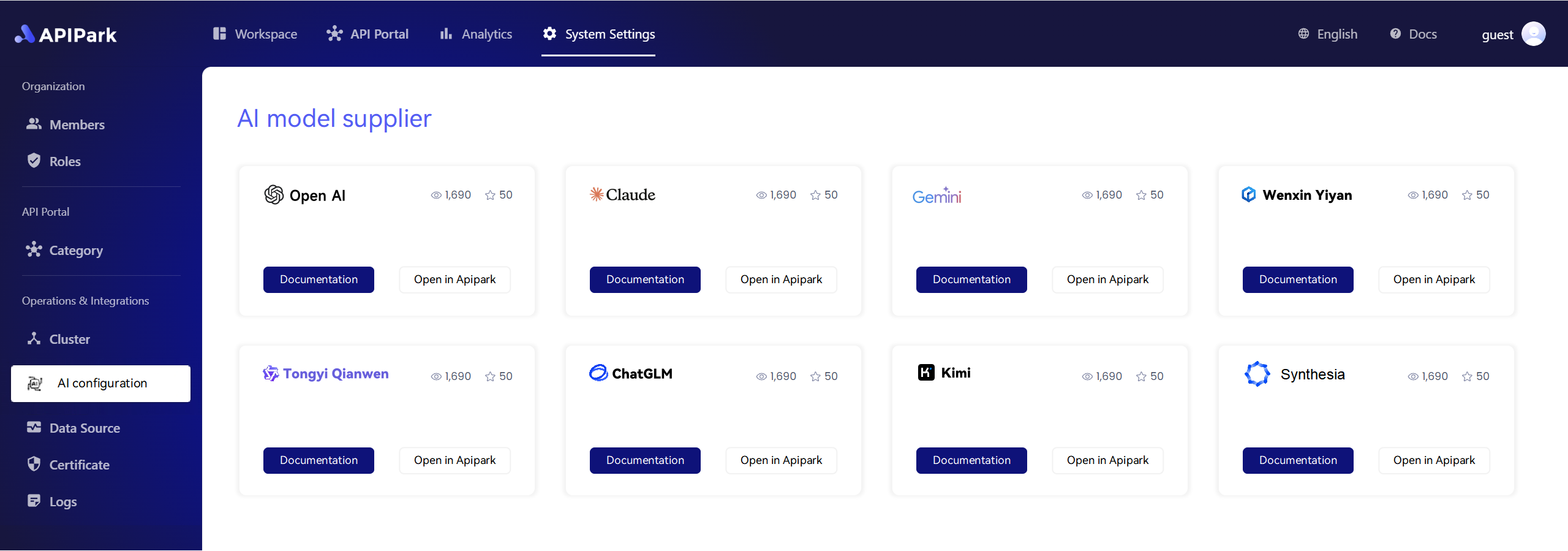
APIPark is a high-performance AI gateway that allows you to securely access the most comprehensive LLM APIs globally on the APIPark platform, including OpenAI, Anthropic, Mistral, Llama2, Google Gemini, and more.Try APIPark now! 👇👇👇
Guiding the AI Frontier: Icons within an LLM Gateway
The rise of Large Language Models (LLMs) has introduced a new layer of complexity to application development. Managing multiple LLMs, orchestrating prompts, handling context windows, and monitoring costs require sophisticated tools. An LLM Gateway serves as this control center, abstracting away much of the underlying complexity and providing a unified interface for AI invocation. On the Home Deck of such a gateway, specialized icons become indispensable for navigating the nuances of AI management.
Icons specific to an LLM Gateway might include: * Model Selection: Icons representing different AI models (e.g., distinct brain symbols, unique shapes for different providers like GPT, Llama, etc.) to quickly switch between or compare models. * Prompt Management: A speech bubble with gears, a notepad, or a thought cloud could signify where users create, store, and manage their prompts for various AI tasks. * Context Window: An icon showing expanding boxes or a memory chip could represent tools for managing the conversational context and token limits. * Fine-Tuning/Training: A microscope, a growth chart, or a "neural network" like symbol could indicate features for customizing models or uploading training data. * Cost Tracking/Quotas: A coin stack, a wallet, or a dollar sign icon would provide immediate access to AI usage costs and budget management. * AI Service Deployment: A rocket, a cloud, or a "deploy" arrow could represent the process of deploying custom AI services or prompt-encapsulated APIs.
For a platform like APIPark, which functions as a robust LLM Gateway, these icons would be critical. Imagine a developer on APIPark's Home Deck seeing an icon that clearly denotes "Unified API Format for AI Invocation." This visual cue immediately communicates APIPark's core value proposition: standardizing AI requests to reduce complexity. Another icon for "Prompt Encapsulation into REST API" would highlight the ease with which users can transform custom prompts into reusable API services. These specific, well-thought-out icons empower developers to efficiently harness the power of AI, making tasks like integrating 100+ AI models or creating new sentiment analysis APIs far less intimidating.
The precise visual language within an LLM Gateway must reflect the cutting-edge nature of AI while making it accessible. It requires icons that are both technologically representative and intuitively understandable, bridging the gap between advanced AI concepts and practical application. By mastering these icons, an LLM Gateway can transform the daunting task of AI orchestration into a streamlined, user-friendly experience, unlocking unprecedented potential for innovation across various industries. It ensures that the immense power of LLMs is not confined to AI specialists but becomes readily available to a broader spectrum of developers and businesses.
The Art and Science of Icon Design for Technical UIs
Designing effective icons for technical UIs, particularly for platforms like an API Developer Portal, an Open Platform, or an LLM Gateway, is a blend of art and science. It requires not only aesthetic sensibility but also a deep understanding of user psychology, technical domain knowledge, and meticulous execution.
Consistency: The Cornerstone of Intuitive Design
The most crucial principle is consistency. Icons within a single system must adhere to a unified visual language in terms of style (line art, filled, glyphs), color palette, size, and perspective. Inconsistency creates visual noise and forces users to re-learn meanings, increasing cognitive load. A developer navigating APIPark's interface, for example, expects icons representing similar actions (e.g., "create," "edit," "delete") to share common visual attributes, regardless of whether they apply to an API, a prompt, or an AI model. This consistency builds familiarity and trust, making the interface feel cohesive and professional.
Clarity and Simplicity: Avoiding Ambiguity
Technical interfaces deal with complex concepts, making clarity in icon design paramount. An icon should be simple enough to be understood at a glance, even at small sizes. Avoid overly detailed or abstract designs that might be misinterpreted. For instance, an icon for "API Resource Access Requires Approval" should clearly convey a sense of permission or gatekeeping, perhaps a checkmark within a shield or a hand holding a document, rather than a cryptic symbol. When designing for an LLM Gateway, where concepts like "token limits" or "model temperature" might need visual representation, the icons must distil these complex ideas into easily digestible visual metaphors.
Scalability: Adapting to Diverse Environments
Technical users often work across multiple devices and screen resolutions, from large monitors to tablets. Icons must be designed to be scalable without losing fidelity or legibility. Vector graphics are ideal for this, ensuring sharp visuals regardless of zoom level. Whether displayed as a tiny favicon or a prominent feature on a dashboard, the icon's message must remain crystal clear. This ensures a consistent and high-quality user experience across all touchpoints, from a detailed administration panel to a mobile monitoring view.
Accessibility: Inclusive Design
Inclusive design is not an option but a necessity. Icons must be designed with accessibility in mind. * Color Contrast: Ensure sufficient contrast between the icon and its background, especially for text and interactive elements. * Alternative Text (Alt Text): Every icon, especially if it's purely decorative or provides additional context, should have appropriate alt text for screen readers. This ensures that visually impaired users can understand the icon's meaning. * Labeling: While icons aim to reduce text, for critical actions or less universally understood symbols, accompanying text labels are essential, especially in a technical context where precision is key. This hybrid approach caters to both quick visual scanning and detailed textual comprehension.
Testing and Iteration: User-Centric Refinement
Icon design is rarely a one-shot process. It requires iterative testing with actual users. User feedback can reveal ambiguities, preferences, and areas for improvement. A/B testing different icon designs for a critical feature on an API Developer Portal can yield invaluable insights into what resonates best with the target audience. This scientific approach ensures that icons are not just aesthetically pleasing but also highly functional and user-friendly, evolving alongside the platform and its users' needs. The process involves showing early prototypes to representative users and observing their interpretations and interactions. This qualitative data, combined with quantitative metrics (e.g., time to task completion, click rates), guides the refinement process, ultimately leading to an icon system that is both effective and beloved by its users.
Strategic Impact: How Mastered Icons Elevate UI & User Experience for Technical Platforms
The mastery of Home Deck Icons transcends mere visual appeal; it becomes a strategic differentiator that profoundly impacts the operational efficiency, user adoption, and overall success of complex technical platforms. By carefully designing and implementing these visual cues within an API Developer Portal, an Open Platform, or an LLM Gateway, organizations can achieve several critical advantages:
- Enhanced Developer Productivity: For developers, time is a precious commodity. Instantly recognizable icons on a Home Deck mean less time spent searching for features and more time spent on actual development, integration, and innovation. Reduced cognitive load translates directly into faster task completion and a more efficient workflow, directly impacting project timelines and delivery. A developer using APIPark, for example, can quickly jump to "Detailed API Call Logging" or "Powerful Data Analysis" via intuitive icons, streamlining their debugging and performance monitoring efforts.
- Reduced Training and Onboarding Costs: A visually intuitive interface, heavily supported by clear icons, significantly lowers the barrier to entry for new users. Training new developers or administrators on a complex API Developer Portal becomes less arduous when the system speaks a universal visual language. This reduces the need for extensive documentation reviews and hands-on training sessions, freeing up resources and accelerating the onboarding process. The self-explanatory nature of well-designed icons makes the platform more accessible to a wider audience, including those who may not have extensive prior experience with similar systems.
- Faster Adoption of New Features: In the rapidly evolving world of APIs and AI, platforms constantly introduce new functionalities. When these new features are represented by consistent, well-designed icons that integrate seamlessly into the existing visual language of the Home Deck, users are more likely to discover and adopt them quickly. This facilitates quicker rollout of innovations and ensures that the platform's capabilities are fully leveraged. For an Open Platform, this means that community-contributed features or new integrations can be easily highlighted and understood, encouraging a dynamic ecosystem.
- Improved Brand Perception and Trust: A meticulously designed UI, spearheaded by an intelligent icon system, communicates professionalism, attention to detail, and a user-centric philosophy. This builds trust and strengthens brand perception. Users are more likely to perceive a platform like APIPark as reliable and cutting-edge if its interface is not only powerful but also elegantly designed and easy to use. This positive perception can be a key competitive advantage in a crowded market, attracting more users and fostering long-term loyalty. It signals that the platform provider genuinely understands and cares about the user's experience, which is a powerful message in the enterprise software space.
- Reduced Error Rates and Enhanced System Stability: When actions are clearly represented by icons, the chances of users making mistakes are significantly reduced. Misclicks, incorrect configurations, or accidental deletions can be minimized through unambiguous visual cues, leading to a more stable and secure operational environment. For an LLM Gateway, this means accurately selecting the right model or prompt, thereby preventing costly errors in AI-driven applications and maintaining the integrity of AI-powered services. Features like "API Resource Access Requires Approval" can be visually reinforced with an icon that clearly denotes a pending state or a permission-based action, guiding users to follow the correct protocols and preventing unauthorized access or data breaches.
In essence, mastering Home Deck Icons transforms the user interface from a mere control panel into a powerful, intuitive, and enjoyable experience. It's an investment that pays dividends in productivity, efficiency, and user satisfaction, ultimately driving the success and adoption of critical technical platforms in the age of complex digital ecosystems.
The Role of APIPark in the Ecosystem of Enhanced Experiences
The discussion surrounding the mastery of Home Deck Icons and their profound impact on UI and user experience finds a compelling real-world context in platforms like APIPark. APIPark stands as a prime example of a comprehensive solution that, by providing robust API Developer Portal and LLM Gateway functionalities within an Open Platform framework, inherently creates the need for superb UI/UX, including powerful icon systems, to truly unlock its potential.
APIPark is an all-in-one AI gateway and API developer portal, open-sourced under the Apache 2.0 license. Its core mission is to help developers and enterprises manage, integrate, and deploy AI and REST services with ease. Consider its array of powerful features: quick integration of 100+ AI models, unified API formats, prompt encapsulation into REST APIs, end-to-end API lifecycle management, and independent API/access permissions for each tenant. Each of these sophisticated functionalities, while immensely valuable on the backend, demands a clear and intuitive front-end representation to be effectively utilized.
For instance, APIPark's ability to "Quickly Integrate 100+ AI Models" could be made immensely more accessible through a well-designed Home Deck icon that signals AI model availability and integration status. A user navigating to the "Prompt Encapsulation into REST API" feature would benefit from an icon that clearly depicts the transformation of a text prompt into a reusable API endpoint. The platform's commitment to "End-to-End API Lifecycle Management" would require a series of consistent icons guiding users through design, publication, invocation, and decommissioning phases. Similarly, the feature for "API Service Sharing within Teams" would be immediately understandable if represented by an icon symbolizing collaboration or shared resources.
APIPark’s design as an Open Platform further underscores the importance of intuitive icons. As an open-source project, it thrives on community engagement and contributions. Clear icons for accessing documentation, contributing code, or exploring public APIs would foster a more vibrant and active community. Its role as an LLM Gateway necessitates specific icons for managing AI model versions, monitoring AI usage costs, and visualizing prompt effectiveness, all of which are crucial for developers leveraging its AI orchestration capabilities. The "Powerful Data Analysis" and "Detailed API Call Logging" features, which give businesses deep insights into performance and security, would be accessed far more efficiently through distinct, meaningful icons on the Home Deck, allowing operations personnel to quickly identify and troubleshoot issues.
Ultimately, APIPark's technical prowess, performance rivaling Nginx (achieving over 20,000 TPS), and commitment to security (API resource access requires approval) are foundational. However, it is the user's ability to effortlessly navigate and harness these capabilities that determines the true value of the platform. A masterfully designed set of Home Deck Icons would transform APIPark's powerful backend into an accessible, user-friendly, and highly efficient command center, allowing developers, operations personnel, and business managers to truly maximize the platform's potential for enhanced efficiency, security, and data optimization. It bridges the gap between raw technical power and seamless user interaction, proving that even in the most technical domains, UI/UX, driven by meticulous icon design, remains paramount.
Conclusion
The journey through the intricate world of "Home Deck Icons" reveals a profound truth: in the realm of sophisticated technical platforms such as API Developer Portals, Open Platforms, and LLM Gateways, UI/UX is not a secondary concern but a foundational pillar of success. We have seen how meticulously crafted icons transcend their decorative role to become critical navigational aids, cognitive load reducers, and powerful communicators of complex functionalities. From streamlining API discovery and management to simplifying the orchestration of advanced AI models, these visual cues are the unsung heroes that transform daunting interfaces into intuitive, efficient, and user-friendly command centers.
Mastering the art and science of icon design—prioritizing consistency, clarity, scalability, and accessibility—is a strategic investment that yields tangible benefits: heightened developer productivity, reduced training costs, faster feature adoption, strengthened brand perception, and minimized error rates. Platforms like APIPark, with their extensive capabilities in API management and AI integration, stand to gain immensely from a thoughtful and user-centric approach to their visual design, demonstrating that even the most robust backend systems rely on an elegant and intuitive frontend to unlock their full potential.
In an era where digital complexity continues to escalate, the mastery of Home Deck Icons is not merely a design preference; it is an imperative. It is the key to creating digital experiences that are not only functional but also empowering, enabling users to navigate, control, and innovate within the dynamic landscapes of APIs and AI with unparalleled ease and confidence.
Frequently Asked Questions (FAQs)
- What are "Home Deck Icons" in the context of technical platforms? "Home Deck Icons" refer to the carefully designed graphical representations found on the primary dashboard or central interface (the "Home Deck") of complex technical systems like API Developer Portals, Open Platforms, and LLM Gateways. These icons serve as critical visual cues for navigation, quick identification of features, and reduction of cognitive load, enabling users to efficiently interact with a wide array of functionalities.
- Why are well-designed icons crucial for an API Developer Portal? For an API Developer Portal, well-designed icons streamline the developer journey by providing intuitive visual shortcuts to key sections such as API discovery, documentation, subscription management, monitoring, and analytics. This reduces the time developers spend navigating the interface, enhances their productivity, and ensures a more efficient and less frustrating experience when interacting with APIs.
- How do icons contribute to the effectiveness of an Open Platform? On an Open Platform, icons visually communicate and facilitate the core principles of accessibility, extensibility, and collaboration. They can represent features like community contributions, third-party integrations, public APIs, and development resources. By making these aspects clear and easily discoverable, icons encourage greater participation, foster a dynamic ecosystem, and reinforce the platform's commitment to openness and shared development.
- What specific challenges do icons address within an LLM Gateway? An LLM Gateway presents unique challenges due to the complexity of managing Large Language Models. Icons address these by providing clear visual representations for functions like model selection, prompt management, context window handling, fine-tuning, and cost tracking. They abstract complex AI concepts into understandable visual metaphors, making advanced AI orchestration more accessible and user-friendly for developers and administrators.
- What are the key principles for designing effective icons for technical UIs? Designing effective icons for technical UIs involves several key principles:
- Consistency: Maintaining a unified visual language across all icons.
- Clarity and Simplicity: Ensuring icons are easily understandable at a glance and avoid ambiguity.
- Scalability: Designing icons that retain fidelity and legibility across various sizes and resolutions.
- Accessibility: Considering color contrast, providing alt text for screen readers, and using text labels for crucial actions.
- Testing and Iteration: Continuously refining designs based on user feedback to ensure optimal functionality and user experience.
🚀You can securely and efficiently call the OpenAI API on APIPark in just two steps:
Step 1: Deploy the APIPark AI gateway in 5 minutes.
APIPark is developed based on Golang, offering strong product performance and low development and maintenance costs. You can deploy APIPark with a single command line.
curl -sSO https://download.apipark.com/install/quick-start.sh; bash quick-start.sh
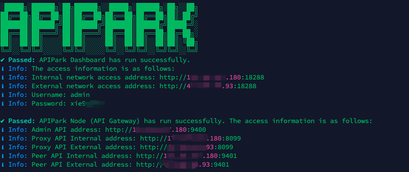
In my experience, you can see the successful deployment interface within 5 to 10 minutes. Then, you can log in to APIPark using your account.
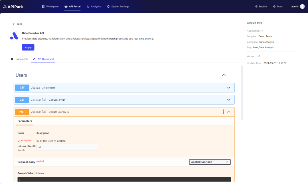
Step 2: Call the OpenAI API.