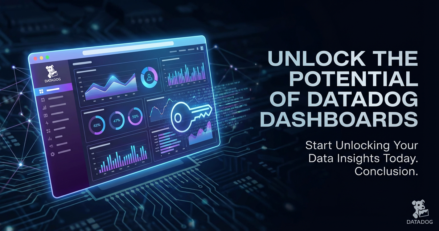
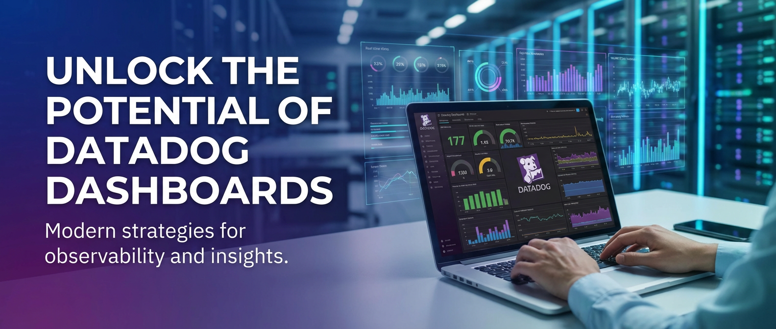
Unlock the Potential of Datadog Dashboards


In the relentless march of technological progress, where applications are fragmented into microservices, infrastructure spans hybrid and multi-cloud environments, and user expectations demand unparalleled uptime and performance, the ability to see, understand, and react to the intricate dance of systems has become not just a luxury, but an existential imperative. The modern digital landscape is a tapestry woven from countless threads of data, a complex ecosystem where every click, every API call, every transaction generates a torrent of information. Without a robust and intuitive system to distill this chaos into clarity, organizations risk flying blind, navigating a storm without a compass. This is where the profound power of observability platforms like Datadog comes into play, offering a unified lens through which to perceive the health, performance, and security of an entire technological stack.
At the heart of Datadog's comprehensive suite of tools lies a feature that transforms raw data into actionable intelligence: the Datadog Dashboard. Far more than just a collection of pretty graphs, these dashboards serve as the command center for engineers, operations teams, and even business stakeholders, providing real-time insights into the pulse of their digital operations. They are the narrative canvas upon which the story of system performance, user experience, and business metrics is continuously told, enabling quick identification of anomalies, proactive problem-solving, and informed decision-making. To truly unlock the potential of Datadog Dashboards is to empower teams with the vision required to thrive in a perpetually evolving technological world, transforming mountains of metrics, logs, and traces into a clear, concise, and compelling story. This article will embark on a comprehensive journey, exploring the fundamental principles, advanced techniques, and strategic applications of Datadog Dashboards, demonstrating how they can be harnessed to achieve unparalleled operational excellence and drive innovation across the enterprise.
The Indispensable Role of Monitoring in Modern Ecosystems
The era of monolithic applications running on a handful of dedicated servers is largely behind us. Today's applications are distributed, ephemeral, and dynamic, often consisting of hundreds of microservices, serverless functions, and containers orchestrated across multiple cloud providers. This architectural shift, while offering unprecedented agility and scalability, introduces a commensurate increase in complexity. Debugging issues in a monolithic application might involve inspecting a few log files; troubleshooting a distributed system, however, requires correlating data across dozens of services, infrastructure components, and network layers. The sheer volume and velocity of data generated by these systems make manual observation an impossible task.
Monitoring, therefore, transcends mere server uptime checks; it evolves into an all-encompassing discipline known as observability. Observability is the ability to infer the internal states of a system by examining its external outputs: metrics, logs, and traces. It's about asking arbitrary questions of your system and getting answers, even for scenarios you didn't explicitly predict. Without robust observability, teams are perpetually reactive, constantly firefighting critical incidents, struggling to pinpoint root causes, and ultimately delivering a suboptimal experience to their users. Proactive monitoring, facilitated by powerful dashboards, allows teams to identify subtle shifts, anticipate problems before they escalate, and understand the intricate dependencies that underpin their applications. This shift from reactive firefighting to proactive, data-driven decision-making is critical for maintaining uptime, ensuring performance, and ultimately safeguarding customer trust and business continuity in the modern, always-on digital economy.
Datadog: A Unified Platform for Observability
Datadog has emerged as a frontrunner in the observability space, distinguishing itself through its commitment to unifying disparate data streams into a single, cohesive platform. Unlike traditional monitoring tools that often specialize in one aspect – be it metrics, logs, or traces – Datadog's strength lies in its ability to ingest, correlate, and visualize all these signals in concert. This holistic approach means that an engineer investigating a spike in API latency doesn't just see a graph; they can seamlessly pivot from that metric to the underlying traces that show the full path of the request across microservices, and then drill down into the logs generated by each service at that precise moment. This integrated view dramatically accelerates root cause analysis and reduces the mean time to resolution (MTTR).
The platform's architecture is designed for scale and flexibility. It employs a lightweight agent that runs on hosts, containers, and serverless functions, collecting a vast array of metrics, logs, and traces from the operating system, applications, and custom scripts. Beyond agent-based collection, Datadog offers extensive integrations with over 700 technologies, including cloud providers (AWS, Azure, GCP), databases (PostgreSQL, MongoDB), web servers (Nginx, Apache), message queues (Kafka, RabbitMQ), and a myriad of third-party services. This broad compatibility ensures that virtually any component of a modern tech stack can feed its data into Datadog, creating a truly unified data lake for observability. This unified data then becomes the raw material for constructing highly informative and actionable dashboards, transforming raw telemetry into a clear, understandable narrative of system behavior and performance.
Deep Dive into Datadog Dashboards: The Command Center
Datadog Dashboards are the visual interface to your entire operational landscape, translating complex data into understandable graphs, charts, and statistics. They serve as the central hub for monitoring system health, application performance, user activity, and business metrics. Their power lies not just in their aesthetic presentation, but in their dynamic interactivity and the ability to tell a comprehensive story about your systems at a glance. They allow teams to move beyond mere data points to derive meaningful insights, facilitating rapid problem identification, performance optimization, and strategic decision-making.
Datadog offers two primary types of dashboards, each tailored for different use cases and offering distinct advantages:
Timeboards vs. Screenboards: A Comparative Overview
| Feature | Timeboards
This section will detail the various types of widgets available in Datadog and how to effectively utilize them to build informative and insightful dashboards. The selection and configuration of widgets are paramount to creating a dashboard that effectively communicates the desired narrative. Each widget type serves a unique purpose, providing a distinct perspective on the underlying data.
Key Components of a Dashboard
- Widgets: The fundamental building blocks of any Datadog Dashboard are its widgets. They are the visual representations of your metrics, logs, traces, and various other data sources. Datadog offers a rich variety of widget types, each designed to convey specific kinds of information effectively.
- Timeseries Graph: The quintessential line graph, displaying how one or more metrics change over time. Ideal for observing trends, spikes, and dips in performance metrics like CPU utilization, request latency, or error rates. Users can layer multiple metrics, apply functions (sum, average, count, max, min, percentiles), and group by tags.
- Query Value: Displays the current value of a metric or a derived aggregate (e.g., average, sum, min, max). Perfect for showing critical KPIs like current active users, total errors, or the latest API response time at a glance.
- Table: Presents tabular data, often used to rank hosts, services, or containers by a specific metric. For instance, displaying the top 10 services by error count or the hosts with the highest CPU usage. This is particularly useful for scrutinizing the performance of individual API endpoints or services managed by an API Gateway.
- Heatmap: Visualizes the distribution of a metric over time, often used for latency or resource utilization. It can reveal patterns and hot spots that might be missed in a standard timeseries graph, showing where the majority of values lie.
- Top List: Similar to a table but visually optimized for displaying a ranked list of items based on a metric, e.g., top-N slowest API endpoints.
- Log Stream: Directly embeds a live stream of filtered logs onto the dashboard. Invaluable for real-time troubleshooting, allowing engineers to see logs correlated with metric spikes.
- Trace List: Displays a list of traces based on filters, helping to pinpoint problematic requests within a specific timeframe or service.
- Event Stream: Shows a chronological list of events (e.g., deployments, alerts, configuration changes) which can be crucial for correlating performance changes with operational activities.
- Host Map/Container Map: Provides a visual overview of your infrastructure, color-coded by a chosen metric (e.g., CPU, memory pressure), allowing for quick identification of unhealthy hosts or containers.
- Service Map: Visually represents the dependencies and communication between different services in your application, often highlighting problematic links or high-latency paths.
- Network Map: Offers a topological view of network traffic and connections, useful for identifying network bottlenecks or unusual traffic patterns.
- Markdown/Text: Allows for adding rich text, explanations, links, and images to provide context and guidance for dashboard users. Essential for making dashboards self-explanatory and for linking to runbooks or documentation.
- Image: Embeds images, such as architecture diagrams or team logos, to enhance visual communication.
- Alert Value: Shows the status of a specific monitor, providing an immediate visual cue if an important alert is triggered.
- Iframe: Embeds external web content directly into the dashboard, useful for integrating dashboards from other tools or internal status pages.
- Anomaly Graph: Visualizes metrics alongside their expected range, highlighting unusual deviations that might indicate emerging problems.
- Change Graph: Focuses on percentage changes in metrics, helping to spot significant shifts in behavior rather than absolute values.
- Graphing Types: Beyond the widget choice, the specific graphing type within a widget (especially for timeseries) significantly impacts readability. Options include line, area, bar, stacked bar, and scatter plots. Each has its strengths; for instance, line graphs are excellent for trends, while bar graphs are better for comparing discrete values.
- Templating Variables: This is a powerful feature that makes dashboards dynamic and reusable. Templating allows users to create dropdown menus on a dashboard to filter all widgets based on a selected tag (e.g.,
host,service,env,region). Instead of creating a separate dashboard for each environment or service, a single templatized dashboard can serve all purposes, simply by changing a variable. This is invaluable for managing large, complex infrastructures where individual resources or API endpoints need to be quickly isolated for inspection. - Timeframes and Auto-Refresh: Dashboards allow you to set a global timeframe (e.g., last 1 hour, 4 hours, 1 day) and configure auto-refresh intervals. This ensures that the data displayed is always current, providing a real-time pulse of your systems, which is critical during incident response.
- Sharing and Collaboration Features: Dashboards can be easily shared with specific teams, individuals, or made public. They also support annotations, allowing users to add notes about specific events (e.g., deployments, outages) directly onto the graphs, providing crucial context for future analysis and collaboration.
Best Practices for Dashboard Design
Creating effective Datadog Dashboards is as much an art as it is a science. A poorly designed dashboard can be overwhelming and counterproductive, while a well-crafted one becomes an invaluable asset for operational insight.
- Clarity Over Clutter: Resist the urge to cram too many widgets onto a single dashboard. Each dashboard should have a clear purpose and tell a coherent story. If a dashboard becomes too busy, consider breaking it down into multiple, more focused dashboards. Prioritize the most important metrics that address the dashboard's primary objective.
- Audience-Specific Dashboards: Different stakeholders have different needs. An SRE team might need highly granular, technical metrics, while business leaders require high-level KPIs.
- SRE/Operations Dashboards: Focus on "golden signals" (latency, traffic, errors, saturation), detailed infrastructure health, and service-level performance.
- Developer Dashboards: Emphasize application-specific metrics, API endpoint performance, error traces, and log streams relevant to their code.
- Business Dashboards: Showcase key performance indicators (KPIs) like conversion rates, user engagement, revenue, and customer experience metrics.
- Security Dashboards: Monitor authentication failures, unusual network activity, threat detections, and compliance status.
- The "Golden Signals" Approach: For application and service monitoring, always start with the four golden signals:
- Latency: How long does it take to serve a request? (e.g.,
avg:api.request.duration{service:user-service}). - Traffic: How much demand is being placed on your system? (e.g.,
sum:api.requests.total{service:user-service}). - Errors: How often does the system fail? (e.g.,
sum:api.errors.total{service:user-service}). - Saturation: How full is your system? (e.g.,
avg:system.cpu.utilization{service:user-service}). These provide a high-level view of service health and are excellent candidates for the top section of any application dashboard.
- Latency: How long does it take to serve a request? (e.g.,
- Storytelling with Data: Arrange widgets logically to guide the viewer through a narrative. Start with high-level summaries or critical KPIs at the top, followed by more granular details and diagnostic information further down. For instance, a dashboard might start with overall application health, then drill down into individual service performance, and finally display relevant logs and traces. This sequential flow helps users quickly understand the context and then dive deeper if an issue is identified.
- Iterative Design: Dashboards are not static artifacts. They should evolve as your systems change, and as your understanding of what's important grows. Regularly review your dashboards with your team. Are they still providing value? Are there missing metrics? Are some widgets never looked at? Solicit feedback and refine them over time to ensure they remain relevant and useful.
- Use Markdown and Text Widgets for Context: Don't assume everyone understands every graph. Use markdown widgets to add descriptions, explain complex metrics, link to relevant documentation, or provide runbook instructions. This significantly reduces the cognitive load on users and makes dashboards more accessible.
- Leverage Templating Variables Extensively: As mentioned, templating is key for scalability. If you have multiple environments (dev, staging, prod) or instances of a service, create a single dashboard with a "env" or "service" template variable. This reduces maintenance overhead and provides flexibility.
- Consistent Naming and Tagging: Ensure that your metrics, hosts, and services are consistently named and tagged across your infrastructure. This consistency is vital for building queries that work across different widgets and for making templating effective. Standardized tags like
service,env,team,regionare indispensable for filtering and grouping data.
By adhering to these principles, teams can transform their Datadog Dashboards from mere data displays into powerful, intuitive command centers that provide unparalleled visibility and empower proactive operational management.
Integrating Data Sources for Comprehensive Dashboards
The true strength of Datadog Dashboards lies in their ability to aggregate and present data from an incredibly diverse array of sources. A comprehensive dashboard isn't built from isolated data points; it's a mosaic created from correlated metrics, logs, and traces originating from every layer of your technological stack. Understanding how to effectively collect and integrate these data sources is foundational to unlocking the full potential of your dashboards.
Metrics Collection
Metrics are numerical values measured over time, providing quantitative insights into the behavior and performance of your systems.
- Agent-Based Collection: The primary method for collecting infrastructure and application metrics is through the Datadog Agent. This lightweight agent runs on your hosts, containers (Docker, Kubernetes), and even serverless environments.
- System Metrics: The agent automatically collects crucial system-level metrics like CPU utilization, memory usage, disk I/O, network traffic, and process statistics. These are fundamental for any infrastructure health dashboard.
- Application Integrations: Beyond basic system metrics, the agent also includes numerous integrations for popular technologies. For instance, it can pull metrics from web servers (Nginx, Apache), databases (PostgreSQL, MySQL, Redis), message brokers (Kafka, RabbitMQ), and cloud services, providing insights into their operational status.
- Custom Checks: For applications or services not covered by standard integrations, the agent supports custom checks written in Python, allowing you to collect specific performance indicators unique to your software.
- Custom Metrics (DogStatsD): For instrumenting your own application code with performance metrics, DogStatsD is indispensable. This protocol, compatible with Datadog's agent, allows developers to send custom metrics (counters, gauges, histograms, timers) directly from their applications. For example, you might track the number of times a specific function is called, the duration of an internal computation, or the size of a queue. This granular, application-specific data is crucial for building detailed performance dashboards and understanding the internal workings of your software. When monitoring custom API endpoints, DogStatsD is perfect for tracking request counts, response times, and error codes at a very precise level within your application logic.
- Cloud Integrations: Datadog offers deep, native integrations with major cloud providers such as AWS, Azure, and Google Cloud Platform. This allows Datadog to ingest metrics directly from cloud services like EC2, S3, Lambda, RDS, Azure VMs, Azure Functions, GCP Compute Engine, and Cloud Spanner, without requiring an agent on every single resource. These integrations are vital for monitoring the managed services that form the backbone of many cloud-native architectures, enriching dashboards with data from components you don't directly control.
- API Integrations: Many modern applications and services rely heavily on external APIs for various functionalities – payment processing, content delivery networks (CDNs), identity providers, or even internal service-to-service communication. Datadog can be configured to collect metrics from these external API sources. This is typically achieved in a few ways:
- Synthetic Monitoring: Datadog's Synthetic Monitoring can make regular API calls to external endpoints, measuring latency, response codes, and payload content. These synthetic checks generate metrics that can be charted on dashboards, providing an external, user-like perspective on API availability and performance.
- Custom Integrations/Webhooks: For certain proprietary or niche APIs, you might need to write custom scripts or leverage webhooks that pull data from the API and then push it into Datadog as custom metrics via DogStatsD or the Datadog API itself. This allows for monitoring specialized APIs that might expose operational data relevant to your business.
- API Management Platforms: An increasingly important data source for API metrics comes from dedicated API Gateway and management platforms. These platforms sit in front of your APIs, handling traffic routing, authentication, rate limiting, and analytics. They collect incredibly valuable metrics about API usage, performance, and errors. A robust API Gateway provides a unified point of observation for all incoming API traffic.
Log Management
Logs are timestamped records of events that occur within your systems, providing a detailed textual narrative of what happened, when, and why. Integrating logs into dashboards brings invaluable context to metric trends.
- Collecting Logs: Datadog can collect logs from virtually any source:
- Files: From application log files on hosts and containers.
- System Logs: Syslog, journald.
- Cloud Logs: CloudWatch Logs, Azure Monitor, Google Cloud Logging.
- Log Forwarders: Fluentd, Logstash, Vector. The Datadog Agent includes a sophisticated log collection and forwarding mechanism, capable of tailing files, listening on network ports, and integrating with container orchestrators.
- Structured Logging and Parsing: For logs to be truly useful in dashboards, they need to be parseable and ideally structured (JSON, key-value pairs). Datadog's Log Processing Pipelines allow you to extract relevant attributes (facets) from raw log lines (e.g.,
status_code,user_id,latency_ms,api_endpoint). These facets can then be used for filtering, grouping, and aggregating logs, making them queryable and visualizable. - Log Patterns and Facets in Dashboards: Once logs are ingested and parsed, dashboards can leverage them in several ways:
- Log Streams: Embed a live stream of filtered logs, directly correlating log messages with metric spikes. If an API latency graph shows a sudden increase, a nearby log stream widget filtered for that API service might immediately reveal corresponding error messages.
- Log Facets as Widgets: You can create widgets that show the count of specific log patterns or the distribution of values from a log facet. For example, a pie chart showing the distribution of HTTP status codes from your API Gateway logs, or a table listing the top error messages.
- Log-based Metrics: Datadog can generate metrics directly from logs. If you have a log line indicating a successful transaction, you can create a metric
transaction.success.countfrom it, which can then be charted like any other metric. This is incredibly powerful for turning textual data into quantitative trends.
APM (Application Performance Monitoring)
APM provides deep visibility into the performance of individual applications and services, tracking requests as they flow through your distributed system.
- Tracing Requests End-to-End: Datadog APM uses distributed tracing to follow a single request across multiple services, databases, and queues. Each operation within a request (a "span") is recorded, showing its duration, errors, and associated metadata. This allows for a complete, end-to-end view of the request lifecycle, crucial for understanding performance bottlenecks in complex microservice architectures.
- Service Maps and Dependencies: APM automatically generates service maps, visually representing the dependencies between your services. This helps identify which services are calling which, and pinpoint potential bottlenecks or failure domains. These maps can be integrated into dashboards to provide a high-level architectural overview.
- Linking Traces to Metrics and Logs: One of Datadog's most powerful features is the seamless correlation between traces, metrics, and logs. If a dashboard shows a spike in API latency (metric), you can click on that point on the graph to immediately see relevant traces and logs from that exact timeframe, allowing for rapid root cause analysis. This integrated view is invaluable for debugging issues related to specific API calls.
- The Role of an API Gateway in APM: An API Gateway is a critical component in a modern microservices architecture, acting as the single entry point for all API requests. It handles concerns like authentication, authorization, rate limiting, request routing, and often, telemetry collection.This makes a robust API Gateway an exceptionally rich source of data for Datadog Dashboards, providing both high-level and granular insights into your API ecosystem.
- Centralized Monitoring Point: By placing an API Gateway at the edge, you gain a centralized point for monitoring all incoming API traffic. This means you can observe overall request volume, latency, and error rates before requests even reach individual services.
- Traffic Management: The API Gateway can provide metrics on traffic shaping, load balancing decisions, and circuit breaker states.
- Security Observability: It can report on authentication failures, unauthorized access attempts, and other security-related events.
- Distributed Tracing Integration: Many API Gateways are designed to inject and propagate tracing headers (like OpenTelemetry or W3C Trace Context), ensuring that traces initiated at the gateway continue seamlessly through downstream services and are correctly captured by APM tools like Datadog.
APIPark is a high-performance AI gateway that allows you to securely access the most comprehensive LLM APIs globally on the APIPark platform, including OpenAI, Anthropic, Mistral, Llama2, Google Gemini, and more.Try APIPark now! 👇👇👇
Practical Applications: Building Powerful Dashboards
Now that we understand the various data sources and dashboard components, let's explore practical applications by building several types of powerful Datadog Dashboards. Each dashboard serves a distinct purpose, combining different widgets and data sources to tell a specific story.
Use Case 1: Infrastructure Health Dashboard
This dashboard provides a high-level overview of the health and resource utilization of your underlying infrastructure, whether it be virtual machines, containers, or serverless functions. It's often the first place operations teams look during an incident.
Key Metrics & Widgets: * Host Map/Container Map Widget: Color-coded by CPU utilization or memory pressure. This gives an immediate visual cue for any overloaded or unhealthy nodes. Template variables could allow filtering by env, region, or service. * Timeseries Graphs: * system.cpu.idle (or system.cpu.utilization): Average CPU usage across all hosts/containers, grouped by host. * system.mem.used / system.mem.total: Memory usage across infrastructure. * system.disk.in_use: Disk utilization (especially for data-heavy services). * system.net.bytes_rcvd / system.net.bytes_sent: Network I/O. * system.load.1, system.load.5, system.load.15: Load average. * Query Value Widgets: Displaying the total number of active hosts/containers, or the highest CPU/memory usage on any single node. * Top List Widget: Identifying the top N hosts by highest CPU usage or memory consumption, which helps in quickly identifying resource contention. * Process List Widget: (For specific hosts) Showing the top processes consuming resources on a problematic host. * Event Stream Widget: Displaying infrastructure-level events such as host reboots, scaling events, or configuration changes, providing context for any metric fluctuations.
Value: This dashboard helps teams quickly identify infrastructure bottlenecks, resource exhaustion, and overall system stability issues before they impact applications, ensuring a stable foundation for all services.
Use Case 2: Application Performance Dashboard
This dashboard focuses on the "golden signals" of your application and individual services, providing crucial insights into user-facing performance and reliability. This is where the output of your APIs truly comes to life.
Key Metrics & Widgets: * Timeseries Graphs (Golden Signals): * trace.http.request.duration: Average and 90th/95th percentile latency for all API requests, grouped by service. * trace.http.request.hits: Total request volume (traffic) for the application. * trace.http.request.errors: Total error rate (HTTP 5xx, application errors) for the application. * system.cpu.utilization (of application hosts/containers): Saturation metric. * Query Value Widgets: Current average API latency, current error rate percentage, current requests per second. * Top List Widget: Slowest API endpoints (grouped by URL path or operation name) by average latency. * Service Map Widget: A visual representation of service dependencies, highlighting any services that are currently experiencing high latency or error rates. * Log Stream Widget: Filtered for application errors (e.g., status:error and service:my-app), providing immediate textual context for performance degradation. * Trace List Widget: Filtered for high-latency or error-generating traces, allowing engineers to quickly jump into specific problematic requests for detailed investigation. * Alert Value Widgets: Showing the status of critical APM monitors (e.g., "High API Latency," "Elevated Error Rate").
Value: This dashboard empowers development and SRE teams to monitor the health of their applications in real-time, quickly diagnose performance issues, and ensure a high-quality user experience across all interactions, including direct API calls from client applications.
Use Case 3: Business KPI Dashboard
Beyond technical metrics, Datadog can also be used to track business-critical KPIs, demonstrating the direct impact of your technology on business outcomes. This is where technology meets strategy.
Key Metrics & Widgets: * Query Value Widgets: * Total User Sign-ups (from a custom metric user.signup.count). * Conversion Rate (derived from transactions.success / page.views.checkout). * Daily Revenue (from a custom revenue.total metric). * Active Users. * Timeseries Graphs: * user.signup.count over time. * order.processing.success vs. order.processing.failure rates. * Geographic distribution of user activity (if location data is tagged). * Website traffic metrics from RUM (Real User Monitoring) or Synthetic monitoring. * Top List Widget: Top-performing products or features (if instrumented). * Markdown Widget: Explaining what each KPI represents and linking to business intelligence reports or strategic documents. * Anomaly Graph: For key business metrics like conversion rate, highlighting unusual deviations that might indicate a market shift or a technical issue impacting business.
Value: This dashboard bridges the gap between technical operations and business objectives, providing business stakeholders with a real-time pulse of their company's performance and highlighting how technical issues might directly impact revenue or user growth.
Use Case 4: Security and Compliance Dashboard
In an era of increasing cyber threats and stringent regulations, monitoring security posture is non-negotiable. Datadog can be a powerful tool for visualizing security events and ensuring compliance.
Key Metrics & Widgets: * Timeseries Graphs: * security.auth.failed_logins: Count of failed login attempts over time. * security.network.denied_connections: Number of blocked network connection attempts. * security.audit.events: Volume of audit log events. * aws.cloudtrail.event_count / azure.monitor.auditlogs.count: Cloud audit log volume. * Query Value Widget: Number of active security threats detected (if integrated with security tools). * Table Widget: Top N source IPs attempting unauthorized access, or the most frequently targeted users. * Log Stream Widget: Filtered for critical security events (e.g., severity:high AND type:security), showing a real-time feed of potential threats. * Geo Map Widget: (If IP data is available) Visualizing the geographic origin of suspicious login attempts or network activity. * Alert Value Widgets: Status of monitors for critical security alerts (e.g., "Brute Force Detected," "Unauthorized Access to S3 Bucket").
Value: This dashboard provides security teams with immediate visibility into potential threats, policy violations, and compliance status, enabling rapid response to security incidents and helping maintain a robust security posture.
Use Case 5: Monitoring an API Gateway
A dedicated API Gateway dashboard is crucial for any organization that relies heavily on APIs for internal communication, partner integrations, or public exposure. The API Gateway is the frontline for your services, and its health is paramount. It's an excellent point to discuss how platforms like APIPark integrate into this ecosystem.
The modern digital economy thrives on interconnected services, and at the heart of this intricate web lies the API Gateway. This critical infrastructure component acts as the single entry point for all API requests, orchestrating traffic, enforcing security policies, and providing a unified façade for backend services. For organizations leveraging microservices, hybrid cloud architectures, or offering APIs as a product, the health and performance of their API Gateway are directly tied to the overall reliability and responsiveness of their entire ecosystem. Monitoring this layer meticulously is not just beneficial; it's absolutely essential.
For instance, consider a robust API Gateway like ApiPark. APIPark, an Open Source AI Gateway & API Management Platform, is designed to streamline the management, integration, and deployment of both AI and traditional REST services. As a centralized control plane for all API traffic, APIPark generates a wealth of operational data that is invaluable for Datadog Dashboards. Its capabilities, from quick integration of 100+ AI models to end-to-end API lifecycle management and detailed API call logging, make it an ideal source of granular metrics. By integrating APIPark's telemetry into Datadog, teams gain unparalleled visibility into their entire API landscape, from the initial request to the final response, encompassing both human-facing applications and AI-driven workflows.
Key Metrics & Widgets for an API Gateway Dashboard (e.g., with APIPark):
- Overall API Health:
- Timeseries Graph:
apipark.api.requests.total(Total request count per second across all APIs). This shows the overall traffic volume handled by the gateway. - Timeseries Graph:
apipark.api.latency.avgandapipark.api.latency.p95(Average and 95th percentile latency for all requests through the gateway). Essential for understanding user experience. - Timeseries Graph:
apipark.api.errors.total(Total 4xx and 5xx error rates). Critical for identifying immediate issues impacting consumers. - Query Value: Current active connections/requests.
- Query Value: Overall 5xx error percentage.
- Timeseries Graph:
- Individual API Performance (Leveraging Templating):
- Use a templating variable for
api_nameorapi_version. - Timeseries Graph:
apipark.api.requests.total{api_name:$api_name}. Showing traffic for a specific API. - Timeseries Graph:
apipark.api.latency.p99{api_name:$api_name}. Highlighting tail latency for specific critical APIs. - Table Widget: List of all APIs, ranked by
apipark.api.errors.rate(error percentage), allowing quick identification of problematic APIs. This can easily be derived from APIPark's detailed API call logging.
- Use a templating variable for
- Client & Consumer Metrics:
- Top List Widget: Top N
client_ids orconsumer_groups by request volume. Identifying heavy users or potential abuse. - Top List Widget: Top N
client_ids orconsumer_groups experiencing the highest error rates. - Timeseries Graph: Requests per second, grouped by
client_id(if available and not too high cardinality).
- Top List Widget: Top N
- Security & Policy Enforcement:
- Timeseries Graph:
apipark.security.auth_failures(Authentication failures). - Timeseries Graph:
apipark.rate_limit.exceeded(Requests denied due to rate limiting). - Log Stream Widget: Filtered for
service:apiparkandstatus:error OR status:warnto see real-time security events, policy violations, or gateway configuration issues. APIPark's comprehensive logging capabilities provide this granular detail.
- Timeseries Graph:
- Resource Utilization of the Gateway Itself:
- Timeseries Graph:
system.cpu.utilizationandsystem.mem.usedfor the hosts running APIPark instances. Even a high-performance gateway like APIPark, capable of over 20,000 TPS on an 8-core CPU, needs monitoring to ensure it's not resource-constrained.
- Timeseries Graph:
- AI Model Specific Metrics (Relevant for APIPark's AI Gateway features):
- Timeseries Graph:
apipark.ai.model.invocations.total(Total calls to specific AI models, grouped byai_model_name). - Timeseries Graph:
apipark.ai.model.latency.avg(Latency for AI model invocations). - Table Widget: Top N AI models by invocation count or error rate. This showcases how the Open Platform nature of APIPark allows integration and monitoring of diverse AI services.
- Query Value: Total tokens processed by AI models.
- Timeseries Graph:
Value: A dedicated API Gateway dashboard provides a critical vantage point for managing and operating your API ecosystem. It helps: * Proactive Issue Detection: Spot latency spikes or error rate increases at the gateway before they are reported by users. * Traffic Management Insights: Understand traffic patterns, identify peak usage, and plan for scaling. * Security Oversight: Monitor for unauthorized access, rate limit breaches, and other security incidents. * Performance Optimization: Pinpoint underperforming APIs or client applications. * Business Intelligence: Track API consumption, which can be a direct business metric for API products. * Operational Efficiency: For platforms like APIPark, which offer a unified API format for AI invocation and prompt encapsulation into REST API, this dashboard allows teams to monitor the performance of these encapsulated AI services just as easily as traditional REST APIs. The Open Platform approach of APIPark means that these insights are crucial for driving further development and adoption of AI services.
By combining these diverse data sources and building targeted dashboards, organizations can move from a fragmented view of their operations to a unified, intelligent command center, ultimately unlocking unprecedented levels of operational efficiency and strategic foresight.
Advanced Dashboard Features and Tips
Mastering the basics of Datadog Dashboards is a great start, but the platform offers a wealth of advanced features that can elevate your monitoring capabilities from good to exceptional. These techniques allow for deeper insights, more precise analysis, and a more dynamic user experience.
- Alerting from Dashboards: While Datadog has a dedicated monitors section, you can quickly create an alert directly from any graph on your dashboard. If you observe a metric behaving abnormally on a timeseries graph, you can convert that graph's query into a monitor with a few clicks. This ensures that the insights you gain from your visual data can be immediately translated into actionable alerts, notifying the right teams when critical thresholds are breached. This seamless transition from observation to action is a cornerstone of proactive incident management.
- Graphing Queries: Datadog Query Language (DQL): Beneath every widget lies a powerful query written in Datadog's query language. Understanding DQL is key to unlocking complex visualizations. It allows for:
- Metric Functions: Applying mathematical functions (e.g.,
rate,integral,diff,cumulative_sum,rollup) to transform raw metrics into more meaningful representations. For example,rate(avg:system.cpu.user{host:my-host})shows CPU usage per second. - Conditional Aggregations: Combining different aggregation methods.
- Arithmetical Operations: Performing calculations between multiple metrics (e.g.,
sum:metric_a / sum:metric_bto get a ratio or percentage). This is invaluable for creating custom KPIs like error rates, or success rates for an API service (e.g.,sum:apipark.api.errors.total / sum:apipark.api.requests.total). - Filtering and Grouping: Precisely filtering data by tags (e.g.,
env:production,service:my-api) and grouping by those tags to compare different entities. - Formula & Functions: Creating complex formulas directly in the graph to derive new metrics on the fly or perform transformations like
abs(),log(),pow(). This provides immense flexibility without needing to create new custom metrics at the source.
- Metric Functions: Applying mathematical functions (e.g.,
- Annotations and Events: Datadog allows you to annotate specific points in time on your graphs. These annotations can be created manually, or automatically via integrations (e.g., GitHub for code deployments, Jenkins for CI/CD pipeline runs). Events (like deployments, configuration changes, or critical alerts) appear as vertical lines on your timeseries graphs. This provides crucial context for understanding why a metric might have suddenly changed. For instance, a spike in API errors after a new deployment event (visible as an annotation) immediately points towards the deployment as a potential cause.
- Dashboard Lists and Groups: As your organization grows, you might accumulate dozens or even hundreds of dashboards. Datadog helps manage this complexity through dashboard lists and groups.
- Dashboard Lists: Allow you to organize related dashboards into logical categories (e.g., "Infrastructure," "Application A," "Security," "API Gateway Monitoring").
- Groups: Within lists, you can further group dashboards by team, environment, or project. This ensures that users can quickly find the dashboards relevant to their roles and responsibilities, preventing information overload.
- Synthetic Monitoring Widgets: Datadog Synthetic Monitoring allows you to simulate user interactions or API calls from various global locations, providing an external perspective on your application's availability and performance. Widgets for Synthetics can display:
- Availability Graph: Showing uptime percentage.
- Latency Graph: End-to-end response times from different locations.
- Status Widget: A quick overview of the current status of key synthetic tests. These widgets are invaluable for front-end dashboards or for monitoring critical external API dependencies, demonstrating how your application performs from a user's perspective, or how reliable external APIs are.
- Custom Dashboards with External Data (Webhooks, CSV): For highly specialized use cases, Datadog offers more advanced ways to ingest data beyond its standard agents and integrations. While less common for typical operational dashboards, you can:
- Webhooks: Send data from custom sources to Datadog's API endpoint.
- CSV Upload: Ingest historical data from CSV files for comparison or trend analysis (though this is more for one-off analysis than real-time monitoring). These methods offer flexibility for integrating niche data sources that might not have direct integrations, further enhancing the "Open Platform" nature of Datadog.
- Dashboard History and Rollback: Datadog automatically keeps a history of dashboard changes. This means if an unintended modification breaks a dashboard, you can easily view past versions and roll back to a functional state. This feature is crucial for maintaining dashboard integrity in collaborative environments where multiple team members might be making adjustments.
- Automated Dashboard Creation (API): For organizations with extensive infrastructure or dynamic service deployments, manually creating dashboards can be time-consuming. Datadog's API allows for programmatic creation, modification, and deletion of dashboards. This enables "infrastructure as code" principles to be applied to your monitoring setup, allowing you to automatically spin up relevant dashboards alongside new services or environments, ensuring consistent monitoring practices from the outset. This ties perfectly into the automated deployment story of a comprehensive API Management platform like APIPark, where new APIs and AI models can be deployed and simultaneously have their corresponding Datadog dashboards provisioned.
By delving into these advanced features, teams can move beyond basic visualization to create highly sophisticated, context-rich, and automated monitoring solutions. This not only enhances visibility but also streamlines operational workflows, accelerates problem resolution, and ultimately contributes to a more resilient and high-performing digital ecosystem.
The Future of Observability and Dashboards
The landscape of technology is in perpetual flux, and with it, the demands placed upon observability platforms and their dashboards continue to evolve. What was considered cutting-edge yesterday is merely standard practice today. The future promises an even deeper integration of intelligence, automation, and user-centric design to empower teams further.
- AI/ML-Driven Insights: The sheer volume and velocity of data generated by modern systems often overwhelm human analysts. Future dashboards will increasingly leverage artificial intelligence and machine learning to cut through the noise. This means:
- Intelligent Anomaly Detection: Moving beyond static thresholds, AI will dynamically learn baselines and identify subtle, multivariate anomalies that indicate emerging problems, even in highly complex systems.
- Root Cause Analysis Assistance: AI algorithms will assist in correlating disparate data points (metrics, logs, traces) to suggest potential root causes for incidents, significantly reducing MTTR.
- Automated Summarization: Dashboards might automatically summarize key events, changes, and their potential impact, providing context without requiring extensive manual digging.
- Predictive Analytics: Forecasting future resource needs, potential performance bottlenecks, or even likely failure points based on historical trends and current system state.
- Proactive Anomaly Detection: The goal is to identify and resolve issues before users are even aware of them. AI-powered anomaly detection will be central to this, but also advancements in:
- Contextual Alerting: Alerts will be richer, providing more context about the anomaly, its potential impact, and suggested remediation steps directly within the notification or dashboard.
- Automated Self-Healing: In conjunction with intelligent dashboards, systems might be designed to trigger automated remediation actions (e.g., scaling up resources, rolling back deployments) when specific anomalies are detected, moving towards truly autonomous operations.
- Enhanced Collaboration and Automation: Dashboards are inherently collaborative tools, and future iterations will amplify this aspect:
- Integrated Communication: Tighter integration with communication platforms (Slack, Microsoft Teams) to facilitate discussions around dashboard insights, share findings, and initiate incident response workflows directly from the dashboard interface.
- Runbook Automation Integration: Dashboards will offer direct links or embedded controls to trigger automated runbooks, allowing operators to execute diagnostic or remediation steps with a single click, enhancing efficiency during critical events.
- Personalized Views: Dashboards will become even more customizable, potentially using AI to suggest relevant widgets and layouts based on a user's role, recent activity, and historical preferences, ensuring each user sees the most pertinent information immediately.
- Cross-Organizational Transparency: For large enterprises, dashboards will become central to sharing performance and operational insights across different departments, fostering a culture of transparency and shared understanding of system health. This is particularly relevant for platforms like APIPark which serve as an Open Platform allowing for API service sharing within teams, and independent API and access permissions for each tenant. The ability to visualize these diverse usage patterns and performance metrics will be crucial.
- The Continuous Evolution of Monitoring Tools: The core tenets of observability – metrics, logs, and traces – will remain, but how they are collected, processed, and presented will continuously evolve. This includes:
- Open Standards Adoption: Greater adoption of open standards like OpenTelemetry for telemetry data collection and correlation, enabling even more seamless integration across different tools and vendors. This aligns perfectly with the philosophy of an Open Platform like APIPark, which provides an open-source solution for API management.
- Serverless and Edge Observability: As computing pushes further to the edge and into serverless functions, monitoring tools will need to adapt to even more ephemeral and distributed environments, with specialized dashboards for these unique architectures.
- Sustainability Monitoring: Incorporating metrics related to the environmental impact of infrastructure (e.g., carbon emissions per transaction), making "green ops" a part of the dashboard narrative.
Datadog Dashboards, as the window into these complex systems, will transform into increasingly intelligent, adaptive, and interactive command centers. They will not merely display data but will actively guide decision-making, automate responses, and offer predictive foresight, ultimately enabling organizations to navigate the complexities of the digital future with greater confidence and agility. The journey to unlock their full potential is ongoing, promising a future where observability is not just about seeing, but about understanding, predicting, and acting with unprecedented precision.
Conclusion
In the intricate and ever-evolving landscape of modern digital operations, the ability to gain real-time, comprehensive insight into the performance, health, and security of your systems is no longer a competitive advantage – it is a fundamental necessity. Datadog Dashboards stand as the linchpin of this imperative, transforming a deluge of raw telemetry data into a coherent, actionable narrative. We have journeyed through their foundational components, distinguishing between Timeboards and Screenboards, dissecting the vast array of widgets, and emphasizing the critical role of robust data integration from diverse sources including metrics, logs, traces, and crucially, the performance indicators from your API infrastructure.
We explored the practical applications, demonstrating how to construct powerful dashboards for infrastructure health, application performance, business KPIs, security posture, and the vital monitoring of API Gateways. In this context, platforms like ApiPark, an Open Source AI Gateway & API Management Platform, exemplify how critical infrastructure components are rich data sources for Datadog. The detailed logging and performance metrics generated by an API Gateway like APIPark – encompassing everything from total requests and latency to error rates for individual API endpoints and AI model invocations – can be seamlessly integrated into Datadog, providing unparalleled visibility into your entire API ecosystem and ensuring the smooth operation of your services. APIPark’s nature as an Open Platform further underscores the interoperability and flexibility required to feed diverse data streams into a unified observability solution.
Beyond the basics, we delved into advanced techniques, from leveraging the Datadog Query Language for complex analysis to utilizing templating for dynamic dashboards, and understanding the significance of annotations for contextual understanding. The future of dashboards, as we envision it, is one augmented by AI and machine learning, driving predictive insights, proactive anomaly detection, and seamless automation to further reduce cognitive load and accelerate response times.
Ultimately, unlocking the full potential of Datadog Dashboards is about more than just graphing data; it's about empowering your teams with the clarity to make informed decisions, the agility to respond rapidly to incidents, and the foresight to continuously optimize your systems for resilience and efficiency. By strategically designing, iteratively refining, and intelligently leveraging these powerful visual tools, organizations can transform their operational challenges into opportunities for innovation, ensuring their digital endeavors not only survive but thrive in an increasingly complex world. Dashboards are not just a display; they are your eyes and ears, your early warning system, and your strategic compass in the vast digital ocean.
Frequently Asked Questions (FAQs)
1. What is the primary difference between a Timeboard and a Screenboard in Datadog?
A Timeboard is designed for analyzing time-series data, meaning all its widgets share a common global time window, allowing for direct comparison of metrics over the same period. It automatically adjusts widget sizes to fit the browser window, making it ideal for operational use cases where observing trends and correlations across various metrics over time is paramount. In contrast, a Screenboard provides a free-form canvas where widgets can be independently sized, positioned, and configured with different timeframes or auto-refresh settings. This flexibility makes Screenboards excellent for creating comprehensive, static status pages, executive overviews, or incident war rooms where diverse information, including text, images, and specific points in time, needs to be presented without strict time-correlation across all elements.
2. How can I ensure my Datadog Dashboards are not overwhelming or cluttered?
To prevent dashboards from becoming overwhelming, adhere to the principle of "clarity over clutter." Each dashboard should serve a specific, well-defined purpose, catering to a particular audience (e.g., SRE, business leadership, security). Prioritize only the most critical metrics and widgets that directly support that purpose, starting with high-level summaries and progressively adding detail. Utilize templating variables to make dashboards dynamic and reusable, reducing the need for multiple, slightly varied dashboards. Furthermore, strategically employ Markdown widgets for context and explanations, and regularly review and prune unnecessary widgets. If a dashboard feels too busy, consider breaking it down into several more focused dashboards, each telling a smaller, more specific story.
3. Can Datadog Dashboards monitor external APIs, and how does an API Gateway like APIPark contribute to this?
Yes, Datadog Dashboards can absolutely monitor external APIs. This is primarily achieved through Datadog's Synthetic Monitoring, which actively makes calls to external API endpoints and collects metrics on availability, latency, and response content. For internal APIs or APIs exposed via an API Gateway, agents and custom metrics (DogStatsD) can be used to collect granular data from the application layer. An API Gateway, such as APIPark, significantly enhances API monitoring by acting as a central point of traffic ingress and egress. APIPark, as an Open Source AI Gateway & API Management Platform, automatically gathers extensive metrics on total requests, latency, error rates, consumer usage, and even specific AI model invocations. These rich, pre-aggregated metrics from APIPark can be seamlessly ingested by Datadog, enabling the creation of comprehensive dashboards that provide a holistic view of the API ecosystem's health, performance, and security directly from the gateway's perspective.
4. What are the "golden signals" of monitoring, and why are they important for dashboards?
The "golden signals" are four key metrics that provide a comprehensive, high-level overview of any service's health and performance: Latency (how long requests take), Traffic (how much demand is on the service), Errors (how often the service fails), and Saturation (how full the service is). These signals are crucial for dashboards because they offer a consistent and effective way to quickly assess the operational status of any application or service. By prominently displaying these four metrics, ideally at the top of an application performance dashboard, teams can rapidly identify if there's a problem, determine its general nature, and begin more targeted investigations, making them indispensable for proactive monitoring and incident response.
5. How can I use Datadog's advanced features, like its Query Language, to create more powerful dashboard widgets?
Datadog's Query Language (DQL) empowers users to go beyond basic metric display by applying functions, performing arithmetic operations, and building complex aggregations directly within a widget's query. For example, instead of just displaying raw request counts, you can use DQL to calculate a real-time error rate by dividing the sum of error metrics by the sum of total request metrics (sum:api.errors.total / sum:api.requests.total). You can also apply functions like rate() to show changes per second, rollup() for different time aggregations, or diff() to show the difference between current and past values. Mastering DQL allows you to create custom KPIs, derive new insights from existing data, and precisely tailor widgets to answer specific questions about your systems' behavior.
🚀You can securely and efficiently call the OpenAI API on APIPark in just two steps:
Step 1: Deploy the APIPark AI gateway in 5 minutes.
APIPark is developed based on Golang, offering strong product performance and low development and maintenance costs. You can deploy APIPark with a single command line.
curl -sSO https://download.apipark.com/install/quick-start.sh; bash quick-start.sh

In my experience, you can see the successful deployment interface within 5 to 10 minutes. Then, you can log in to APIPark using your account.

Step 2: Call the OpenAI API.