Mastering Datadogs Dashboard: Tips for Real-Time Insights


In the relentless pursuit of operational excellence and system reliability, real-time insights have become the bedrock upon which modern enterprises thrive. The ability to instantly understand the health, performance, and behavior of complex distributed systems is no longer a luxury but a fundamental necessity. In this intricate landscape, Datadog emerges as a formidable ally, offering a unified observability platform that brings together metrics, traces, logs, and user experience data. At the heart of this powerful platform lies the Datadog Dashboard – a highly customizable, dynamic canvas where raw data transforms into actionable intelligence, illuminating the darkest corners of your infrastructure and applications.
Mastering Datadog's Dashboard is not merely about dragging and dropping widgets; it's an art form that combines a deep understanding of your systems with the strategic application of visualization best practices. It's about crafting a narrative from data, enabling teams—from developers and SREs to business stakeholders—to quickly diagnose issues, identify trends, and make informed decisions that drive efficiency and innovation. This comprehensive guide will delve into the intricacies of designing, optimizing, and leveraging Datadog Dashboards to unlock their full potential, ensuring you gain the real-time insights necessary to stay ahead in an ever-evolving technological environment. We will explore the foundational principles, advanced techniques, and specific use cases, including how to monitor crucial components like API gateways and other vital service integrations, ensuring every piece of your digital infrastructure is under vigilant watch.
The Foundation of Observability: Understanding Datadog's Data Ingestion Architecture
Before one can master the visual representation of data, it's imperative to comprehend how that data makes its way into the Datadog platform. Datadog's strength lies in its ability to aggregate information from an incredibly diverse ecosystem of sources, providing a single pane of glass for monitoring. This ingestion architecture is multifaceted, primarily relying on agents, integrations, and its robust API. Each component plays a crucial role in collecting, processing, and enriching the vast streams of telemetry data that power your dashboards.
At its core, the Datadog Agent is a lightweight software that runs on your hosts (servers, containers, serverless functions) and collects metrics, traces, and logs. It's the frontline worker, diligently gathering system-level statistics like CPU utilization, memory consumption, disk I/O, and network activity. Beyond basic host metrics, the agent also includes a plethora of integrations for popular technologies, ranging from databases like PostgreSQL and MySQL to web servers like Nginx and Apache, and container orchestration platforms like Kubernetes. These integrations are configured to collect specific metrics and logs relevant to each service, often exposing custom checks that provide deeper insights into application-level performance. The agent then securely sends this data to the Datadog platform, where it is processed, indexed, and made available for querying and visualization.
Beyond the agent, Datadog boasts an extensive library of cloud integrations, allowing it to pull metrics and logs directly from major cloud providers such as AWS, Google Cloud Platform, and Microsoft Azure. This eliminates the need for agents on every cloud resource, simplifying deployment and management for cloud-native architectures. These integrations leverage the cloud providers' own APIs to collect services-specific data, such as EC2 instance metrics, Lambda invocation counts, S3 bucket sizes, or Azure Function executions. This seamless data flow ensures that your entire cloud footprint is visible and measurable within Datadog.
Furthermore, Datadog offers a powerful API that allows custom data ingestion. For bespoke applications, niche services, or situations where an off-the-shelf integration doesn't exist, developers can push metrics, events, and logs directly to Datadog using its comprehensive API. This flexibility is invaluable for integrating highly specialized components or for enriching existing data streams with custom application-specific telemetry. For instance, if you have a legacy system that doesn't easily support agent deployment, you can script a process to periodically extract relevant data and send it to Datadog via the API, ensuring no critical piece of your infrastructure remains unmonitored. This open approach to data ingestion is a cornerstone of Datadog's versatility, establishing it as a truly open platform for observability. Understanding these diverse data sources is the first step towards effectively visualizing and interpreting them on your dashboards.
The Canvas of Clarity: Datadog Dashboard Types and Their Strategic Applications
Datadog provides two primary types of dashboards, each tailored for different use cases and offering distinct advantages in how they present information: Screenboards and Timeboards. A discerning master of Datadog understands when and why to choose one over the other, optimizing the visual narrative for the intended audience and purpose.
Screenboards: The Executive Summary and Operational Overview
Screenboards are free-form, gridless dashboards designed for a high-level overview, storytelling, and presenting a holistic view of your system's health. Imagine a digital whiteboard where you can arrange various widgets without strict temporal constraints. They are ideal for displaying a mix of real-time metrics, status checks, text, images, and embedded videos, creating a rich, informative display.
Key Characteristics and Use Cases:
- Free-Form Layout: Widgets can be resized and placed anywhere on the canvas, allowing for highly customized arrangements that prioritize visual flow and readability. This flexibility is crucial for designing dashboards that follow a logical progression, guiding the viewer through critical information.
- Mix of Widget Types: Screenboards excel at integrating diverse information. You might have a large text widget explaining the dashboard's purpose, several graph widgets showing key performance indicators (KPIs), a service map for microservice dependencies, and perhaps an embedded webpage displaying an external status page. This multimedia capability makes them excellent for status pages or operational runbooks.
- Snapshot and Overview: Best suited for displaying the current state or recent trends without focusing heavily on historical data comparison or deep temporal analysis. They are the go-to choice for Network Operations Centers (NOCs), executive summaries, or departmental status displays where quick comprehension is paramount.
- Event-Driven Context: Screenboards can prominently feature event streams and log streams, providing immediate context for any alerts or anomalies depicted by other widgets. This allows operators to see not just what is happening, but also when related events occurred, facilitating faster root cause analysis.
- Example Scenario: A "Production Health" screenboard might include a series of "Host Map" widgets showing the health of different regions, "Top List" widgets displaying the services consuming the most resources, "Monitor Status" widgets indicating the health of critical alerts, and a "Notes" widget providing instructions for on-call engineers. This comprehensive yet flexible layout allows for rapid assessment of the overall production environment.
Timeboards: The Deep Dive and Temporal Analysis Powerhouse
Timeboards, conversely, are structured, grid-based dashboards optimized for displaying and analyzing metrics over time. Every widget on a Timeboard shares a common time selector, allowing users to effortlessly zoom in on specific timeframes, compare different periods, and identify trends or anomalies. They are the analytical backbone for engineers and data analysts seeking to understand system behavior across varying durations.
Key Characteristics and Use Cases:
- Shared Time Selector: This is the defining feature. All widgets on a Timeboard are synchronized to the same global time window. Changing the time range (e.g., from "Past 1 Hour" to "Past 24 Hours") updates every graph simultaneously, providing a consistent temporal context for all displayed metrics. This uniformity is indispensable for conducting thorough incident investigations or long-term performance reviews.
- Grid-Based Layout: Widgets snap to a grid, ensuring alignment and a clean, organized appearance. While less flexible than Screenboards in terms of free placement, the grid structure aids in readability and consistency, particularly when dealing with many similar graphs.
- Historical Comparison and Trend Analysis: Timeboards are specifically designed for comparing current performance against historical baselines, identifying regressions, and observing long-term trends. Features like "overlaying" previous time periods are exceptionally powerful for capacity planning or post-mortem analysis.
- Focus on Metrics and Graphs: While other widgets can be included, Timeboards primarily revolve around time-series graphs, heat maps, and event overlay, offering a deep dive into the quantitative aspects of system performance. They are engineering-centric, built for detailed metric exploration.
- Example Scenario: An "Application Performance Monitoring (APM)" timeboard might feature several time-series graphs showing request latency, error rates, and throughput for a specific service. It could also include a "Heat Map" of garbage collection pauses in JVM applications and a "Top List" of slow database queries. The shared time selector allows an engineer investigating a latency spike to instantly see if other related metrics also escalated during that exact period.
Choosing the Right Dashboard Type:
The choice between a Screenboard and a Timeboard should be deliberate and driven by the dashboard's objective. If you need a persistent, high-level status display for a broad audience, a Screenboard is likely the better choice. If you require deep analytical capabilities, the ability to compare historical data, and a focus on time-series metrics for engineers and troubleshooting, then a Timeboard is indispensable. Often, organizations will utilize both: a high-level Screenboard for general awareness, linking to more detailed Timeboards for specific services or incident investigations.
| Feature / Aspect | Screenboard | Timeboard |
|---|---|---|
| Layout | Free-form, gridless, flexible | Grid-based, structured, aligned |
| Time Selector | Per-widget, or custom timeframes for some widgets | Shared global time selector for all widgets |
| Primary Purpose | High-level overview, status page, storytelling | Detailed temporal analysis, troubleshooting |
| Content Mix | Diverse: metrics, logs, events, text, images | Primarily metrics, time-series graphs |
| Target Audience | Executives, NOCs, broad operational teams | Engineers, SREs, data analysts |
| Historical View | Less emphasized, focus on current/recent data | Core functionality, robust historical comparison |
| Typical Use Cases | Incident response summary, executive dashboard | Performance tuning, root cause analysis, capacity planning |
By strategically choosing and designing each dashboard type, you empower your teams with the right information, presented in the most effective format, transforming raw data into meaningful and actionable real-time insights.
The Art of Visualization: Core Principles of Effective Dashboard Design
Effective dashboard design transcends mere technical proficiency; it demands a blend of artistry and scientific rigor. A well-designed Datadog Dashboard is not just a collection of metrics; it's a meticulously crafted communication tool that tells a clear, concise, and compelling story about your system's health. Adhering to core principles ensures that your dashboards are not only aesthetically pleasing but, more importantly, highly functional and actionable.
Clarity and Readability: The First Impression
The primary goal of any dashboard is to convey information quickly and unambiguously. Cluttered dashboards, dense with too many metrics or poorly chosen visualizations, overwhelm the viewer and hinder rapid decision-making.
- Less is More: Resist the urge to include every conceivable metric. Focus on the most critical KPIs that directly indicate system health, performance, or user experience. Each widget should serve a clear purpose, contributing to the overall narrative.
- Intuitive Layout: Arrange widgets logically. Group related metrics together. Consider a hierarchical flow, moving from high-level summaries at the top or left to more granular details below or to the right. Important information should be immediately visible "above the fold."
- Consistent Naming and Labeling: Use clear, descriptive names for graphs, legends, and axes. Avoid jargon where possible, or ensure it's universally understood by the target audience. Consistent terminology across dashboards reduces cognitive load.
- Thoughtful Color Palette: While Datadog offers a wide range of colors, use them judiciously. Reserve vibrant colors for critical alerts or significant deviations. Maintain consistency in color coding (e.g., always use red for errors, green for success) across your dashboards. Be mindful of colorblindness accessibility.
Context and Actionability: Empowering Decision-Making
Data without context is just noise. An effective dashboard provides the necessary background for understanding why certain metrics are behaving the way they are and what actions might be required.
- Add Contextual Information: Utilize "Note" widgets to explain the dashboard's purpose, define key metrics, or provide links to runbooks and documentation. This is especially crucial for dashboards shared across teams or with less technical stakeholders.
- Thresholds and Baselines: Configure monitors and alerts that integrate directly into your dashboards. Displaying warning and critical thresholds on graphs immediately highlights when a metric deviates from its expected range, drawing attention to potential issues before they escalate. Overlaying historical data (e.g., last week's average) provides a baseline for comparison.
- Correlation, Not Just Collection: Design dashboards that help identify correlations between different metrics. For example, if you see a spike in latency, can you immediately see if it correlates with a spike in CPU utilization or a sudden increase in garbage collection events? This facilitates quicker root cause analysis.
- Actionable Insights: Every segment of your dashboard should ideally lead to an action or a deeper investigation. If a metric is trending negatively, does the dashboard provide enough information to point towards a potential cause, or at least to the next logical step in debugging?
Audience and Purpose: Tailoring the Narrative
Not all dashboards are created equal, nor should they be. The design should be meticulously tailored to the specific audience and the problem it aims to solve.
- Executive Dashboards: Focus on high-level business KPIs, overall system health, and service availability. Minimize technical jargon. Use Screenboards for a clean, digestible overview.
- Operational Dashboards (NOC/SRE): Emphasize immediate alerts, critical resource utilization, and key service metrics. Optimize for quick detection and initial triage. Screenboards with a mix of status widgets and time-series graphs are often effective here.
- Developer/Debugging Dashboards: Provide granular technical metrics, detailed logs, trace information, and application-specific performance indicators. Timeboards are invaluable for deep-dive analysis.
- Capacity Planning Dashboards: Focus on long-term trends, resource utilization forecasts, and historical growth patterns. Timeboards with extensive historical overlays are essential.
By meticulously applying these core design principles, you transform your Datadog Dashboards from mere data repositories into powerful engines of real-time insight, guiding your teams through the complexities of modern systems with clarity and confidence.
Essential Widgets: The Building Blocks of Real-Time Insights
Datadog's strength in visualization lies in its rich array of widgets, each designed to present data in a specific, effective manner. Mastering the dashboard means knowing which widget to use for what type of data and insight. Let's explore some of the most essential widgets and their strategic applications.
1. Timeseries Graph: The Foundation of Temporal Analysis
The Timeseries widget is arguably the most fundamental and frequently used visualization in Datadog. It displays one or more metrics over a specified time period, plotting their values against time.
- Strategic Use: Indispensable for tracking trends, identifying anomalies, and understanding how metrics evolve over time. Use it for CPU utilization, request latency, error rates, throughput, and any other metric where temporal context is crucial.
- Configuration Tips:
- Aggregation: Choose the appropriate aggregation method (e.g.,
avg,sum,max,min,count).avgis great for general performance,sumfor cumulative values,maxfor identifying peak loads. - Scope: Use
group bytags to break down a metric by specific dimensions (e.g.,host,service,region). This helps identify outliers or performance differences across groups. - Overlay: Leverage "Compare to previous period" or custom time overlays to compare current performance against historical baselines, crucial for detecting regressions or seasonal patterns.
- Conditional Formatting: Apply colors based on thresholds to immediately highlight critical values (e.g., red for high latency, green for normal).
- Formulas: Combine multiple metrics using arithmetic operations to create derived metrics (e.g., error rate = errors / total requests).
- Aggregation: Choose the appropriate aggregation method (e.g.,
2. Query Value: The Instant KPI Reader
The Query Value widget displays the current or aggregated value of a single metric. It's a quick, at-a-glance indicator of a key performance indicator.
- Strategic Use: Perfect for showing critical KPIs that demand immediate attention, such as current error rate, total active users, or average request latency. Ideal for executive dashboards or NOC screens where brevity is key.
- Configuration Tips:
- Units: Ensure units are correctly displayed (e.g., ms, %, Count/s).
- Precision: Set the number of decimal places for readability.
- Conditional Formatting: Crucial for this widget. Define thresholds that change the color of the displayed value, instantly signaling status (e.g., green for good, yellow for warning, red for critical).
3. Top List: Identifying the Frontrunners and Underperformers
The Top List widget displays a ranked list of entities based on a chosen metric. It can show the top N or bottom N performers.
- Strategic Use: Excellent for identifying resource hogs, most frequent error sources, slowest database queries, or most active users. Helps pinpoint areas requiring immediate attention.
- Configuration Tips:
- Scope: Define the entity you want to rank (e.g.,
host,service,container). - Metric: Choose the metric by which to rank (e.g.,
system.cpu.usage,http.request.duration). - Order: Select ascending or descending to show top or bottom performers.
- Scope: Define the entity you want to rank (e.g.,
4. Host Map: The Geographic/Logical Health Overview
The Host Map widget visualizes the health and performance of a group of hosts or resources on a grid. Each square represents an entity, colored according to a chosen metric's value.
- Strategic Use: Provides an immediate visual overview of the health of an entire fleet, data center, or cloud region. Quickly identify clusters of unhealthy hosts or hotspots.
- Configuration Tips:
- Group By: Organize your hosts by relevant tags (e.g.,
region,availability-zone,environment). - Color By: Select a critical metric to determine the color (e.g.,
system.cpu.iowait,system.load.1). Apply a color palette that clearly distinguishes healthy from unhealthy states. - Size By: Optionally size squares by another metric (e.g.,
network.in.bytes) to show relative importance or load.
- Group By: Organize your hosts by relevant tags (e.g.,
5. Heat Map: Uncovering Patterns and Outliers in High-Dimensional Data
The Heat Map widget visualizes the distribution of a metric across two dimensions over time, using color intensity to represent values.
- Strategic Use: Ideal for identifying patterns, outliers, and performance changes across a large number of entities or categories. For example, seeing request latency distribution across different services and time periods, or resource utilization across container instances.
- Configuration Tips:
- X-Axis: Typically time.
- Y-Axis: The dimension you want to analyze (e.g.,
service,container_name). - Color Scale: Choose a color ramp that effectively highlights value differences, often from cool (low) to warm (high).
6. Event Stream & Log Stream: Adding Context to Metrics
These widgets display a real-time stream of events or logs.
- Strategic Use: Crucial for correlating metric changes with specific events (deployments, configuration changes, alerts) or log messages (errors, warnings). Provides immediate context during incident investigation.
- Configuration Tips:
- Filters: Apply filters to narrow down the stream to relevant events or logs (e.g.,
status:error,service:api-gateway). - Search: Use search queries to find specific patterns or messages.
- Filters: Apply filters to narrow down the stream to relevant events or logs (e.g.,
7. Service Map: Visualizing Dependencies
The Service Map widget automatically maps the dependencies between your services, showing the flow of requests.
- Strategic Use: Provides a high-level visual understanding of your microservice architecture, identifying bottlenecks, points of failure, and how issues in one service might impact others.
- Configuration Tips:
- Scope: Focus on specific services or environments using tags.
- Metrics: Overlay metrics like error rate or latency on the connections to highlight problematic paths.
8. Note & Markdown: Explaining and Documenting
These widgets allow you to add free-form text, rich markdown, images, and embedded content.
- Strategic Use: Essential for providing context, instructions, runbook links, explanations of metrics, and disclaimers. Transform a dashboard from raw data into a narrative guide.
- Configuration Tips:
- Clarity: Write concise and clear explanations.
- Formatting: Use markdown for headings, bolding, lists, and links to improve readability.
- Images: Embed diagrams or architecture images for visual context.
By strategically combining these essential widgets, you can construct dashboards that not only display data but also empower your teams with comprehensive, contextualized, and actionable real-time insights, fostering a proactive approach to system management.
Advanced Data Visualization: Unleashing the Power of Datadog Functions and Formulas
Beyond the basic configuration of individual widgets, Datadog offers a powerful array of functions and formulas that can transform raw metrics into deeply insightful visualizations. These advanced capabilities allow you to manipulate, combine, and derive new metrics, pushing the boundaries of what your dashboards can reveal. Mastering these techniques is crucial for extracting the most granular and relevant real-time insights from your data.
1. Metric Aggregation and Grouping: Beyond the Basics
While basic aggregations (sum, avg, max, min) are fundamental, understanding rollup and count_nonzero can provide deeper insights.
rollup(metric.name, avg, 3600): This function allows you to explicitly resample your metrics over a different time interval. For instance, if you're looking at hourly trends but your metrics come in every 10 seconds,rollupcan average them out over an hour, smoothing out noise and highlighting long-term patterns. This is invaluable for capacity planning dashboards where minute-by-minute fluctuations are less important than daily or hourly averages.count_nonzero(metric.name): This counts the number of times a metric reported a non-zero value within a time window. Useful for understanding activity levels, such as the number of active hosts reporting a specific metric, or the number of unique API endpoints hit within a period.
2. Formulas: Deriving New Metrics on the Fly
Datadog's formula editor is a game-changer, allowing you to perform arithmetic operations, comparisons, and conditional logic on multiple metrics directly within a widget. This eliminates the need for pre-calculated custom metrics, offering incredible flexibility.
- Error Rate Calculation: One of the most common and powerful uses is calculating error rates. If you have a metric for
requests.errorsandrequests.total, you can define a formula(a / b) * 100whereaissum:requests.errorsandbissum:requests.total. This immediately gives you a percentage error rate, often a more actionable KPI than raw error counts. - Utilization Ratios: Calculate ratios like disk utilization (
disk.used / disk.total) or memory utilization (mem.used / mem.total) as percentages. - Change Over Time: Use
change(metric.name)to visualize the rate of change of a metric, orintegral(metric.name)to calculate the cumulative sum over time (e.g., total bytes transferred). - Conditional Logic (Booleans): While not as explicit as
if/else, you can use boolean comparisons that result in 0 or 1. For example,metric.value > 100would yield 1 when true and 0 when false, allowing you to count occurrences of a condition.
3. Conditional Formatting: Highlighting Deviations and Alerts
Conditional formatting allows you to dynamically change the appearance of your widgets (colors, backgrounds) based on metric values or thresholds. This is paramount for drawing immediate attention to critical states.
- For Query Value Widgets: Set up rules like: if
error.rateis > 5%, make the background red; if > 2%, make it yellow; otherwise, green. This transforms a number into an instant status indicator. - For Timeseries Graphs: Apply color changes to the graph line or add shaded regions to indicate warning or critical thresholds. This makes it easy to spot when a metric crosses a dangerous boundary.
- For Host Maps and Heat Maps: Define color palettes that intuitively represent different states (e.g., green for healthy, orange for warning, red for critical) based on the "Color By" metric.
4. Overlaying Events and Annotations: Adding Contextual Layers
Metrics alone can be misleading without context. Overlaying events and custom annotations directly onto your graphs provides crucial context.
- Deployment Markers: Configure your CI/CD pipeline to send Datadog events for every deployment. When viewing a graph, you can then overlay these events, immediately seeing if a performance degradation correlates with a recent deployment.
- Configuration Changes: Similarly, log configuration changes as events.
- Custom Annotations: Manually add annotations to mark specific incidents, maintenance windows, or observed external events that might impact your metrics. This narrative layer transforms a purely quantitative graph into a historical record of system behavior.
5. Multi-faceted Widgets: Combining Different Data Types
Leveraging widgets that integrate multiple data types provides a richer view. For example, a Timeboard showing a log stream alongside related metrics allows for immediate correlation during debugging. A Service Map can be enhanced by overlaying APM metrics like error rates directly on the connections between services.
By thoughtfully applying these advanced visualization techniques—from sophisticated metric formulas to intelligent conditional formatting and contextual overlays—you can empower your Datadog Dashboards to do more than just display data; they can actively guide your teams towards understanding complex system interactions and proactively addressing potential issues, solidifying your grasp on real-time insights.
Granular Control: Leveraging Tags and Filters for Focused Insights
The sheer volume of data flowing into Datadog can be overwhelming. To transform this deluge into manageable, actionable insights, the platform relies heavily on a robust tagging system and powerful filtering capabilities. Mastering these features is not just about organizing data; it's about creating dynamic, surgical views into your environment, allowing you to focus on precisely what matters, when it matters. This granular control is a hallmark of an effective Datadog master.
The Ubiquity and Power of Tags
Tags are key-value pairs (key:value) that you apply to virtually every piece of telemetry data in Datadog: hosts, containers, services, metrics, logs, and traces. They are the metadata that enriches your data, providing the context necessary for meaningful analysis.
- Automatic Tagging: Datadog Agents and cloud integrations automatically collect a wealth of tags. For example,
host,aws_account,region,availability-zone,container_name,image_name,service, andenvare common tags derived automatically from your infrastructure. - Custom Tagging: Crucially, you can define and apply your own custom tags. This is where the power truly lies.
- Application-Specific Tags:
team:frontend,app:customer-portal,feature:checkout. These allow you to filter data specific to a particular application, team, or feature. - Business-Oriented Tags:
business_unit:marketing,cost_center:engineering,customer_tier:premium. This bridges the gap between technical metrics and business impact, enabling FinOps and business analytics. - Deployment Tags:
version:1.2.3,commit:abcdef. Essential for correlating performance changes with specific code deployments. - Environment Tags:
env:production,env:staging,env:development. Critical for segmenting data across different environments and preventing false positives from non-production systems.
- Application-Specific Tags:
Best Practices for Tagging:
- Consistency: Establish a clear tagging policy and enforce it across your organization. Consistent tags like
service:my-apporenv:prodare paramount for effective filtering. - Granularity: Tag resources at an appropriate level. Too few tags limit flexibility; too many can lead to "tag sprawl." Strive for tags that represent meaningful dimensions for querying and analysis.
- Automation: Automate tag application as much as possible, for instance, through Infrastructure as Code (Terraform, CloudFormation) or container orchestration metadata (Kubernetes labels).
Filtering with Precision: The Art of the Query Scope
Once your data is richly tagged, Datadog's filtering mechanisms allow you to carve out specific subsets of data for visualization, alerting, and analysis. This is done primarily through the query scope in widgets and the global dashboard filters.
- Widget-Level Scope: Every widget allows you to define a specific query scope using tags. For example,
service:web-app AND env:production NOT host:legacy-server. This ensures that each graph or metric only displays the data relevant to its purpose. - Global Dashboard Filters: Timeboards and Screenboards can have global filters applied. These filters act as a magnifying glass, narrowing the scope of all widgets on the dashboard simultaneously.
- Pre-defined Filters: You can set default global filters, for example,
env:productionfor a production-specific dashboard. - Interactive Filters: Users can dynamically change global filters at runtime (e.g., selecting a different
regionorservicefrom a dropdown). This allows a single dashboard to serve multiple purposes, providing tailored views without creating duplicate dashboards.
- Pre-defined Filters: You can set default global filters, for example,
Template Variables: Dynamic and Reusable Dashboards
Template variables elevate the power of filtering, transforming static dashboards into dynamic, interactive tools. They allow users to select values from dropdown menus directly on the dashboard, which then updates the queries of all widgets configured to use that variable.
- How They Work: You define a template variable (e.g.,
{{env}},{{service}}). The variable's possible values are usually populated dynamically by Datadog based on existing tags (e.g., all uniqueenvtags, all uniqueservicetags). In your widget queries, instead of hardcodingenv:production, you'd writeenv:{{env}}. - Use Cases:
- Multi-Environment Dashboards: A single "Application Performance" dashboard can be used for
production,staging, anddevelopmentby simply selecting the desired environment from a dropdown. - Service-Specific Views: If you have many microservices, a "Service Overview" dashboard can use a
{{service}}template variable, allowing users to drill down into any specific service without leaving the dashboard. - Region/Data Center Specificity: For geographically distributed applications, a
{{region}}variable allows rapid switching between regional views.
- Multi-Environment Dashboards: A single "Application Performance" dashboard can be used for
By meticulously implementing a tagging strategy and leveraging Datadog's powerful filtering and template variable capabilities, you empower your teams with highly adaptable, focused, and intuitive dashboards. This granular control is indispensable for quickly isolating issues, comparing performance across dimensions, and ensuring that every stakeholder receives precisely the real-time insights they need, avoiding information overload and fostering a more efficient operational posture.
APIPark is a high-performance AI gateway that allows you to securely access the most comprehensive LLM APIs globally on the APIPark platform, including OpenAI, Anthropic, Mistral, Llama2, Google Gemini, and more.Try APIPark now! 👇👇👇
Proactive Monitoring: Integrating Alerts and Anomaly Detection for Foresight
The true value of real-time insights on a Datadog Dashboard extends beyond merely observing current conditions; it lies in the ability to anticipate and proactively respond to potential issues before they impact users. This shift from reactive problem-solving to proactive prevention is largely facilitated by integrating powerful alerting mechanisms and advanced anomaly detection directly into your dashboard strategy. A master of Datadog leverages these tools to transform observations into actionable foresight.
The Symbiotic Relationship of Dashboards and Alerts
Datadog's monitors (alerts) are not isolated entities; they are deeply intertwined with your dashboards. While dashboards visualize data, monitors are the guardians that watch over that data, notifying you when critical thresholds are breached or unusual patterns emerge.
- Visualizing Alert Status: Integrate "Monitor Status" widgets onto your Screenboards to provide a high-level overview of the health of your most critical alerts. A quick glance can reveal if any key services or metrics are in a warning or critical state.
- Overlaying Alert Events: Configure your monitors to generate events in Datadog when they trigger or resolve. By overlaying these events onto your time-series graphs, you immediately gain context: "This CPU spike occurred exactly when our high-CPU alert fired." This helps validate alert thresholds and understand the impact of events.
- Drill-down from Alerts to Dashboards: Ensure that your alert notifications (e.g., in Slack, email) include direct links to relevant Datadog Dashboards. When an alert fires, the on-call engineer should be able to instantly jump to the dashboard that provides the most context for that specific issue, expediting the diagnostic process. This creates a seamless workflow from notification to investigation.
Leveraging Anomaly Detection for Subtle Shifts
Traditional threshold-based alerts are effective for known failure modes, but modern systems often exhibit subtle, non-linear performance degradations that fall within "normal" ranges yet indicate underlying problems. This is where Datadog's machine learning-powered anomaly detection comes into play.
- How Anomaly Detection Works: Datadog's anomaly detection algorithm learns the normal behavior of a metric over time, accounting for seasonality, trends, and daily/weekly patterns. It then identifies when current values deviate significantly from this learned baseline, even if they don't cross a static threshold.
- Strategic Use on Dashboards:
- Detecting Performance Drifts: Use anomaly detection on metrics like request latency, average response time, or resource utilization. A gradual increase in latency might not trigger a static alert but would be flagged as anomalous, indicating a performance drift before it becomes critical.
- Identifying Capacity Issues: For metrics like queue depth or active connections, anomaly detection can highlight unusual spikes outside of typical peak hours, hinting at unexpected load or inefficiencies.
- Pinpointing Subtle Errors: If error rates suddenly jump by a small but statistically significant amount, anomaly detection can catch it, even if the raw number of errors is still "low."
- Visualizing Anomalies: Datadog's graphs can overlay the "expected" range (the normal band) on top of the actual metric. When the actual metric deviates outside this band, it's visually flagged as anomalous. This provides immediate visual cues on your dashboards, prompting investigation.
Composite Monitors and Forecasts: Building Intelligent Alerts
Datadog offers even more sophisticated monitoring capabilities that can be reflected and informed by your dashboard insights.
- Composite Monitors: Combine multiple monitor conditions into a single, more intelligent alert. For example, "Alert if (high CPU AND high disk I/O) OR (high error rate on API gateway)." This reduces alert fatigue by firing only on truly critical combinations of events.
- Metric Forecast Monitors: Predict future metric values based on historical data. You can then set alerts if the actual metric is projected to exceed a certain value in the next hour or day. This is particularly valuable for capacity planning, allowing you to proactively provision resources before they become exhausted. Visualizing these forecasts alongside current trends on a Timeboard provides compelling evidence for resource allocation decisions.
By thoughtfully integrating Datadog's alerting and anomaly detection capabilities with your dashboards, you empower your operations teams to move beyond reactive firefighting. Your dashboards become not just reflections of the present but powerful crystal balls, offering foresight into potential issues and enabling a truly proactive approach to maintaining system health and ensuring the continuous availability of your services, including critical components like your API gateway.
Dashboarding for Specific Use Cases: Tailoring Insights to Operational Needs
While general dashboard design principles apply across the board, the true mastery of Datadog dashboards lies in tailoring them to specific operational needs and use cases. Different teams and system components demand distinct visualizations and metrics. Let's explore how to craft effective dashboards for various critical domains, including the often-overlooked yet vital area of API gateway monitoring.
1. Application Performance Monitoring (APM) Dashboards
APM dashboards are the lifeblood for developers and application owners, providing deep insights into the performance and health of their services.
- Key Metrics: Request latency (p90, p95, p99), error rates, throughput, golden signals (latency, traffic, errors, saturation), garbage collection metrics, database query performance, external service call performance.
- Essential Widgets:
- Timeseries: For latency, error rates, throughput across different services.
- Top List: To identify slowest endpoints, most frequently erroring services, or most expensive database queries.
- Service Map: To visualize service dependencies and quickly pinpoint bottlenecks in distributed traces.
- Trace Search: To jump directly into detailed traces for specific problematic requests.
- Log Stream: Filtered for application-specific errors or warnings.
- Focus: Quickly identify performance regressions, error spikes, and understand the impact of code changes. Enable rapid drill-down from a high-level overview to individual traces.
2. Infrastructure Monitoring Dashboards
These dashboards cater to infrastructure engineers and SREs, focusing on the underlying compute, network, and storage resources.
- Key Metrics: CPU utilization, memory usage, disk I/O, network I/O, process count, container resource limits and usage, Kubernetes pod status, node health.
- Essential Widgets:
- Host Map: For a geographical or logical overview of host health, coloring by CPU or memory.
- Timeseries: For aggregate resource utilization across clusters, individual host metrics, or resource usage by specific container images.
- Top List: For identifying hosts with highest resource consumption.
- Event Stream: For critical system events like reboots, scaling actions, or configuration changes.
- Focus: Detect resource exhaustion, infrastructure failures, identify noisy neighbors, and ensure efficient resource allocation.
3. Log Management Dashboards
Log dashboards transform unstructured log data into structured insights, crucial for debugging and security.
- Key Metrics: Log volume by source/service/status, error rate from logs, unique users affected by errors, frequency of specific log patterns.
- Essential Widgets:
- Log Stream: The core, filtered by
service,status,env, or custom attributes. - Timeseries: For log volume over time, or the count of specific log messages.
- Top List: For top error messages, top users experiencing errors, or top source IPs generating unusual logs.
- Facets/Pie Chart: To visualize the distribution of log attributes (e.g., log status distribution, service distribution).
- Log Stream: The core, filtered by
- Focus: Pinpoint application errors, security incidents, audit trails, and general system behavior inferred from logs.
4. Network Performance Monitoring (NPM) Dashboards
NPM dashboards provide visibility into network traffic, connectivity, and performance, essential for ensuring reliable communication between services.
- Key Metrics: Network throughput (bytes in/out), packet loss, retransmissions, latency between services, connection counts, DNS query times.
- Essential Widgets:
- Timeseries: For network traffic across specific interfaces, services, or endpoints.
- Network Map: To visualize network topology and traffic flow between services.
- Top List: For top talkers (highest bandwidth consumers) or services with the most network errors.
- Host Map: Coloring hosts by network saturation.
- Focus: Identify network bottlenecks, misconfigurations, DDoS attacks, or communication failures between microservices.
5. Cloud Cost Management (FinOps) Dashboards
These dashboards bridge the gap between technical operations and financial stewardship, optimizing cloud spend.
- Key Metrics: Total cloud spend, spend by service, spend by team/project, forecasted spend, cost per request/transaction, resource utilization vs. cost.
- Essential Widgets:
- Timeseries: For tracking spend over time, broken down by account or service.
- Query Value: For current daily/monthly spend.
- Top List: For identifying top cost-consuming services or teams.
- Bar Chart/Pie Chart: For visualizing cost distribution across different cloud services (EC2, S3, RDS) or cost centers.
- Formulas: To calculate cost per unit of work (e.g.,
total_cost / total_requests).
- Focus: Drive cost awareness, identify areas for optimization, track budget adherence, and ensure efficient resource provisioning.
6. API Gateway Monitoring Dashboards: The Crucial Chokepoint
Monitoring your API gateway is paramount, as it serves as the critical entry point for all incoming API requests, acting as a crucial intermediary between external consumers and your backend services. A robust API gateway monitoring dashboard provides insights into the health, performance, and security of this vital component, ensuring seamless communication and protecting your backend.
APIPark - Open Source AI Gateway & API Management Platform is an excellent example of such a critical component. As an all-in-one AI gateway and API developer portal, APIPark facilitates the quick integration of 100+ AI models, unifies API formats, and manages the end-to-end API lifecycle. Platforms like APIPark process enormous volumes of API traffic, and any degradation or security incident here can have cascading effects across an entire ecosystem. Therefore, monitoring its performance and behavior with Datadog is not just beneficial but essential.
- Key Metrics for API Gateway (e.g., APIPark) Monitoring:
- Request Latency: p90, p95, p99 for requests passing through the gateway.
- Error Rates: HTTP 4xx (client errors) and 5xx (server errors) by endpoint and status code.
- Throughput/Request Volume: Total requests per second.
- CPU/Memory Utilization: Of the gateway instances themselves.
- Network I/O: Traffic in and out of the gateway.
- Authentication/Authorization Failures: Count of failed API key validations or permission denials.
- Rate Limiting Events: How often the gateway is rejecting requests due to rate limits.
- Backend Latency: Latency introduced by the backend services proxied through the gateway.
- Cache Hit/Miss Ratio: If the gateway utilizes caching.
- Essential Widgets for API Gateway Monitoring:
- Timeseries:
- Overlayed graphs showing
gateway.request.latency.p99,gateway.error.rate, andgateway.request.countto correlate performance with traffic. - CPU and Memory utilization of the APIPark gateway instances.
- Overlayed graphs showing
- Top List:
- "Top 10 Slowest API Endpoints" to identify performance bottlenecks.
- "Top 10 Erroring API Endpoints" to quickly address failing functionalities.
- "Top 10 Client IPs with 4xx Errors" for security or misconfiguration investigation.
- Query Value: Showing the current "Total Requests/Sec" and "Overall Error Rate."
- Log Stream: Filtered for logs from the APIPark gateway (e.g.,
service:apipark_gateway), specifically for error messages, access logs, and security events. This allows correlation of metric spikes with specific log messages. - Event Stream: Overlaying deployment events for the gateway or backend services, or specific security events (e.g., WAF triggers).
- Pie Chart/Bar Chart: Visualizing the distribution of HTTP status codes (2xx, 4xx, 5xx) to quickly understand the nature of responses.
- Table Widget: Summarizing key metrics per API endpoint (latency, error rate, throughput) for quick comparison.
- Timeseries:
By meticulously designing dashboards for each of these specialized areas, your organization can move from generic monitoring to highly targeted, actionable insights. This nuanced approach ensures that every team—from infrastructure to application development, and from security to business intelligence—is equipped with the precise real-time intelligence needed to excel in their respective domains, ultimately leading to a more resilient, efficient, and secure operational landscape. The specific monitoring of an open platform like APIPark, which serves as a central API gateway for AI and REST services, exemplifies the critical need for such tailored dashboarding to maintain performance and security.
Collaborative Dashboarding and Sharing: Fostering a Culture of Shared Understanding
In modern, distributed organizations, observability is a team sport. Data silos and fragmented insights hinder effective collaboration and slow down incident resolution. Datadog Dashboards, when effectively shared and collaboratively managed, become powerful tools for fostering a culture of shared understanding, empowering teams to work in concert towards common goals. Mastering this aspect of Datadog is about transforming individual insights into collective intelligence.
The Imperative of Sharing
Imagine an on-call engineer trying to diagnose an issue that spans multiple services. Without access to relevant dashboards, they might spend precious time recreating views or asking colleagues for screenshots. Shared dashboards provide immediate access to critical information, eliminating friction and accelerating the diagnostic process.
- Read-Only Links: The simplest way to share a dashboard is via a read-only link. This is ideal for sharing with external stakeholders, reporting, or embedding in internal wikis/documentation. It ensures that the dashboard content is visible without allowing unintended modifications.
- Public URLs (for Screenboards): For dashboards intended for a very wide audience or for display on large screens (e.g., a NOC wall monitor), Datadog allows generating public URLs for Screenboards. These typically refresh automatically and are excellent for status pages that don't require authentication.
- Datadog User Permissions: Within Datadog, granular role-based access control (RBAC) allows you to define who can view, edit, or delete dashboards.
- View-only access: For most team members who need to consume information.
- Edit access: For dashboard owners or specific SRE/DevOps teams responsible for maintaining them.
- Admin access: For global management. This ensures that dashboards are maintained by responsible parties while still being accessible to those who need the insights.
Collaborative Creation and Ownership
Dashboards are living documents; they evolve as systems change and as new monitoring needs emerge. Facilitating collaborative creation ensures that dashboards remain relevant and accurate.
- Team Ownership: Assign ownership of dashboards to specific teams rather than individuals. This prevents "dashboard rot" if an individual leaves and ensures continuous maintenance and improvement.
- Review Process: Encourage a review process for new or significantly updated dashboards. Colleagues can provide feedback on clarity, completeness, and adherence to best practices, catching omissions or ambiguities before they become problematic.
- Version Control (via API): For highly critical dashboards, especially those representing core services, consider managing them as code. Datadog's API allows programmatic creation, updating, and deletion of dashboards. Storing dashboard JSON definitions in a Git repository enables version control, pull requests, and automated deployment, treating your dashboards as first-class citizens in your Infrastructure as Code (IaC) pipeline. This is particularly valuable for organizations that leverage a robust open platform approach for their infrastructure.
Dashboards as a Communication Tool
Effective dashboards serve as a common language across technical and even business teams.
- Incident Response: During an incident, a well-curated dashboard becomes the central source of truth, allowing all responders to look at the same data, reducing miscommunication, and accelerating resolution. Sharing dynamic views or filtered versions can guide focused troubleshooting.
- Post-Mortems: Dashboards provide the historical context needed for effective post-mortem analysis, helping teams understand the sequence of events and the system's behavior leading up to an outage.
- Reporting and Business Alignment: High-level executive dashboards can translate complex technical metrics into business-relevant KPIs, aligning technical operations with business objectives. Sharing these insights fosters a deeper understanding of the impact of operational health on the bottom line.
By embracing a collaborative approach to dashboard creation, management, and sharing, organizations can elevate their observability maturity. This collective ownership transforms dashboards from mere technical tools into powerful drivers of team alignment, efficient incident management, and a shared commitment to maintaining a robust and performant operational environment.
Optimizing Dashboard Performance and Maintenance: Sustaining Clarity Over Time
As your infrastructure grows and your Datadog dashboards multiply, maintaining their performance, relevance, and accuracy becomes a critical, ongoing task. Neglecting dashboard hygiene can lead to slow loading times, outdated information, and ultimately, a loss of trust in your observability platform. Mastering Datadog dashboards extends to the continuous effort of optimization and maintenance, ensuring they remain reliable sources of real-time insights.
Strategies for Enhancing Dashboard Performance
Large, complex dashboards, especially those with many widgets, high-cardinality metrics, or long time ranges, can sometimes suffer from slow loading. Optimizing performance is crucial for quick access to insights.
- Widget Consolidation and Simplification:
- Remove Redundancy: Eliminate widgets that display identical or very similar information.
- Combine Metrics: Use formulas to combine multiple related metrics into a single graph where appropriate (e.g., total requests instead of individual service requests if a summary is sufficient).
- Reduce Queries per Widget: Each unique query adds overhead. For Timeseries widgets, use
group bytags to display multiple lines on a single graph rather than creating separate widgets for each grouping (e.g., one graph showing CPU byhostinstead of one graph per host).
- Smart Time Range Selection:
- Default to Shorter Ranges: For operational dashboards, default the time range to "Past 1 Hour" or "Past 4 Hours." Longer ranges (e.g., "Past 7 Days") demand more data retrieval and processing, slowing initial load. Users can always expand the range if needed.
- Consider Rollups: If you need to view long time ranges, leverage the
rollup()function in your metric queries to aggregate data to a coarser granularity (e.g., hourly average instead of minute-by-minute) for improved performance.
- Optimize Tag Usage and Query Scope:
- Precise Filters: Ensure your widget queries and global dashboard filters are as specific as possible, limiting the amount of data Datadog needs to process. Avoid overly broad wildcard queries.
- Cardinality Awareness: Be mindful of high-cardinality tags. While powerful, querying metrics with thousands or millions of unique tag values can impact performance. Only
group bytags that provide genuinely useful differentiation.
- Leverage Snapshots and Dashboard Lists:
- Snapshots for Historical Records: Instead of constantly loading large historical datasets, use dashboard snapshots (which capture a dashboard's state at a specific time) for post-mortems or historical reviews.
- Organized Dashboard Lists: Use folders, favorites, and search to quickly find the right dashboard, reducing the time spent navigating a cluttered list.
Continuous Maintenance and Governance
Dashboards, like code, require ongoing maintenance to remain valuable. Without it, they become stale, misleading, or even detrimental.
- Regular Audits: Periodically review all active dashboards.
- Relevance: Are the displayed metrics still critical? Have services been deprecated or replaced?
- Accuracy: Are all widgets displaying data correctly? Are there any broken queries or missing metrics?
- Clarity: Can a new team member easily understand the dashboard's purpose and the meaning of its metrics?
- Usage: Are teams actually using this dashboard? If not, consider deprecating or archiving it.
- Deprecation and Archiving: Establish a process for deprecating or archiving outdated dashboards. A cluttered dashboard list is as unhelpful as a cluttered dashboard itself.
- Documentation: Maintain clear documentation for your most critical dashboards, explaining their purpose, the metrics displayed, and any expected thresholds or patterns. This is crucial for onboarding new team members and ensuring consistent understanding.
- Training and Best Practices: Educate your teams on dashboard best practices—not just how to use Datadog, but how to design effective dashboards. This empowers everyone to contribute to a healthy observability ecosystem. Encourage the use of Datadog's built-in sharing features and template variables to foster reusability and reduce duplication.
- Feedback Loops: Encourage users to provide feedback on dashboards. What's missing? What's confusing? This continuous feedback loop is vital for iterative improvement and ensuring dashboards meet real operational needs.
By proactively addressing performance concerns and establishing robust maintenance routines, you ensure that your Datadog Dashboards remain fast, relevant, and trustworthy sources of real-time insights. This commitment to ongoing refinement is a hallmark of truly mastering the platform, enabling your organization to consistently derive maximum value from its observability investment.
Beyond the GUI: Programmatic Dashboard Management with Datadog's API
While Datadog's graphical user interface (GUI) provides an intuitive way to build and manage dashboards, the true power of an open platform like Datadog is fully realized through its programmatic capabilities. For organizations operating at scale, relying solely on manual GUI interactions for dashboard creation and maintenance quickly becomes impractical and prone to inconsistencies. This is where Datadog's robust API becomes an indispensable tool, enabling Infrastructure as Code (IaC) principles for your observability layer.
The Case for Dashboard as Code (DaC)
Treating your Datadog Dashboards as code offers numerous compelling advantages, aligning your observability practices with modern software development workflows:
- Version Control: Store dashboard definitions (typically in JSON format) in a Git repository. This allows for version history, tracking changes, and reverting to previous states if necessary.
- Consistency and Standardization: Ensure all dashboards adhere to organizational standards, naming conventions, and best practices. Templates can be created and reused across teams and projects, reducing manual errors and promoting uniformity.
- Automation: Automate the creation, updating, and deletion of dashboards as part of your CI/CD pipelines. When a new service is deployed or an environment is spun up, its corresponding dashboards can be automatically provisioned.
- Reproducibility: Easily recreate entire sets of dashboards in different environments (e.g., staging, production) or across multiple Datadog organizations.
- Collaboration and Review: Leverage standard Git workflows (pull requests, code reviews) for dashboard changes, allowing teams to collaborate and review modifications before they are applied to the live Datadog instance.
- Disaster Recovery: If Datadog ever experienced data loss, having your dashboard definitions as code provides a quick and reliable way to restore them.
Practical Implementation with Datadog's API
Datadog provides a comprehensive API that exposes endpoints for managing various resources, including dashboards.
- Dashboard Creation and Update:
- The
POST /api/v1/dashboardendpoint allows you to create a new dashboard by providing its JSON definition. - The
PUT /api/v1/dashboard/{dashboard_id}endpoint allows you to update an existing dashboard. - The JSON payload for a dashboard definition is extensive, describing every aspect: layout, widgets, queries, conditional formatting, template variables, and more. You can easily export an existing dashboard from the UI (Dashboard settings -> JSON) to get a starting template.
- The
- Dashboard Deletion: The
DELETE /api/v1/dashboard/{dashboard_id}endpoint allows for programmatic removal of dashboards. - Fetching Dashboards: The
GET /api/v1/dashboard/{dashboard_id}endpoint retrieves the JSON definition of a specific dashboard, useful for auditing or migrating dashboards.
Tooling for DaC
While you can interact with the Datadog API directly using curl or client libraries (Python, Go, Ruby, etc.), several tools streamline the DaC workflow:
- Terraform: This is arguably the most popular choice for managing Datadog resources, including dashboards, as code. The Datadog Terraform provider offers resources like
datadog_dashboardwhich allows you to define your dashboards using HashiCorp Configuration Language (HCL). This fits perfectly into a broader IaC strategy where infrastructure, monitoring, and even API gateways like APIPark are provisioned and managed programmatically. - Custom Scripts: For simpler setups or highly specialized requirements, custom Python or shell scripts leveraging Datadog's API client libraries can be effective.
- Datadog CLI: The Datadog CLI provides command-line access to many API functions, useful for quick scripting or one-off operations.
Integrating with CI/CD
The true synergy of programmatic dashboard management emerges when integrated into your CI/CD pipeline:
- Pull Request (PR) for Dashboard Changes: When a team wants to modify or create a new dashboard, they submit a PR with the updated JSON/HCL definition.
- Automated Validation: CI jobs can lint the JSON/HCL, validate its syntax, and even simulate Datadog API calls to check for errors.
- Review and Approval: The PR undergoes peer review, ensuring quality and adherence to standards.
- Automated Deployment: Upon merging the PR, a CI/CD pipeline step automatically pushes the changes to Datadog via the API or Terraform, applying the dashboard updates or creating new ones.
This programmatic approach ensures that your Datadog Dashboards are always up-to-date, consistent, and managed with the same rigor and efficiency as your application code and underlying infrastructure. For any organization striving for true operational maturity and comprehensive observability across its open platform services, including critical components like an API gateway, programmatic dashboard management is not just an advanced feature, but a fundamental necessity for scaling and maintaining insight.
The Future of Real-Time Insights: Evolving with Datadog
The landscape of observability is in a constant state of evolution, driven by the increasing complexity of modern architectures and the relentless demand for faster, more intelligent insights. Datadog, as a leading open platform in this space, is continuously innovating, pushing the boundaries of what real-time insights can achieve. Mastering Datadog dashboards means not only understanding its current capabilities but also appreciating the trajectory of its development and how future enhancements will shape our ability to interpret and act on data.
Augmented Intelligence and Machine Learning
One of the most significant trends is the deeper integration of Artificial Intelligence and Machine Learning (AI/ML) into observability platforms. While Datadog already employs ML for anomaly detection and forecasting, the future promises even more sophisticated applications:
- Root Cause Analysis Automation: Future iterations will likely offer more advanced AI-driven root cause analysis, where the platform automatically sifts through metrics, logs, and traces to pinpoint the most probable cause of an issue, reducing the mean time to resolution (MTTR) significantly. Dashboards will then highlight these AI-identified causes, guiding engineers directly to the problem area.
- Predictive Operations: Beyond simple forecasting, ML models will become more adept at predicting cascading failures or resource exhaustion long before they occur, allowing for proactive intervention. Dashboards will evolve to prominently feature these predictive insights, enabling teams to operate with an unprecedented level of foresight.
- Smart Alerts: AI will refine alerting, reducing false positives and negatives by learning the nuances of system behavior across different conditions, ultimately leading to more actionable and less noisy notifications.
Unified Experience and Contextualization
The drive towards a truly unified observability experience will continue, breaking down the traditional silos between different data types.
- Enhanced Correlation: Datadog's existing capabilities for correlating metrics, logs, and traces will become even more seamless. Imagine clicking on a spike in a Timeseries graph and instantly being presented with the exact logs, traces, and related events from that precise moment across all affected services, including those managed by an API gateway.
- Contextual Intelligence: Dashboards will become even more intelligent in providing context. Instead of just displaying raw data, they might offer dynamic suggestions for relevant dashboards, runbooks, or even potential solutions based on similar past incidents. This transforms dashboards into interactive knowledge bases.
- Business-Oriented Observability: The integration of technical observability with business metrics will deepen. Dashboards will not only show system health but also directly translate it into business impact (e.g., revenue loss per minute of downtime, conversion rate degradation due to latency spikes). This will further empower business stakeholders with actionable insights derived from the operational health of their systems.
Edge Computing and IoT Monitoring
As computing extends beyond traditional data centers and clouds to the edge and Internet of Things (IoT) devices, Datadog's monitoring capabilities will adapt to these new paradigms. Dashboards will need to handle data from highly distributed, often intermittent, and resource-constrained environments, offering insights into device health, connectivity, and performance at massive scale.
Enhanced Security Observability
The convergence of observability and security (SecOps) will strengthen. Dashboards will play a critical role in visualizing security posture, detecting anomalies indicative of threats, and monitoring compliance. Metrics, logs, and events related to authentication failures (e.g., from an API gateway like APIPark), suspicious network activity, and configuration drift will be integrated for a holistic view of both operational health and security.
Open Standards and Interoperability
As an open platform, Datadog will continue to embrace and contribute to open standards like OpenTelemetry. This commitment to interoperability ensures that organizations have maximum flexibility in how they collect and transmit telemetry data, reducing vendor lock-in and fostering a more collaborative observability ecosystem. Dashboards will seamlessly ingest and visualize data from a multitude of sources, regardless of their origin, making it easier to monitor diverse and complex architectures.
The journey of mastering Datadog's Dashboard is an ongoing one, evolving with the platform itself and the ever-changing demands of modern systems. By staying abreast of these emerging trends and continuously refining our approach to dashboard design and data interpretation, we can ensure that our pursuit of real-time insights remains at the cutting edge, transforming complex data into clear, actionable intelligence that drives operational excellence and innovation.
Conclusion: The Continuous Journey to Real-Time Insight Mastery
In the intricate tapestry of modern distributed systems, the Datadog Dashboard stands as a beacon of clarity, transforming an overwhelming flood of telemetry data into digestible, actionable real-time insights. From the foundational understanding of its data ingestion mechanisms to the nuanced art of widget selection, the strategic application of advanced formulas, and the indispensable power of robust tagging, mastering this critical component of Datadog is an ongoing journey that profoundly impacts an organization's operational efficiency, reliability, and ultimately, its competitive edge.
We've traversed the landscape of dashboard types—Screenboards for executive overviews and Timeboards for deep analytical dives—each meticulously designed for specific purposes. We've explored the core principles that govern effective visualization: clarity, context, and tailoring the narrative to the audience, ensuring that every pixel serves a purpose. The essential widgets, from the ubiquitous Timeseries to the insightful Host Map and the contextual Log Stream, have been examined as the building blocks of compelling data stories. Furthermore, we delved into the advanced techniques of Datadog's powerful functions and formulas, conditional formatting, and the crucial role of overlays in enriching data with context and foresight.
The discussion extended to the granular control offered by Datadog's pervasive tagging system and dynamic filters, including template variables, which empower users to carve out precise views from vast datasets. We emphasized the symbiotic relationship between dashboards and proactive monitoring, leveraging alerts and anomaly detection to shift from reactive firefighting to preventative action. Tailoring dashboards for specific use cases, such as APM, infrastructure, logs, and critically, the comprehensive monitoring of an API gateway like the powerful and versatile APIPark, showcased how specialized insights drive focused operational excellence. Finally, we underscored the importance of collaborative dashboarding, rigorous maintenance, and the strategic advantages of programmatic management via Datadog's API for scaling observability practices through an open platform approach.
The mastery of Datadog's Dashboard is not a static achievement but a continuous evolution. It requires an unwavering commitment to understanding your systems, a keen eye for effective data storytelling, and an eagerness to adapt to the platform's ever-advancing capabilities. By embracing these principles, teams can transform their dashboards from mere data displays into indispensable navigation systems, guiding them through the complexities of their digital world with confidence, speed, and unparalleled clarity. The journey to real-time insight mastery with Datadog is challenging, yet immensely rewarding, paving the way for more resilient systems, more efficient operations, and ultimately, greater innovation.
5 Frequently Asked Questions (FAQs)
1. What is the fundamental difference between a Datadog Screenboard and a Timeboard, and when should I use each?
Answer: The fundamental difference lies in their layout and primary purpose. A Screenboard is a free-form, gridless dashboard ideal for high-level overviews, storytelling, and mixed content (metrics, logs, text, images). It's best for executive summaries, NOC displays, or status pages where a snapshot of current health is needed. A Timeboard, conversely, is a structured, grid-based dashboard where all widgets share a common time selector. It's designed for deep temporal analysis, incident investigation, and historical comparisons, making it ideal for engineers and SREs analyzing trends and anomalies over time.
2. How can I ensure my Datadog Dashboards are actionable and not just decorative?
Answer: To ensure actionability, focus on clarity, context, and purpose. Limit the number of metrics to only the most critical KPIs. Use conditional formatting (colors, thresholds) to instantly highlight problematic values. Overlay events (deployments, alerts) on graphs to provide context. Include "Note" widgets with explanations, runbook links, or next steps. Most importantly, tailor each dashboard to a specific audience and problem, ensuring that the insights it provides directly lead to a decision or further investigation. Leveraging features like template variables also allows users to dynamically focus on relevant data, making dashboards more interactive and actionable.
3. What role do tags play in effective Datadog dashboarding, and how should I use them?
Answer: Tags are crucial for organizing, filtering, and segmenting your telemetry data in Datadog. They are key-value pairs (e.g., service:web-app, env:production) applied to all data sources. Effective tagging allows you to scope your dashboard widgets to specific components, environments, or teams, preventing data overload and focusing insights. You should implement a consistent tagging strategy across your organization, applying relevant custom tags (application, business unit, version) alongside Datadog's automatic tags. Use these tags in your widget queries and global dashboard filters, and leverage template variables for dynamic, interactive dashboards.
4. How can Datadog dashboards help in monitoring my API Gateway, especially for a platform like APIPark?
Answer: Datadog dashboards are essential for monitoring an API gateway like APIPark because the gateway is a critical chokepoint for all API traffic. You can use dashboards to visualize key metrics such as request latency (p90, p95, p99), error rates (HTTP 4xx/5xx), throughput, authentication failures, and rate-limiting events. Widgets like Timeseries graphs can show trends in these metrics, Top Lists can identify slow or erroring endpoints, and Log Streams can correlate metric anomalies with specific log messages from APIPark. By closely monitoring these aspects, you can ensure the performance, reliability, and security of your API ecosystem.
5. Is it possible to manage Datadog Dashboards using code, and what are the benefits of doing so?
Answer: Yes, absolutely. Datadog provides a robust API that allows for programmatic management of dashboards, enabling "Dashboard as Code" (DaC). The benefits are significant, especially for large organizations: 1. Version Control: Store dashboard definitions in Git for tracking changes and easy rollbacks. 2. Consistency: Standardize dashboard designs and naming conventions across teams. 3. Automation: Automatically create, update, or delete dashboards as part of your CI/CD pipelines (e.g., using Terraform). 4. Reproducibility: Easily spin up identical dashboards for different environments or projects. 5. Collaboration: Use standard code review processes for dashboard changes. This approach treats your observability assets with the same rigor as your application code, improving reliability and scalability.
🚀You can securely and efficiently call the OpenAI API on APIPark in just two steps:
Step 1: Deploy the APIPark AI gateway in 5 minutes.
APIPark is developed based on Golang, offering strong product performance and low development and maintenance costs. You can deploy APIPark with a single command line.
curl -sSO https://download.apipark.com/install/quick-start.sh; bash quick-start.sh
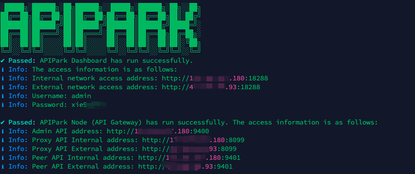
In my experience, you can see the successful deployment interface within 5 to 10 minutes. Then, you can log in to APIPark using your account.
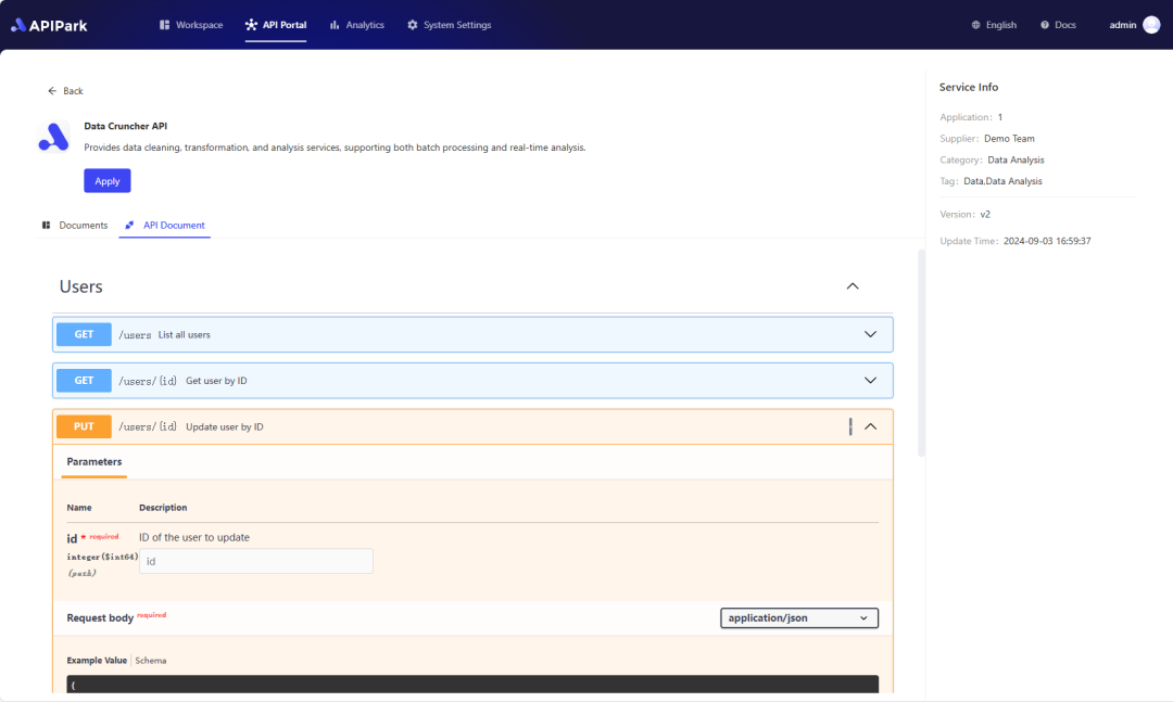
Step 2: Call the OpenAI API.